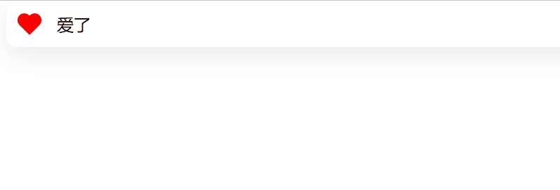
第一种:采用放大缩小方式,形成动画效果
HTML:
<!DOCTYPE html>
<html lang="en" >
<head>
  <meta charset="UTF-8">
<link rel="stylesheet" href="./style.css">

</head>
<body>
  <input type="checkbox" checked="checked" id="favorite" name="favorite-checkbox" value="favorite-button">
  <label for="favorite" class="container">
    <svg xmlns="http://www.w3.org/2000/svg" width="24" height="24" viewBox="0 0 24 24" fill="none" stroke="currentColor" stroke-width="2" stroke-linecap="round" stroke-linejoin="round" class="feather feather-heart"><path d="M20.84 4.61a5.5 5.5 0 0 0-7.78 0L12 5.67l-1.06-1.06a5.5 5.5 0 0 0-7.78 7.78l1.06 1.06L12 21.23l7.78-7.78 1.06-1.06a5.5 5.5 0 0 0 0-7.78z"></path></svg>
    <div class="action">
      <span class="option-1">点击喜欢</span>
      <span class="option-2">爱了</span>
    </div>
  </label>

</body>
</html>
CSS
/* From uiverse.io by @barisdogansutcu */
label {
  background-color: white;
  display: flex;
  align-items: center;
  gap: 14px;
  padding: 10px 15px 10px 10px;
  cursor: pointer;
  user-select: none;
  border-radius: 10px;
  box-shadow: rgba(149, 157, 165, 0.2) 0px 8px 24px;
  color: black;
 }

 input {
  display: none;
 }

 input:checked + label svg {
  fill: hsl(0deg 100% 50%);
  stroke: hsl(0deg 100% 50%);
  animation: heartButton 1s;
 }

 @keyframes heartButton {
  0% {
   transform: scale(1);
  }

  25% {
   transform: scale(1.3);
  }

  50% {
   transform: scale(1);
  }

  75% {
   transform: scale(1.3);
  }

  100% {
   transform: scale(1);
  }
 }

 input + label .action {
  position: relative;
  overflow: hidden;
  display: grid;
 }

 input + label .action span {
  grid-column-start: 1;
  grid-column-end: 1;
  grid-row-start: 1;
  grid-row-end: 1;
  transition: all .5s;
 }

 input + label .action span.option-1 {
  transform: translate(0px,0%);
  opacity: 1;
 }

 input:checked + label .action span.option-1 {
  transform: translate(0px,-100%);
  opacity: 0;
 }

 input + label .action span.option-2 {
  transform: translate(0px,100%);
  opacity: 0;
 }

 input:checked + label .action span.option-2 {
  transform: translate(0px,0%);
  opacity: 1;
 }
第二种:弹出喜欢类型(动态效果)
第三种:爱心分身

第四种:向上弹出多个爱心效果

第五种:手动点赞特效


后四个效果的源码已经调试好了,我就把它们放在文件夹里了(原因是有些需要jquery.js文件),方便大家统一提取。
获取方式:关注《源码小客栈》,回复2022102712