文章目录
一、用R的基础绘图系统作图
基础绘图系统有两类函数:一类是高水平作图函数(直接产生图形的函数);一类是低水平作图函数(在图形基础上加新的图形或者元素)
1.函数plot()
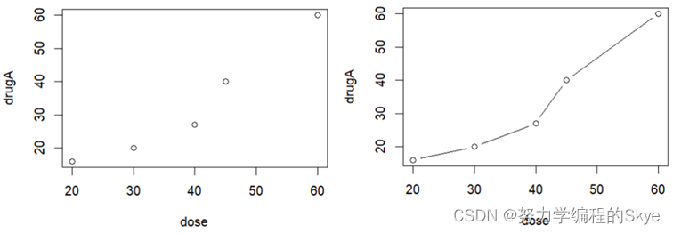
#准备数据
dose <- c(20, 30, 40, 45, 60)
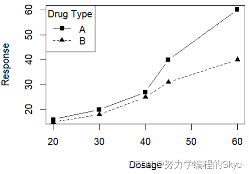
drugA <- c(16, 20, 27, 40, 60)
drugB <- c(15, 18, 25, 31, 40)
plot(dose,drugA)
plot(dose,drugA,type = 'b') #默认type=p
lty不同类型的线,pch不同特征的点。
plot(dose,drugA,type='b',xlab = "Dosage",ylab = "Response",lty=1,pch=15)
lines(dose,drugB,type='b',lty=2,pch=17)
legend("topleft",title = "Drug Type",legend=c("A","B"),lty=c(1,2),pch = c(15,17))
2.直方图和密度曲线图
引入MASS包中关于年轻女性厌食症体重变化的数据
> library(MASS)
> data(anorexia)
> str(anorexia)
'data.frame':	72 obs. of  3 variables:
 $ Treat : Factor w/ 3 levels "CBT","Cont","FT": 2 2 2 2 2 2 2 2 2 2 ...
 $ Prewt : num  80.7 89.4 91.8 74 78.1 88.3 87.3 75.1 80.6 78.4 ...
 $ Postwt: num  80.2 80.1 86.4 86.3 76.1 78.1 75.1 86.7 73.5 84.6 ...
hist(Prewt)#直方图
plot(density(Prewt))#密度图
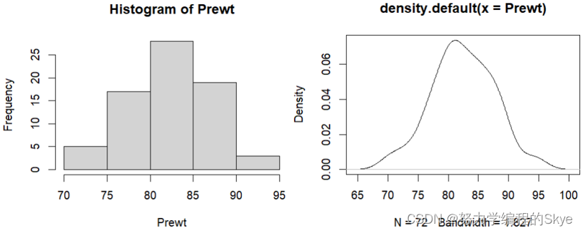
参数col:设置形状颜色;
参数las:值为1设置纵坐标的横向表示。
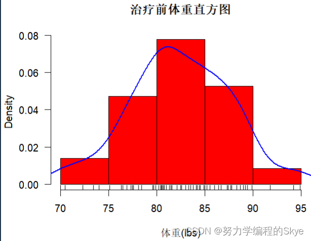
hist(Prewt,freq = FALSE,xlab = "体重(lbs)",col='red',main = "治疗前体重直方图",las=1)
lines(density(Prewt),col='blue',lwd=2)
rug(Prewt)
3.条形图
以来自一项关于类风湿性关节炎治疗新方法试验的数据集为例:
首先,查看数据。table()用于生成分类变量的频数统计表。
> library(vcd)
> data(Arthritis)
> attach(Arthritis)
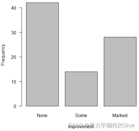
> counts<-table(Improved)
> counts
Improved
None Some Marked
42 14 28
barplot()除了展示直方图,还可以展示二维列联表数据。
barplot(counts,xlab="Improvement",ylab = "Frequency",las=1)
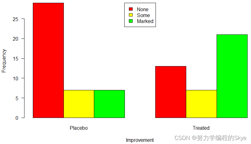
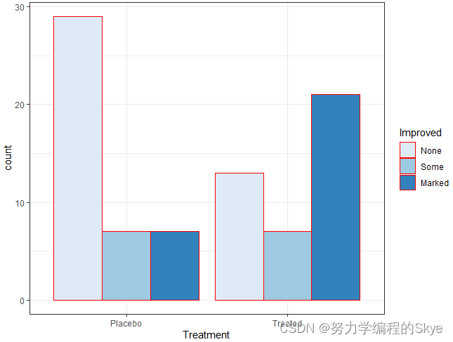
counts<-table(Improved,Treatment)
barplot(counts,xlab="Improvement",ylab = "Frequency",col=c("red","yellow","green"),las=1,beside=TRUE)
legend("top",legend=rownames(counts),fill=c("red","yellow","green"))
4.饼图
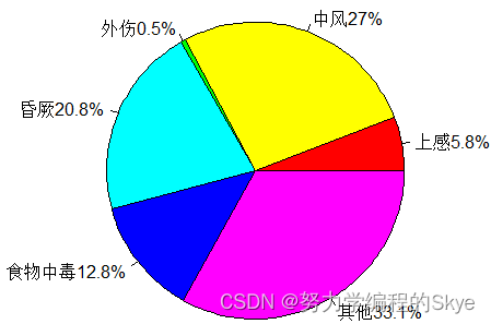
**饼图:**使用pie()绘制。
paste0():可以根据第三个参数把字符串连接在一起。
percent <- c(5.8, 27.0, 0.5, 20.8, 12.8, 33.1)
disease <- c("上感","中风","外伤","昏厥","食物中毒","其他")
labs<-paste0(disease,percent,"%")
pie(percent,labels = labs,col = rainbow(6))
5.箱线图和小提琴图
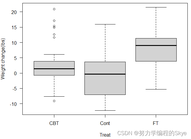
**箱型图:**使用boxplot()绘制。
library(MASS)
data(anorexia)
anorexia$wt.change<-anorexia$Postwt-anorexia$Prewt
boxplot(wt.change~Treat,data=anorexia,ylab="Weight change(lbs)",las=1)
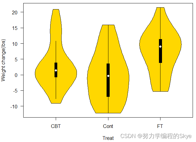
**小提琴图:**使用vioplot()绘制。
library(vioplot)
vioplot(wt.change~Treat,data=anorexia,ylab="Weight change(lbs)",las=1,col="gold")
6.克里夫兰点图
**克里夫兰点图:**使用dotchart()绘制。
dotchart(VADeaths)
dotchart(t(VADeaths),pch = 19)
二、用ggplot2包作图
1.初识ggplot2包
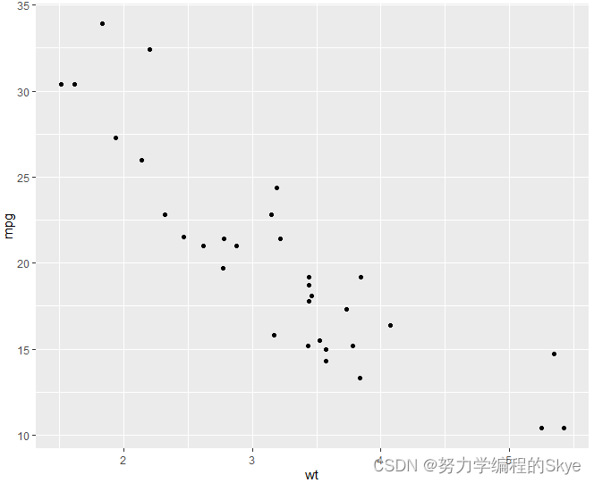
ggplot2包提供了一套基于图层语法的绘图系统,各种数据可视化的原则完全一致。以汽车燃油数据集mtcars为例。
library(ggplot2)
p<-ggplot(data=mtcars,mapping=aes(x=wt,y=mpg))
p+geom_point()
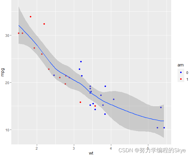
数据集中变量am(传动方式)是个分类变量0/1
mtcars$am<-factor(mtcars$am)
ggplot(data=mtcars,aes(x=wt,y=mpg,color=am))+geom_point()
ggplot(data=mtcars,aes(x=wt,y=mpg,color=am))+geom_smooth()
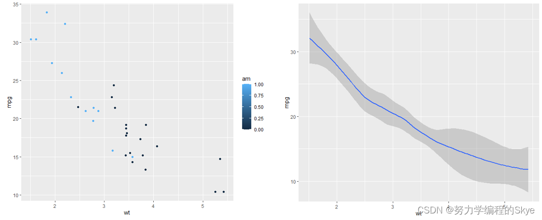
ggplot(data=mtcars,aes(x=wt,y=mpg))+geom_point(aes(color=am))+scale_color_manual(values = c("blue","red"))+stat_smooth()
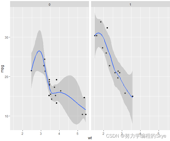
ggplot2还可以分组绘图。
ggplot(data=mtcars,aes(x=wt,y=mpg))+geom_point()+stat_smooth()+facet_grid(~am)
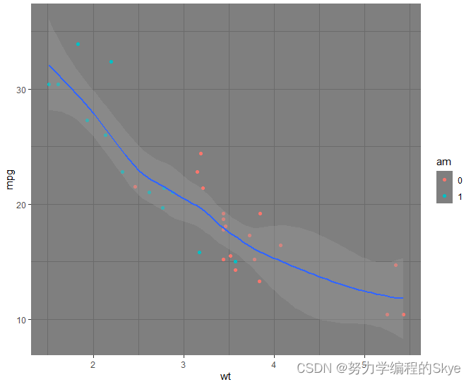
ggplot2包还可以将图的主题设置为暗色主题。
ggplot(data=mtcars,aes(x=wt,y=mpg))+geom_point(aes(color=am))+stat_smooth()+theme_dark()
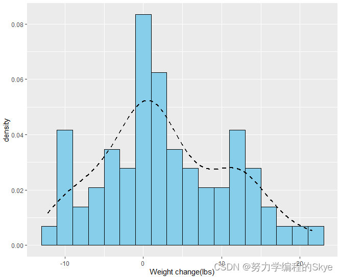
2.分布的特征
分布特征分别用ggplot2包绘制为直方图和折线图
ggplot(anorexia,aes(x=wt.change,y=..density..))+geom_histogram(binwidth = 2,fill="skyblue",color="black")+labs(x="Weight change(lbs)")+stat_density(geom="line",linetype="dashed",size=1)
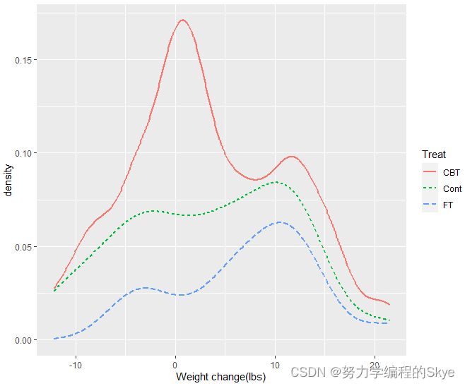
ggplot(anorexia,aes(x=wt.change,color=Treat,linetype=Treat))+labs(x="Weight change(lbs)")+stat_density(geom="line",size=1)
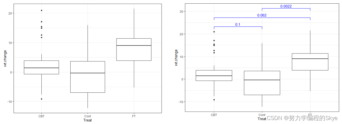
**箱形图:**使用geom_boxplot()绘制。
**ggpubr包:**提供了在平行箱型图上添加组件比较的统计学差异功能。
ggplot(anorexia,aes(x=Treat,y=wt.change),fill=Treat)+geom_boxplot()+theme_bw()
library(ggpubr)
mycomparisons<-list(c("CBT","Cont"), c("CBT", "FT"), c("Cont", "FT"))
ggplot(anorexia,aes(x=Treat,y=wt.change),fill=Treat)+geom_boxplot()+stat_compare_means(comparisons=mycomparisons,method="t.test",color="blue")+theme_bw()
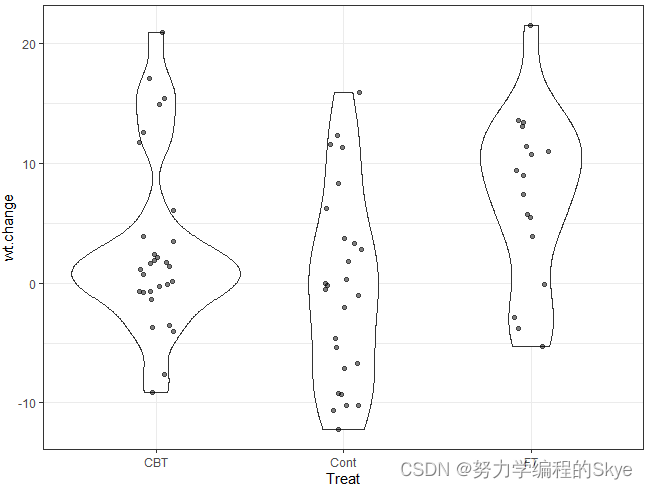
小提琴图
# position:字符串形式的位置参数,确定位置(也可以是返回位置参数的函数)
ggplot(anorexia,aes(x=Treat,y=wt.change),fill=Treat)+geom_violin()+geom_point(position=position_jitter(0.1),alpha=0.5)+theme_bw()
3.比例的构成
比例叠加到条形图如下:
#scale_fill_brewer()一般用于箱线图和条形图等需要填充的图
#1.计数
ggplot(Arthritis,aes(x=Treatment,fill=Improved))+
  geom_bar(color="red")+
  scale_fill_brewer()+
  theme_bw()
#2.比例
ggplot(Arthritis,aes(x=Treatment,fill=Improved))+
  geom_bar(color="red",position = "fill")+
  scale_fill_brewer()+
  theme_bw()
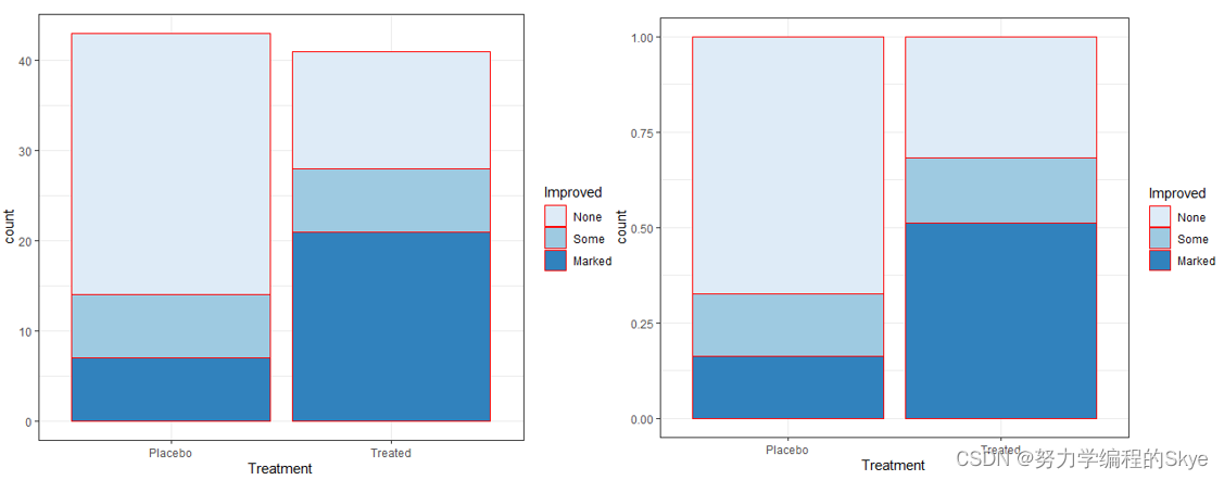
还可以将条形图并排放置
ggplot(Arthritis,aes(x=Treatment,fill=Improved))+
  geom_bar(color="red",position = "dodge")+
  scale_fill_brewer()+
  theme_bw()
4.ggsave()保存图形
p<-ggplot(Arthritis,aes(x=Treatment,fill=Improved))+
    geom_bar(color="red",position = "dodge")+
    scale_fill_brewer()+
    theme_bw()
ggsave("myplot.png",p)
ggsave("myplot.tiff", width = 15, height = 12, units = "cm", dpi = 500)
三、其他图形
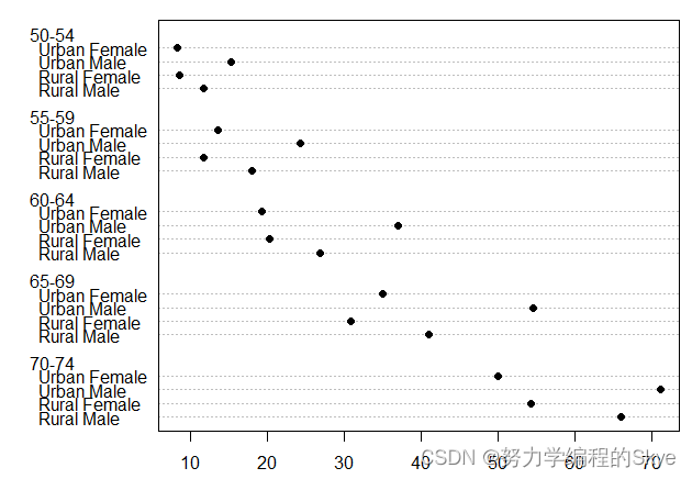
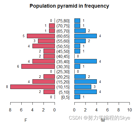
1.金字塔图
金字塔图:使用pyramid()绘制,是背靠背式的条形图
library(epiDisplay)
data(Oswego)
pyramid(Oswego$age,Oswego$sex,col.gender = c(2,4),bar.label = TRUE)
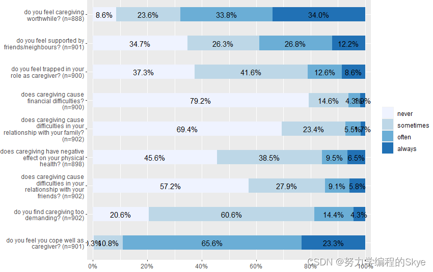
2.横向堆栈条形图
library(sjPlot)
data(efc)
view_df(efc) #查看数据集信息

library(dplyr)
qdata<-dplyr::select(efc,c82cop1:c90cop9)
plot_stackfrq(qdata)
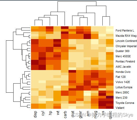
3.热图
> data(mtcars)
> dat<-scale(mtcars)#进行数据的中心化和标准化
> class(dat)
[1] "matrix" "array"
> heatmap(dat)
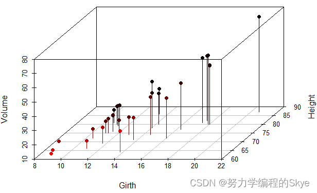
4.三维散点图
三维散点图:使用scatterplot3d()绘制。其中参数type用于绘制图的类型,默认为"p"(点),这里设为"h"(垂直线段)。参数angle为x轴和y轴的角度。
library(scatterplot3d)
data(trees)
scatterplot3d(trees,type="h",highlight.3d = T,angle=55,pch=16)
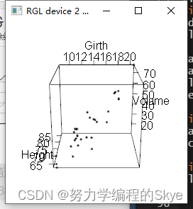
如果想动态调整3D图形,可以使用plot3d()绘制。
library(rgl)
plot3d(trees)
5.词云图
> library(wordcloud2)
> head(demoFreqC)
        V2   V1
1     数据 2304
3     统计 1413
4     用户  855
5     模型  846
7     分析  773
8 数据分析  750
> wordcloud2(demoFreqC)

wordcloud2主要输入的是词频统计表。
总结
提示:这里对文章进行总结:
以上就是今天要讲的内容,本文仅仅简单介绍了R语言绘制各种基本图形的用法。