R数据可视化手册SE(R Graphics Cookbook SE)

1.R基础知识
运行本书的示例前,需加载以下包:
library(tidyverse)library(gcookbook)
library(ggplot2)
library(dplyr)1.1加载以符号分隔的文本文件
data <- read.csv('datafile.csv',
                 header = F, #数据没有标题行
                 sep = '\t', #数据以制表符分隔
                 stringsAsFactors = F #不对数据中的字符串做因子(factor)处理
                 )
names(data) <- c("c1", "c2", "c3") #手动重命名列名
1.2加载excel文件
library(readxl) #导入包
data <- read_excel("datafile.xlsx",
                   sheet = 2, #指定工作表(序数和工作表名都可以)
                   col_names = c("c1", "c2", "c3","c4"), #指定列名
                   col_types = c("blank", "text", "date", "numeric")
                   #去除第一列,并且指定之后3列的类型
                   )
1.3加载SPSS/SAS/Stata文件
library(haven) #会保持更新
data <- read_sav('datafile.sav') #SPSS
read_sas() #SAS
read_dta() #Stata
library(foreign) #可能不支持最新的文件版本
read.octave() #Octave&MATLAB
read.systat() #SYSTAT
read.xport() #SAS XPORT
read.dta() #Stata
read.spss() #SPSS
1.4链接函数和管道操作符%>%
library(dplyr) #管道操作符由dplyr包提供
head(morley)
## Expt Run Speed
## 001 1 1 850
## 002 1 2 740
## 003 1 3 900
## 004 1 4 1070
## 005 1 5 930
## 006 1 6 850morley %>% #加载morley数据集,传递给filter()函数
filter(Expt == 1) %>% #仅保留数据中Expt值为1的行
summary() #将结果传递给summary()函数,进行统计## Expt Run Speed
## Min. :1 Min. : 1.00 Min. : 650
## 1st Qu.:1 1st Qu.: 5.75 1st Qu.: 850
## Median :1 Median :10.50 Median : 940
## Mean :1 Mean :10.50 Mean : 909
## 3rd Qu.:1 3rd Qu.:15.25 3rd Qu.: 980
## Max. :1 Max. :20.00 Max. :1070#summary(filter(morley, Expt == 1))与其等价在进行多重嵌套函数调用时,使用管道操作符的可读性比直接由内而外调用函数的效果更好。管道操作符本质上是将操作符左侧的内容作为右侧函数调用的第一个参数。
2.快速浏览数据
2.1绘制散点图
使用基础绘图系统
plot(mtcars$wt, mtcars$mpg, col = '#0093E9')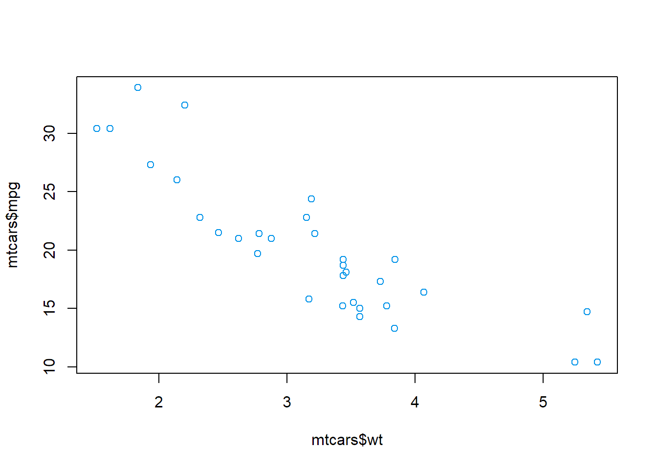
使用ggplot2包
ggplot(mtcars, aes(x = wt, y = mpg)) + #创建一个绘图对象,将数据框mtcars传递给函数,然后设置作为x值和y值的列
  geom_point(col = '#0093E9') #向图像中添加一层点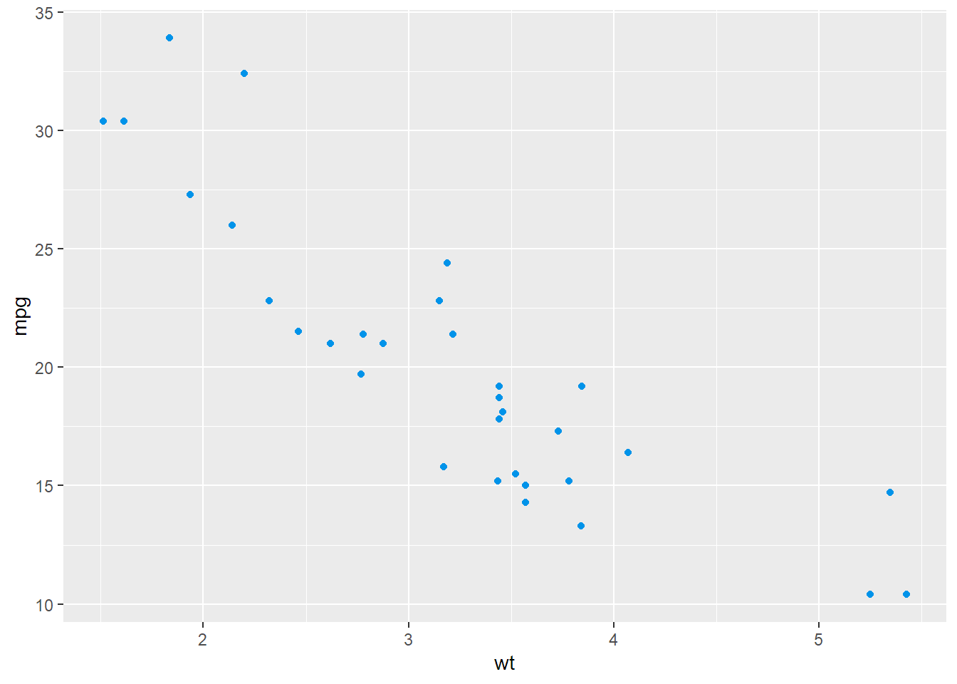
ggplot(data = NULL, aes(x = mtcars$wt, y = mtcars$mpg)) + #此方法用于传入相应的向量,但该包的设计是基于数据框而不是向量,所以这种方法会限制使用
  geom_point(col = '#80D0C7')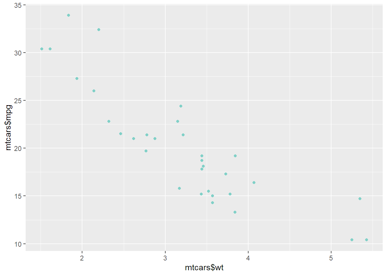
2.2绘制折线图
使用基础绘图系统
plot(pressure$temperature, pressure$pressure, type = 'l', col = '#00DBDE') #绘制折线
points(pressure$temperature, pressure$pressure, col = '#00DBDE') #添加数据点
lines(pressure$temperature, pressure$pressure/2, type = 'l', col = '#FC00FF') #绘制更多折线
points(pressure$temperature, pressure$pressure/2, col = '#FC00FF') #继续添加数据点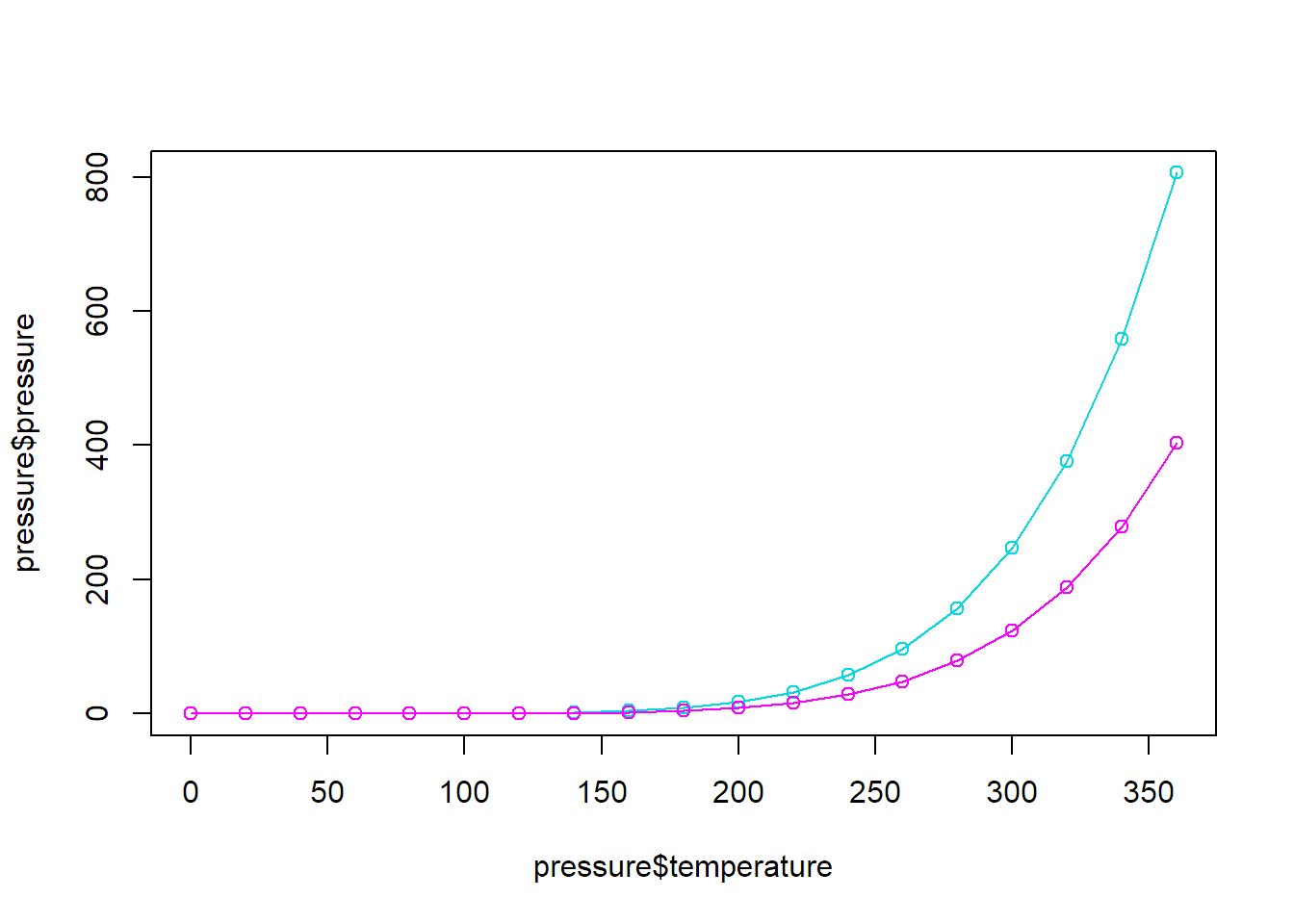
使用ggplot2包
ggplot(pressure, aes(x = temperature, y = pressure)) +
  geom_line(col = '#6284FF') +
  geom_point(col = '#FF0000')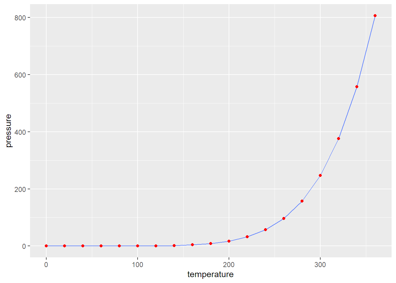
2.3绘制条形图
使用基础绘图系统
barplot(BOD$demand, #设定条形的高度
        names.arg = BOD$Time, #设定每个条形对应标签
        col = '#4158D0')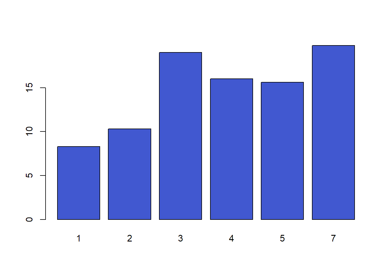
barplot(table(mtcars$cyl), col = '#4158D0') #频数图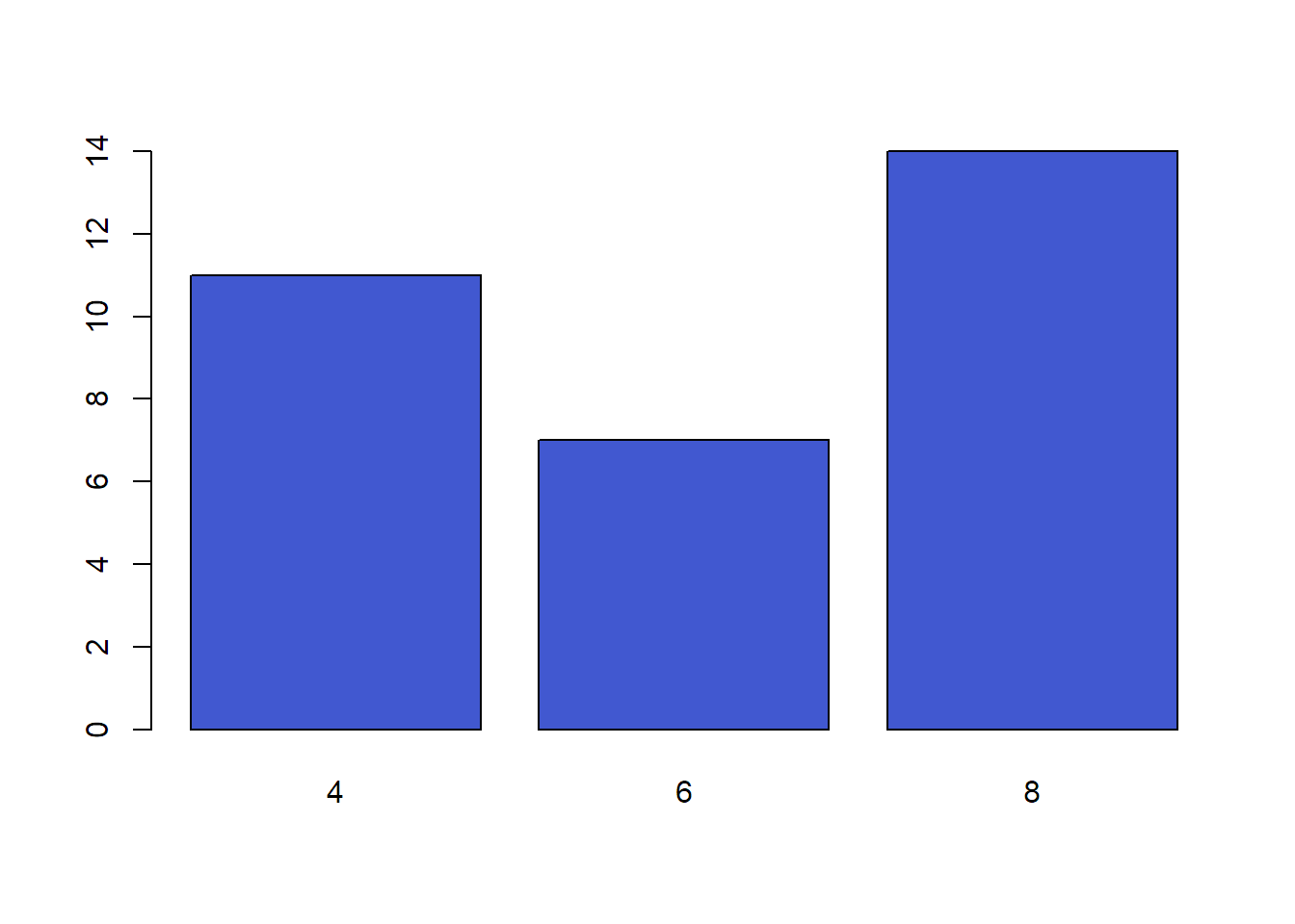
使用ggplot2包
ggplot(BOD, aes(x = Time, #此时x为连续型变量
                y = demand)) +
  geom_col(fill = '#08AEEA', col='#000000') #绘制连续变量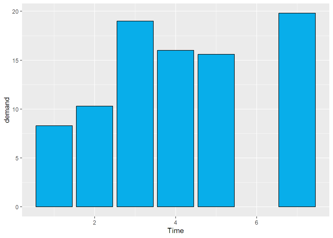
ggplot(BOD, aes(x = factor(Time), #此时将x转化为因子型变量,从而系统将其视作离散值
                y = demand)) +
  geom_col(fill = '#08AEEA', col='#000000') #绘制连续变量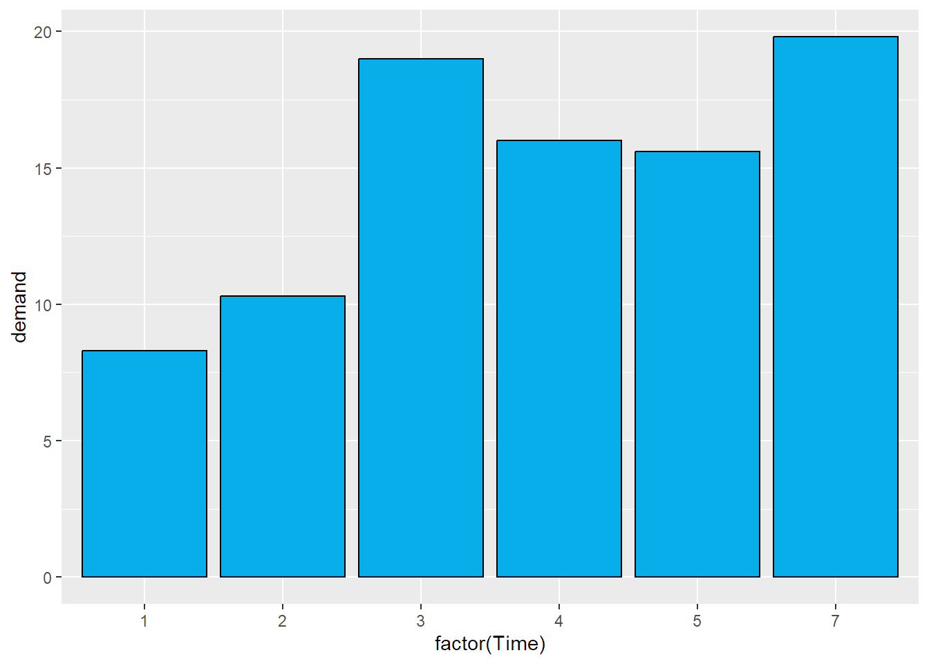
ggplot(mtcars, aes(x = cyl)) +
  geom_bar(fill = '#FF2525', col='#000000') #绘制分组变量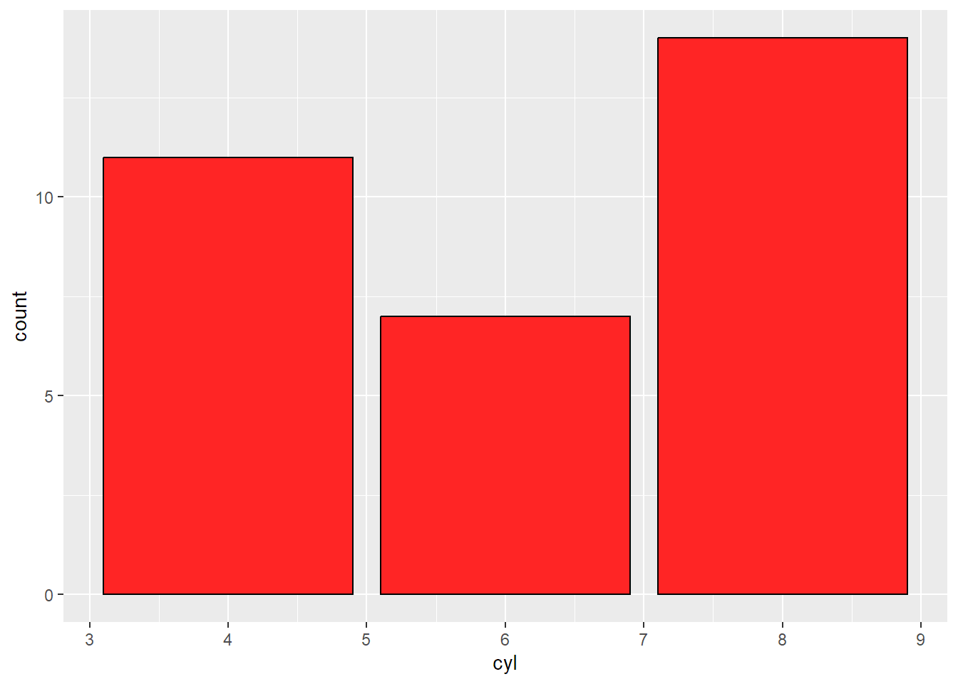
ggplot(mtcars, aes(x = factor(cyl))) +
  geom_bar(fill = '#FF2525', col='#000000') #绘制分组变量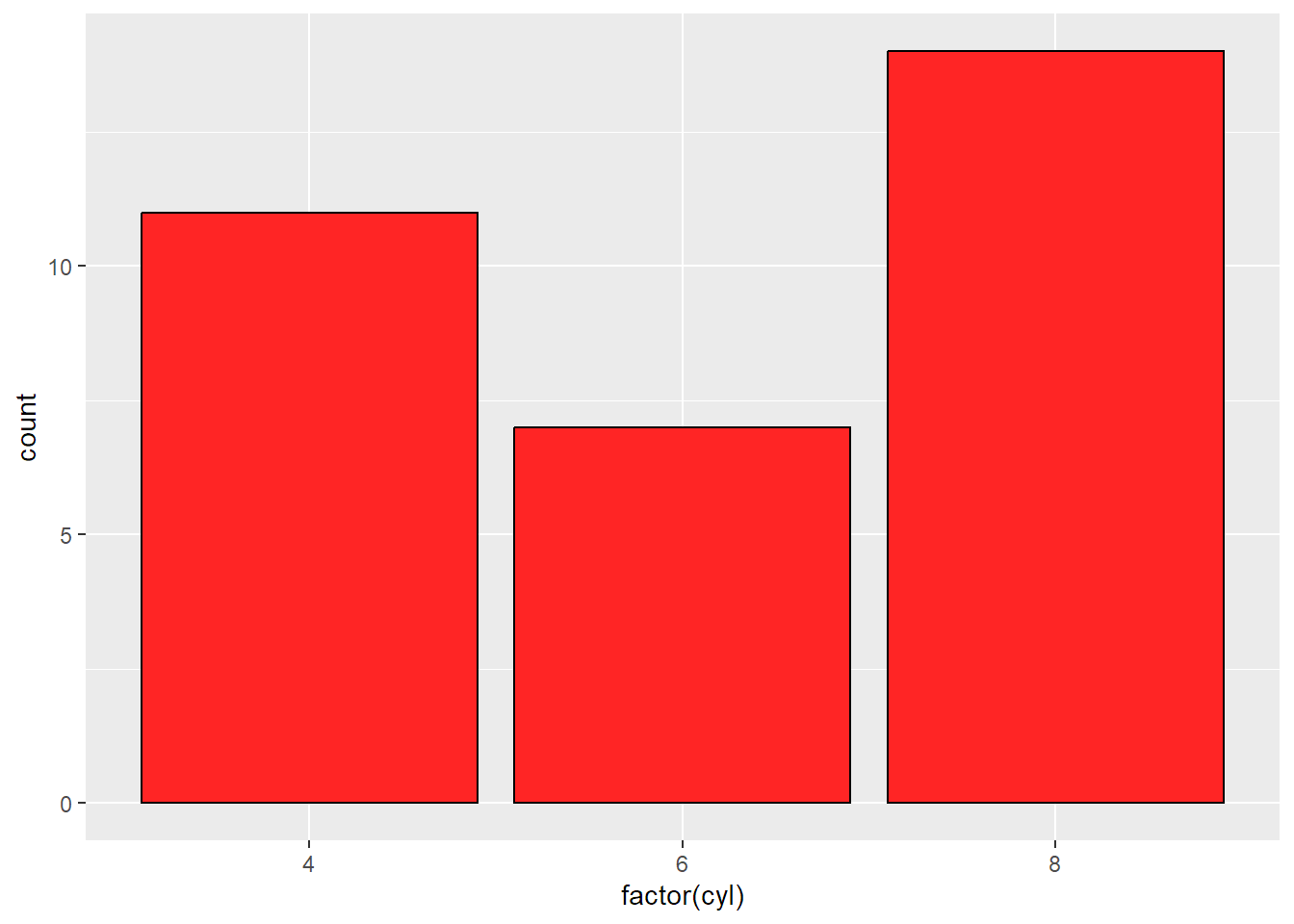
2.4绘制直方图
使用基础绘图系统
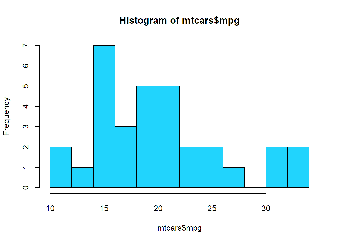
hist(mtcars$mpg, #传递向量
     breaks = 10, #指定组距
     col = '#21D4FD'
     )
使用ggplot2包
ggplot(mtcars, aes(x = mpg)) +
  geom_histogram(binwidth = 1, fill = '#21D4FD', col = 'black') #设置更大的组距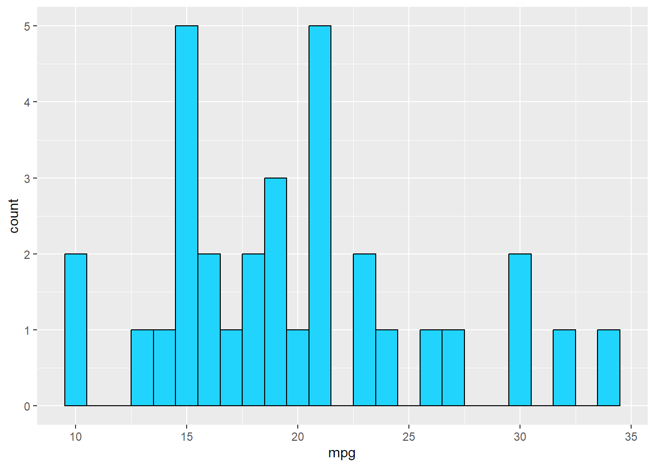
2.5绘制箱形图
使用基础绘图系统
plot(ToothGrowth$supp, ToothGrowth$len, col = '#B721FF')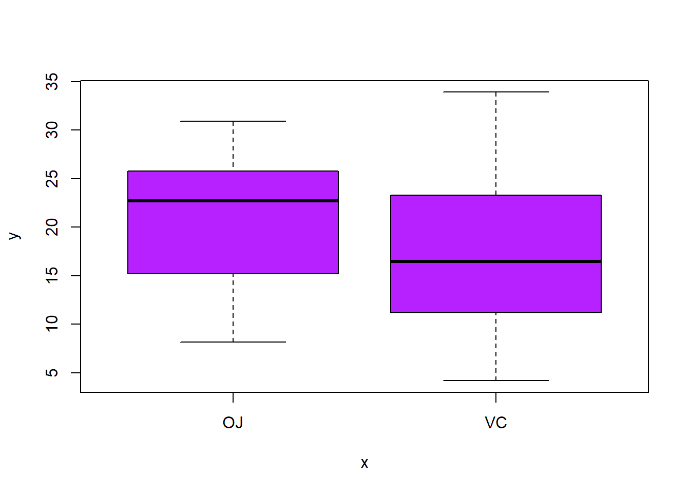
boxplot(len ~ supp + dose, #当两个参数变量在同一个数据框时,可以使用这种形式进行变量组合
        data = ToothGrowth,
        col = c('#B721FF','#21D4FD'))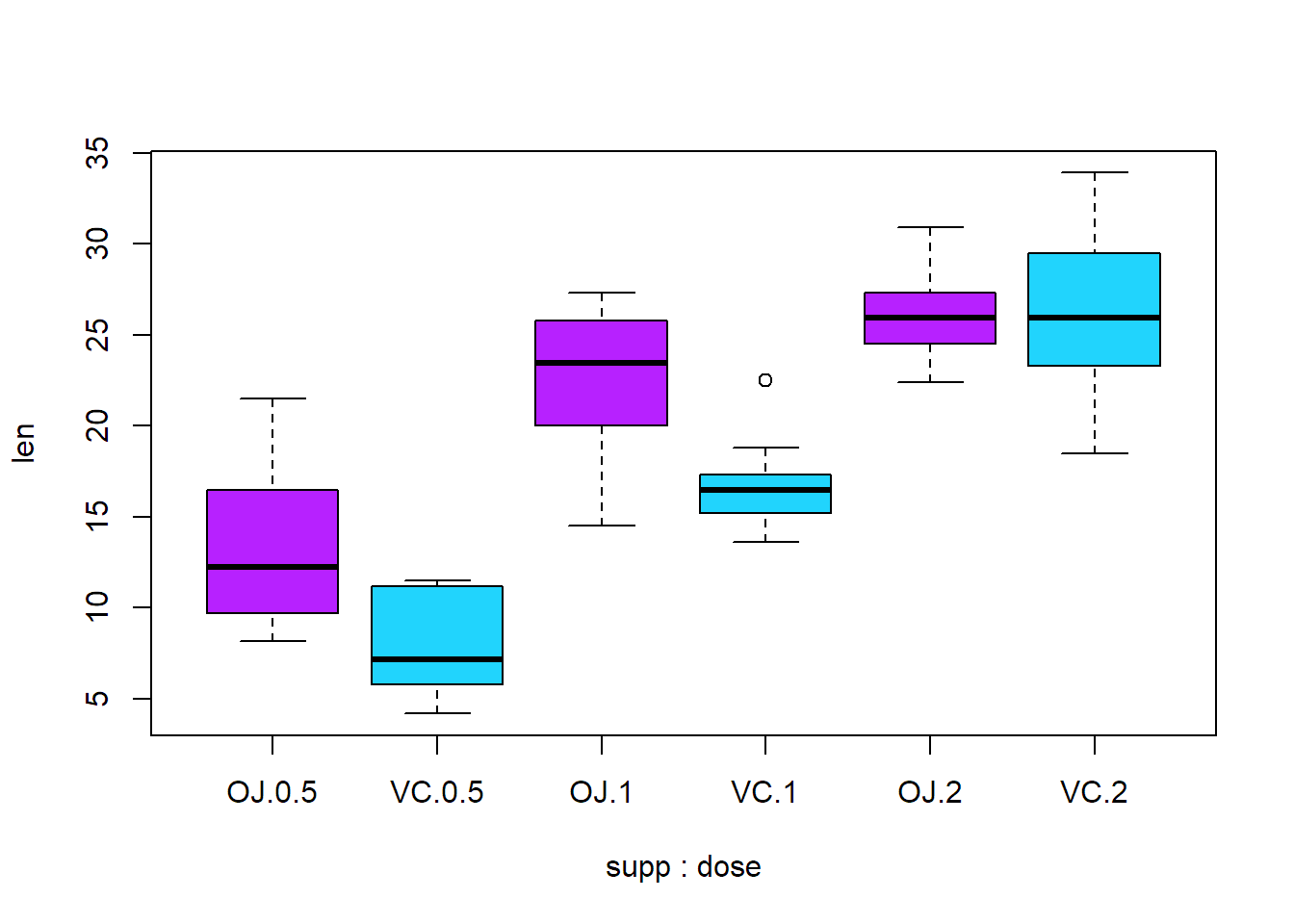
使用ggplot2包
ggplot(ToothGrowth, aes(x = supp, y = len)) +
  geom_boxplot(fill = '#e4f9f5', col = '#30e3ca')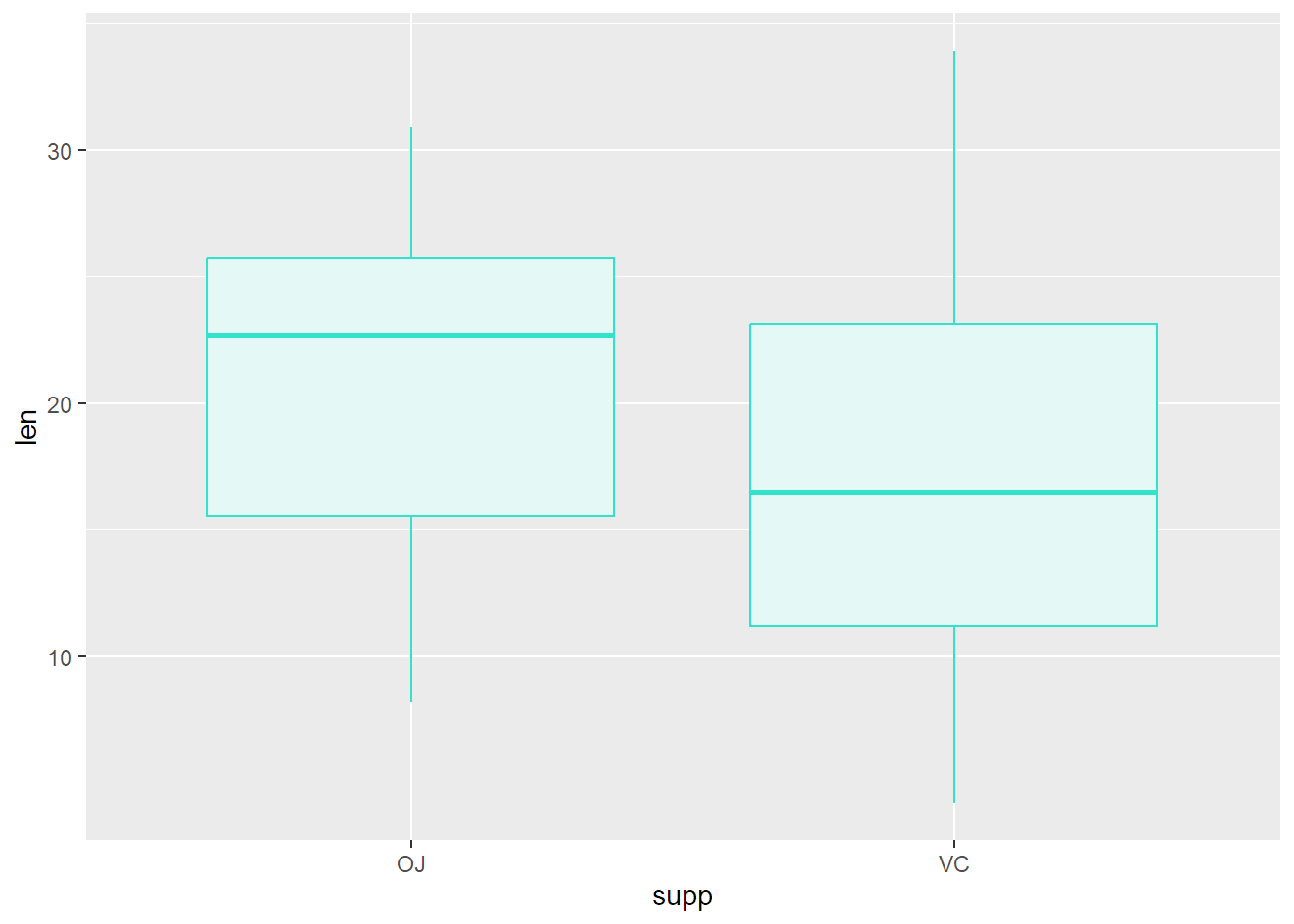
ggplot(ToothGrowth,
       aes(x = interaction(supp, dose), #使用函数进行组合
           y = len,
           fill = supp)) +
  geom_boxplot()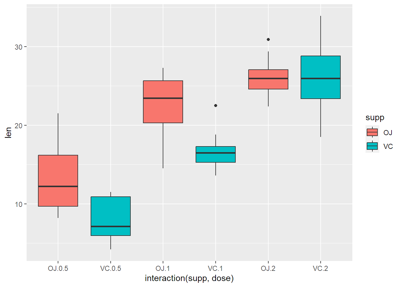
2.6绘制函数图像
使用基础绘图系统
curve(x^3 - 5*x, from = -6, to = 6, col = '#3f72af')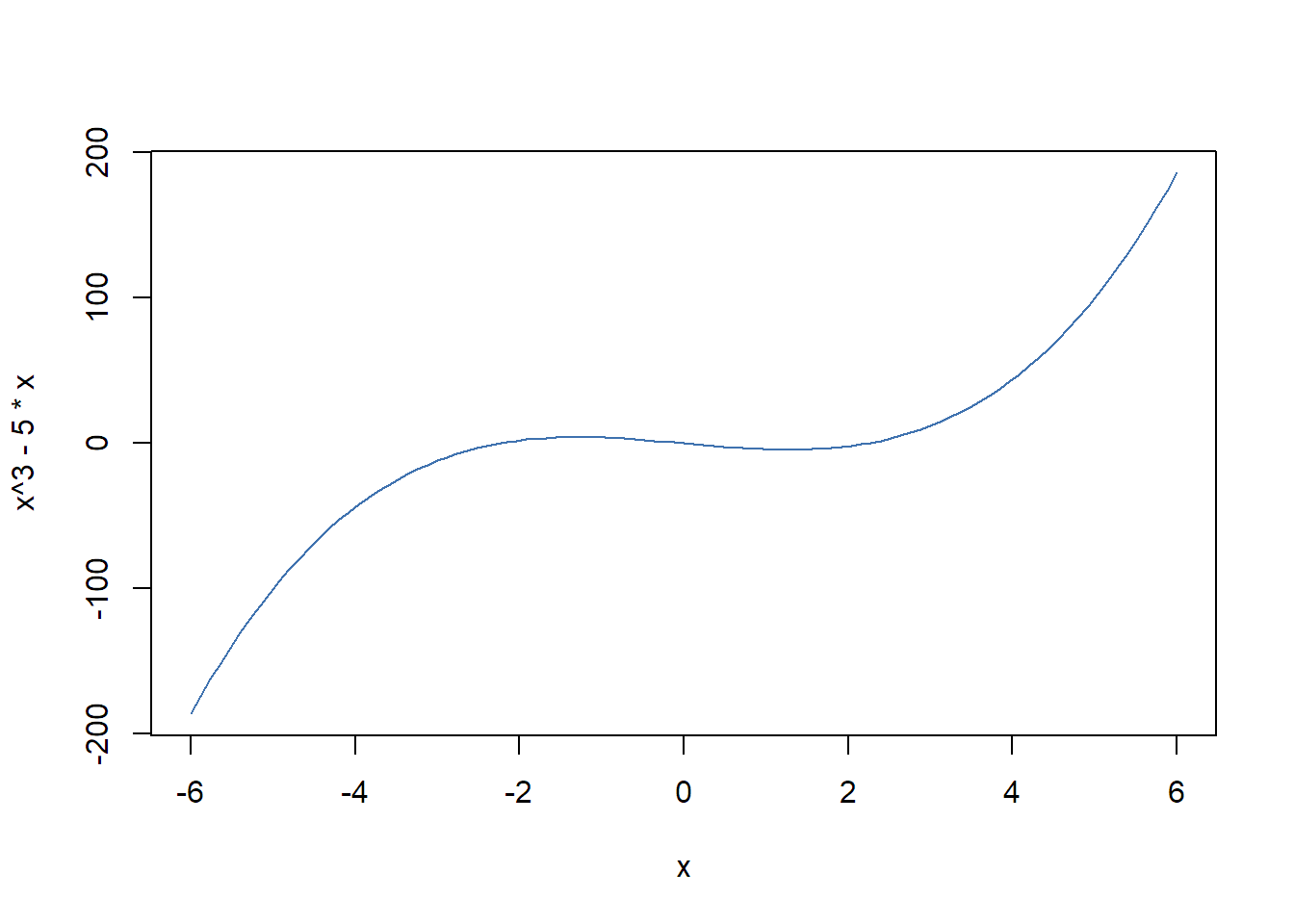
#绘制用户自定义的函数图像
myfun <- function(xvar) {
  1/(1 + exp(-xvar + 10))
}
curve(myfun(x), from = 0, to = 20, col = '#08d9d6')
#添加直线
curve(1 - myfun(x), add = T, col = '#ff2e63')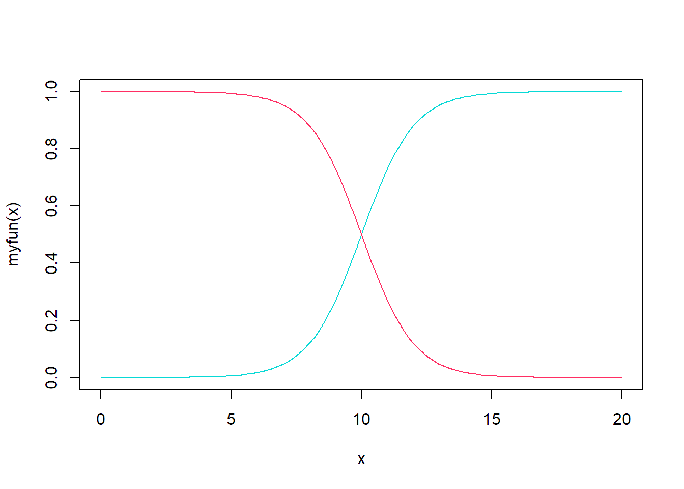
使用ggplot2包
ggplot(data.frame(x = c(0,20)), aes(x = x)) +
  stat_function(fun = myfun, geom = 'line', col = '#f08a5d')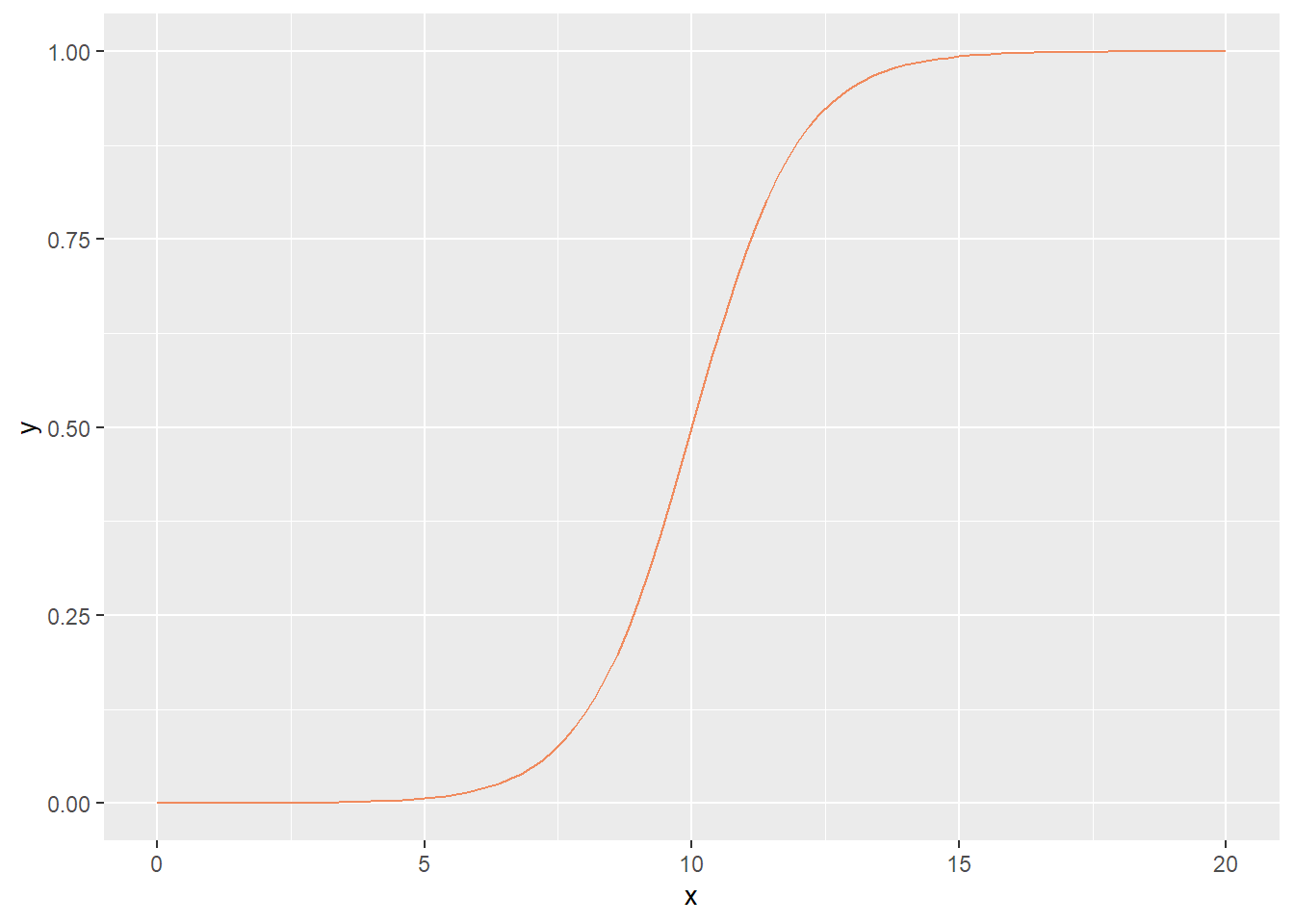
1.本文学习资料为R数据可视化手册:第2版 / (美)温斯顿·常(Winston Chang)著 , 王佳[等]译. -- 北京:人民邮电出版社,2021.5
2.本文代码运行R版本为 R version 4.2.2 (2022-10-31 ucrt)