1.椭圆形
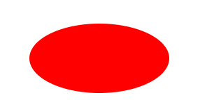
#oval {
  width: 200px;
  height: 100px;
  background: red;
  border-radius: 100px / 50px;
}
2.上、下、左、右三角
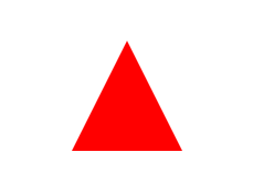
  #triangle-up {
		width: 0;
		height: 0;
		//上三角
		border-left: 50px solid transparent;
		border-right: 50px solid transparent;
		border-bottom: 100px solid red;
		//下三角
		border-left: 50px solid transparent;
		border-right: 50px solid transparent;
		border-top: 100px solid red;
		//左三角
		border-top: 50px solid transparent;
	    border-right: 100px solid red;
        border-bottom: 50px solid transparent;
        //右三角
        border-top: 50px solid transparent;
		border-left: 100px solid red;
		border-bottom: 50px solid transparent;
	}
3.左上角、右上角、左下角、右下角
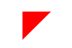
#triangle-topleft {
  	width: 0;
 	height: 0;
 	//左上角
 	border-top: 100px solid red;
 	border-right: 100px solid transparent;
 	//右上角
 	border-top: 100px solid red;
	border-left: 100px solid transparent;
	//左下角
	border-bottom: 100px solid red;
	border-right: 100px solid transparent;
	//右下角
	border-bottom: 100px solid red;
	border-left: 100px solid transparent;
}
4.箭头
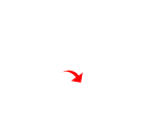
#curvedarrow {
	  position: relative;
	  width: 0;
	  height: 0;
	  border-top: 9px solid transparent;
	  border-right: 9px solid red;
	  transform: rotate(10deg);
}
#curvedarrow:after {
	  content: "";
	  position: absolute;
	  border: 0 solid transparent;
	  border-top: 3px solid red;
	  border-radius: 20px 0 0 0;
	  top: -12px;
	  left: -9px;
	  width: 12px;
	  height: 12px;
	  transform: rotate(45deg);
}
5.梯形
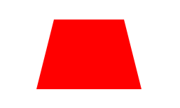
#trapezoid {
  border-bottom: 100px solid red;
  border-left: 25px solid transparent;
  border-right: 25px solid transparent;
  height: 0;
  width: 100px;
}
6.平行四边形
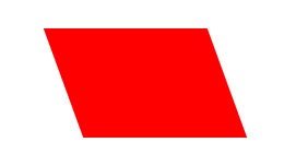
#parallelogram {
  width: 150px;
  height: 100px;
  transform: skew(20deg);
  background: red;
}
7.星星 (6角)
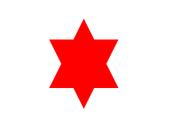
#star-six {
  width: 0;
  height: 0;
  border-left: 50px solid transparent;
  border-right: 50px solid transparent;
  border-bottom: 100px solid red;
  position: relative;
}
#star-six:after {
  width: 0;
  height: 0;
  border-left: 50px solid transparent;
  border-right: 50px solid transparent;
  border-top: 100px solid red;
  position: absolute;
  content: "";
  top: 30px;
  left: -50px;
}
8.星星 (5角)

#star-five {
  margin: 100px 0;
  position: relative;
  display: block;
  color: red;
  width: 0px;
  height: 0px;
  border-right: 100px solid transparent;
  border-bottom: 70px solid red;
  border-left: 100px solid transparent;
  transform: rotate(35deg);
}
#star-five:before {
  border-bottom: 80px solid red;
  border-left: 30px solid transparent;
  border-right: 30px solid transparent;
  position: absolute;
  height: 0;
  width: 0;
  top: -45px;
  left: -65px;
  display: block;
  content: '';
  transform: rotate(-35deg);
}
#star-five:after {
  position: absolute;
  display: block;
  color: red;
  top: 3px;
  left: -105px;
  width: 0px;
  height: 0px;
  border-right: 100px solid transparent;
  border-bottom: 70px solid red;
  border-left: 100px solid transparent;
  transform: rotate(-70deg);
  content: '';
}
9.五边形
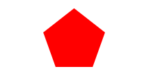
#pentagon {
  position: relative;
  width: 54px;
  box-sizing: content-box;
  border-width: 50px 18px 0;
  border-style: solid;
  border-color: red transparent;
}
#pentagon:before {
  content: "";
  position: absolute;
  height: 0;
  width: 0;
  top: -85px;
  left: -18px;
  border-width: 0 45px 35px;
  border-style: solid;
  border-color: transparent transparent red;
}
10.六边形
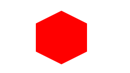
#hexagon {
  width: 100px;
  height: 55px;
  background: red;
  position: relative;
}
#hexagon:before {
  content: "";
  position: absolute;
  top: -25px;
  left: 0;
  width: 0;
  height: 0;
  border-left: 50px solid transparent;
  border-right: 50px solid transparent;
  border-bottom: 25px solid red;
}
#hexagon:after {
  content: "";
  position: absolute;
  bottom: -25px;
  left: 0;
  width: 0;
  height: 0;
  border-left: 50px solid transparent;
  border-right: 50px solid transparent;
  border-top: 25px solid red;
}
11.八边形
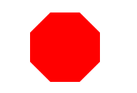
#octagon {
	width: 100px;
	height: 100px;
	background: red;
	position: relative;
}

#octagon:before {
	content: "";
	position: absolute;
	top: 0;
	left: 0;
	border-bottom: 29px solid red;
	border-left: 29px solid #fff;
	border-right: 29px solid #fff;
	width: 42px;
	height: 0;
}

#octagon:after {
	content: "";
	position: absolute;
	bottom: 0;
	left: 0;
	border-top: 29px solid red;
	border-left: 29px solid #fff;
	border-right: 29px solid #fff;
	width: 42px;
	height: 0;
}
12.爱心
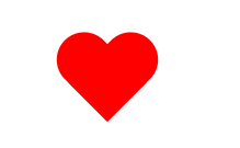
#heart {
  position: relative;
  width: 100px;
  height: 90px;
}
#heart:before,
#heart:after {
  position: absolute;
  content: "";
  left: 50px;
  top: 0;
  width: 50px;
  height: 80px;
  background: red;
  border-radius: 50px 50px 0 0;
  transform: rotate(-45deg);
  transform-origin: 0 100%;
}
#heart:after {
  left: 0;
  transform: rotate(45deg);
  transform-origin: 100% 100%;
}
13.对话泡泡
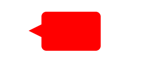
#talkbubble {
  width: 120px;
  height: 80px;
  background: red;
  position: relative;
  -moz-border-radius: 10px;
  -webkit-border-radius: 10px;
  border-radius: 10px;
}
#talkbubble:before {
  content: "";
  position: absolute;
  right: 100%;
  top: 26px;
  width: 0;
  height: 0;
  border-top: 13px solid transparent;
  border-right: 26px solid red;
  border-bottom: 13px solid transparent;
}
14.12点 爆发
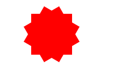
#burst-12 {
  background: red;
  width: 80px;
  height: 80px;
  position: relative;
  text-align: center;
}
#burst-12:before,
#burst-12:after {
  content: "";
  position: absolute;
  top: 0;
  left: 0;
  height: 80px;
  width: 80px;
  background: red;
}
#burst-12:before {
  transform: rotate(30deg);
}
#burst-12:after {
  transform: rotate(60deg);
}
15.8点 爆发
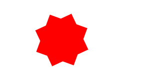
#burst-8 {
  background: red;
  width: 80px;
  height: 80px;
  position: relative;
  text-align: center;
  transform: rotate(20deg);
}
#burst-8:before {
  content: "";
  position: absolute;
  top: 0;
  left: 0;
  height: 80px;
  width: 80px;
  background: red;
  transform: rotate(135deg);
}
16.太极
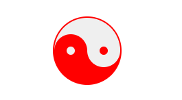
#yin-yang {
  width: 96px;
  box-sizing: content-box;
  height: 48px;
  background: #eee;
  border-color: red;
  border-style: solid;
  border-width: 2px 2px 50px 2px;
  border-radius: 100%;
  position: relative;
}
#yin-yang:before {
  content: "";
  position: absolute;
  top: 50%;
  left: 0;
  background: #eee;
  border: 18px solid red;
  border-radius: 100%;
  width: 12px;
  height: 12px;
  box-sizing: content-box;
}
#yin-yang:after {
  content: "";
  position: absolute;
  top: 50%;
  left: 50%;
  background: red;
  border: 18px solid #eee;
  border-radius: 100%;
  width: 12px;
  height: 12px;
  box-sizing: content-box;
}
17.徽章丝带
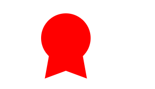
#badge-ribbon {
  position: relative;
  background: red;
  height: 100px;
  width: 100px;
  border-radius: 50px;
}
#badge-ribbon:before,
#badge-ribbon:after {
  content: '';
  position: absolute;
  border-bottom: 70px solid red;
  border-left: 40px solid transparent;
  border-right: 40px solid transparent;
  top: 70px;
  left: -10px;
  transform: rotate(-140deg);
}
#badge-ribbon:after {
  left: auto;
  right: -10px;
  transform: rotate(140deg);
}
18.十字
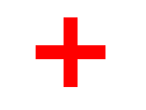
#cross {
  background: red;
  height: 100px;
  position: relative;
  width: 20px;
}
#cross:after {
  background: red;
  content: "";
  height: 20px;
  left: -40px;
  position: absolute;
  top: 40px;
  width: 100px;
}
19.指示器
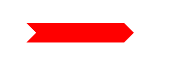
#pointer {
  width: 200px;
  height: 40px;
  position: relative;
  background: red;
}
#pointer:after {
  content: "";
  position: absolute;
  left: 0;
  bottom: 0;
  width: 0;
  height: 0;
  border-left: 20px solid white;
  border-top: 20px solid transparent;
  border-bottom: 20px solid transparent;
}
#pointer:before {
  content: "";
  position: absolute;
  right: -20px;
  bottom: 0;
  width: 0;
  height: 0;
  border-left: 20px solid red;
  border-top: 20px solid transparent;
  border-bottom: 20px solid transparent;
}
20.锁

#lock {
  font-size: 8px;
  position: relative;
  width: 18em;
  height: 13em;
  border-radius: 2em;
  top: 10em;
  box-sizing: border-box;
  border: 3.5em solid red;
  border-right-width: 7.5em;
  border-left-width: 7.5em;
  margin: 0 0 6rem 0;
}
#lock:before {
  content: "";
  box-sizing: border-box;
  position: absolute;
  border: 2.5em solid red;
  width: 14em;
  height: 12em;
  left: 50%;
  margin-left: -7em;
  top: -12em;
  border-top-left-radius: 7em;
  border-top-right-radius: 7em;
}
#lock:after {
  content: "";
  box-sizing: border-box;
  position: absolute;
  border: 1em solid red;
  width: 5em;
  height: 8em;
  border-radius: 2.5em;
  left: 50%;
  top: -1em;
  margin-left: -2.5em;
}
21.月亮
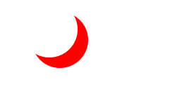
#moon {
  width: 80px;
  height: 80px;
  border-radius: 50%;
  box-shadow: 15px 15px 0 0 red;
}