一.使用flex弹性造一个APP首页轮子
这是内科大企业课(全栈开发_web前端的课程),需求如下:
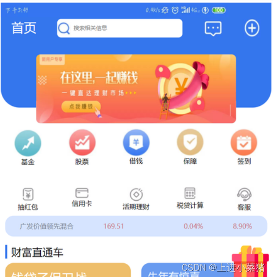
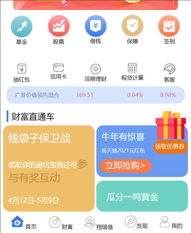
使用Flex弹性布局,仿写下面的页面:
二.需求分析和完成步骤
先分析这个页面,我们可以先写一个大的盒子,作为整个页面:
<div id="content">
</div>
设置其为弹性布局,排列顺序为从上到下
#content {


	display: flex;
	flex-direction: column;
}
将下面这部分作为一块,使用一个盒子。
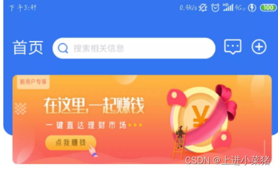
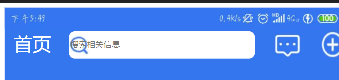
然后将下面的图片,放到最上方,写一个div盒子:

<div id="top">
    <div id="time">
        <img src="./work1/img/01.png" alt="">
    </div>
</div>
css为:
#top {


	width: 100%;
	height: 310px;
	background-color: #3476ed;
	border-bottom-left-radius: 45px;
	border-bottom-right-radius: 45px;
}
效果预览:

将这一行作为一个div盒子:
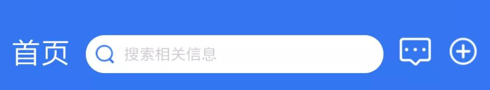
html为:
<div id="first">
    <span>首页</span>
    <input type="text" size="40" placeholder="搜索相关信息">
    <img src="./work1/img/2.png" alt="">
    <img src="./work1/img/3.png" alt="">
</div>
CSS为:
#first {


	display: flex;
	justify-content: space-around;

}

#first span {


	font-size: 30px;
	color: white;
	font-family: "微软雅黑";
}

#first input {


	border-radius: 10px;
	border: none;
	background: url('../img/1.png') no-repeat 0px 5px;
	background-color: white;
	color: #c6c6c6;
}
效果如下:
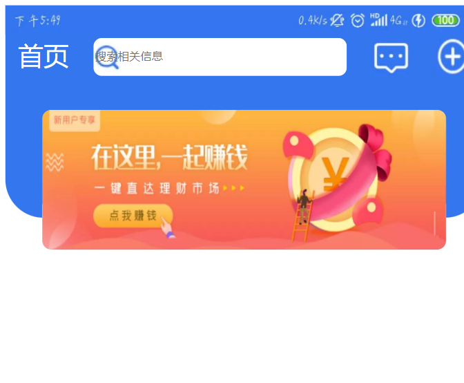
然后放置一张图片上去:
<div id="img">
    <img src="./work1/img/4.png" alt="">
</div>
设置其CSS,利用弹性布局将其在主轴居中,然后使用margin设置其四周的位置:
#img{


	display: flex;
	justify-content: center;
	align-items: center;
	margin: 40px 0px ;
}
效果展示:
然后是这一部分:
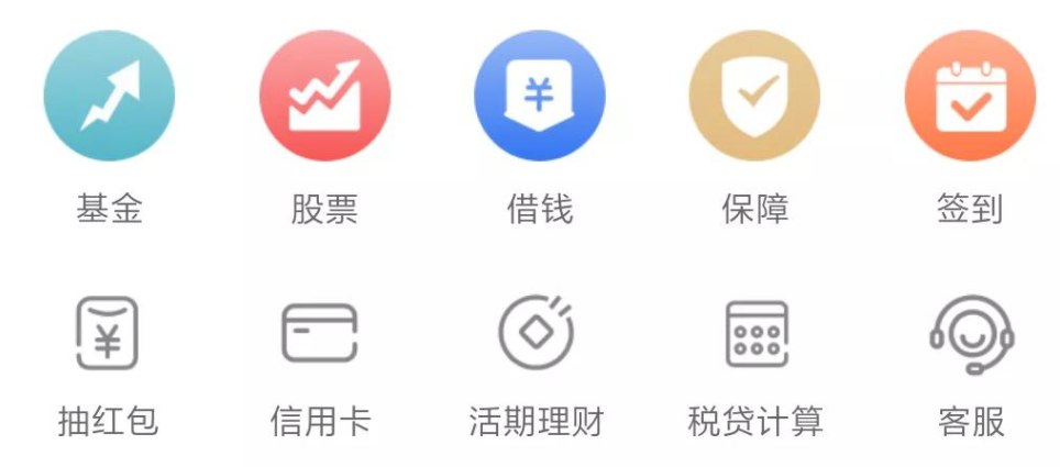
<div id="body">
    <div><img src="./work1/img/5.png" alt=""><span>基金</span></div>
    <div><img src="./work1/img/6.png" alt=""><span>股票</span></div>
    <div><img src="./work1/img/7.png" alt=""><span>借钱</span></div>
    <div><img src="./work1/img/8.png" alt=""><span>保障</span></div>
    <div><img src="./work1/img/9.png" alt=""><span>签到</span></div>
    <div><img src="./work1/img/10.png" alt=""><span>抽红包</span></div>
    <div><img src="./work1/img/11.png" alt=""><span>信用卡</span></div>
    <div><img src="./work1/img/12.png" alt=""><span>活期理财</span></div>
    <div><img src="./work1/img/13.png" alt=""><span>税贷计算</span></div>
    <div><img src="./work1/img/14.png" alt=""><span>客服</span></div>
</div>
CSS内容如下:
#body {


	display: flex;
	flex-wrap: wrap;
	flex-direction: row;
	justify-content: space-around;
	/* align-content: center; */
}
#body div{


	display: flex;
	flex-flow: column nowrap;
	flex-basis: 20%;
	align-items: center;
	margin-top: 50px;
}
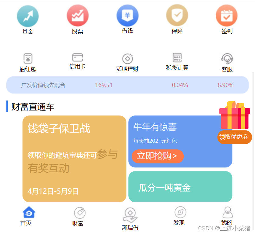
效果如下:

本块解释:
将body盒子设置弹性布局,主轴为y轴,设置为运行换行:“flex-wrap: wrap;”。内容发布为:平分其剩余空间:“justify-content: space-around;”
写一下下面这部分:
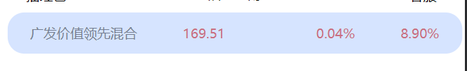
<div id="bodytext">
    <span>广发价值领先混合</span>
    <span>169.51</span>
    <span></span>
    <span>0.04%</span>
    <span>8.90%</span>
</div>
css代码如下:
#bodytext{


	margin: 10px;
	display: flex;
	background-color: #d6e4ff;
	justify-content: space-around;
	height: 50px;
	align-items: center;
	border-radius: 20px;
	/* width: 100%; */
}
#bodytext span:nth-child(1){


	color: #757e8f;
}
#bodytext span:nth-child(2){


	color: #c96f81;
}
#bodytext span:nth-child(4){


	color: #c96f81;
}
#bodytext span:nth-child(5){


	color: #c96f81;
}
下面写一下财富直通车:

<div id="text">
    <span>财富直通车</span>
</div>
CSS代码如下:
#text{


    border-style: none none none solid;
    border-color: #3476ed;
    margin: 10px;
    border-width: 5px;

}
#text span{


    margin: 10px;
    font-size: 25px;
}
下面开始写这一部分
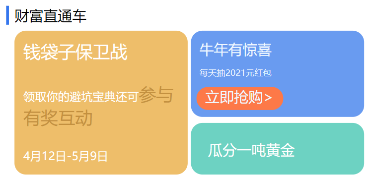
html代码
<div id="lastbody">
    <div id="qian">
        <span>钱袋子保卫战</span>
        <span>领取你的避坑宝典还可<span style="color: #c3903f; margin: 0px;">参与有奖互动</span></span>
        <span>4月12日-5月9日</span>
    </div>
    <div id="niu">
        <div id="niu1">
            <span>牛年有惊喜</span>
            <span>每天抽2021元红包</span>
            <div id="qiang"><span>立即抢购></span></div>
        </div>
        <div id="niu2">
            <span>
                瓜分一吨黄金
            </span>
        </div>
    </div>
</div>
CSS代码:
#lastbody {


	display: flex;
	justify-content: center;
}

#qian {


	background-color: #eebe6a;
	width: 300px;
	height: 250px;
	display: flex;
	flex-wrap: wrap;
	border-radius: 20px;

}

#qian span:nth-child(1) {


	color: white;
	margin: 15px;
	font-size: 30px;
}

#qian span:nth-child(2) {


	color: white;
	margin: 15px;
	font-size: 20px;
}

#qian span:nth-child(3) {


	color: white;
	margin: 15px;
	font-size: 20px;
}

#niu {


	/* background-color: red; */
	width: 300px;
	height: 250px;
	display: flex;
	flex-wrap: wrap;
	border-radius: 20px;
	margin-left: 5px;
	flex-direction: column;

}

#niu1 {


	display: flex;
	flex-direction:column;
	width: 100%;
	height: 150px;
	background-color: #699bf0;
	border-radius: 20px;
}

#niu1 span:nth-child(1){


	color: aliceblue;
	font-size: 25px;
	margin: 15px 15px 0px 15px;
}
#niu1 span:nth-child(2){


	color: aliceblue;
	font-size: 15px;
	margin: 15px 15px 15px 15px;
}
#niu1 span:nth-child(3){


	display: flex;

	color: aliceblue;
	/* background-color: #fd7948; */

	font-size: 20px;
	margin: 0px 15px 0px 15px;

}
#qiang{


	background-color: #fd7948;
	width: 150px;
	height: 40px;
	border-radius: 20px;
	margin-left: 10px;
}
#niu2{


	display: flex;
	margin-top: 10px;
	background-color: #6dd2c2;
	height: 90px;
	border-radius: 20px;
}
#niu2 span{


	color: white;
	font-size: 25px;
	margin: 30px;
}
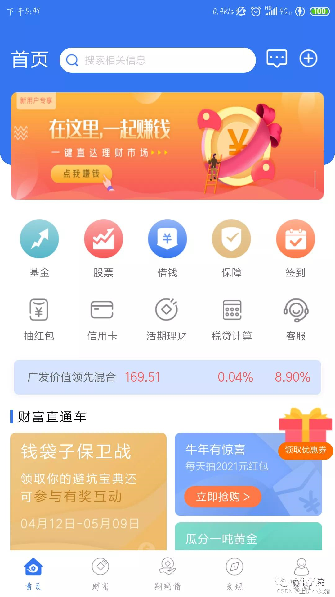
三.效果预览:
最后的底部:
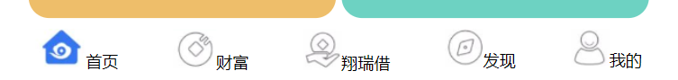
Html代码:
<div id="foot">
    <div id="sy"><img src="./work1/img/17.png" alt=""><span>首页</span></div>
    <div><img src="./work1/img/18.png" alt=""><span>财富</span></div>
    <div><img src="./work1/img/19.png" alt=""><span>翔瑞借</span></div>
    <div><img src="./work1/img/20.png" alt=""><span>发现</span></div>
    <div><img src="./work1/img/21.png" alt=""><span>我的</span></div>
</div>
CSS代码:
#foot{


	margin-top: 10px;
	display: flex;
	justify-content: space-around;
}
发现还差一个礼包:
我们先去阿里巴巴矢量图库找一个好看的图片:
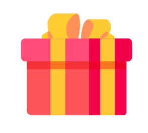
<div id="libao">
    <img src="./work1/img/libao.png" alt=""><br />
    <div id="youhui">
        <span>领取优惠券</span>
    </div>
</div>
CSS代码如下:
#libao {


	position: absolute;
	top: 570px;
	right: 0px;
}

#libao img {


	width: 100px;

}

#libao span{


	position: absolute;
	color: white;
	/* background-color: #e97518; */
	height: 35px;
	top: 100px;
	right: 10px;
	border-radius: 20px;
	font-size: 17px;
}
#youhui{


	height: 40px;
	margin-top: -10px;
	background-color: #e97518;
	border-radius: 20px;
}
最终效果: