结合了:https://blog.csdn.net/kk_yanwu/article/details/80658422 和 https://www.cnblogs.com/liyu2012/p/5525609.html两位作者的作品,进行整改
代码:
<div class="one">
        <div>1</div>
        <div>2</div>
        <div>3</div>
        <div>4</div>
        <div>5</div>
    </div>
1、flex-direction
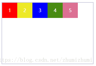
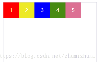
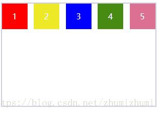
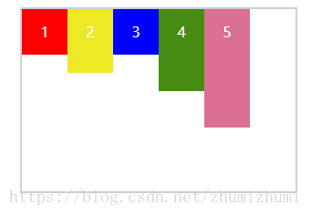
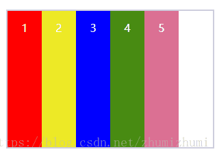
(1)row:主轴为水平方向,起点在左端(默认选项)
.one{
            display: flex;
            flex-direction: row;
        }
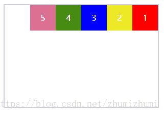
(2) row-reverse:主轴为水平方向,起点在右端
.one{
      display: flex;
      flex-direction: row-reverse;
    }
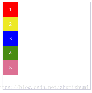
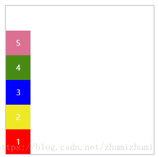
(3) column:主轴为垂直方向,起点在上沿
.one{
      display: flex;
      flex-direction: column;
    }
(4) column-reverse:主轴为垂直方向,起点在下沿
.one{
      display: flex;
      flex-direction: column-reverse;
    }
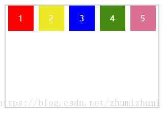
2、flex-wrap
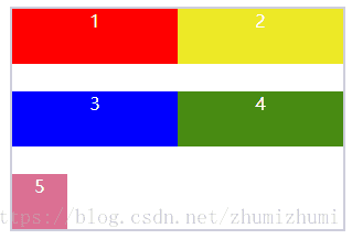
(1)nowrap :默认、不换行
.one{
      display: flex;
      flex-wrap:nowrap ;
    }
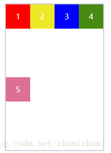
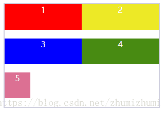
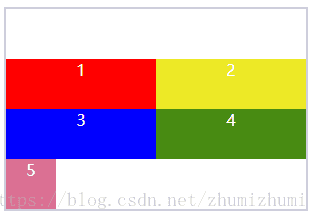
(2)换行,第一行在上方,被换行的在下方
.one{
      display: flex;
      flex-wrap:wrap  ;
    }
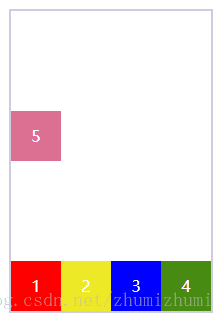
(3) wrap-reverse :换行,第一行在下方,被换行的在上方
.one{
      display: flex;
      flex-wrap:wrap-reverse;
    }
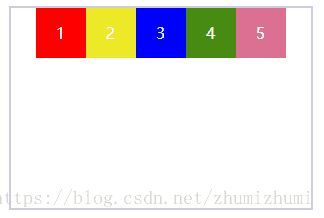
3、justify-content
(1)flex-start :左对齐
.one{
      display: flex;
      justify-content:flex-start ;
     }

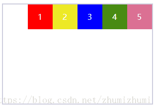
(2)flex-end 尾部对其
.one{
      display: flex;
      justify-content:flex-end;
     }
(3)center 居中对齐
.one{
      display: flex;
      justify-content:center ;
     }
(4) space-between两端对齐,项目之间的间隔都相等
.one{
      display: flex;
      justify-content:space-between;
     }
(5) space-around每个项目两侧的间隔相等。所以,项目之间的间隔比项目与边框的间隔大一倍
.one{
      display: flex;
      justify-content:space-around;
     }
4、align-items(交叉轴上如何对齐)
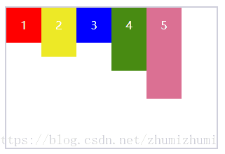
(1) flex-start:头部对齐,当子元素设置高度时,默认对齐方式
.one{
            display: flex;
            align-items:flex-start;
        }
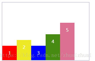
(2)flex-end:尾部对齐
.one{
            display: flex;
            align-items:flex-end;
        }
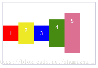
(3)center:居中对齐
.one{
            display: flex;
            align-items:center;
        }
(4) baseline:与第一个子元素基线对齐
.one{
            display: flex;
            align-items:baseline;
        }
(5) stretch:子元素未设置高度或者设置的高度为auto时,拉伸元素填满父元素
.one{
            display: flex;
            align-items:stretch;
        }
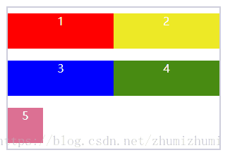
5、align-content:设置在垂直方向排列方式,必须对父元素设置自由盒属性display:flex;,
横向排列flex-direction:row;并且设置换行,flex-wrap:wrap;这样这个属性的设置才会起作用。
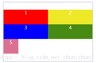
(1)stretch:默认设置,填充方式为给每个项目下方增加空白。第一个项目默认从容器顶端开始排列
.one{
            display: flex;
            flex-direction:row;
            flex-wrap:wrap;
            align-content:stretch;
        }
(2) Center:所有项目垂直居中
.one{
            display: flex;
            flex-direction:row;
            flex-wrap:wrap;
            align-content:center;
        }
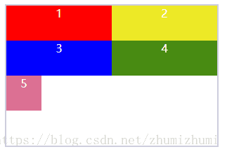
(3) flex-start:容器顶部
.one{
            display: flex;
            flex-direction:row;
            flex-wrap:wrap;
            align-content:flex-start;
        }
(4) flex-end项目放在容器底部
.one{
            display: flex;
            flex-direction:row;
            flex-wrap:wrap;
            align-content:flex-end;
        }
(5) space-between两端对齐
.one{
            display: flex;
            flex-direction:row;
            flex-wrap:wrap;
            align-content:space-between;
        }
(6) space-around上下位置保留相同长度空白,且是间距的长度的一半
.one{
            display: flex;
            flex-direction:row;
            flex-wrap:wrap;
            align-content:space-around;
        }