今天遇到了一个界面的数据是一个json数据实现的动态绑定,里面有对应的字符串绑定或者数组遍历,但是其的状态是根据data中的数据是否为空来控制”完成“和”未完成“的显示状态的。
vue 提倡 状态驱动界面,用data里面字段,控制界面的组件显示或者隐藏就非常合理了。不同字段对应的不同的显示逻辑,也就很合理了。
数据为单个字符串时:
<div v-if="info">{

    {

    info}}</div>
<div v-else>暂时没有数据...</div>
数据为数组或者对象时:
<div v-if="arr.length">
  <p v-for="item of arr">{

    {

    item}}</p>
</div>
<div v-else>暂时没有数据...</div>
不过还可以不要将这些放在v-if=""中,使用计算属性或函数控制。。。
dom增加属性
<view :class="isShow">内容内容</view>
data中增加isShow默认值
data() {


   return{


      isShow: "domhide",
   }
}
在style中声明domhide和domshow两个class
.domhide{

    display: none;}
.domshow{

    display: block;}
在load中增加计时程序
onLoad() {


  if (this.timer) {


     clearInterval(this.timer);
   }
   this.timer = setInterval(() => {


   this.isShow= "domshow";
   }, 5000);
},
uniapp中实现文本行数/高度超过隐藏就并显示更多按钮
扫描二维码关注公众号,回复:
14653081 查看本文章

- uni.createSelectorQuery()返回一个 SelectorQuery 对象实例。可以在这个实例上使用 select
等方法选择节点,并使用 boundingClientRect 等方法选择需要查询的信息。 - selectorQuery.selectAll(selector)在当前页面下选择匹配选择器 selector 的所有节点,返回一个
NodesRef 对象实例,可以用于获取节点信息。
<template>
    <view class="problem">
        <view class="card-box" v-for="(item,index) in list" :key="index">
            <view class="title mb20">Q{

    {

    index+1}}: {

    {

    item.title}}</view>
            <!-- 文本超过360rpx时溢出隐藏,并显示展开按钮 -->
            <view class="desc" ref="desc" style="white-space:pre-wrap;">
                <view class="inline" :style="{
                'height': elData[index].height >= 360?'360rpx':'auto',
                'transition': 'height .2s'
                }">{

    {

    item.content}}
                </view>
                <view class="more row-center mt20" v-if="elData[index].height >= 360" @click="elData[index].height = 0">
                    展开 <u-icon name="arrow-down" color="#999"></u-icon>
                </view>
                <view class="more row-center mt20" v-if="elData[index].height == 0" @click="elData[index].height = 370">
                    收起 <u-icon name="arrow-up" color="#999"></u-icon>
                </view>
            </view>
        </view>
    </view>
</template>

<script>
    import {

     problem } from '@/api/user.js'
    export default {


        data() {


            return {


                // 多个文本数据列表
                list: [],
                // 每个文本的信息
                elData: [],
            }
        },
        mounted() {


            this.getProblem()
        },
        methods: {


            getProblem() {


                // 获取文本信息的api接口 problem
                problem().then(res => {


                    this.list = res.data.list;
                    // 等待渲染完成在获取页面元素信息
                    this.$nextTick(() => {


                        let el = uni.createSelectorQuery().selectAll('.desc')
                        el.boundingClientRect(res => {


                            console.log(res)
                            // 拿到类名为 desc 的全部元素信息
                            this.elData = res;
                        }).exec()
                    })
                })
            },
        }
    }
</script>
<style>
    page {


        background-color: #FFFFFF;
    }
    .problem {


        padding: 0 30rpx;
    }
    .card-box {


        box-shadow: 0 0 20rpx rgba(0, 0, 0, 0.1);
        margin: 40rpx 0 0 0;
        border-radius: 10rpx;
        padding: 40rpx 30rpx 0 30rpx;
    }
    .title {


        font-weight: 500;
        font-size: 30rpx;
        color: #101010;
    }
    .desc {


        font-weight: 300;
        font-size: 26rpx;
        color: #333;
        padding-bottom: 30rpx;
    }
    .desc .inline {


        overflow: hidden;
    }
    .open {


        color: #999;
        font-weight: 300;
        background-color: #FFFFFF;
        padding: 0 20rpx 35rpx;
    }
</style>
transition过渡效果
transition: 1s; // 过渡效果时间
transition: width 1s ,height 2s ,background 3s; // 宽度1s完成变化,高度2s完成变化,背景色3s完成变化
uniapp开发小程序实现滑动页面控制元素的显示和隐藏效果
实现思路:通过小程序API中的触摸事件,配合CSS来实现元素的显示和隐藏。ps(也想过另一种通过监听页面滚动的方式来实现,不过效果一定很差0.0)
<view class="container" @touchmove="handletouchstart" @touchend="handletouchend">
     <view class="column popupfx" :class="specClass" @click="createHaibao">我是要发生变化的元素</view>
</view>
data() {


  return {


   specClass: 'hide',
     };
   },
methods:{


 handletouchstart() {


  this.specClass = 'show';
 },
 handletouchend() {


  this.specClass = 'hide';
 },}
<style lang="scss">
.popupfx {


    position: fixed;
    top: 80%;
    right: 20upx;
    z-index: 10;
    &.show {


        animation: showLayer 0.2s linear both;
    }
    &.hide {


        animation: hideLayer 0.2s linear both;
    }
    @keyframes showLayer {


      0% {


        transform: translateX(0%);
      }
      100% {


        transform: translateX(80upx); //这里可以通过变大变小调整偏移量
      }
    }
    @keyframes hideLayer {


      0% {


        transform: translateX(80upx);
      }
      100% {


        transform: translateX(0);
      }
    }
  }
</style>
uniapp父组件控制显示隐藏
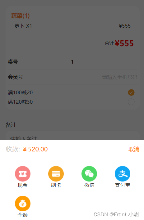
我们开发uniapp时会用到uview的组件,很方便,但项目中可能会对组件进行二次修改,设置成时候自己项目的功能、样式,如果多处需要用到,可能需要进行二次封装,这时候就会涉及到父子传参等问题,这篇文章主要是为了记录解决父组件控制子组件的显示隐藏问题,下面以u-popup组件为例吧!
<!--子组件-->
<template>
	<view class="payment">
	<!-- 弹出框 -->
	<u-popup mode="bottom" v-model="show" :mask-close-able='false'>
	  <view class="popUpBox">
	    <view class="popUpBoxPriceBox flex">
	      <view class="proceeds">收款: <text>¥520.00</text></view>
	      <view class="close" @click="onClose">取消</view>
	    </view>

	    <view class="paymentBigBox ">
	      <view class="onePayment flex" v-for="(item,i) in modeOfPayment" @click="onPay(i)">
	        <image :src="item.image"></image>
	        <text>{

    {

    item.name}}</text>
	      </view>
	    </view>

	  </view>
	</u-popup>
	</view>
</template>

<script>
	export default {


		name:"payment",
        props: {


          showModal:{


             type:Boolean,
          }
         },
		data() {


			return {


				show: false, //弹出框显示状态
				modeOfPayment: [{


				    image: '../static/settleAccounts/weixin.png',
				    name: '微信'
				  },{


				    image: '../static/settleAccounts/zhifubao.png',
				    name: '支付宝'
				  },{


				    image: '../static/settleAccounts/yue.png',
				    name: '余额'
				  }],
			};
		},
        watch:{


        //因为是单项数据流,v-modal控制的组件显示隐藏,父组件不可以通过props内的参数直接改变子元素参数,所以我们通过watch来监控数据的变化,间接修改show的数据
        showModal(val) {


          this.show=val
          }
       },
       methods:{


          onClose(){


             this.show=false
             this.$emit('close',this.show)  //通知父组件隐藏了
          },
       }
   }
</script>
<!--父组件-->
<template>
 <view>
   <button @click="showPay">点击显示</button>
   <payment :showModal="showPay" @close="onclose"></payment>
 </view>
</template>
<script>
  import payment from "../../components/payment.vue"
  export default {


    data() {


      return {


        showPay:false,//显示支付方式
      }
    },
    components: {


      payment
    },
    methods:{


       onclose(show){


           this.showPay=show
           console.log(show,"子组件传过来的值----")
       },
       showPay(){


            this.showPay=true //传给子组件动态控制显示隐藏
       }
     }
   }
</script>