统计数据可视化
数据可视化可以帮助人更好的分析数据,信息的质量很大程度上依赖于其表达方式。对数字罗列所组成的数据中所包含的意义进行分析,使分析结果可视化。其实数据可视化的本质就是视觉对话。数据可视化将技术与艺术完美结合,借助图形化的手段,清晰有效地传达与沟通信息。一方面,数据赋予可视化以价值;另一方面,可视化增加数据的灵性,两者相辅相成,帮助企业从信息中提取知识、从知识中收获价值。精心设计的图形不仅可以提供信息,还可以通过强大的呈现方式增强信息的影响力,吸引人们的注意力并使其保持兴趣。
环境准备
本文所做的数据的数据可视化实现基于python 3.9.4,需安装matplotlib、numpy、pyecharts、pandas等依赖库,可通过下述命令完成。
pip install matplotlib
pip install numpy
pip install -v pyecharts==1.1.0
pip install pandas
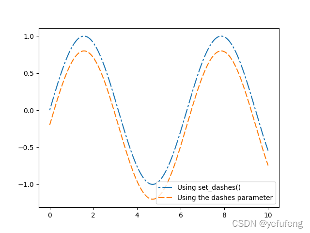
线图
将值标注成点,并通过直线将这些点按照某种顺序连接起来形成的图
场景:数据在一个有序的因变量上的变化,它的特点是反映事物随序类别而变化的趋势,可以清晰展现数据的增减趋势、增减的速率、增减的规律、峰值等特征
优点
-
能很好的展现某个维度的变化趋势
-
能比较多组数据在同一维度上的趋势
-
适合展现较大的数据集
缺点
- 每张图上不适合展示太多条线图
类似图表:堆积图、曲线图、双Y轴折线图、面积图
示例
import numpy as np
import matplotlib.pyplot as plt

x = np.linspace(0, 10, 500)
y = np.sin(x)

fig, ax = plt.subplots()
fig.canvas.set_window_title('Line Example')
# Using set_dashes() to modify dashing of an existing line
line1, = ax.plot(x, y, label='Using set_dashes()')
# 2pt line, 2pt break, 10pt line, 2pt break
line1.set_dashes([2, 2, 10, 2])

# Using plot(..., dashes=...) to set the dashing when creating a line
line2, = ax.plot(x, y - 0.2, dashes=[6, 2], label='Using the dashes parameter')

ax.legend()
plt.show()
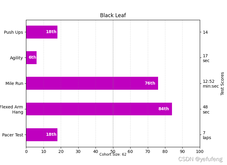
柱图
是一种以长方形的长度来表达数值的统计报告图,由一系列高度不等的纵向条纹表示数据分布的情况
**场景:**适合用于展示二维数据集,其中一个轴表示需要对比的分类维度,另一个代表相应数值,如(月份,商品销量),或展示在一个维度上,多个同质可比的指标的比较,如(月份、苹果产量、桃子产量)
优点
-
简单直观,很容易根据柱子的长短看出值得大小
-
易于比较各组数据之间的差别
缺点
- 不适合较大数据集展现
类似图表:条形图、直方图、堆积图、百分比堆积图、双Y轴图等
示例
import numpy as np
import matplotlib.pyplot as plt
from matplotlib.ticker import MaxNLocator
from collections import namedtuple

Student = namedtuple('Student', ['name', 'grade', 'gender'])
Score = namedtuple('Score', ['score', 'percentile'])

# GLOBAL CONSTANTS
testNames = ['Pacer Test', 'Flexed Arm\n Hang', 'Mile Run', 'Agility',
             'Push Ups']
testMeta = dict(zip(testNames, ['laps', 'sec', 'min:sec', 'sec', '']))


def attach_ordinal(num):
    """helper function to add ordinal string to integers

    1 -> 1st
    56 -> 56th
    """
    suffixes = {

    str(i): v
                for i, v in enumerate(['th', 'st', 'nd', 'rd', 'th',
                                       'th', 'th', 'th', 'th', 'th'])}

    v = str(num)
    # special case early teens
    if v in {

    '11', '12', '13'}:
        return v + 'th'
    return v + suffixes[v[-1]]


def format_score(scr, test):
    """
    Build up the score labels for the right Y-axis by first
    appending a carriage return to each string and then tacking on
    the appropriate meta information (i.e., 'laps' vs 'seconds'). We
    want the labels centered on the ticks, so if there is no meta
    info (like for pushups) then don't add the carriage return to
    the string
    """
    md = testMeta[test]
    if md:
        return '{0}\n{1}'.format(scr, md)
    else:
        return scr


def format_ycursor(y):
    y = int(y)
    if y < 0 or y >= len(testNames):
        return ''
    else:
        return testNames[y]


def plot_student_results(student, scores, cohort_size):
    #  create the figure
    fig, ax1 = plt.subplots(figsize=(9, 7))
    fig.subplots_adjust(left=0.115, right=0.88)
    fig.canvas.set_window_title('Horizontal Bar Chart Example')

    pos = np.arange(len(testNames))

    rects = ax1.barh(pos, [scores[k].percentile for k in testNames],
                     align='center',
                     height=0.5, color='m',
                     tick_label=testNames)

    ax1.set_title(student.name)

    ax1.set_xlim([0, 100])
    ax1.xaxis.set_major_locator(MaxNLocator(11))
    ax1.xaxis.grid(True, linestyle='--', which='major',
                   color='grey', alpha=.25)

    # Plot a solid vertical gridline to highlight the median position
    ax1.axvline(50, color='grey', alpha=0.25)
    # set X-axis tick marks at the deciles
    cohort_label = ax1.text(.5, -.07, 'Cohort Size: {0}'.format(cohort_size),
                            horizontalalignment='center', size='small',
                            transform=ax1.transAxes)

    # Set the right-hand Y-axis ticks and labels
    ax2 = ax1.twinx()

    scoreLabels = [format_score(scores[k].score, k) for k in testNames]

    # set the tick locations
    ax2.set_yticks(pos)
    # make sure that the limits are set equally on both yaxis so the
    # ticks line up
    ax2.set_ylim(ax1.get_ylim())

    # set the tick labels
    ax2.set_yticklabels(scoreLabels)

    ax2.set_ylabel('Test Scores')

    ax2.set_xlabel(('Percentile Ranking Across '
                    '{grade} Grade {gender}s').format(
                        grade=attach_ordinal(student.grade),
                        gender=student.gender.title()))

    rect_labels = []
    # Lastly, write in the ranking inside each bar to aid in interpretation
    for rect in rects:
        # Rectangle widths are already integer-valued but are floating
        # type, so it helps to remove the trailing decimal point and 0 by
        # converting width to int type
        width = int(rect.get_width())

        rankStr = attach_ordinal(width)
        # The bars aren't wide enough to print the ranking inside
        if width < 5:
            # Shift the text to the right side of the right edge
            xloc = width + 1
            # Black against white background
            clr = 'black'
            align = 'left'
        else:
            # Shift the text to the left side of the right edge
            xloc = 0.98*width
            # White on magenta
            clr = 'white'
            align = 'right'

        # Center the text vertically in the bar
        yloc = rect.get_y() + rect.get_height()/2.0
        label = ax1.text(xloc, yloc, rankStr, horizontalalignment=align,
                         verticalalignment='center', color=clr, weight='bold',
                         clip_on=True)
        rect_labels.append(label)

    # make the interactive mouse over give the bar title
    ax2.fmt_ydata = format_ycursor
    # return all of the artists created
    return {

    'fig': fig,
            'ax': ax1,
            'ax_right': ax2,
            'bars': rects,
            'perc_labels': rect_labels,
            'cohort_label': cohort_label}

student = Student('Black Leaf', 2, 'boy')
scores = dict(zip(testNames,
                  (Score(v, p) for v, p in
                   zip(['7', '48', '12:52', '17', '14'],
                       np.round(np.random.uniform(0, 1,
                                                  len(testNames))*100, 0)))))
cohort_size = 62  # The number of other 2nd grade boys

arts = plot_student_results(student, scores, cohort_size)
plt.show()
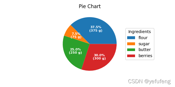
饼图
以饼状图形显示一个数据系列中各项大小与各项总和的比列,也被称为扇形统计图
场景:适用于二维数据,即一个分类字段,一个连续数据字段,当用户更关注于简单占比时,很适合使用饼图
优点:
- 简单直观,很容易看到组成成分的占比
缺点:
-
不适合较大数据集展现
-
数据项中不能有负值
-
当比例接近时,人眼很难准确判别
类似图表:环形图、3D饼图
示例
import numpy as np
import matplotlib.pyplot as plt

fig, ax = plt.subplots(figsize=(6, 3), subplot_kw=dict(aspect="equal"))
fig.canvas.set_window_title('Pie Chart Example')
recipe = ["375 g flour",
          "75 g sugar",
          "250 g butter",
          "300 g berries"]

data = [float(x.split()[0]) for x in recipe]
ingredients = [x.split()[-1] for x in recipe]


def func(pct, allvals):
    absolute = int(pct/100.*np.sum(allvals))
    return "{:.1f}%\n({:d} g)".format(pct,  absolute)


wedges, texts, autotexts = ax.pie(
    data, autopct=lambda pct: func(pct, data), textprops=dict(color="w"))

ax.legend(wedges, ingredients, title="Ingredients",
          loc="center left", bbox_to_anchor=(1, 0, 0.5, 1))

plt.setp(autotexts, size=8, weight="bold")
ax.set_title("Pie Chart")
plt.show()
import numpy as np
import matplotlib.pyplot as plt
fig, ax = plt.subplots(figsize=(6, 3), subplot_kw=dict(aspect="equal"))
fig.canvas.set_window_title('Pie Chart Example')
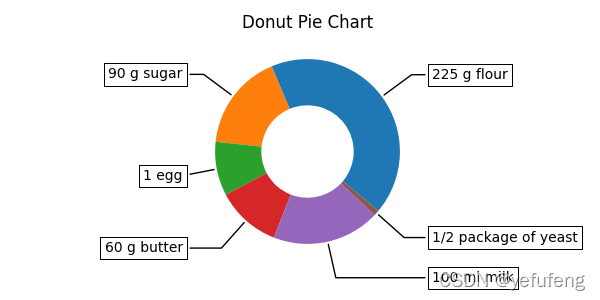
recipe = ["225 g flour",
"90 g sugar",
"1 egg",
"60 g butter",
"100 ml milk",
"1/2 package of yeast"]
data = [225, 90, 50, 60, 100, 5]
wedges, texts = ax.pie(data, wedgeprops=dict(width=0.5), startangle=-40)
bbox_props = dict(boxstyle="square,pad=0.3", fc="w", ec="k", lw=0.72)
kw = dict(xycoords='data', textcoords='data', arrowprops=dict(arrowstyle="-"),
bbox=bbox_props, zorder=0, va="center")
for i, p in enumerate(wedges):
ang = (p.theta2 - p.theta1)/2. + p.theta1
y = np.sin(np.deg2rad(ang))
x = np.cos(np.deg2rad(ang))
horizontalalignment = {
-1: "right", 1: "left"}[int(np.sign(x))]
connectionstyle = "angle,angleA=0,angleB={}".format(ang)
kw["arrowprops"].update({
"connectionstyle": connectionstyle})
ax.annotate(recipe[i], xy=(x, y), xytext=(1.35*np.sign(x), 1.4*y),
horizontalalignment=horizontalalignment, **kw)
ax.set_title("Donut Pie Chart")
plt.show()
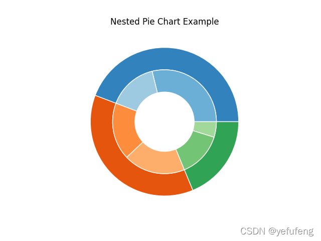
import numpy as np
import matplotlib.pyplot as plt

fig, ax = plt.subplots()

size = 0.3
vals = np.array([[60., 32.], [37., 40.], [29., 10.]])

cmap = plt.get_cmap("tab20c")
outer_colors = cmap(np.arange(3)*4)
inner_colors = cmap(np.array([1, 2, 5, 6, 9, 10]))

ax.pie(vals.sum(axis=1), radius=1, colors=outer_colors,
       wedgeprops=dict(width=size, edgecolor='w'))

ax.pie(vals.flatten(), radius=1-size, colors=inner_colors,
       wedgeprops=dict(width=size, edgecolor='w'))

ax.set(aspect="equal", title='Nested Pie Chart Example')
fig.canvas.set_window_title('Nested Pie Chart Example')
plt.show()
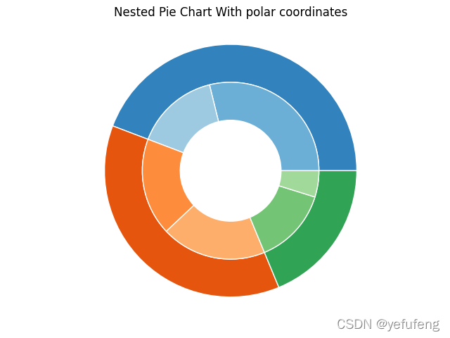
import numpy as np
import matplotlib.pyplot as plt

fig, ax = plt.subplots(subplot_kw=dict(polar=True))
size = 0.3
vals = np.array([[60., 32.], [37., 40.], [29., 10.]])
# normalize vals to 2 pi
valsnorm = vals/np.sum(vals)*2*np.pi
# obtain the ordinates of the bar edges
valsleft = np.cumsum(np.append(0, valsnorm.flatten()[:-1])).reshape(vals.shape)

cmap = plt.get_cmap("tab20c")
outer_colors = cmap(np.arange(3)*4)
inner_colors = cmap(np.array([1, 2, 5, 6, 9, 10]))

ax.bar(x=valsleft[:, 0], width=valsnorm.sum(axis=1), bottom=1-size,
       height=size, color=outer_colors, edgecolor='w', linewidth=1, align="edge")

ax.bar(x=valsleft.flatten(), width=valsnorm.flatten(), bottom=1-2*size,
       height=size, color=inner_colors, edgecolor='w', linewidth=1, align="edge")

ax.set(title="Nested Pie Chart With polar coordinates")
fig.canvas.set_window_title('Nested Pie Chart With polar coordinates')
ax.set_axis_off()

plt.show()
指标看板
通过文字、数字和符号的合理排版,对数据进行一目了然的展示。由看板标签和看板指标组成,标签有维度决定,指标由数据的度量决定。
场景:适合用来展示一个维度下的一个或者多个度量,特别是对某些指标需要精确读数的场景
优点:
-
展示的是详细的数字,用户得到的都是精确信息
-
简单直观,重点数字突出,容易得到关键信息
缺点:
-
展现的维度只有一个
-
展现指标不宜过多
-
只是数字面板,不具备图形的各种优势
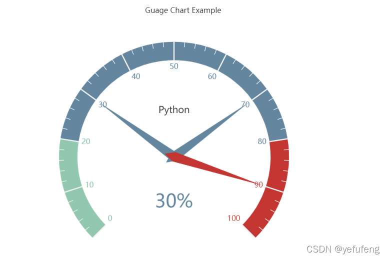
仪表盘
像一个钟表或者刻度盘,有刻度和指针,其中刻度表示度量,指针表示维度,指针角度表示数值,指针指向当前数值
场景:管理报表或者报告,直观的表现出某个指标的进度或实际情况
优点:
-
将专业数据通过常见的刻度表形式展现,非常直观易懂
-
拟物化的展现更人性化
缺点:
-
适用场景比较窄,主要用于进度或占比的展现
-
只能一个维度,指标也不宜过多,展现信息有限
类似图表:堆积图
from pyecharts import charts

# using version 1.1.0
gauge = charts.Gauge()
gauge.add('Guage Chart Example', [('Python', 30), ('Java', 70.),('C', 90)])
gauge.render(path="Guage_Chart_Example.html")
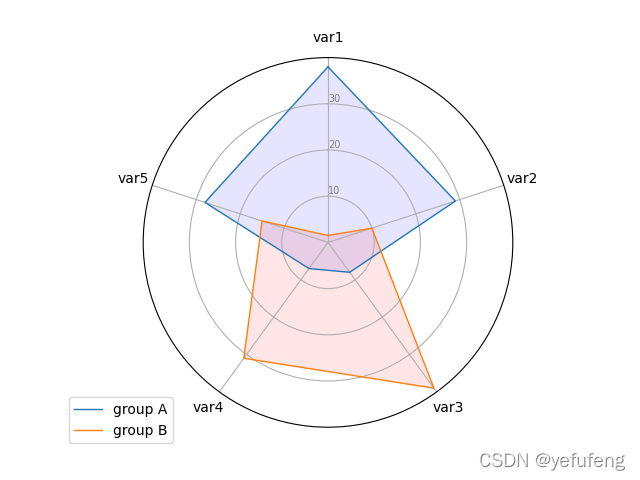
雷达图
又称蜘蛛网图,将多个维度的数据量映射到起始于同一圆心的坐标轴上,结束于圆周边缘,然后将同一组的点使用线连接起来
场景:雷达图使用于多为数据集,表现整体的综合情况
优点:
-
适合展现某个数据集的多个关键特征
-
适合展现某个数据集的多个关键特征和标准值的比对
-
适合比较多条数据在多个维度上的取值
缺点:
-
多维但是维度不能太多,一般四到八个
-
比较的记录条数不宜太多
import matplotlib.pyplot as plt
import pandas as pd
from math import pi

# set test data
df = pd.DataFrame({


    'group': ['A', 'B', 'C', 'D'],
    'var1': [38, 1.5, 30, 4],
    'var2': [29, 10, 9, 34],
    'var3': [8, 39, 23, 24],
    'var4': [7, 31, 33, 14],
    'var5': [28, 15, 32, 14]
})

categories = list(df)[1:]
N = len(categories)

angles = [n / float(N) * 2 * pi for n in range(N)]
angles += angles[:1]

ax = plt.subplot(111, polar=True)

# set first location
ax.set_theta_offset(pi / 2)
ax.set_theta_direction(-1)

# set background
plt.xticks(angles[:-1], categories)
ax.set_rlabel_position(0)
plt.yticks([10, 20, 30], ["10", "20", "30"], color="grey", size=7)
plt.ylim(0, 40)

values = df.loc[0].drop('group').values.flatten().tolist()
values += values[:1]
ax.plot(angles, values, linewidth=1, linestyle='solid', label="group A")
ax.fill(angles, values, 'b', alpha=0.1)

values = df.loc[1].drop('group').values.flatten().tolist()
values += values[:1]
ax.plot(angles, values, linewidth=1, linestyle='solid', label="group B")
ax.fill(angles, values, 'r', alpha=0.1)

plt.legend(loc='upper right', bbox_to_anchor=(0.1, 0.1))

plt.show()