1.1自定义view的简介
为什么要使用自定义view
在Android开发中有很多业务场景,原生的控件是无法满足应用,并且经常也会遇到一个UI在多处 重复使用情况,那么就需要通过自定义View的方式来实现这些UI效果。
作为一个Android开发工程师自定义View属于一个必备技能。
1.2android自定义view几种方式
自定义View的实现方式有以下几种: 组合控件,继承控件,自绘控件
详细可分为:自定义组合控件,继承系统View控件,继承系统ViewGroup,自绘View控件,自绘 ViewGroup控件
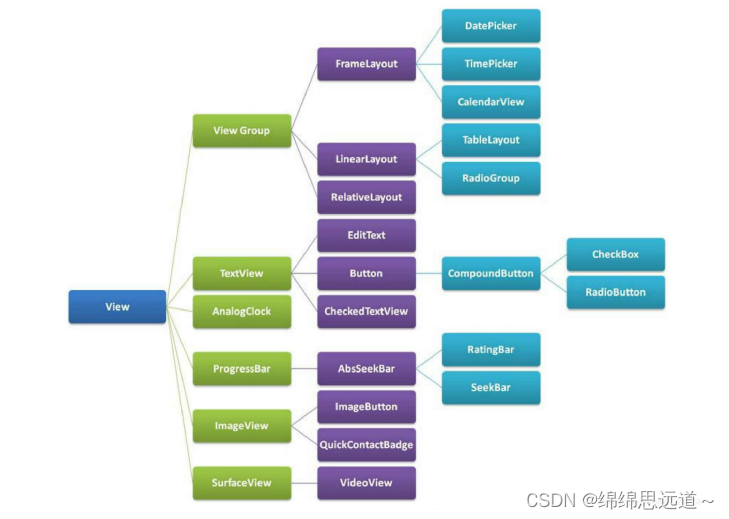
1.3 View和ViewGroup
如图显示:
1.4 自定义组合控件
组合控件就是将多个控件组合成一个新的控件,可以重复使用。 应用场景:在项目中经常会遇到一些比较复杂的UI块需要用在多处使用,那么我们就可以通过五大布局 和基本控件组合成一个新的布局View,这样就可以方便的将该UI用在项目的不同页面中,比如一个标题 栏。这种方式比较简单,只要通过布局文件实现相应的UI,然后将该UI加到适合的五大布局中即可。
1.4.1使用步骤:
1. 编写布局文件
<?xml version="1.0" encoding="utf-8"?>
<RelativeLayout xmlns:android="http://schemas.android.com/apk/res/android"
android:layout_width="match_parent"
android:layout_height="wrap_content"
android:background="#8B8BCC" >
<Button
    android:id="@+id/left_btn"
    android:layout_width="30dp"
    android:layout_height="30dp"
    android:layout_centerVertical="true"
    android:layout_margin="5dp"
    android:background="@mipmap/back1_64" />
<TextView
    android:id="@+id/title_tv"
    android:layout_width="wrap_content"
    android:layout_height="wrap_content"
    android:layout_centerInParent="true"
    android:text="这是标题"
    android:textColor="#ffffff"
    android:textSize="20sp" />
</RelativeLayout>
2. 实现构造方法
3. 初始化UI
4. 提供对外的方法
//因为我们的布局采用RelativeLayout,所以这里继承RelativeLayout。
public class HeaderView extends RelativeLayout {
    private Button left_btn;
    private TextView title_tv;
    private RelativeLayout layout_root;
    public HeaderView(Context context) {
        super(context);
    }
5. 在布局当中引用该控件
6. activity中使用
    public HeaderView(Context context, AttributeSet attrs) {
        super(context, attrs);
        initView(context);
    }
    public HeaderView(Context context, AttributeSet attrs, int defStyleAttr)
    {
        super(context, attrs, defStyleAttr);
    }
    //初始化UI,可根据业务需求设置默认值。
    private void initView(Context context) {
        LayoutInflater.from(context).inflate(R.layout.view_header, this,
                true);
        left_btn = findViewById(R.id.left_btn);
        title_tv = findViewById(R.id.title_tv);
        layout_root = findViewById(R.id.header_root_layout);
        layout_root.setBackgroundColor(Color.BLACK);
        title_tv.setTextColor(Color.WHITE);
    }
    //设置标题文字的方法
    private void setTitle(String title) {
        if (!TextUtils.isEmpty(title)) {
            title_tv.setText(title);
        }
    }
    //对左边按钮设置事件的方法
    private void setLeftListener(OnClickListener onClickListener) {
        left_btn.setOnClickListener(onClickListener);
    }
}
5. 在布局当中引用该控件
<?xml version="1.0" encoding="utf-8"?>
<LinearLayout xmlns:android="http://schemas.android.com/apk/res/android"
xmlns:app="http://schemas.android.com/apk/res-auto"
xmlns:tools="http://schemas.android.com/tools"
android:layout_width="match_parent"
android:layout_height="match_parent"
android:orientation="vertical"
tools:context=".MainActivity2">
<com.hopu.customviewdemo.view.HeaderView
    android:id="@+id/title_bar"
    android:layout_width="match_parent"
    android:layout_height="wrap_content" />
</LinearLayout>
6. activity中使用
public class MainActivity2 extends AppCompatActivity {
    private HeaderView title_bar;
    @Override
    protected void onCreate(Bundle savedInstanceState) {
        super.onCreate(savedInstanceState);
        setContentView(R.layout.activity_main2);
        title_bar = findViewById(R.id.title_bar);
        title_bar.setLeftListener(new View.OnClickListener() {
            @Override
            public void onClick(View v) {
                Toast.makeText(MainActivity2.this, "左侧按钮被点击",
                        Toast.LENGTH_SHORT).show();
            }
        });
    }
}
1.2 继承系统控件
1.2.1简介
通过继承系统控件(View子类控件或ViewGroup子类控件)来完成自定义View,一般是希望在原 有系统控件基础上做一些修饰性的修改,而不会做大幅度的改动,如在TextView的文字下方添加下 划线,在LinearLayout布局中加一个蒙板等。这种方式往往都会复用系统控件的onMeasure和 onLayout方法,而只需要重写onDraw方法,在其中绘制一些需要的内容。
下面会分别继承View类控件和ViewGroup类控件来举例说明
1.2.2使用步骤:
1. 继承View控件,并重写onDraw方法
2. 在布局文件中调用
举个栗子:为在TextView文字下方显示红色下划线
1. 继承View控件,并重写onDraw方法
public class UnderlineTextView extends
        androidx.appcompat.widget.AppCompatTextView {
    public UnderlineTextView(Context context, @Nullable AttributeSet attrs) {
        super(context, attrs);
    }

    @Override
    protected void onDraw(Canvas canvas) {
        super.onDraw(canvas);
        Paint paint = new Paint();
        paint.setColor(Color.RED);
        paint.setStrokeWidth(5);
        int width = getWidth();
        int height = getBaseline();
        canvas.drawLine(0, height, width, height, paint);
    }
}
2. 在布局文件中调用
就像使用一个普通TextView一样使用UnderlineTextView。
<com.hopu.customviewdemo.view.UnderlineTextView
android:layout_width="match_parent"
android:layout_height="wrap_content"
android:text="张三"/>
1.3继承ViewGroup类系统控件
1.3.1使用步骤:
1. 继承ViewGroup类系统控件
2. 在布局文件中调用
举个栗子:
在layout布局上添加一个浅红色的半透明蒙板,这种需求在工作中也是非常常见的。
1. 继承ViewGroup类系统控件
public class ForegroundLinearLayout extends LinearLayout{
    public ForegroundLinearLayout(Context context, @Nullable AttributeSet
            attrs) {
        super(context, attrs);
    }
    @Override
    protected void dispatchDraw(Canvas canvas) {
        super.dispatchDraw(canvas);
        canvas.drawColor(Color.parseColor("#50FF0000"));
    }
}
2. 在布局文件中调用
对ForegroundLinearLayout的使用,就和使用其父类LinearLayout一样。
<?xml version="1.0" encoding="utf-8"?>
<RelativeLayout xmlns:android="http://schemas.android.com/apk/res/android"
android:layout_width="match_parent"
android:layout_height="match_parent">
<com.hopu.customviewdemo.view.ForegroundLinearLayout
    android:layout_width="match_parent"
    android:layout_height="200dp"
    android:layout_centerInParent="true"
    android:gravity="center">
    <TextView
        android:layout_width="wrap_content"
        android:layout_height="wrap_content"
        android:layout_centerInParent="true"
        android:text="Hello World!"
        android:textColor="@android:color/black"
        android:textSize="50dp" />
</com.hopu.customviewdemo.view.ForegroundLinearLayout>
</RelativeLayout>
继承系统控件小结:
从上面两个例子可见,继承系统原有的控件来实现自定义View,步骤非常简单,比组合控件简单多了。 但是这一节需要对Canvas,paint,Path等绘制方面的知识有一定的了解,且还需要对ViewGroup的中 内容的绘制顺序有一定的了解,才能在原生控件的基础上做出想要的效果来。
2.绘图工具
2.1.Paint(画笔)
2.1.1什么是画笔
就是画笔,用于设置绘制风格,如:线宽(笔触粗细),颜色,透明度和填充风格等 直接使用无参构造方法 就可以创建Paint实例: Paint paint = new Paint( );
2.1.2常用方法
setARGB(int a,int r,int g,int b): 设置绘制的颜色,a代表透明度,r,g,b代表颜色值。
setAlpha(int a): 设置绘制图形的透明度。
setColor(int color): 设置绘制的颜色,使用颜色值来表示,该颜色值包括透明度和RGB颜 色。 setAntiAlias(boolean aa): 设置是否使用抗锯齿功能,会消耗较大资源,绘制图形速度会变 慢。 setDither(boolean dither): 设定是否使用图像抖动处理,会使绘制出来的图片颜色更加平滑 和饱满,图像更加清晰
setFilterBitmap(boolean filter): 如果该项设置为true,则图像在动画进行中会滤掉对 Bitmap图像的优化操作, 加快显示速度,本设置项依赖于dither和xfermode的设置
setMaskFilter(MaskFilter maskfilter): 设置MaskFilter,可以用不同的MaskFilter实现滤 镜的效果,如滤化,立体等
setColorFilter(ColorFilter colorfilter): 设置颜色过滤器,可以在绘制颜色时实现不用颜色 的变换效果
setPathEffect(PathEffect effect) 设置绘制路径的效果,如点画线等
setShader(Shader shader): 设置图像效果,使用Shader可以绘制出各种渐变效果 setShadowLayer(float radius ,float dx,float dy,int color):在图形下面设置阴影层,产生 阴影效果, radius为阴影的角度,dx和dy为阴影在x轴和y轴上的距离,color为阴影的颜色 setStyle(Paint.Style style): 设置画笔的样式,为FILL,FILL_OR_STROKE,或STROKE setStrokeCap(Paint.Cap cap): 当画笔样式为STROKE或FILL_OR_STROKE时,设置笔刷的 图形样式, 如圆形样Cap.ROUND,或方形样式Cap.SQUARE
setSrokeJoin(Paint.Join join): 设置绘制时各图形的结合方式,如平滑效果等 setStrokeWidth(float width): 当画笔样式为STROKE或FILL_OR_STROKE时,设置笔刷的 粗细度
setXfermode(Xfermode xfermode): 设置图形重叠时的处理方式,如合并,取交集或并 集,经常用来制作橡皮的擦除效果
setFakeBoldText(boolean fakeBoldText): 模拟实现粗体文字,设置在小字体上效果会非 常差 setSubpixelText(boolean subpixelText): 设置该项为true,将有助于文本在LCD屏幕上的 显示效果
setTextAlign(Paint.Align align): 设置绘制文字的对齐方向 setTextScaleX(float scaleX): 设置绘制文字x轴的缩放比例,可以实现文字的拉伸的效果
setTextSize(float textSize): 设置绘制文字的字号大小
setTextSkewX(float skewX): 设置斜体文字,skewX为倾斜弧度 setTypeface(Typeface typeface): 设置Typeface对象,即字体风格,包括粗体,斜体以及 衬线体,非衬线体等
setUnderlineText(boolean underlineText): 设置带有下划线的文字效果
setStrikeThruText(boolean strikeThruText): 设置带有删除线的效果
setStrokeJoin(Paint.Join join): 设置结合处的样子,Miter:结合处为锐角, Round:结合处 为圆弧:BEVEL:结合处为直线
setStrokeMiter(float miter):设置画笔倾斜度
setStrokeCap (Paint.Cap cap):设置转弯处的风格
其他常用方法: float ascent( ):测量baseline之上至字符最高处的距离
float descent():baseline之下至字符最低处的距离
int breakText(char[] text, int index, int count, float maxWidth, float[] measuredWidth): 检测一行显示多少文字
clearShadowLayer( ):清除阴影层 其他的自行查阅文档
2.2Canvas(画布):
画笔有了,接着就到画布(Canvas)
2.2.1常用的方法:
2.2.1.1构造方法:
Canvas(): 创建一个空的画布,可以使用setBitmap()方法来设置绘制具体的画布。
Canvas(Bitmap bitmap): 以bitmap对象创建一个画布,将内容都绘制在bitmap上,因此 bitmap不得为null。
2.2.1.2:常用方法:
1.drawXXX()方法族:以一定的坐标值在当前画图区域画图,另外图层会叠加, 即后面绘画的图 层会覆盖前面绘画的图层。
比如: drawRect(RectF rect, Paint paint) :绘制区域,参数一为RectF一个区域
drawPath(Path path, Paint paint) :绘制一个路径,参数一为Path路径对象
drawBitmap(Bitmap bitmap, Rect src, Rect dst, Paint paint) : 贴图,参数一就是我们常 规的Bitmap对象,参数二是源区域(这里是bitmap), 参数三是目标区域(应该在canvas的位 置和大小),参数四是Paint画刷对象, 因为用到了缩放和拉伸的可能,当原始Rect不等于目 标Rect时性能将会有大幅损失。
drawLine(float startX, float startY, float stopX, float stopY, Paintpaint) : 画线,参数一起 始点的x轴位置,参数二起始点的y轴位置,参数三终点的x轴水平位置, 参数四y轴垂直位 置,最后一个参数为Paint 画刷对象。
drawPoint(float x, float y, Paint paint): 画点,参数一水平x轴,参数二垂直y轴,第三个 参数为Paint对象。
drawText(String text, float x, floaty, Paint paint) : 渲染文本,Canvas类除了上面的还可 以描绘文字,参数一是String类型的文本, 参数二x轴,参数三y轴,参数四是Paint对象。
drawOval(RectF oval, Paint paint):画椭圆,参数一是扫描区域,参数二为paint对象; drawCircle(float cx, float cy, float radius,Paint paint): 绘制圆,参数一是中心点的x轴, 参数二是中心点的y轴,参数三是半径,参数四是paint对象;
drawArc(RectF oval, float startAngle, float sweepAngle, boolean useCenter, Paint paint): 画弧,参数一是RectF对象,一个矩形区域椭圆形的界限用于定义在形状、大小、电 弧,参数二是起始角 (度)在电弧的开始,参数三扫描角(度)开始顺时针测量的,参数四是如果 这是真的话,包括椭圆中心的电 弧,并关闭它,如果它是假这将是一个弧线,参数五是Paint对象;
2.clipXXX()方法族:在当前的画图区域裁剪(clip)出一个新的画图区域,这个画图区域就是canvas 对象的当前画图区域了。
比如:clipRect(new Rect()),那么该矩形区域就是canvas的当前画图区 域
3.save()和restore()方法:
save( ):用来保存Canvas的状态。save之后,可以调用Canvas的平 移、放缩、旋转、错切、裁剪等操作!
restore():用来恢复Canvas之前保存的状态。防止 save后对Canvas执行的操作对后续的绘制有影响。 save()和restore()要配对使用(restore可以比 save少,但不能多),若restore调用次数比save多,会报错!
4.translate(float dx, float dy): 平移,将画布的坐标原点向左右方向移动x,向上下方向移动 y.canvas的默认位置是在(0,0)
5.scale(float sx, float sy):扩大,x为水平方向的放大倍数,y为竖直方向的放大倍数 6.rotate(float degrees):旋转,angle指旋转的角度,顺时针旋转
2.3.Path(路径)
2.3.1path是什么?
简单点说就是描点,连线~在创建好我们的Path路径后,可以调用Canvas的 drawPath(path,paint) 将图形绘制出来
2.3.2常用的方法:
addArc(RectF oval, float startAngle, float sweepAngle:为路径添加一个多边形
addCircle(float x, float y, float radius, Path.Direction dir):给path添加圆圈
addOval(RectF oval, Path.Direction dir):添加椭圆形
addRect(RectF rect, Path.Direction dir):添加一个区域
addRoundRect(RectF rect, float[] radii, Path.Direction dir):添加一个圆角区域
isEmpty():判断路径是否为空 transform(Matrix matrix):应用矩阵变换
transform(Matrix matrix, Path dst):应用矩阵变换并将结果放到新的路径中,即第二个参数。
更高级的效果可以使用PathEffect类!
moveTo(float x, float y):不会进行绘制,只用于移动移动画笔
lineTo(float x, float y):用于直线绘制,默认从(0,0)开始绘制,用moveTo移动! 比如 mPath.lineTo(300, 300);
quadTo(float x1, float y1, float x2, float y2): 用于绘制圆滑曲线,即贝塞尔曲线,同样可 以结合moveTo使用!
rCubicTo(float x1, float y1, float x2, float y2, float x3, float y3) 同样是用来实现贝塞尔曲线 的。 (x1,y1) 为控制点,(x2,y2)为控制点,(x3,y3) 为结束点。 Same as cubicTo, but the coordinates are considered relative to the current point on this contour.就是多一个控制 点而已~ 绘制上述的曲线: mPath.moveTo(100, 500); mPath.cubicTo(100, 500, 300, 100, 600, 500); 如果不加上面的那个moveTo的话:则以(0,0)为起点,(100,500)和(300,100)为控制点绘制贝塞尔曲线
arcTo(RectF oval, float startAngle, float sweepAngle): 绘制弧线(实际是截取圆或椭圆的 一部分)ovalRectF为椭圆的矩形,startAngle 为开始角度, sweepAngle 为结束角度。
2.3.4.使用:
直接上代码:
public class MyView extends View {
    private Paint paint;
    private Paint paint01;
    public MyView(Context context) {
        super(context);
        init();
    }

    public MyView(Context context, @Nullable AttributeSet attrs) {
        super(context, attrs);
        init();
    }

    public MyView(Context context, @Nullable AttributeSet attrs, int defStyleAttr) {
        super(context, attrs, defStyleAttr);
        init();
    }

    public MyView(Context context, @Nullable AttributeSet attrs, int defStyleAttr, int defStyleRes) {
        super(context, attrs, defStyleAttr, defStyleRes);
        init();
    }
    public void init(){
        paint = new Paint();
        paint01 = new Paint();
        //抗锯齿
        paint.setAntiAlias(true);
        paint01.setAntiAlias(true);
        //设置画笔的颜色
        paint.setColor(getResources().getColor(R.color.purple_500));
        paint01.setColor(getResources().getColor(R.color.pink));
        //画笔的样式
        paint.setStyle(Paint.Style.FILL);
        paint.setTextSize(40);

    }

    @Override
    protected void onDraw(Canvas canvas) {
        super.onDraw(canvas);
        //给画布设置颜色
        canvas.drawColor(getResources().getColor(R.color.purple_200));
        //画一个圆
        canvas.drawCircle(getWidth()/2,getHeight()/2,100,paint);
        //绘制图像
        canvas.drawBitmap(BitmapFactory.decodeResource(getResources(),R.mipmap.bingsha),400,0,paint);
        //画一个点
        //canvas.drawPoint(10,10,paint);
        //画一个矩形
        canvas.drawRect(100,100,300,200,paint);
        //绘制yuan圆角矩形
        canvas.drawRoundRect(new RectF(50,50,210,110),15,15,paint01);

//        //绘制多边形
//        Path path = new Path();
//        path.moveTo(10,10);
//        path.lineTo(100,50);
//        path.lineTo(200,40);
//        path.lineTo(300,20);
//        path.lineTo(200,10);
//        path.lineTo(100,70);
//        path.lineTo(50,40);
//        path.close();
//        canvas.drawPath(path,paint01);
        //绘制文字
        Path path1 = new Path();
        path1.moveTo(0,100);
        path1.lineTo(100,0);
        path1.lineTo(200,100);
        path1.lineTo(300,200);
        path1.lineTo(400,100);
        path1.close();
        canvas.drawTextOnPath("ABCDEFGHIJKLMNOPQRSTUVWXYZ",path1,25,25,paint01);
    }
}
<?xml version="1.0" encoding="utf-8"?>
<LinearLayout xmlns:android="http://schemas.android.com/apk/res/android"
xmlns:app="http://schemas.android.com/apk/res-auto"
xmlns:tools="http://schemas.android.com/tools"
android:layout_width="match_parent"
android:layout_height="match_parent"
tools:context=".MainActivity">
<com.hp.daystage02.MyView
android:layout_width="match_parent"
android:layout_height="match_parent" />
</LinearLayout>