
前言
Android自定义控件,在项目中运用十分广泛,好多看上去炫酷的特效或是产品想要的效果,原生的系统控件中没有直接提供,此时我们就需要自定义控件。而自定义控件的难易程度不同,遇到想要的控件,我们首先想到是的看看有没有开源的轮子,有就直接拿来用。如果没有的话,我们就要自己想办法造。造轮子的过程可能并不容易,此时我们就需要了解一下自定义的原理和流程。本文总结了自定义控件的流程和几种常用的实现方式,同时结合项目实际运用做一个小结。仅供你参考,如有疑问,欢迎留言讨论。
文章目录
自定义View的难度也分等级,常用的有三种实现方式。实现方式由易到难。
1.自定义View分类
1.1 继承现有控件
继承具体的控件,如TextView,Button,EditText等等,对其控件的功能进行拓展。
如想要实现自定义字体、文本输入框中显示分段的电话号码等。(参考下文实现方式一)
1.2 将现有控件进行组合
继承ViewGroup,如LinearLayout,FrameLayout等等,实现功能更加强大控件。
这里不用重写onMeasure、onLayout等方法。如实现标题栏等。(参考下文实现方式二)
1.3 重写View实现全新的控件
继承View,这个难度最大,功能也最强大。需要掌握绘制的原理和步骤。
如实现倒计时进条等。(参考下文实现方式三)
2. Android之View坐标系
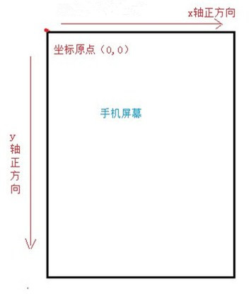
首先要明确一下View坐标系的获取,Android中的坐标系和数学中的坐标系是不同的。
Android中的坐标系统 :屏幕的左上角是坐标系统原点(0,0),原点向右延伸是X轴正方向,原点向下延伸是Y轴方向。
X、Y轴方向:
视图坐标系:
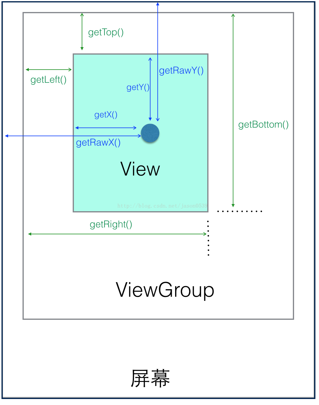
2.1 View 当中的方法
View获取自身的坐标:
- getTop(): 获取 view 本身顶部到父容器 ViewGroup 顶部的距离。
- getBottom(): 获取 view 本身底部到父容器 ViewGroup 顶部的距离。
- getLeft(): 获取 view 本身左侧到父容器 ViewGroup 左侧的距离。
- getRight(): 获取 view 本身右侧到父容器 ViewGroup 左侧的距离。
View获取自身宽高:
- getHeight():获取View的高度
- getWidth():获取View的宽度
2.2 MotionEvent当中的方法
-
getY(): 获取点击事件相对控件左边的x轴坐标,即点击事件距离控件左边的距离。
-
getY():获取点击事件相对控件顶边的y轴坐标,即点击事件距离控件顶边的距离。
-
getRawX():获取点击事件相对整个屏幕左边的x轴坐标,即点击事件距离整个屏幕左边的距离。
-
getRawY():获取点击事件相对整个屏幕顶边的y轴坐标,即点击事件距离整个屏幕顶边的距离。
3. 自定义View的流程
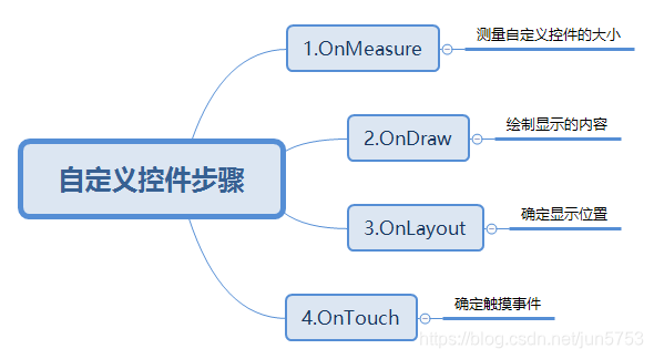
View的绘制基本由onMeasure()、onLayout()、onDraw()这个三个函数完成
| 函数 | 作用 | 相关方法 |
|---|---|---|
onMeasure() |
测量View的宽高 | setMeasuredDimension(),onMeasure() |
onLayout() |
计算当前View以及子View的位置 | onLayout(),setFrame() |
onDraw() |
视图的绘制工作 | onDraw() |
如我们在代码中自定义CustomView
class CustomView : View {

    constructor(context: Context?) : super(context)

    /**
     * 在xml布局文件中使用时自动调用
     */
    constructor(context: Context?, attrs: AttributeSet?) : super(context, attrs)
     /**
     * 不会自动调用,如果有默认style时,在第二个构造函数中调用
     */
    constructor(context: Context?, attrs: AttributeSet?, defStyleAttr: Int) :        super(context, attrs, defStyleAttr)

    override fun onMeasure(widthMeasureSpec: Int, heightMeasureSpec: Int) {
        super.onMeasure(widthMeasureSpec, heightMeasureSpec)
    }

       override fun onLayout(changed: Boolean, left: Int, top: Int, right: Int, bottom: Int) {
        super.onLayout(changed, left, top, right, bottom)
    }


    override fun onDraw(canvas: Canvas?) {
        super.onDraw(canvas)
    }

}
上面的代码是主要用到了构造方法和重写的方法来实现想要的效果。
说明:
- 构造函数是View的入口,用于初始化一些的内容,和获取自定义属性。
- 无论是我们继承系统View还是直接继承View,都需要对构造函数进行重写。
- 构造函数有多个,是为了兼容低版本,现在在项目中,一般重写第三个函数即可。
-
在实际项目中 除了构造函数是必须实现的,其他三个方法根据情况可选实现即可。
也就是说,绘制的流程虽然有
onMeasure()、onLayout()、onDraw()这三个方法,不一定都需要重写,只需要改变需要的方法就行了接下来,进行实例说明。
4. 项目中用到的自定义View
-
电话号码输入框分段显示
-
封装通用的标题栏
-
实现倒计时进度条
4.1 实现方式一:自定义EditText
如实现输入电话号码 分段显示。
//输入电话号码 分段显示 如:xxx xxxx xxxx
class TelEditText : EditText {
    var isBank = true
    private val addString = " "
    private var isRun = false

    constructor(context: Context) : this(context, null)

    constructor(context: Context, attributes: AttributeSet?) : super(context, attributes) {
        init()
    }

    private fun init() {
        addTextChangedListener(object : TextWatcher {
            override fun beforeTextChanged(s: CharSequence, start: Int, count: Int, after: Int) {

            }

            override fun onTextChanged(s: CharSequence, start: Int, before: Int, count: Int) {
                //这几句要加,不然每输入一个值都会执行两次onTextChanged(),导致堆栈溢出
                if (isRun) {
                    isRun = false
                    return
                }
                isRun = true
                if (isBank) {
                    var finalString = ""
                    var index = 0
                    val telString = s.toString().replace(" ", "")
                    if (index + 3 < telString.length) {
                        finalString += telString.substring(index, index + 3) + addString
                        index += 3
                    }
                    while (index + 4 < telString.length) {
                        finalString += telString.substring(index, index + 4) + addString
                        index += 4
                    }
                    finalString += telString.substring(index, telString.length)
                    this@TelEditText.setText(finalString)
                    //此语句不可少,否则输入的光标会出现在最左边,不会随输入的值往右移动
                    this@TelEditText.setSelection(finalString.length)
                }
            }

            override fun afterTextChanged(s: Editable) {

            }
        })
    }

    // 获得不包含空格的手机号
    fun getPhoneText(): String {
        val str = text.toString()
        return replaceBlank(str)
    }

    private fun replaceBlank(str: String?): String {
        var dest = ""
        if (str != null) {
            val p = Pattern.compile("\\s*|\t|\r|\n")
            val m = p.matcher(str)
            if (m.find()) {
                dest = m.replaceAll("")
            }
        }
        return dest
    }
}
在布局界面中调用:
  <cc.test.widget.TelEditText
        android:id="@+id/etPhone"
        android:layout_width="match_parent"
        android:layout_height="50dp"
        android:background="@null"
        android:inputType="phone"
        android:maxLength="13"
        android:maxLines="1"
        tools:text="13609213770" />
使用时跟EditText类似,只是对属性和显示做了功能扩展。
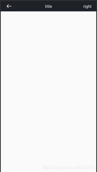
4.2 实现方式二:自定义标题栏
效果图如下:
1.先在xml中绘制标题的样式
<?xml version="1.0" encoding="utf-8"?>
<merge xmlns:android="http://schemas.android.com/apk/res/android"
    xmlns:tools="http://schemas.android.com/tools"
    tools:background="#1F2129"
    tools:layout_height="40dp"
    tools:layout_width="match_parent"
    tools:parentTag="android.widget.FrameLayout">

    <ImageButton
        android:id="@+id/ibBack"
        android:layout_width="40dp"
        android:layout_height="40dp"
        android:layout_gravity="center_vertical"
        android:layout_marginStart="40dp"
        android:background="@null"
        android:contentDescription="@null"
        android:src="@drawable/common_back_white" />

    <TextView
        android:id="@+id/tvTitle"
        android:layout_width="wrap_content"
        android:layout_height="wrap_content"
        android:layout_gravity="center"
        android:textColor="#FFFFFF"
        android:textSize="18sp"
        tools:text="title" />

    <TextView
        android:id="@+id/tvRightText"
        android:layout_width="wrap_content"
        android:layout_height="wrap_content"
        android:layout_gravity="center_vertical|end"
        android:paddingStart="@dimen/dp_20"
        android:paddingTop="@dimen/dp_10"
        android:paddingEnd="@dimen/dp_20"
        android:paddingBottom="@dimen/dp_10"
        android:textColor="#FFFFFF"
        android:textSize="18sp"
        android:visibility="invisible"
        tools:text="right"
        tools:visibility="visible" />

    <ImageButton
        android:id="@+id/ibRight"
        android:layout_width="40dp"
        android:layout_height="40dp"
        android:layout_gravity="center_vertical|end"
        android:layout_marginEnd="15dp"
        android:background="@null"
        android:contentDescription="@null"
        tools:visibility="visible" />

</merge>
2.自定义属性 attr.xml
<?xml version="1.0" encoding="utf-8"?>
<resources>
    <declare-styleable name="TitleLayout">
        <attr name="title_layout_background" format="color" />
        <attr name="title_layout_statusBarBackground" format="color" />
        <attr name="title_layout_titleText" format="string" />
        <attr name="title_layout_titleSize" format="dimension" />
        <attr name="title_layout_titleColor" format="color" />
        <attr name="title_layout_rightText" format="string" />
        <attr name="title_layout_rightTextSize" format="dimension" />
        <attr name="title_layout_rightTextColor" format="color" />
        <attr name="title_layout_rightImageSrc" format="reference|color" />
    </declare-styleable>

</resources>
3.在代码中实现
/**
 * 自定义标题栏控件
 */
class TitleLayout : FrameLayout {

    // 默认背景颜色
    private val defaultBackgroundColor = ResourcesUtil.getColor(R.color.common_black_1F)
    // 是否打断返回上一个界面,这个值被调用在返回监听之后
    private var isInterruptBack = false
    // 返回点击监听
    private var backClickListener: ((View) -> Unit)? = null

    constructor(context: Context) : this(context, null, 0)

    constructor(context: Context, attrs: AttributeSet?) : this(context, attrs, 0)

    //在该函数中实现
    constructor(context: Context, attrs: AttributeSet?, defStyleAttr: Int) : super(
        context,
        attrs,
        defStyleAttr
    ) {
        LayoutInflater.from(context).inflate(R.layout.common_include_title, this, true)
        initAttr(attrs)
        initBackClickListener()
    }

    fun setInterruptBack(interrupt: Boolean): TitleLayout {
        isInterruptBack = interrupt
        return this
    }

    fun setOnBackClickListener(click: (View) -> Unit): TitleLayout {
        backClickListener = click
        return this
    }

    fun getBackImageButton(): ImageButton = ibBack

    fun hideBackImage() {
        invisible(ibBack)
    }

    fun getTitleTextView(): TextView = tvTitle

    fun setTitleColor(color: Int): TitleLayout {
        tvTitle.setTextColor(color)
        return this
    }

    fun setTitleSize(size: Float): TitleLayout {
        tvTitle.setTextSize(TypedValue.COMPLEX_UNIT_PX, size)
        return this
    }

    fun setTitleText(text: CharSequence): TitleLayout {
        tvTitle.text = text
        return this
    }

    fun setTitleText(@StringRes resId: Int): TitleLayout {
        setTitleText(ResourcesUtil.getString(resId))
        return this
    }

    fun setLayoutBackgroundColor(color: Int): TitleLayout {
        setBackgroundColor(color)
        return this
    }

    fun getRightTextView(): TextView = tvRightText

    fun setRightText(text: CharSequence): TitleLayout {
        if (text.isNotEmpty()) {
            tvRightText.text = text
            visible(tvRightText)
            invisible(ibRight)
        }
        return this
    }

    fun setRightTextColor(color: Int): TitleLayout {
        tvRightText.setTextColor(color)
        return this
    }

    fun setRightTextSize(size: Float): TitleLayout {
        tvRightText.setTextSize(TypedValue.COMPLEX_UNIT_PX, size)
        return this
    }

    fun setOnRightTextClickListener(click: (View) -> Unit): TitleLayout {
        tvRightText.onClick { click(it) }
        return this
    }

    fun getRightImageButton(): ImageButton = ibRight

    fun setRightImageResource(id: Int) {
        invisible(tvRightText)
        visible(ibRight)
        ibRight.load(id)
    }

    fun setOnRightIconClickListener(click: (View) -> Unit): TitleLayout {
        ibRight.onClick { click(it) }
        return this
    }

    private fun initAttr(attrs: AttributeSet?) {
        val typedArray = context.obtainStyledAttributes(attrs, R.styleable.TitleLayout)

        val layoutBackgroundColor = typedArray.getColor(
            R.styleable.TitleLayout_title_layout_background,
            defaultBackgroundColor
        )
        setLayoutBackgroundColor(layoutBackgroundColor)

        val statusBarBackgroundColor = typedArray.getColor(
            R.styleable.TitleLayout_title_layout_statusBarBackground, layoutBackgroundColor
        )
        val activity = context
        if (activity is Activity) {
            BarUtil.setStatusBarColor(activity, statusBarBackgroundColor)
        }

        setTitleText(typedArray.getString(R.styleable.TitleLayout_title_layout_titleText) ?: "")
        val titleTextSize =
            typedArray.getDimension(R.styleable.TitleLayout_title_layout_titleSize, -1f)
        if (titleTextSize != -1f) {
            setTitleSize(titleTextSize)
        }
        val titleTextColor =
            typedArray.getColor(R.styleable.TitleLayout_title_layout_titleColor, -1)
        if (titleTextColor != -1) {
            setTitleColor(titleTextColor)
        }

        setRightText(typedArray.getString(R.styleable.TitleLayout_title_layout_rightText) ?: "")
        val rightTextSize =
            typedArray.getDimension(R.styleable.TitleLayout_title_layout_rightTextSize, -1f)
        if (rightTextSize != -1f) {
            setRightTextSize(rightTextSize)
        }
        val rightTextColor =
            typedArray.getColor(R.styleable.TitleLayout_title_layout_rightTextColor, -1)
        if (rightTextColor != -1) {
            setRightTextColor(rightTextColor)
        }

        val rightImageSrc =
            typedArray.getResourceId(R.styleable.TitleLayout_title_layout_rightImageSrc, -1)
        if (rightImageSrc != -1) {
            setRightImageResource(rightImageSrc)
        }

        typedArray.recycle()
    }

    private fun initBackClickListener() {
        val cxt = context
        ibBack.onClick {
            backClickListener?.invoke(it)
            if (!isInterruptBack && cxt is Activity) {
                cxt.finish()
            }
        }
    }
}
在布局文件中调用:
   <cc.test.package.common.widget.TitleLayout
        android:id="@id/titleLayout"
        android:layout_width="match_parent"
        android:layout_height="40dp"
        tools:title_layout_titleText="标题名字" />
在Activity界面中调用:
//标题的名字及事件 可放在此处处理

//如果不重写该返回事件,则默认返回事件为关闭界面
titleLayout.setOnBackClickListener {
           //重写该方法,实现想要的返回逻辑业务
        }
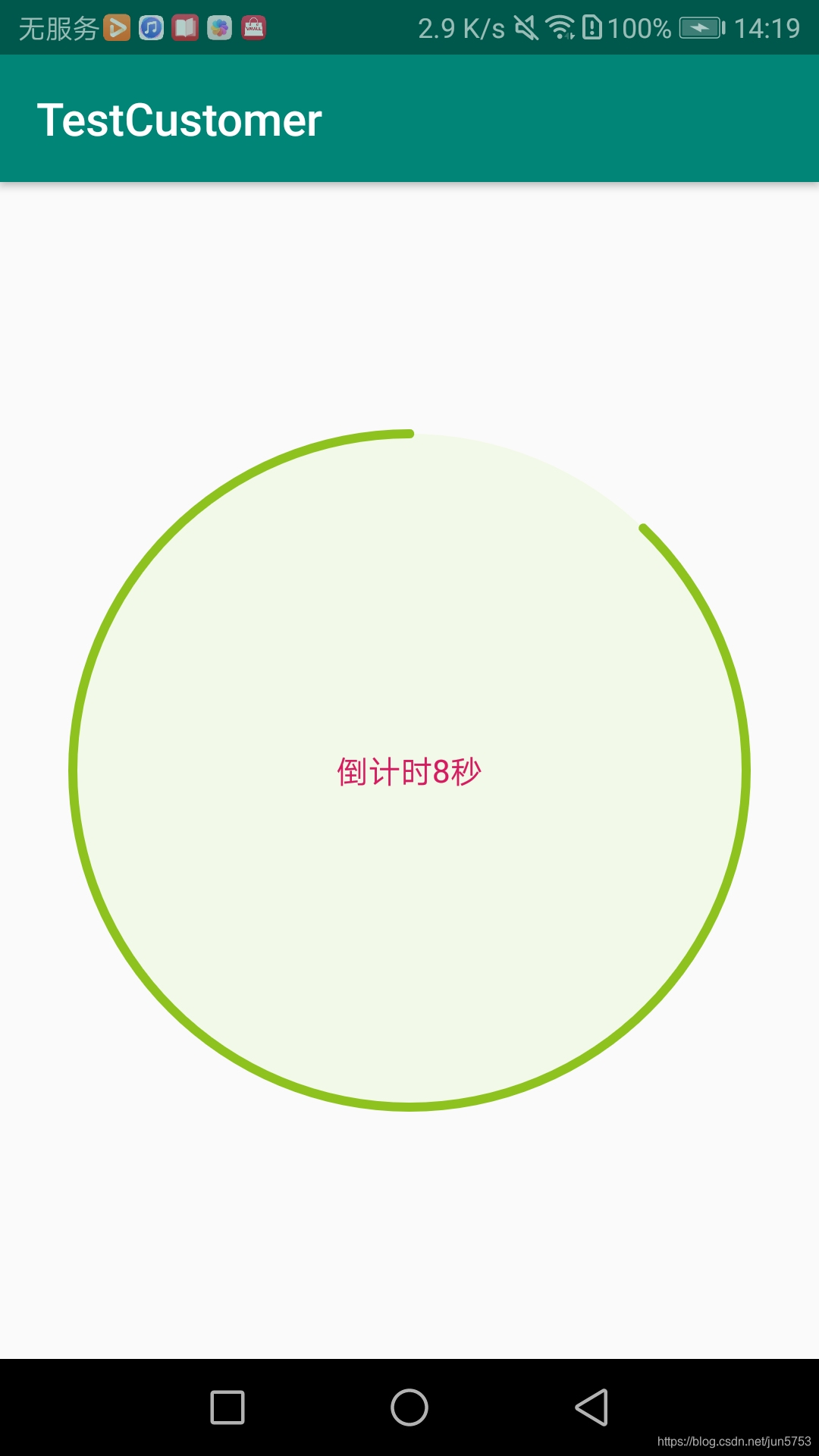
4.3 实现方式三:继承View进行重写
如实现倒计时功能
效果中下所示:
代码中实现方式:
class RoundProgressBar : View {

    constructor(context: Context) : super(context)

    constructor(context: Context, attrs: AttributeSet?) : super(context, attrs) {
        init(context, attrs)
    }

    constructor(context: Context, attrs: AttributeSet?, defStyleAttr: Int) : super(
        context,
        attrs,
        defStyleAttr
    ) {

        init(context, attrs)
    }

    /**
     * 画笔对象的引用
     */
    private var paint = Paint()
    /**
     * 圆环的颜色
     */
    private var roundColor = 0

    /**
     * 圆环进度的颜色
     */
    private var roundProgressColor = 0

    /**
     * 中间进度百分比的字符串的颜色
     */
    private var textColor = 0

    /**
     * 中间进度百分比的字符串的字体
     */
    private var textSize = 0f

    /**
     * 圆环的宽度
     */
    private var roundWidth = 0f

    /**
     * 最大进度
     */
    var max = 0

    /**
     * 进度圆环的起始角度 角度 0为三点钟方向
     */
    private var startAngle = 0

    /**
     * 进度圆环的扫描角度
     */
    private var sweepAngle = 0

    /**
     * 是否显示中间的进度
     */
    private var textIsDisplayable = false

    /**
     * 进度的风格,实心或者空心
     */
    private var style = 0

    companion object {
        const val STROKE = 0
        const val FILL = 1
    }

    private fun init(context: Context, attrs: AttributeSet?) {

        val mTypedArray = context.obtainStyledAttributes(attrs, R.styleable.RoundProgressBar)

        // 获取自定义属性和默认值
        roundColor =
            mTypedArray.getColor(R.styleable.RoundProgressBar_process_roundColor, Color.RED)
        roundProgressColor = mTypedArray.getColor(
            R.styleable.RoundProgressBar_process_roundProgressColor,
            Color.GREEN
        )
        textColor = mTypedArray.getColor(R.styleable.RoundProgressBar_process_txtColor, Color.GREEN)
        textSize = mTypedArray.getDimension(R.styleable.RoundProgressBar_process_txtSize, 15f)
        roundWidth = mTypedArray.getDimension(R.styleable.RoundProgressBar_process_roundWidth, 5f)
        max = mTypedArray.getInteger(R.styleable.RoundProgressBar_process_max, 100)
        startAngle = mTypedArray.getInteger(R.styleable.RoundProgressBar_process_startAngle, 0)
        sweepAngle = mTypedArray.getInteger(R.styleable.RoundProgressBar_process_sweepAngle, 360)
        textIsDisplayable =
            mTypedArray.getBoolean(R.styleable.RoundProgressBar_textIsDisplayable, true)
        style = mTypedArray.getInt(R.styleable.RoundProgressBar_process_style, 0)
        mTypedArray.recycle()
    }

    /**
     * 设置进度,此为线程安全控件,由于考虑多线的问题,需要同步 刷新界面调用postInvalidate()能在非UI线程刷新
     *
     */
    @get:Synchronized
    var progress = 0
        @Synchronized set(progress) {
            @Suppress("NAME_SHADOWING")
            var progress = progress
            if (progress < 0) {
                progress = 0
            }
            if (progress > max) {
                progress = max
            }
            if (progress <= max) {
                field = max - progress
                postInvalidate()
            }

        }

    //设置内环圈圈实心的颜色 圆形
    var cirCleColor: Int
        get() = roundColor
        set(criCleColor) {
            this.roundColor = criCleColor
            postInvalidate()
        }

    //一般只是希望在View发生改变时对UI进行重绘。invalidate()方法系统会自动调用 View的onDraw()方法。
    var cirCleProgressColor: Int
        get() = roundProgressColor
        set(criCleProgressColor) {
            this.roundProgressColor = criCleProgressColor
            postInvalidate()
        }

    @SuppressLint("DrawAllocation")
    override fun onDraw(canvas: Canvas) {
        super.onDraw(canvas)

        // 获取圆心的x坐标
        val centre = width / 2
        val radius = (centre - roundWidth / 2).toInt() // 圆环的半径

        with(paint) {
            strokeCap = Paint.Cap.ROUND
            isAntiAlias = true // 消除锯齿
            isDither = true //防止抖动
            color = roundColor // 设置圆环的颜色
            style = Paint.Style.FILL // 设置空心
            strokeWidth = roundWidth // 设置圆环的宽度
        }
        canvas.drawCircle(centre.toFloat(), centre.toFloat(), radius.toFloat(), paint) // 画出圆环

        // 用于定义的圆弧的形状和大小的界限
        val oval = RectF(
            (centre - radius).toFloat(),
            (centre - radius).toFloat(),
            (centre + radius).toFloat(),
            (centre + radius).toFloat()
        )

        /**
         * 画圆弧 ,画圆环的进度
         */

        when (style) {
            //当前的圆形
            STROKE -> {
                paint.style = Paint.Style.STROKE
                paint.color = roundProgressColor // 设置进度的颜色
                /**
                // drawArc - 根据进度画圆弧
                // 第一个参数定义的圆弧的形状和大小的范围
                // 第二个参数的作用是设置圆弧是从哪个角度来顺时针绘画的 0为三点钟方向
                // 第三个参数 这个参数的作用是设置圆弧扫过的角度 (要求逆时针)
                // 第四个参数 这个参数的作用是设置我们的圆弧在绘画的时候,是否经过圆形
                // 第五个参数 这个参数的作用是设置我们的画笔对象的属性
                 */
                canvas.drawArc(
                    oval,
                    startAngle.toFloat(),
                    -(sweepAngle * this.progress / max).toFloat(),
                    false,
                    paint
                )
            }
            FILL -> {
                paint.style = Paint.Style.FILL_AND_STROKE
                // 根据进度画圆弧
                if (this.progress != 0) {
                    canvas.drawArc(oval, 0f, (360 * this.progress / max).toFloat(), true, paint)
                }
            }
            else -> {
            }
        }
    }
}
在布局中调用方式:
    <com.test.widget.RoundProgressBar
        android:id="@+id/rbProgress"
        android:layout_width="300dp"
        android:layout_height="300dp"
        app:process_max="100"
        app:process_roundColor="#F3F9E8"
        app:process_roundProgressColor="#8EC31F"
        app:process_roundWidth="4dp"
        app:process_startAngle="-90"
        app:process_sweepAngle="360" />
在界面中调用:
class MainActivity : AppCompatActivity() {


    companion object {
        private const val DURATION_TIME = (10 * 1000).toLong()
        private const val TOTAL_PROGRESS = 100
    }

    override fun onCreate(savedInstanceState: Bundle?) {
        super.onCreate(savedInstanceState)
        setContentView(R.layout.activity_main)
        mTimer.start()
    }

    private val mTimer = object : CountDownTimer(DURATION_TIME, 100) {

        override fun onTick(millisUntilFinished: Long) {
            // 每隔一秒调用一次,剩余多少时间
            val progress = (TOTAL_PROGRESS * (DURATION_TIME - millisUntilFinished) / DURATION_TIME)

            rbProgress.progress = progress.toInt()
            mTvTime.text = "倒计时${millisUntilFinished / 1000}秒"
        }

           // 执行完毕
        override fun onFinish() {
            rbProgress.progress = TOTAL_PROGRESS
            mTvTime.text = "时间到"
        }
    }

    override fun onDestroy() {
        super.onDestroy()
        mTimer.cancel()
    }
}
说明:刷新界面时选择invalidate()还是postInvalidate()呢?
首先说一下区别:
- invalidate()
该方法只能在UI主线程中去调用,会刷新整个View,并且当这个View的可见性VISIBLE的时候,View的onDraw()方法将会被调用。
-
postInvalidate()
该方法是可以在非UI线程(任何线程)中去调用刷新UI,不一定是在主线程。因为在postInvalidate()中是利用handler给主线程发送刷新界面的消息来实现的。而正是因为它是通过发送消息来实现的,所以它的界面刷新速度可能没有直接调用invalidate()那么快。
所以当我们不确定当前刷新界面的位置所处的线程是不是在主线程时,用 postInvalidate()为好;
如果能确定就用 invalidate(),比如在触摸反馈事件中 onTouchEvent()是在主线程中的,所以用invalidate()更合适。
5. 总结
至此,总结了项目中用到的三种实现方式。不过,文中所展示的仅仅是自定义View中的冰山一角,自定义View值得开发人员深入挖掘。
参考资料: