官方示例可以参考:https://gallery.pyecharts.org/#/Candlestick/kline_datazoom_slider
文章目录
绘制K线图
import pandas as pd
from pyecharts import options as opts
from pyecharts.charts import Kline


def get_file_df(start_date="2020-01-01", end_date="2021-01-01"):
	"""获取K线数据"""
    file_df = pd.read_pickle("000001.pkl")
    file_df.index = pd.to_datetime(file_df['日期'])
    file_df = file_df.iloc[:, :7]
    file_df.columns = ['date', 'open', 'close', 'high', 'low', 'volume', 'turnover']
    file_df = file_df.drop(["date"], axis=1)
    file_df = file_df.sort_index().truncate(before=start_date, after=end_date)
    return file_df


def draw_kline(k_dataframe: pd.DataFrame):
    kline_chart = Kline(init_opts=opts.InitOpts(width="1700px", height="750px"))
    kline_chart.add_xaxis(xaxis_data=k_dataframe.index.strftime("%Y-%m-%d").tolist())
    kline_chart.add_yaxis("K线", y_axis=k_dataframe[['open', "close", "low", "high"]].values.tolist())
    kline_chart.set_global_opts(
        xaxis_opts=opts.AxisOpts(is_scale=True),
        yaxis_opts=opts.AxisOpts(
            is_scale=True,
            splitarea_opts=opts.SplitAreaOpts(
                is_show=True, areastyle_opts=opts.AreaStyleOpts(opacity=1)
            ),
        ),
        datazoom_opts=[opts.DataZoomOpts()],
        title_opts=opts.TitleOpts(title="k线图"),
    )
    kline_chart.render("save_kline.html")


def main():
    file_df: pd.DataFrame = get_file_df()  # 数据源
    draw_kline(k_dataframe=file_df)


if __name__ == '__main__':
    main()
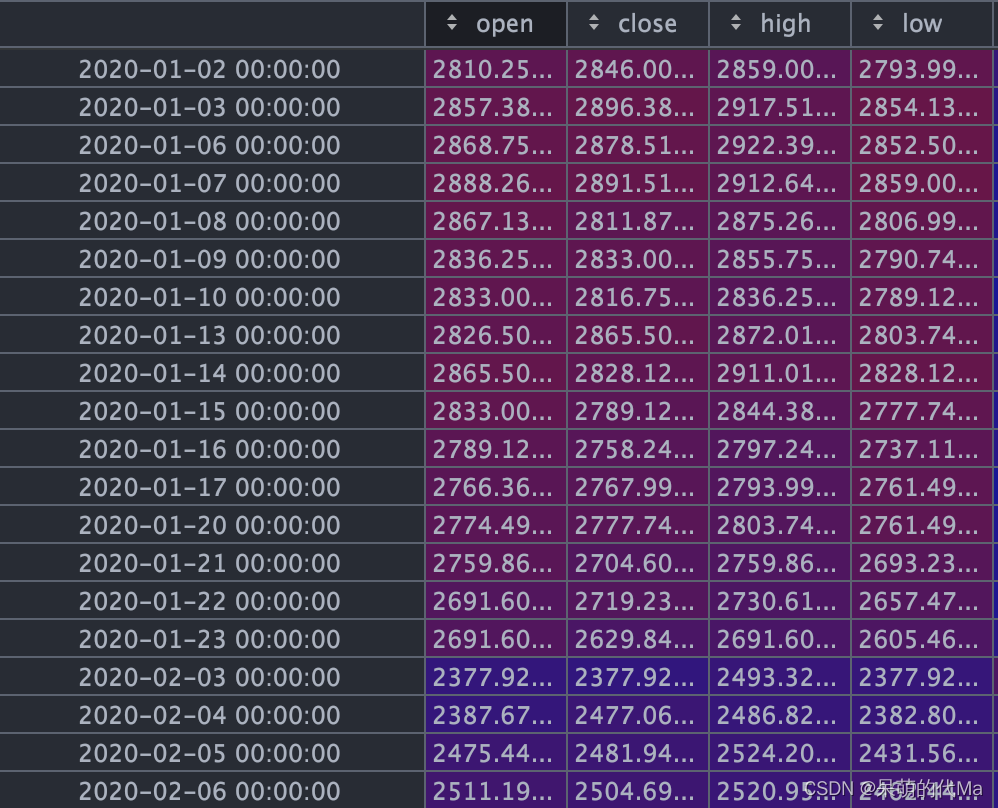
其中K线数据样例:
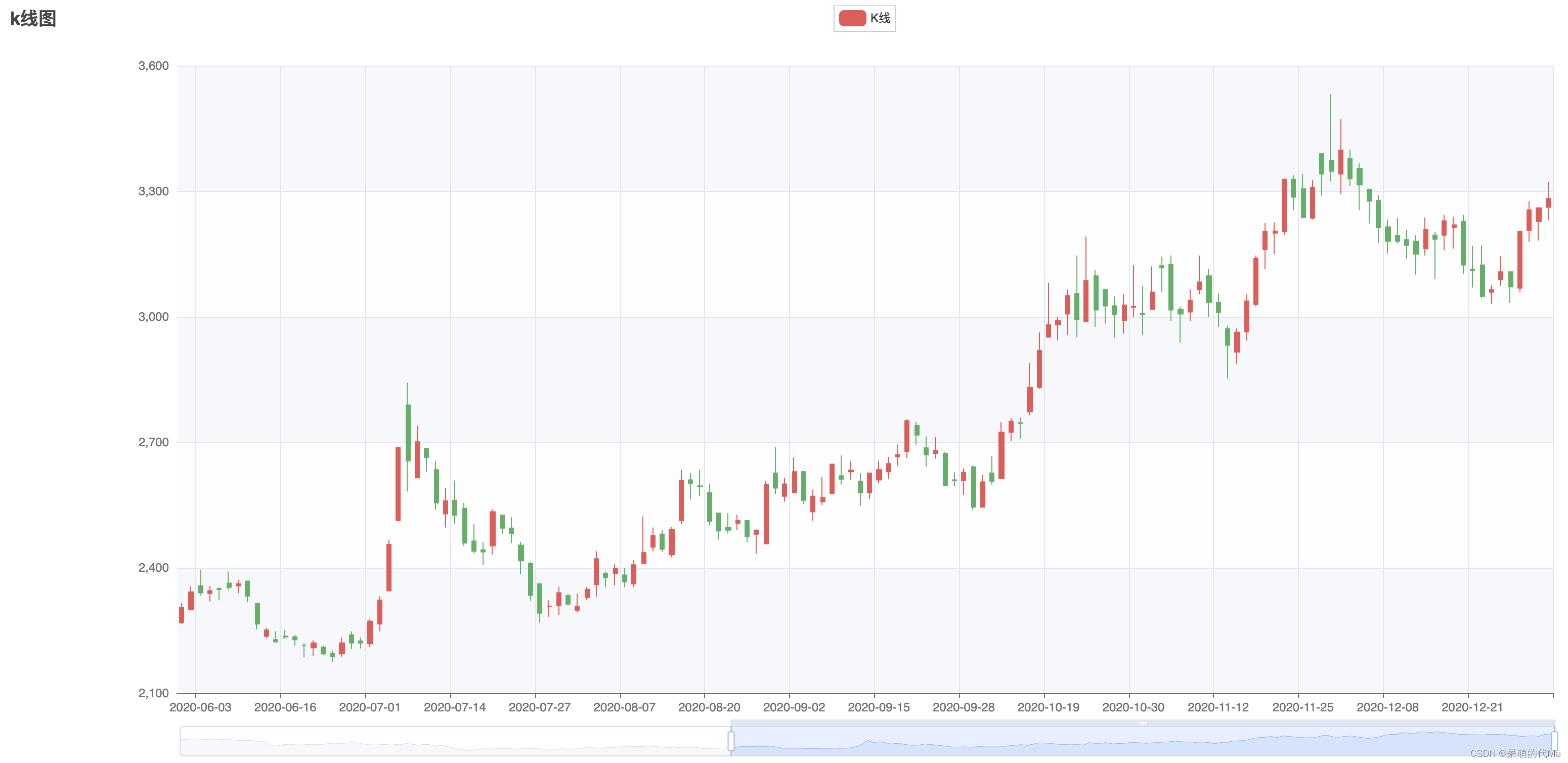
最终保存下来的效果图如下:
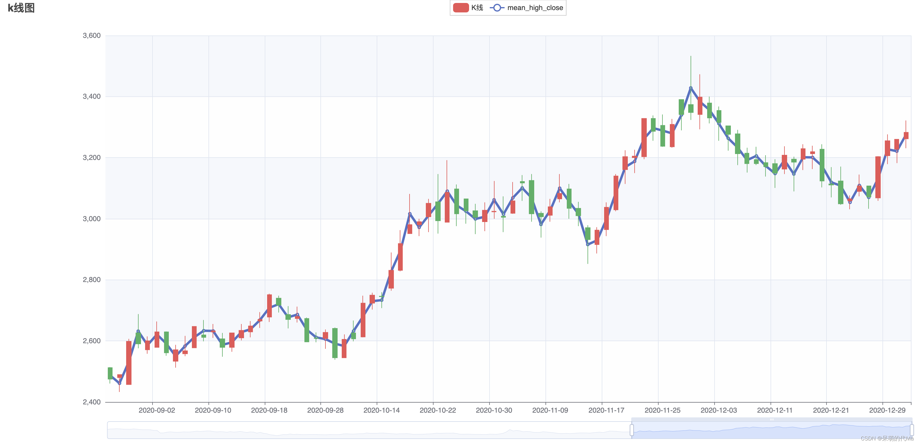
绘制有辅助线的K线图
代码如下:
import pandas as pd
from pyecharts import options as opts
from pyecharts.charts import Kline, Line


def get_file_df(start_date="2020-01-01", end_date="2021-01-01"):
    file_df = pd.read_pickle("000001.pkl")
    file_df.index = pd.to_datetime(file_df['日期'])
    file_df = file_df.iloc[:, :7]
    file_df.columns = ['date', 'open', 'close', 'high', 'low', 'volume', 'turnover']
    file_df = file_df.drop(["date"], axis=1)
    file_df = file_df.sort_index().truncate(before=start_date, after=end_date)
    return file_df


def draw_kline(k_dataframe: pd.DataFrame, same_axis_feature: list = None):
    x_value = k_dataframe.index.strftime("%Y-%m-%d").tolist()
    kline_chart = Kline(init_opts=opts.InitOpts(width="1700px", height="750px"))
    kline_chart.add_xaxis(xaxis_data=x_value)
    kline_chart.add_yaxis("K线", y_axis=k_dataframe[['open', "close", "low", "high"]].values.tolist())
    kline_chart.set_global_opts(
        xaxis_opts=opts.AxisOpts(is_scale=True),
        yaxis_opts=opts.AxisOpts(
            is_scale=True,
            splitarea_opts=opts.SplitAreaOpts(
                is_show=True, areastyle_opts=opts.AreaStyleOpts(opacity=1)
            ),
        ),
        datazoom_opts=[opts.DataZoomOpts()],
        title_opts=opts.TitleOpts(title="k线图"),
    )
    # 添加同价格的辅助线
    for _index, _feature_name in enumerate(same_axis_feature):
        this_line = Line().add_xaxis(x_value).add_yaxis(_feature_name, k_dataframe[_feature_name], yaxis_index=0)
        this_line.set_series_opts(
            label_opts=opts.LabelOpts(is_show=False),
            linestyle_opts=opts.LineStyleOpts(width=4),
        )
        kline_chart.overlap(this_line)
    kline_chart.render("save_kline.html")


def main():
    file_df: pd.DataFrame = get_file_df()  # 数据源
    file_df['mean_high_close'] = (file_df['high'] + file_df['low']) / 2
    draw_kline(file_df, ["mean_high_close"])


if __name__ == '__main__':
    main()
如图,同样的价格因素(最高价与最低价的均值)被传递到图中,辅助我们看图,其他折线同理所示