本专栏将会从基础开始,循序渐进,讲解HTML先关知识,也请大家多多支持。
专栏地址: html专栏
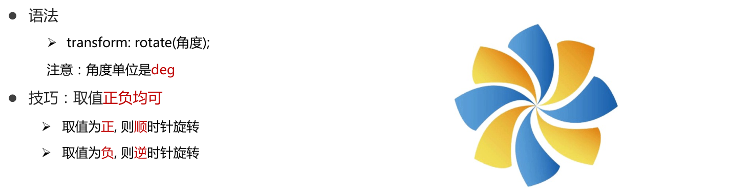
1 旋转
1.1 语法
<!DOCTYPE html>
<html lang="en">
<head>
    <meta charset="UTF-8">
    <meta http-equiv="X-UA-Compatible" content="IE=edge">
    <meta name="viewport" content="width=device-width, initial-scale=1.0">
    <title>旋转效果</title>
    <style>
        img {


            width: 250px;
            transition: all 2s;
        }

        img:hover {


            /* 顺 */
            transform: rotate(360deg);

            /* 逆 */
            /* transform: rotate(-360deg); */
        }


    </style>
</head>
<body>
    <img src="./images/rotate.png" alt="">
</body>
</html>
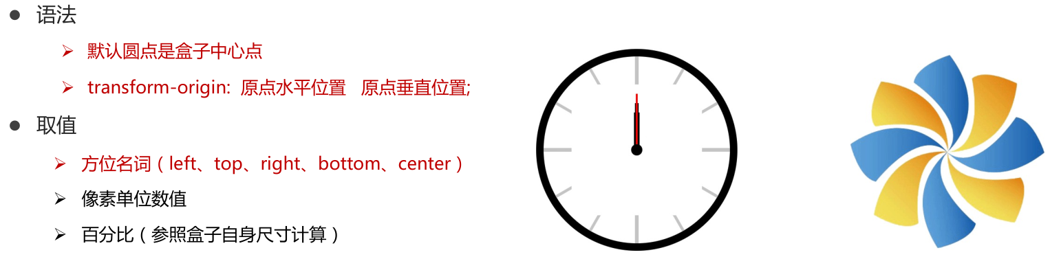
1.2 设置圆点
<!DOCTYPE html>
<html lang="en">
<head>
    <meta charset="UTF-8">
    <meta http-equiv="X-UA-Compatible" content="IE=edge">
    <meta name="viewport" content="width=device-width, initial-scale=1.0">
    <title>转换原点</title>
    <style>
        img {


            width: 250px;
            border: 1px solid #000;
            transition: all 2s;
            transform-origin: right bottom;
            transform-origin: left bottom;
        }

        img:hover {


            transform: rotate(360deg);
        }
    </style>
</head>
<body>
    <img src="./images/rotate.png" alt="">
</body>
</html>
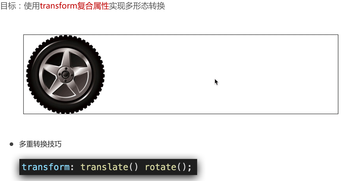
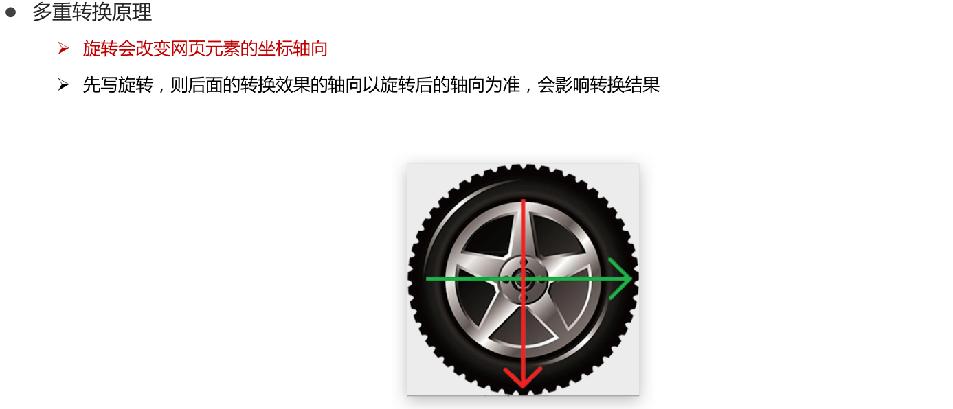
1.3 多重转换
<!DOCTYPE html>
<html lang="en">

<head>
    <meta charset="UTF-8">
    <meta http-equiv="X-UA-Compatible" content="IE=edge">
    <meta name="viewport" content="width=device-width, initial-scale=1.0">
    <title>多重转换</title>
    <style>
        .box {


            width: 800px;
            height: 200px;
            border: 1px solid #000;
        }

        img {


            width: 200px;
            transition: all 8s;
        }

        .box:hover img {


            /* 边走边转 */
            transform: translate(600px) rotate(360deg);

            /* 旋转可以改变坐标轴向 */
            /* transform: rotate(360deg) translate(600px); */

            /* 层叠性 ,所以不能边走边转*/
            /* transform: translate(600px);
            transform: rotate(360deg); */
        }
    </style>
</head>

<body>
    <div class="box">
        <img src="./images/tyre1.png" alt="">
    </div>
</body>

</html>
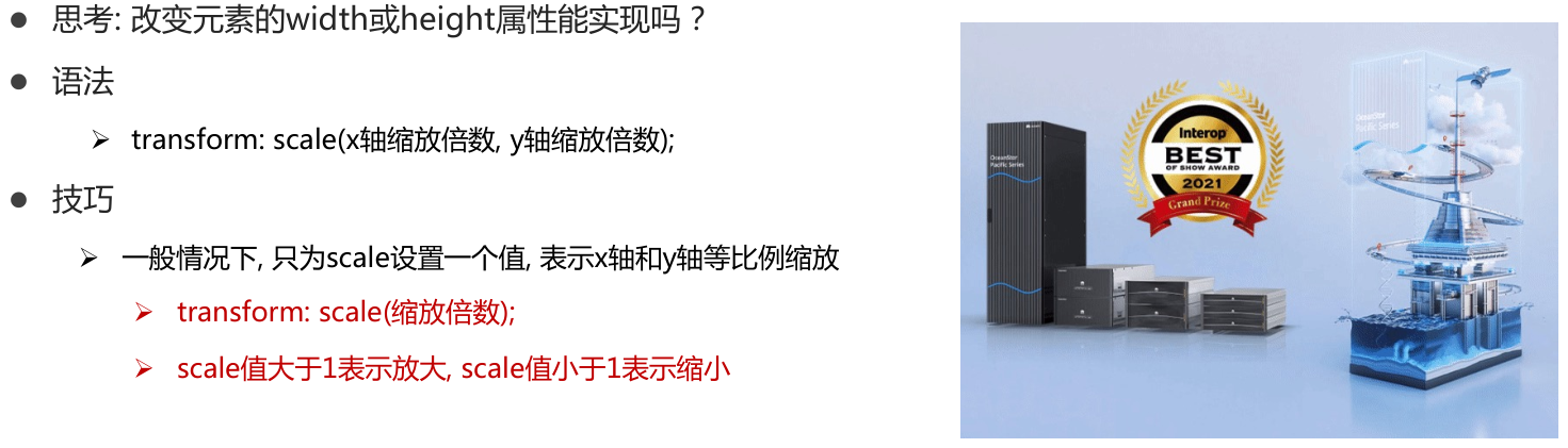
2 缩放
2.1 原理
<!DOCTYPE html>
<html lang="en">

<head>
    <meta charset="UTF-8">
    <meta http-equiv="X-UA-Compatible" content="IE=edge">
    <meta name="viewport" content="width=device-width, initial-scale=1.0">
    <title>缩放效果</title>
    <style>
        .box {


            width: 300px;
            height: 210px;
            margin: 100px auto;
            background-color: pink;

        }

        .box img {


            width: 100%;
            transition: all 0.5s;
        }

        .box:hover img {


            /* width: 150%; */

            transform: scale(1.2);
            transform: scale(0.8);
        }
    </style>
</head>

<body>
    <div class="box">
        <img src="./images/product.jpeg" alt="">
    </div>
</body>

</html>
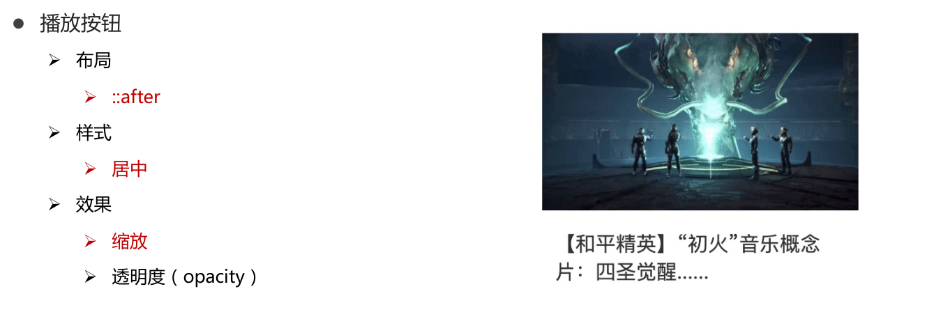
2.2 播放按钮案例
<!DOCTYPE html>
<html lang="en">
<head>
    <meta charset="UTF-8">
    <meta http-equiv="X-UA-Compatible" content="IE=edge">
    <meta name="viewport" content="width=device-width, initial-scale=1.0">
    <title>Document</title>
    <style>
        * {


            margin: 0;
            padding: 0;
        }

        li {


            list-style: none;
        }

        img {


            width: 100%;
        }

        .box {


            width: 249px;
            height: 210px;
            margin: 50px auto;
            overflow: hidden;
        }

        .box p {


            color: #3b3b3b;
            padding: 10px 10px 0 10px;
        }

        .box .pic {


            position: relative;
        }

        .box .pic::after {


            /* 播放按钮压在图片上面 - 居中 */
            position: absolute;
            left: 50%;
            top: 50%;
            /* margin-left: -29px;
            margin-top: -29px; */
            /* transform: translate(-50%, -50%); */

            content: '';
            width: 58px;
            height: 58px;
            background-image: url(./images/play.png);

            /* 大图 */
            transform: translate(-50%, -50%) scale(5);

            /* 透明,看不见 */
            opacity: 0;
            transition: all .5s;
        }

        /* lihover的时候,  谁变小pic::after */
        .box li:hover .pic::after {


            opacity: 1;
            transform: translate(-50%, -50%) scale(1);
        }
    </style>
</head>
<body>
    <div class="box">
        <ul>
            <li>
                <div class="pic"><img src="./images/party.jpeg" alt=""></div>
                <p>【和平精英】“初火”音乐概念片:四圣觉醒......</p>
            </li>
        </ul>
    </div>
</body>
</html>
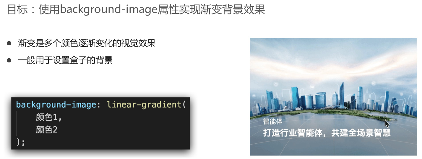
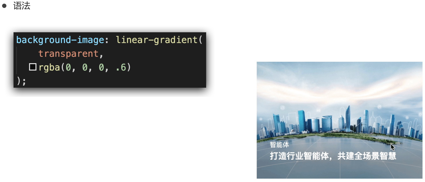
3 渐变
<!DOCTYPE html>
<html lang="en">

<head>
    <meta charset="UTF-8">
    <meta http-equiv="X-UA-Compatible" content="IE=edge">
    <meta name="viewport" content="width=device-width, initial-scale=1.0">
    <title>渐变背景</title>
    <style>
        .box {


            width: 300px;
            height: 200px;
            /* background-image: linear-gradient(
                pink,
                green,
                hotpink
            ); */
            background-image: linear-gradient(
                transparent,
                rgba(0,0,0, .6)
            );
        }
    </style>
</head>

<body>

    <div class="box"></div>


</body>

</html>
3.1 案例1

<!DOCTYPE html>
<html lang="en">

<head>
    <meta charset="UTF-8">
    <meta http-equiv="X-UA-Compatible" content="IE=edge">
    <meta name="viewport" content="width=device-width, initial-scale=1.0">
    <title>产品展示效果</title>
    <style>
        .box {


            position: relative;
        }

        .box img {


            width: 300px;
        }

        .box .title {


            position: absolute;
            left: 15px;
            bottom: 20px;
            z-index: 2;
            width: 260px;
            color: #fff;
            font-size: 20px;
            font-weight: 700;
        }

        .box .mask {


            position: absolute;
            left: 0;
            top: 0;

            /* display: none; */
            opacity: 0;
            width: 300px;
            height: 212px;
            background-image: linear-gradient(
                transparent,
                rgba(0,0,0,.6)
            );
            transition: all .5s;
        }

        .box:hover .mask {


            opacity: 1;
            /* display: block; */
        }
    </style>
</head>

<body>

    <div class="box">
        <img src="./images/product.jpeg" alt="">
        <div class="title">OceanStor Pacific 海量存储斩获2021 Interop金奖</div>
        <!-- 渐变背景 mask -->
        <div class="mask"></div>
    </div>
</body>

</html>
3.2 案例2
- demo.css
* {


    margin: 0;
    padding: 0;
    box-sizing: border-box;
}

li {


    list-style: none;
}

a {


    text-decoration: none;
}

img {


    width: 100%;
    vertical-align: middle;
}

.box {


    width: 1110px;
    height: 247px;
    margin: 20px auto;
    /* background-color: pink; */
}

.box li {


    position: relative;
    float: left;
    width: 350px;
    height: 247px;
    margin-right: 30px;
    overflow: hidden;
}

.box li:last-child {


    margin-right: 0;
}

.box .txt {


    position: absolute;
    left: 0;
    bottom: -50px;
    width: 350px;
    height: auto;
    padding: 20px 30px;
    z-index: 1;
    color: #fff;
    transition: transform .5s;
    /* transition: all .5s; */
}

.box .txt h4 {


    font-size: 14px;
    font-weight: 400;
    line-height: 2em;
    color: #fff;
}

.box .txt h5 {


    margin-bottom: 40px;
    font-size: 18px;
    line-height: 1.5em;
    color: #fff;
}

.box .txt p {


    color: #fff;
    font-size: 14px;
}

.box .txt p .iconfont {


    color: #c7000b;
    vertical-align: middle;
    font-size: 20px;
    font-weight: 700;
}

/* 1. 渐变背景的盒子 */
.box .mask {


    position: absolute;
    left: 0;
    top: 0;
    width: 350px;
    height: 247px;
    background-image: linear-gradient(
        transparent,
        rgba(0,0,0,.6)
    );
    opacity: 0;
    transition: all .5s;
}

/* 2. hover效果 */
/* 2.1 图片缩放 */
.box li .pic img {


    transition: all .5s;
}
.box li:hover .pic img {


    transform: scale(1.2);
}


/* 2.2 渐变背景显示 */
.box li:hover .mask {


    opacity: 1;
}

/* 2.3 文字向上移动 */
.box li:hover .txt {


    transform: translateY(-50px);
}
- demo.html
<!DOCTYPE html>
<html lang="en">
<head>
<meta charset="UTF-8">
<meta http-equiv="X-UA-Compatible" content="IE=edge">
<meta name="viewport" content="width=device-width, initial-scale=1.0">
<title>华为新闻</title>
<link rel="stylesheet" href="./css/demo.css">
</head>
<body>
<div class="box">
<ul>
<li>
<a href="#">
<div class="pic">
<img src="./images/product.jpeg" alt="">
</div>
<div class="txt">
<h4>产品</h4>
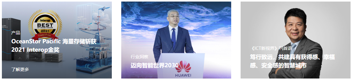
<h5>OceanStor Pacific 海量存储斩获2021 Interop金奖</h5>
<p>
<span>了解更多</span>
<i></i>
</p>
</div>
<!-- 添加渐变背景 -->
<div class="mask"></div>
</a>
</li>
<li>
<a href="#">
<div class="pic">
<img src="./images/huawei1.jpeg" alt="">
</div>
<div class="txt">
<h4>行业洞察</h4>
<h5>迈向智能世界2030</h5>
<p>
<span>了解更多</span>
<i></i>
</p>
</div>
<!-- 添加渐变背景 -->
<div class="mask"></div>
</a>
</li>
<li>
<a href="#">
<div class="pic">
<img src="./images/huawei2.jpeg" alt="">
</div>
<div class="txt">
<h4>《ICT新视界》刊首语</h4>
<h5>笃行致远,共建具有获得感、幸福感、安全感的智慧城市</h5>
<p>
<span>了解更多</span>
<i></i>
</p>
</div>
<!-- 添加渐变背景 -->
<div class="mask"></div>
</a>
</li>
</ul>
</div>
</body>
</html>