使用Bootstrap的JavaScript模态插件添加对话框到您的网站的lightbox、用户通知、或完全自定义内容。
1、工作原理
在开始使用Bootstrap的模态组件之前,请务必阅读以下内容,因为我们的菜单选项最近发生了更改。
- Modal是用HTML、CSS和JavaScript构建的。它们重新定位在文档中的其他所有内容之上,并从
<body>中删除滚动,以使模态内容滚动。 - 点击Modal背景将自动关闭Modal。
- Bootstrap每次只支持一个模态窗口。嵌套模态不受支持,因为我们认为它们的用户体验很差。
- Modals使用
position: fixed,有时它的渲染会有点特别。只要有可能,将Modal HTML放在顶级位置,以避免其他元素的潜在干扰。在另一个固定元素中嵌套.modal时,可能会遇到问题。 - 同样,由于位置固定,在移动设备上使用Modal有一些注意事项。
- 由于HTML5定义其语义的方式,自动聚焦HTML属性在Bootstrap modals中没有作用。为了达到同样的效果,可以使用一些自定义JavaScript
$('#myModal').on('shown.bs.modal', function () {


  $('#myInput').trigger('focus')
})
该组件的动画效果依赖于preferred -reduced-motion media查询。
2、示例
2.1、Modal组件
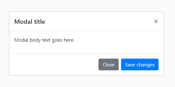
下面是一个静态Modal示例(意味着它的位置和显示已经被覆盖)。包括模态标题、模态主体(填充必需)和模态页脚(可选)。我们要求你尽可能在解散动作中包含模态标题,或者提供另一个显式的解散动作。
<div class="modal" tabindex="-1">
<div class="modal-dialog">
<div class="modal-content">
<div class="modal-header">
<h5 class="modal-title">Modal title</h5>
<button type="button" class="close" data-dismiss="modal" aria-label="Close">
<span aria-hidden="true">×</span>
</button>
</div>
<div class="modal-body">
<p>Modal body text goes here.</p>
</div>
<div class="modal-footer">
<button type="button" class="btn btn-secondary" data-dismiss="modal">Close</button>
<button type="button" class="btn btn-primary">Save changes</button>
</div>
</div>
</div>
</div>
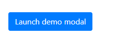
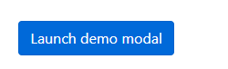
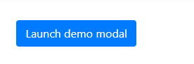
2.2、在线演示
通过单击下面的按钮切换工作模式演示。它会从页面顶部滑下来并淡入。
<!-- Button trigger modal -->
<button type="button" class="btn btn-primary" data-toggle="modal" data-target="#exampleModal">
Launch demo modal
</button>
<!-- Modal -->
<div class="modal fade" id="exampleModal" tabindex="-1" aria-labelledby="exampleModalLabel" aria-hidden="true">
<div class="modal-dialog">
<div class="modal-content">
<div class="modal-header">
<h5 class="modal-title" id="exampleModalLabel">Modal title</h5>
<button type="button" class="close" data-dismiss="modal" aria-label="Close">
<span aria-hidden="true">×</span>
</button>
</div>
<div class="modal-body">
...
</div>
<div class="modal-footer">
<button type="button" class="btn btn-secondary" data-dismiss="modal">Close</button>
<button type="button" class="btn btn-primary">Save changes</button>
</div>
</div>
</div>
</div>
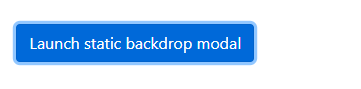
2.3、静态背景
当背景设置为静态时,在它外面点击时,模式将不会关闭。
<!-- Button trigger modal -->
<button type="button" class="btn btn-primary" data-toggle="modal" data-target="#staticBackdrop">
Launch static backdrop modal
</button>
<!-- Modal -->
<div class="modal fade" id="staticBackdrop" data-backdrop="static" data-keyboard="false" tabindex="-1" aria-labelledby="staticBackdropLabel" aria-hidden="true">
<div class="modal-dialog">
<div class="modal-content">
<div class="modal-header">
<h5 class="modal-title" id="staticBackdropLabel">Modal title</h5>
<button type="button" class="close" data-dismiss="modal" aria-label="Close">
<span aria-hidden="true">×</span>
</button>
</div>
<div class="modal-body">
...
</div>
<div class="modal-footer">
<button type="button" class="btn btn-secondary" data-dismiss="modal">Close</button>
<button type="button" class="btn btn-primary">Understood</button>
</div>
</div>
</div>
</div>

2.4、滚动内容
当modal对用户的视口或设备来说太长时,它们会独立于页面本身滚动。
您还可以通过在.modal-dialog中添加.modal-dialog-scrollable来创建一个允许滚动模态主体的可滚动模态。
<!-- Scrollable modal -->
<div class="modal-dialog modal-dialog-scrollable">
  ...
</div>

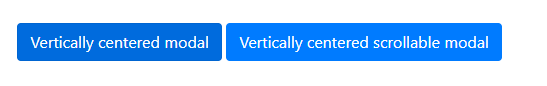
2.5、垂直居中
将.modal-dialog-centered添加到.modal-dialog中,以使模式垂直居中。
<!-- Vertically centered modal -->
<div class="modal-dialog modal-dialog-centered">
  ...
</div>

<!-- Vertically centered scrollable modal -->
<div class="modal-dialog modal-dialog-centered modal-dialog-scrollable">
  ...
</div>
2.6、提示和弹窗
工具提示和弹出窗口可以根据需要放置在modal中。当modal关闭时,任何工具提示和弹出窗口也会自动关闭。
<div class="modal-body">
  <h5>Popover in a modal</h5>
  <p>This <a href="#" role="button" class="btn btn-secondary popover-test" title="Popover title" data-content="Popover body content is set in this attribute.">button</a> triggers a popover on click.</p>
  <hr>
  <h5>Tooltips in a modal</h5>
  <p><a href="#" class="tooltip-test" title="Tooltip">This link</a> and <a href="#" class="tooltip-test" title="Tooltip">that link</a> have tooltips on hover.</p>
</div>

2.7、使用网格
通过在.modal-body中嵌套.container-fluid,在一个模态中利用Bootstrap网格系统。然后,像在其他地方一样使用普通网格系统类。
<div class="modal-body">
  <div class="container-fluid">
    <div class="row">
      <div class="col-md-4">.col-md-4</div>
      <div class="col-md-4 ml-auto">.col-md-4 .ml-auto</div>
    </div>
    <div class="row">
      <div class="col-md-3 ml-auto">.col-md-3 .ml-auto</div>
      <div class="col-md-2 ml-auto">.col-md-2 .ml-auto</div>
    </div>
    <div class="row">
      <div class="col-md-6 ml-auto">.col-md-6 .ml-auto</div>
    </div>
    <div class="row">
      <div class="col-sm-9">
        Level 1: .col-sm-9
        <div class="row">
          <div class="col-8 col-sm-6">
            Level 2: .col-8 .col-sm-6
          </div>
          <div class="col-4 col-sm-6">
            Level 2: .col-4 .col-sm-6
          </div>
        </div>
      </div>
    </div>
  </div>
</div>
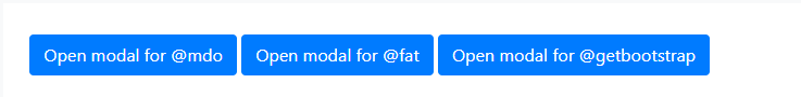
2.8、不同模态框的内容
有一堆按钮都触发相同的模态,但内容略有不同?使用事件。relatedTarget和HTML data-*属性(可能通过jQuery)来根据单击的按钮改变模式的内容。
下面是一个现场演示,后面是HTML和JavaScript示例。
<button type="button" class="btn btn-primary" data-toggle="modal" data-target="#exampleModal" data-whatever="@mdo">Open modal for @mdo</button>
<button type="button" class="btn btn-primary" data-toggle="modal" data-target="#exampleModal" data-whatever="@fat">Open modal for @fat</button>
<button type="button" class="btn btn-primary" data-toggle="modal" data-target="#exampleModal" data-whatever="@getbootstrap">Open modal for @getbootstrap</button>
<div class="modal fade" id="exampleModal" tabindex="-1" aria-labelledby="exampleModalLabel" aria-hidden="true">
<div class="modal-dialog">
<div class="modal-content">
<div class="modal-header">
<h5 class="modal-title" id="exampleModalLabel">New message</h5>
<button type="button" class="close" data-dismiss="modal" aria-label="Close">
<span aria-hidden="true">×</span>
</button>
</div>
<div class="modal-body">
<form>
<div class="form-group">
<label for="recipient-name" class="col-form-label">Recipient:</label>
<input type="text" class="form-control" id="recipient-name">
</div>
<div class="form-group">
<label for="message-text" class="col-form-label">Message:</label>
<textarea class="form-control" id="message-text"></textarea>
</div>
</form>
</div>
<div class="modal-footer">
<button type="button" class="btn btn-secondary" data-dismiss="modal">Close</button>
<button type="button" class="btn btn-primary">Send message</button>
</div>
</div>
</div>
</div>
$('#exampleModal').on('show.bs.modal', function (event) {


  var button = $(event.relatedTarget) // Button that triggered the modal
  var recipient = button.data('whatever') // Extract info from data-* attributes
  // If necessary, you could initiate an AJAX request here (and then do the updating in a callback).
  // Update the modal's content. We'll use jQuery here, but you could use a data binding library or other methods instead.
  var modal = $(this)
  modal.find('.modal-title').text('New message to ' + recipient)
  modal.find('.modal-body input').val(recipient)
})
2.9、改变动画
$modal-fade-transform变量决定.modal-dialog在模式淡入动画之前的转换状态,$modal-show-transform变量决定.modal-dialog在模式淡入动画结束时的转换状态。
例如,如果你想要一个放大的动画,你可以设置$modal-fade-transform: scale(.8)。
2.10、移除动画
对于仅仅出现而不是淡入视图的Modal,请从你的Modal标记中移除.fade类。
<div class="modal" tabindex="-1" aria-labelledby="..." aria-hidden="true">
  ...
</div>
2.11、动态高度
如果一个Modal的高度在它打开的时候改变了,你应该调用$('#myModal').modal('handleUpdate')来重新调整模态的位置,以防出现滚动条。
2.12、Accessibility
一定要添加aria-labelledby="…",引用模态标题,到.modal。另外,你可以用on .modal的咏叹调描述你的模态对话框。注意,你不需要添加role="dialog",因为我们已经通过JavaScript添加了它。
2.13、嵌入YouTube视频
在modal中嵌入YouTube视频需要额外的JavaScript而不是在Bootstrap中自动停止播放和更多。
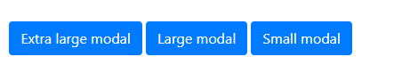
3、Optional sizes
Modal有三种可选的大小,可以通过放在.modal-dialog对话框中的修饰类来使用。这些大小在某些断点处起作用,以避免在较窄的视图上出现水平滚动条。
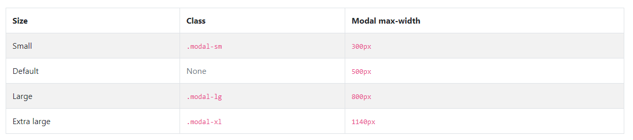
我们没有修饰符类的默认模态构成了中等大小的模态。
<div class="modal-dialog modal-xl">...</div>
<div class="modal-dialog modal-lg">...</div>
<div class="modal-dialog modal-sm">...</div>
4、用法
模态插件通过数据属性或JavaScript按需切换隐藏内容。它还在<body>中添加了.modal-open来覆盖默认的滚动行为,并生成一个.modal- background来提供一个点击区域,以便在点击Modal外部时取消显示的Modal。
4.1、通过data属性
不写JavaScript就激活一个模态。在控制器元素上设置data-toggle="modal",就像按钮一样,再加上data-target="#foo"或href="#foo",以指向要切换的特定模态。
<button type="button" data-toggle="modal" data-target="#myModal">Launch modal</button>
4.2、通过JavaScript
用一行JavaScript调用一个id为myModal的模态
$('#myModal').modal(options)
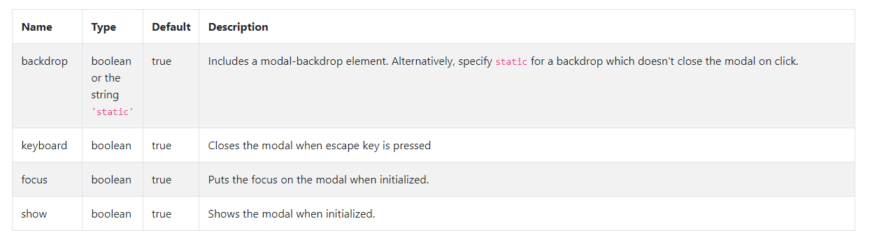
4.3、选项
选项可以通过数据属性或JavaScript传递。对于数据属性,将选项名称附加到data-,如data- background =""。
4.4、方法
异步方法和转换
所有API方法都是异步的,并开始转换。它们在转换开始后立即返回给调用者,但在转换结束前返回。此外,对转换组件的方法调用将被忽略。
4.4.1、.modal(options)
激活您的内容作为一个Modal。接受一个可选的选项对象。
$('#myModal').modal({


  keyboard: false
})
4.4.2、.modal(‘toggle’)
手动切换一个模式。在模态实际显示或隐藏之前返回给调用者(即在shown.bs.modal或hidden.bs.modal事件发生之前)。
$('#myModal').modal('toggle')
4.4.3、.modal(‘show’)
手动打开一个模式。在模态实际显示之前返回给调用者(即在shown.bs.modal事件发生之前)。
$('#myModal').modal('show')
4.4.4、.modal(‘hide’)
手动隐藏一个模态。在模态被隐藏之前返回给调用者(即在hidden.bs.modal事件发生之前)。
$('#myModal').modal('hide')
4.4.5、.modal(‘handleUpdate’)
如果一个模态的高度在它打开的时候发生变化,手动重新调整模态的位置(例如,出现滚动条)。
$('#myModal').modal('handleUpdate')
4.4.6、.modal(‘dispose’)
销毁模态。
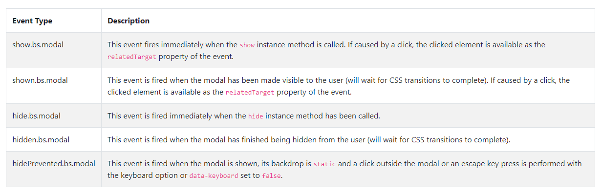
4.5、事件
Bootstrap的模态类暴露了一些与模态功能挂钩的事件。所有的模态事件都是在模态本身触发的(即在<div class="modal">)。
$('#myModal').on('hidden.bs.modal', function (event) {


  // do something...
})
后记
如果你感觉文章不咋地
//(ㄒoㄒ)//,就在评论处留言,作者继续改进;o_O???
如果你觉得该文章有一点点用处,可以给作者点个赞;\\*^o^*//
如果你想要和作者一起进步,可以微信扫描二维码,关注前端老L;~~~///(^v^)\\\~~~
谢谢各位读者们啦(^_^)∠※!!!
