本篇博客参考https://v3.bootcss.com/javascript/#modals-examples
先上bootstrap官网瞅一眼:

https://www.bootcss.com/
开宗明义的提出了模态框不支持同时打开多个,想同时打开多个看来需要另寻高明了,我bootstrap做不到。
不支持同时打开多个模态框
千万不要在一个模态框上重叠另一个模态框。要想同时支持多个模态框,需要自己写额外的代码来实现。
→直接进入
实例操作
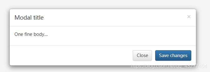
静态实例
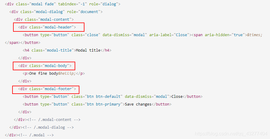
<div class="modal fade" tabindex="-1" role="dialog">
<div class="modal-dialog" role="document">
<div class="modal-content">
<div class="modal-header">
<button type="button" class="close" data-dismiss="modal" aria-label="Close"><span aria-hidden="true">×</span></button>
<h4 class="modal-title">Modal title</h4>
</div>
<div class="modal-body">
<p>One fine body…</p>
</div>
<div class="modal-footer">
<button type="button" class="btn btn-default" data-dismiss="modal">Close</button>
<button type="button" class="btn btn-primary">Save changes</button>
</div>
</div><!-- /.modal-content -->
</div><!-- /.modal-dialog -->
</div><!-- /.modal -->
分析一下上段的代码,我们从所见之处开始分析:
- 先看到的Modal title 明显与普通字体不同,
<h4 class="modal-title">Modal title</h4>
果然,h4的外标签,class样式为modal-title ,所见即所意。 - 第二块One fine body 所见即所意*2
html <div class="modal-body"> <p>One fine body…</p> </div>
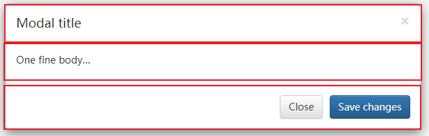
结构分析一下:
然后很明晰的是将整个div分成了三部分
动态实例
上下淡出

增强模态框可访问性
- 务必为
.modal添加role="dialog"和aria-labelledby="..."属性,用于指向模态框的标题栏

- 为
.modal-dialog添加aria-hidden="true"属性。
- 另外,你还应该通过
aria-describedby属性为模态框.modal添加描述性信息
可选尺寸
要大要小由你定~

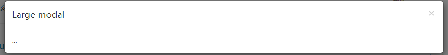

data-target=大or小
.bs-example-modal-lg
or
.bs-example-modal-sm
<!-- Large modal -->
<button type="button" class="btn btn-primary" data-toggle="modal" data-target=".bs-example-modal-lg">Large modal</button>

<div class="modal fade bs-example-modal-lg" tabindex="-1" role="dialog" aria-labelledby="myLargeModalLabel">
  <div class="modal-dialog modal-lg" role="document">
    <div class="modal-content">
      ...
    </div>
  </div>
</div>

<!-- Small modal -->
<button type="button" class="btn btn-primary" data-toggle="modal" data-target=".bs-example-modal-sm">Small modal</button>

<div class="modal fade bs-example-modal-sm" tabindex="-1" role="dialog" aria-labelledby="mySmallModalLabel">
  <div class="modal-dialog modal-sm" role="document">
    <div class="modal-content">
      ...
    </div>
  </div>
</div>
动画效果
如果你不需要模态框弹出时的动画效果(淡入淡出效果),删掉 .fade 类即可。
基本用法
通过data属性:
不需写 JavaScript 代码也可激活模态框。通过在一个起控制器作用的元素(例如:按钮)上添加 data-toggle="modal" 属性,或者 data-target="#foo" 属性,再或者 href="#foo" 属性,用于指向被控制的模态框。
<button type="button" data-toggle="modal" data-target="#myModal">Launch modal</button>
通过JavaScript调用:
find id
$('#myModal').modal(options)
参数
data的参数要方法到data-后,例如刚刚的data-backdrop等
| 名称 | 类型 | 默认值 | 描述 |
|---|---|---|---|
| backdrop | boolean 或 字符串 ‘static’ | true | 包括模态背景元素,或者,为了让单击时不关闭模式的背景 |
| keyboard | boolean | true | 键盘上的 esc 键被按下时关闭模态框 |
| show | boolean | true | 模态框初始化之后就立即显示出来 |
| remote | path | false | 自v3.3.0以来,此选项已被弃用,并已在v4中删除 |
方法:
- .modal(options)
将页面中的某块内容作为模态框激活。接受可选参数 object
$('#myModal').modal({
  keyboard: false
})
- .modal(‘toggle’)
手动打开或关闭模态框。在模态框显示或隐藏之前返回到主调函数中(也就是,在触发 shown.bs.modal 或 hidden.bs.modal 事件之前)。
$('#myModal').modal('toggle')
- .modal(‘show’)
手动打开模态框。在模态框显示之前返回到主调函数中 (也就是,在触发 shown.bs.modal 事件之前)
$('#myModal').modal('show')
- .modal(‘hide’)
手动隐藏模态框。在模态框隐藏之前返回到主调函数中 (也就是,在触发 hidden.bs.modal 事件之前)。
$('#myModal').modal('hide')
- .modal(‘handleUpdate’)
重新调整模态的位置,以防出现滚动条,从而使模态向左跳跃。
仅当模态打开时高度改变时才需要。
$('#myModal').modal('handleUpdate')
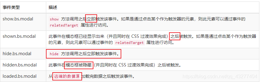
事件
模态框类提供的用于监听代码: