垂直对齐方式
场景:解决行内/行内块元素垂直对齐问题
vertical-align属性只对行内或行内块元素有效.
/* 默认值 基线对齐 */
vertical-align: baseline;
/ 底部对齐 */*
vertical-align: bottom;
/*中线对齐 */
vertical-align: middle;
/* 顶部对齐 */
vertical-align: top;
光标类型
border-radius:数值(百分比)
<!DOCTYPE html>
<html lang="en">

<head>
    <meta charset="UTF-8">
    <meta http-equiv="X-UA-Compatible" content="IE=edge">
    <meta name="viewport" content="width=device-width, initial-scale=1.0">
    <title>Document</title>
    <style>
        .box {


            width: 300px;
            height: 300px;
            background-color: pink;
            margin: 50px auto;
            /*  */
            /* border-radius: 10px; */
            /* 从左上角开始赋值 如果没有赋值看对角 */
            border-radius: 10px 40px;
            border-radius: 10px 40px 60px;
            /* 左上角 右上角  右下角  左下角  顺时针 */
            border-radius: 10px 40px 60px 90px;
            border-radius: 0 50%;
        }
    </style>
</head>

<body>
    <div class="box"></div>
</body>

</html>
overflow溢出部分显示效果
场景:控制内容溢出部分的显示效果,如:显示、隐藏、滚动条……
<!DOCTYPE html>
<html lang="en">

<head>
    <meta charset="UTF-8">
    <meta http-equiv="X-UA-Compatible" content="IE=edge">
    <meta name="viewport" content="width=device-width, initial-scale=1.0">
    <title>Document</title>
    <style>
        .box {


            /* 溢出部分显示效果 */
            /* 默认值 溢出部分可见 */
            overflow: visible;
            /* 溢出部分隐藏 */
            overflow: hidden;
            /* 无论是否溢出都显示滚动条 */
            overflow: scroll;
            /* 根据是否溢出,自动显示滚动条 */
            overflow: auto;
            width: 300px;
            height: 300px;
            background-color: pink;
        }
    </style>
</head>

<body>
    <div class="box">
        年少不知龙哥好,错把村花当成宝年少不知龙哥好,错把村花当成宝年少不知龙哥好,错把村花当成宝年少不知龙哥好,错把村花当成宝年少不知龙哥好,错把村花当成宝年少不知龙哥好,错把村花当成宝年少不知龙哥好,错把村花当成宝年少不知龙哥好,错把村花当成宝年少不知龙哥好,错把村花当成宝年少不知龙哥好,错把村花当成宝年少不知龙哥好,错把村花当成宝年少不知龙哥好,错把村花当成宝年少不知龙哥好,错把村花当成宝年少不知龙哥好,错把村花当成宝年少不知龙哥好,错把村花当成宝年少不知龙哥好,错把村花当成宝年少不知龙哥好,错把村花当成宝年少不知龙哥好,错把村花当成宝年少不知龙哥好,错把村花当成宝年少不知龙哥好,错把村花当成宝年少不知龙哥好,错把村花当成宝年少不知龙哥好,错把村花当成宝年少不知龙哥好,错把村花当成宝年少不知龙哥好,错把村花当成宝年少不知龙哥好,错把村花当成宝年少不知龙哥好,错把村花当成宝年少不知龙哥好,错把村花当成宝年少不知龙哥好,错把村花当成宝年少不知龙哥好,错把村花当成宝年少不知龙哥好,错把村花当成宝年少不知龙哥好,错把村花当成宝年少不知龙哥好,错把村花当成宝
    </div>
</body>
定位的盒子慎用 overflow: hidden;
文字溢出显示
<!DOCTYPE html>
<html lang="en">

<head>
    <meta charset="UTF-8">
    <meta http-equiv="X-UA-Compatible" content="IE=edge">
    <meta name="viewport" content="width=device-width, initial-scale=1.0">
    <title>Document</title>
    <style>
        .box {


            width: 160px;
            height: 20px;
            font-size: 16px;
            background-color: pink;
            /* 如果文字显示不开 自动换行 */
            /* white-space: normal; */
            /* 1 让换行的文字强制在一行显示 */
            white-space: nowrap;
            /* 2 溢出的部分隐藏 */
            overflow: hidden;
            /* 3 文字溢出显示用省略号 */
            text-overflow: ellipsis;

        }

        .box1 {


            /* 多行文本溢出显示省略号 */
            overflow: hidden;
            text-overflow: ellipsis;
            display: -webkit-box;
            -webkit-line-clamp: 3;
            -webkit-box-orient: vertical;
            width: 170px;
            height: 66px;
            background-color: red;
        }

        /*
        多行文本溢出必须有固定的高度
        有兼容性问题,ie浏览器不支持
        实际开发建议后端程序员来完成多行文字溢出功能.
        */
    </style>
</head>

<body>
    <div class="box">升降桌的体验天花板?9am智能升降桌Robin体验</div>
    <hr>
    <div class="box1">EOPN品牌 羽绒服男女装大鹅狼毛领2021冬季新款户外工装情侣派克服厚重4.5斤外套 石墨灰 M</div>
</body>

</html>
元素本身隐藏
 /* 隐藏元素本身 占位置 */
visibility: hidden;
 /* 隐藏元素本身 不占位置*/
 display: none;
<!DOCTYPE html>
<html lang="en">

<head>
    <meta charset="UTF-8">
    <meta http-equiv="X-UA-Compatible" content="IE=edge">
    <meta name="viewport" content="width=device-width, initial-scale=1.0">
    <title>Document</title>
    <style>
        div {


            width: 200px;
            height: 200px;
        }

        .box1 {


            /* 隐藏元素本身 占位置 */
            /* visibility: hidden; */
            /* 隐藏元素本身 不占位置*/
            display: none;
            background-color: red;
        }

        .box2 {


            background-color: purple;
        }

        .father {


            width: 500px;
            height: 500px;
            background-color: pink;
        }

        /* 1 让son盒子隐藏 */
        .son {


            display: none;
            width: 100px;
            height: 100px;
            background-color: blue;
        }

        /* 2 鼠标经过father盒子后让son显示出来 */
        .father:hover .son {


            display: block;
        }
    </style>
</head>

<body>
    <div class="box1">乔治</div>
    <div class="box2">小猪佩奇</div>
    <hr>
    <div class="father">
        <div class="son"></div>
    </div>
</body>

</html>
元素整体透明度
opacity:0.5;
属性值:0~1之间的数字
1:表示完全不透明
0:表示完全透明
opacity会让元素整体透明,包括里面的内容,如:文字、子元素等……
细线边框
border-collapse: collapse;
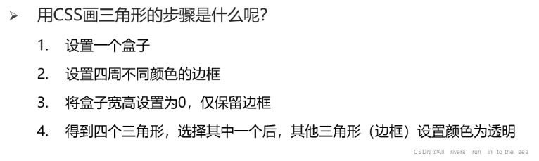
css画三角形
<!DOCTYPE html>
<html lang="en">

<head>
    <meta charset="UTF-8">
    <meta http-equiv="X-UA-Compatible" content="IE=edge">
    <meta name="viewport" content="width=device-width, initial-scale=1.0">
    <title>Document</title>
    <style>
        .box {


            /* width: 300px;
            height: 300px; */
            width: 0;
            height: 0;
            /* background-color: pink; */
            /* transparent 清澈 透明的 */
            border-top: 50px solid transparent;
            border-bottom: 50px solid green;
            border-left: 50px solid transparent;
            border-right: 50px solid transparent;
        }
    </style>
</head>

<body>
    <div class="box"></div>
</body>

</html>
链接伪类选择器
<!DOCTYPE html>
<html lang="en">

<head>
    <meta charset="UTF-8">
    <meta http-equiv="X-UA-Compatible" content="IE=edge">
    <meta name="viewport" content="width=device-width, initial-scale=1.0">
    <title>Document</title>
    <style>
        a {


            text-decoration: none;
        }

        /* 1 未访问过的状态 */
        a:link {


            color: red;
        }

        /* 2 访问之后的状态 */
        /* 0001+0010 =0011 */
        a:visited {


            color: blue;
        }

        /* 3 鼠标悬停时候的状态 */
        a:hover {


            color: green;
        }

        /* 4 鼠标按下未弹起时的状态 */
        a:active {


            color: orange;
        }

        /* 伪类选择器权重是10 */
        /* 如果要实现以上4种伪类选择器生效 必须遵循 LVHA的写法 */
    </style>
</head>

<body>
    <a href="#">百度一下</a>
</body>

</html>
焦点伪类
获得焦点的状态
只对表单元素有效
input:focus {


            background-color: pink;
        }
属性选择器
通常借助
html属性来选择元素,通常用于input标签选择具有att属性的E元素。
E[att]{}
选择具有att属性且属性值等于val的E元素。
E[att=“val”]{}
<!DOCTYPE html>
<html lang="en">

<head>
    <meta charset="UTF-8">
    <meta http-equiv="X-UA-Compatible" content="IE=edge">
    <meta name="viewport" content="width=device-width, initial-scale=1.0">
    <title>Document</title>
    <style>
        /* 选中input标签都具有type属性选择出来 */
        /* input[type] {
            width: 300px;
            height: 50px;
            border: 3px solid red;
        } */
        /* 选中input标签都具有type属性并且属性值是text才选择出来 */
        /* 0001+0010= 0011 */
        input[type="text"] {


            width: 300px;
            height: 50px;
            border: 3px solid red;
        }

        /* 属性选择器的权重是10 */
    </style>
</head>

<body>
    <input type="text">
    <input type="password">
</body>

</html>
<!DOCTYPE html>
<html lang="en">

<head>
    <meta charset="UTF-8">
    <meta http-equiv="X-UA-Compatible" content="IE=edge">
    <meta name="viewport" content="width=device-width, initial-scale=1.0">
    <title>Document</title>
    <style>
        ul li:nth-child(1) {


            cursor: default;
        }

        ul li:nth-child(2) {


            cursor: pointer;
        }

        ul li:nth-child(3) {


            cursor: zoom-in;
        }

        ul li:nth-child(4) {


            cursor: zoom-out;
        }

        ul li:nth-child(5) {


            cursor: move;
        }

        ul li:nth-child(6) {


            cursor: text;
        }

        ul li:nth-child(7) {


            cursor: not-allowed;
        }
    </style>
</head>

<body>
    <ul>
        <li>鼠标形状默认值 箭头</li>
        <li>鼠标形状 小手</li>
        <li>鼠标形状 放大 后期搭配js一起使用</li>
        <li>鼠标形状 缩小 后期搭配js一起使用</li>
        <li>鼠标形状 移动</li>
        <li>鼠标形状 文本</li>
        <li>鼠标形状 禁止</li>
    </ul>
</body>

</html>
边框圆角
border-radius:数值(百分比)
<!DOCTYPE html>
<html lang="en">

<head>
    <meta charset="UTF-8">
    <meta http-equiv="X-UA-Compatible" content="IE=edge">
    <meta name="viewport" content="width=device-width, initial-scale=1.0">
    <title>Document</title>
    <style>
        .box {


            width: 300px;
            height: 300px;
            background-color: pink;
            margin: 50px auto;
            /*  */
            /* border-radius: 10px; */
            /* 从左上角开始赋值 如果没有赋值看对角 */
            border-radius: 10px 40px;
            border-radius: 10px 40px 60px;
            /* 左上角 右上角  右下角  左下角  顺时针 */
            border-radius: 10px 40px 60px 90px;
            border-radius: 0 50%;
        }
    </style>
</head>

<body>
    <div class="box"></div>
</body>

</html>
overflow溢出部分显示效果
场景:控制内容溢出部分的显示效果,如:显示、隐藏、滚动条……
<!DOCTYPE html>
<html lang="en">

<head>
    <meta charset="UTF-8">
    <meta http-equiv="X-UA-Compatible" content="IE=edge">
    <meta name="viewport" content="width=device-width, initial-scale=1.0">
    <title>Document</title>
    <style>
        .box {


            /* 溢出部分显示效果 */
            /* 默认值 溢出部分可见 */
            overflow: visible;
            /* 溢出部分隐藏 */
            overflow: hidden;
            /* 无论是否溢出都显示滚动条 */
            overflow: scroll;
            /* 根据是否溢出,自动显示滚动条 */
            overflow: auto;
            width: 300px;
            height: 300px;
            background-color: pink;
        }
    </style>
</head>

<body>
    <div class="box">
        年少不知龙哥好,错把村花当成宝年少不知龙哥好,错把村花当成宝年少不知龙哥好,错把村花当成宝年少不知龙哥好,错把村花当成宝年少不知龙哥好,错把村花当成宝年少不知龙哥好,错把村花当成宝年少不知龙哥好,错把村花当成宝年少不知龙哥好,错把村花当成宝年少不知龙哥好,错把村花当成宝年少不知龙哥好,错把村花当成宝年少不知龙哥好,错把村花当成宝年少不知龙哥好,错把村花当成宝年少不知龙哥好,错把村花当成宝年少不知龙哥好,错把村花当成宝年少不知龙哥好,错把村花当成宝年少不知龙哥好,错把村花当成宝年少不知龙哥好,错把村花当成宝年少不知龙哥好,错把村花当成宝年少不知龙哥好,错把村花当成宝年少不知龙哥好,错把村花当成宝年少不知龙哥好,错把村花当成宝年少不知龙哥好,错把村花当成宝年少不知龙哥好,错把村花当成宝年少不知龙哥好,错把村花当成宝年少不知龙哥好,错把村花当成宝年少不知龙哥好,错把村花当成宝年少不知龙哥好,错把村花当成宝年少不知龙哥好,错把村花当成宝年少不知龙哥好,错把村花当成宝年少不知龙哥好,错把村花当成宝年少不知龙哥好,错把村花当成宝年少不知龙哥好,错把村花当成宝
    </div>
</body>
定位的盒子慎用 overflow: hidden;
文字溢出显示
<!DOCTYPE html>
<html lang="en">

<head>
    <meta charset="UTF-8">
    <meta http-equiv="X-UA-Compatible" content="IE=edge">
    <meta name="viewport" content="width=device-width, initial-scale=1.0">
    <title>Document</title>
    <style>
        .box {


            width: 160px;
            height: 20px;
            font-size: 16px;
            background-color: pink;
            /* 如果文字显示不开 自动换行 */
            /* white-space: normal; */
            /* 1 让换行的文字强制在一行显示 */
            white-space: nowrap;
            /* 2 溢出的部分隐藏 */
            overflow: hidden;
            /* 3 文字溢出显示用省略号 */
            text-overflow: ellipsis;

        }

        .box1 {


            /* 多行文本溢出显示省略号 */
            overflow: hidden;
            text-overflow: ellipsis;
            display: -webkit-box;
            -webkit-line-clamp: 3;
            -webkit-box-orient: vertical;
            width: 170px;
            height: 66px;
            background-color: red;
        }

        /*
        多行文本溢出必须有固定的高度
        有兼容性问题,ie浏览器不支持
        实际开发建议后端程序员来完成多行文字溢出功能.
        */
    </style>
</head>

<body>
    <div class="box">升降桌的体验天花板?9am智能升降桌Robin体验</div>
    <hr>
    <div class="box1">EOPN品牌 羽绒服男女装大鹅狼毛领2021冬季新款户外工装情侣派克服厚重4.5斤外套 石墨灰 M</div>
</body>

</html>
元素本身隐藏
 /* 隐藏元素本身 占位置 */
visibility: hidden;
 /* 隐藏元素本身 不占位置*/
 display: none;
<!DOCTYPE html>
<html lang="en">

<head>
    <meta charset="UTF-8">
    <meta http-equiv="X-UA-Compatible" content="IE=edge">
    <meta name="viewport" content="width=device-width, initial-scale=1.0">
    <title>Document</title>
    <style>
        div {


            width: 200px;
            height: 200px;
        }

        .box1 {


            /* 隐藏元素本身 占位置 */
            /* visibility: hidden; */
            /* 隐藏元素本身 不占位置*/
            display: none;
            background-color: red;
        }

        .box2 {


            background-color: purple;
        }

        .father {


            width: 500px;
            height: 500px;
            background-color: pink;
        }

        /* 1 让son盒子隐藏 */
        .son {


            display: none;
            width: 100px;
            height: 100px;
            background-color: blue;
        }

        /* 2 鼠标经过father盒子后让son显示出来 */
        .father:hover .son {


            display: block;
        }
    </style>
</head>

<body>
    <div class="box1">乔治</div>
    <div class="box2">小猪佩奇</div>
    <hr>
    <div class="father">
        <div class="son"></div>
    </div>
</body>

</html>
元素整体透明度
opacity:0.5;
属性值:0~1之间的数字
1:表示完全不透明
0:表示完全透明
opacity会让元素整体透明,包括里面的内容,如:文字、子元素等……
细线边框
border-collapse: collapse;