3天把JS过了一遍,因为网课太水就没能继续看下去,我知道这远远不够,计划研究JavaScript编程艺术,在此之前,先来一个小设计熟悉JS编程习惯:
案例介绍:
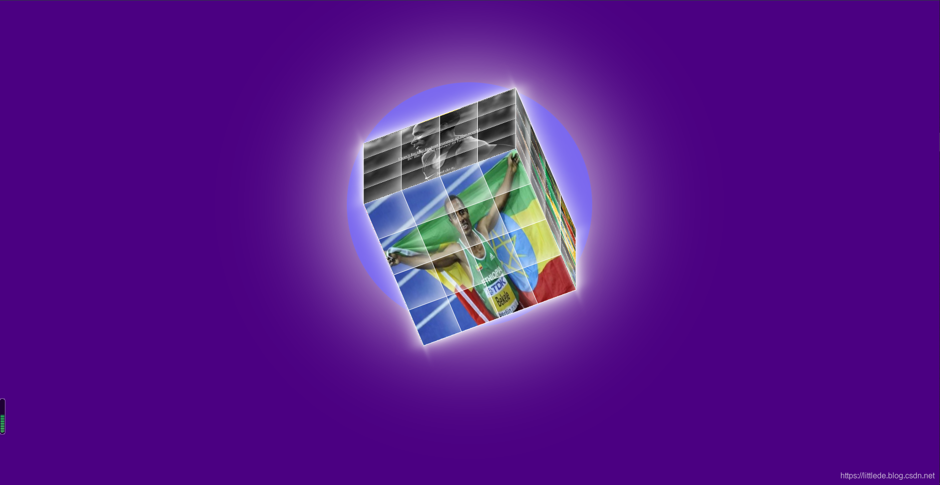
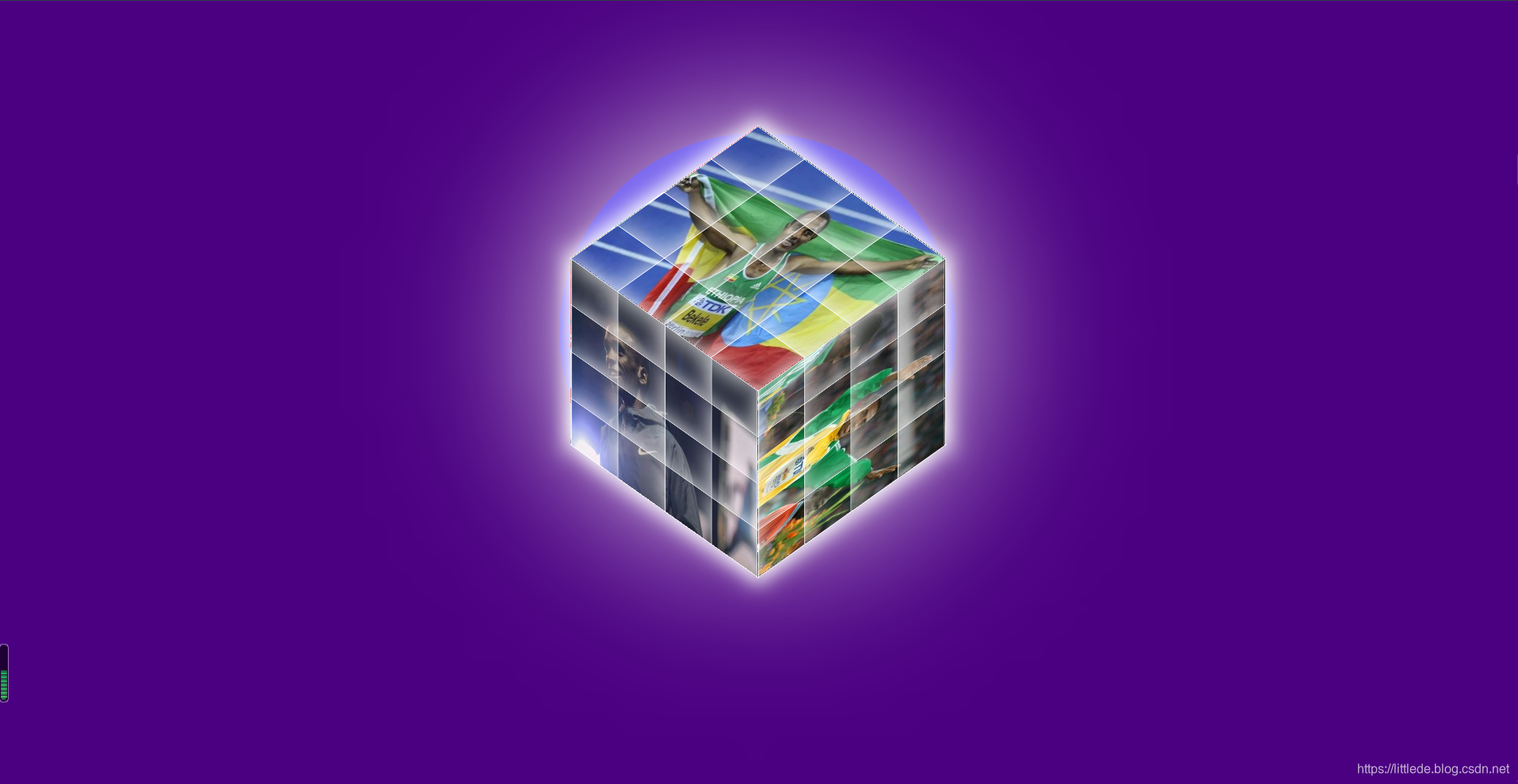
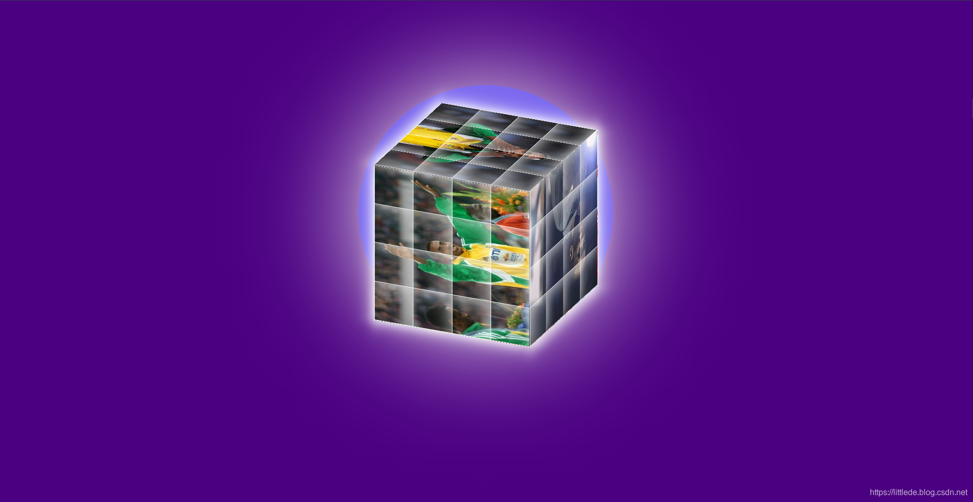
设计一个不停旋转的4阶魔方,魔方每一个面的方格能够依次飞出原位置,稳定在一个大的范围,紧接着旋转 恢复原位。魔方之下有一个圆形的发光区域。
HTML部分:
HTML部分主要是结构,包括了三个部分,魔方之下的圆形区域主容器container,装载魔方的区域box,魔方的6个面top,bottom,left,right,front,back,以及他们的公共部分page:
<html>
<head>
	<meta charset="utf-8">
	<title>sportCube</title>
	<link rel="stylesheet" type="text/css" href="CSS/sportCube.css">
</head>
<body>
	<div id="container">
		<div id="box">
			<div class="page top"></div>
			<div class="page bottom"></div>
			<div class="page left"></div>
			<div class="page right"></div>
			<div class="page front"></div>
			<div class="page back"></div>
		</div>
	</div>
	<script src="JS/sportCube.js">JS</script>
</body>
</html>
大体构架就画出来了:
CSS部分
在HTML设置好之后,要给区域设置样式
静态样式:
(1)背景颜色和container的边框阴影:
body{
	background-color:#4B0082;
}
#container{
	width: 600px;
	height: 600px;
	background-color:	#7B68EE;
	margin: 200px auto;
	border-radius: 300px;
	box-shadow: 0px 0px 250px white;
	border: 1px solid #7B68EE;
}
(2)魔方每个面的立体效果
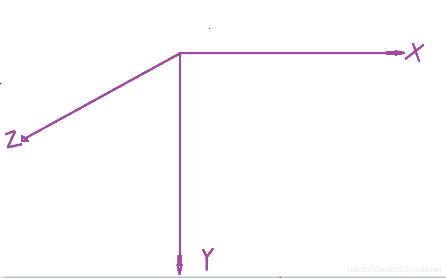
因为一开始区域内的6个面都叠加在一起,并没有我们想要的立体效果,所以这个时候我们要给每一个面设置3D样式,绕着X,Z轴做旋转:
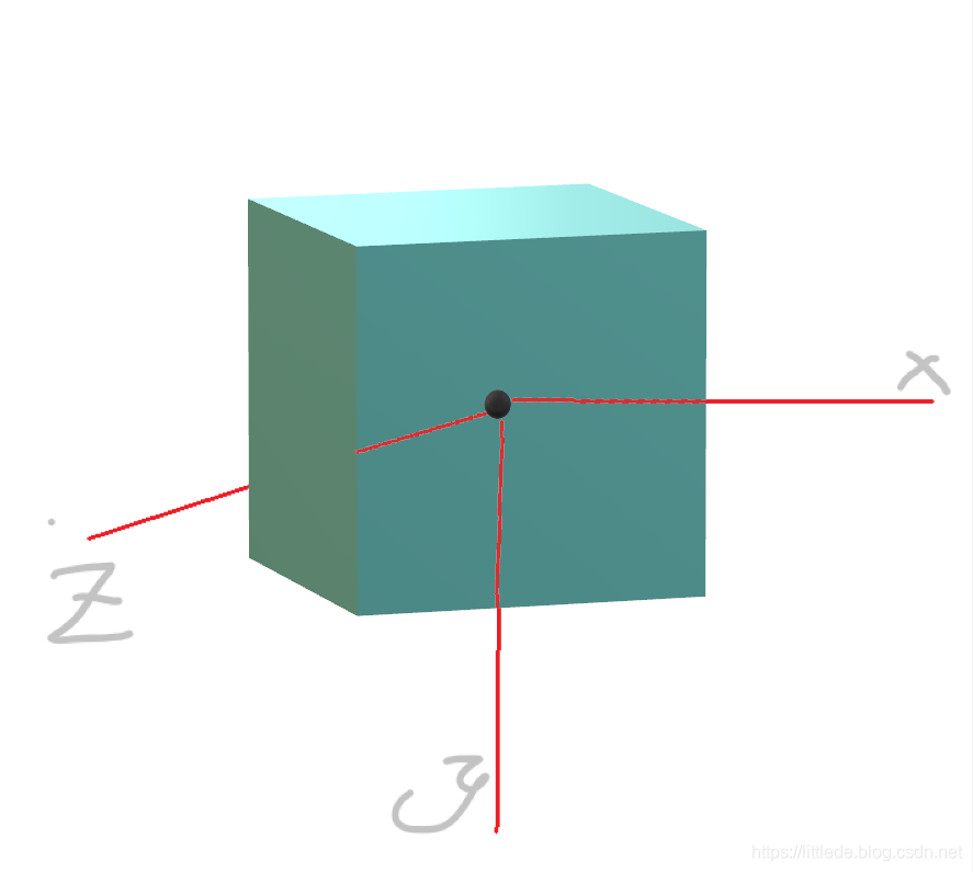
.top:沿着Y轴负方向平移200px,绕X轴旋转90度
.bottom:沿着Y轴正方向平移200px,绕X轴旋转-90度
.left:沿着X轴负方向平移200px,绕Y轴旋转-90度
.right:沿着X轴正方向平移200px,绕Y轴旋转90度
.front:沿着Z轴正方向平移200px
.back:沿着Z轴负方向平移200px,绕X轴旋转180度
值得注意的是,要保证每个面的正法向指向外部,以便后续统一的设置样式。
动态样式:
如何设置魔方主体的旋转?只要让整个魔方的box区域,绕着X,Y,Z轴旋转,设置动画animation属性,定义动画即可:
#box{
	width: 400px;
	height: 400px;
	margin: auto;
	transform-style: preserve-3d;
	animation: frame1 3s linear  infinite;
	transform: rotateX(45deg) rotateZ(45deg);
}
@keyframes frame1{
	0%{
		transform: rotateX(0deg) rotateY(0deg);
	}
	100%{
		transform: rotateX(360deg) rotateZ(360deg);
	}
}
这个时候魔方就能转起来了
*{
	margin: 0;
	padding: 0;
}
body{
	background-color:#4B0082;
}
#container{
	width: 600px;
	height: 600px;
	background-color:	#7B68EE;
	margin: 200px auto;
	border-radius: 300px;
	box-shadow: 0px 0px 250px white;
	border: 1px solid #7B68EE;
}
#box{
	width: 400px;
	height: 400px;
	margin: auto;
	transform-style: preserve-3d;
	animation: frame1 3s linear  infinite;
	transform: rotateX(45deg) rotateZ(45deg);
	position: relative;
	top: 130px;
}
@keyframes frame1{
	0%{
		transform: rotateX(0deg) rotateY(0deg);
	}
	100%{
		transform: rotateX(360deg) rotateZ(360deg);
	}
}
@keyframes frame2{
	0%{
		transform: translateZ(0px) scale(1) rotateZ(0deg);
	}
	35%{
		transform: translateZ(0px) scale(1) rotateZ(0deg);
	}
	55%{
		transform: translateZ(400px) scale(0.3) rotateZ(720deg);
	}
	85%{
		transform: translateZ(400px) scale(0.3) rotateZ(720deg);
	}
	100%{
		transform: translateZ(0px) scale(1) rotateZ(0deg);
	}
}
.page{
	width: 400px;
	height: 400px;
	position: absolute;
	transform-style: preserve-3d;
}
.top{
	transform: translateY(-200px) rotateX(90deg);
}
.bottom{
	transform: translateY(200px) rotateX(-90deg);
}
.left{
	transform: translateX(-200px) rotateY(-90deg);
}
.right{
	transform: translateX(200px) rotateY(90deg);
}
.front{
	transform: translateZ(200px);
}
.back{
	transform: translateZ(-200px) rotateX(180deg);
}
.page div:nth-child(1){
	animation: frame2  7s ease infinite;
}
.page div:nth-child(2){
	animation: frame2  7s ease 0.15s infinite;
}
.page div:nth-child(3){
	animation: frame2  7s ease 0.3s infinite;
}
.page div:nth-child(4){
	animation: frame2 7s ease 0.45s infinite;
}
.page div:nth-child(5){
	animation: frame2  7s ease 0.6s infinite;
}
.page div:nth-child(6){
	animation: frame2 7s ease 0.75s	infinite;
}
.page div:nth-child(7){
	animation: frame2 7s ease 0.9s infinite;
}
.page div:nth-child(8){
	animation: frame2  7s ease 1.05s	infinite;
}
.page div:nth-child(9){
	animation: frame2  7s ease 1.2s	infinite;
}
.page div:nth-child(10){
	animation: frame2  7s ease 0.3s infinite;
}
.page div:nth-child(11){
	animation: frame2 7s ease 0.45s infinite;
}
.page div:nth-child(12){
	animation: frame2  7s ease 0.6s infinite;
}
.page div:nth-child(13){
	animation: frame2 7s ease 0.75s	infinite;
}
.page div:nth-child(14){
	animation: frame2 7s ease 0.9s infinite;
}
.page div:nth-child(15){
	animation: frame2  7s ease 1.05s	infinite;
}
.page div:nth-child(16){
	animation: frame2  7s ease 1.2s	infinite;
}
JavaScript部分:
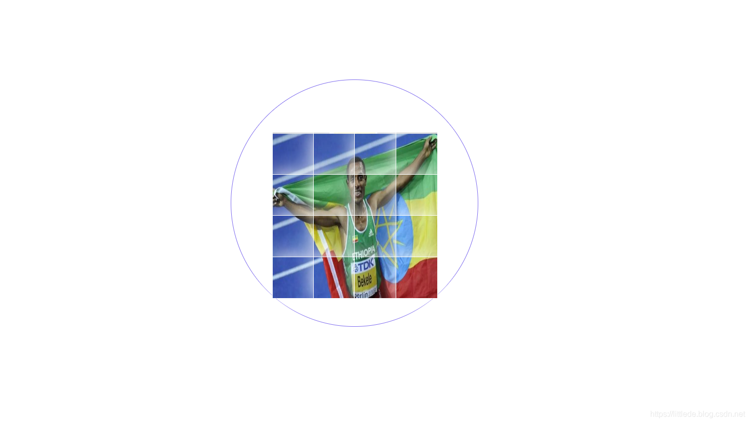
在JS部分,我们要给每一个面设置小图片,将整张图加在每一个面上,并且分割成16个小块,然后再给小块用CSS设置动画。
找到.page区域并给区域导入图片:
var arr=document.querySelectorAll(".page");//按选择器找到.page
for(var i=0;i<arr.length;i++)//历遍6个面
{
	for(var j=0;j<4;j++)//历遍4个层
	{
		for(var k=0;k<4;k++)//历遍4个列
		{
			var divs=document.createElement("div");//创建元素
			divs.style.cssText="width:100px;height:100px;border:1px solid white;position:absolute;background-image:url(images/"+(i+1)+".png);background-size:400px 400px;box-shadow:0px 0px 50px white";

			divs.style.top=j*100+"px";
			divs.style.left=k*100+"px";

			divs.style.backgroundPositionX=-k*100+"px";
			divs.style.backgroundPositionY=-j*100+"px";

			arr[i].appendChild(divs);
		}
	}
}
(1)在插入图片的时候,要设置图片的高和宽,另外如何选择图片的路径?我们要将图片按序号命名然后将路径名字符串拼接在一起:
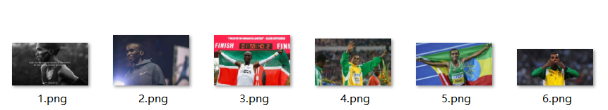
将路径名字符串拼接在一起:
background-image:url(images/"+(i+1)+".png);//注意i的范围
给每个方块设置边框,达到定位的效果:
	divs.style.top=j*100+"px";
	divs.style.left=k*100+"px";
给每一个方块设置背景位置偏移,达到每个方块显示一张图的对应部位:
	divs.style.backgroundPositionX=-k*100+"px";
	divs.style.backgroundPositionY=-j*100+"px";
(2)设置好这些之后,我们回头去设置CSS动画,让每一个面中的方块依次的飞出原位置,然后飞回原位置,同时又给每一个方块设置旋转,动画很好设置,那么如何定位到每一个方块呢?其实我们可以通过 .page div:nth-child(1)找到page下div区域的每一个子元素:
@keyframes frame2{
	0%{
		transform: translateZ(0px) scale(1) rotateZ(0deg);
	}
	35%{
		transform: translateZ(0px) scale(1) rotateZ(0deg);
	}
	55%{
		transform: translateZ(400px) scale(0.3) rotateZ(720deg);
	}
	85%{
		transform: translateZ(400px) scale(0.3) rotateZ(720deg);
	}
	100%{
		transform: translateZ(0px) scale(1) rotateZ(0deg);
	}
}
.top{
	transform: translateY(-200px) rotateX(90deg);
}
.bottom{
	transform: translateY(200px) rotateX(-90deg);
}
.left{
	transform: translateX(-200px) rotateY(-90deg);
}
.right{
	transform: translateX(200px) rotateY(90deg);
}
.front{
	transform: translateZ(200px);
}
.back{
	transform: translateZ(-200px) rotateX(180deg);
}
.page div:nth-child(1){
	animation: frame2  7s ease infinite;
}
.page div:nth-child(2){
	animation: frame2  7s ease 0.15s infinite;
}
.page div:nth-child(3){
	animation: frame2  7s ease 0.3s infinite;
}
.page div:nth-child(4){
	animation: frame2 7s ease 0.45s infinite;
}
.page div:nth-child(5){
	animation: frame2  7s ease 0.6s infinite;
}
.page div:nth-child(6){
	animation: frame2 7s ease 0.75s	infinite;
}
.page div:nth-child(7){
	animation: frame2 7s ease 0.9s infinite;
}
.page div:nth-child(8){
	animation: frame2  7s ease 1.05s	infinite;
}
.page div:nth-child(9){
	animation: frame2  7s ease 1.2s	infinite;
}
.page div:nth-child(10){
	animation: frame2  7s ease 0.3s infinite;
}
.page div:nth-child(11){
	animation: frame2 7s ease 0.45s infinite;
}
.page div:nth-child(12){
	animation: frame2  7s ease 0.6s infinite;
}
.page div:nth-child(13){
	animation: frame2 7s ease 0.75s	infinite;
}
.page div:nth-child(14){
	animation: frame2 7s ease 0.9s infinite;
}
.page div:nth-child(15){
	animation: frame2  7s ease 1.05s	infinite;
}
.page div:nth-child(16){
	animation: frame2  7s ease 1.2s	infinite;
}
为了有依次飞出的效果,我们给每个动画设置了一个延迟,这样一来就能看到方块依次飞出的效果了。
下面是展示:
HTML+CSS+JS运动魔方实现sportCube
