SwiftUI小功能模块系列
0001、SwiftUI自定义Tabbar动画效果
0002、SwiftUI自定义3D动画导航抽屉效果
技术:SwiftUI3.0、侧边栏、抽屉菜单
运行环境:
SwiftUI3.0 + Xcode13.3.1 + MacOS12.1 + iPhone Simulator iPhone 13 Pro Max
SwiftUI自定义3D动画导航抽屉效果
概述
使用SwiftUI搭建一个做一个自定义侧边栏抽屉菜单
详细
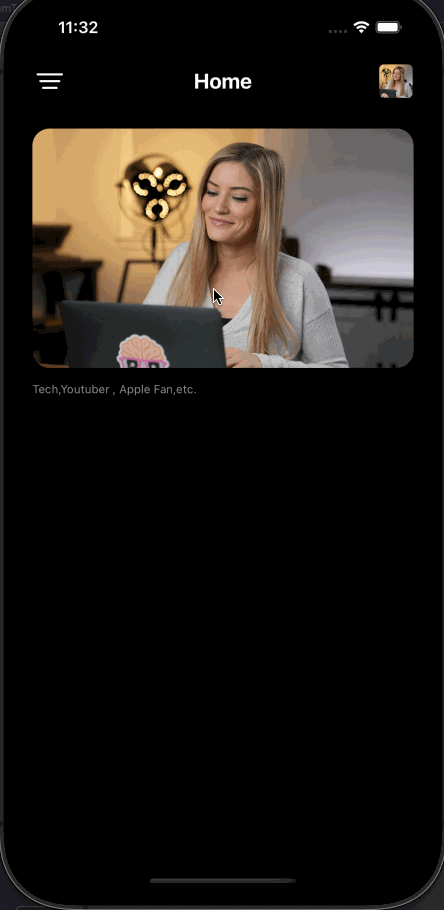
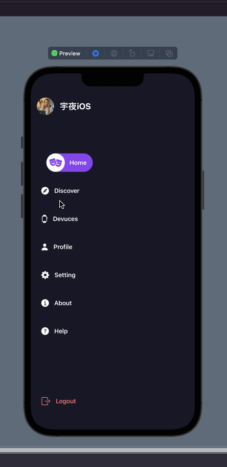
一、运行效果
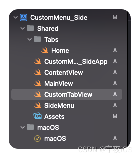
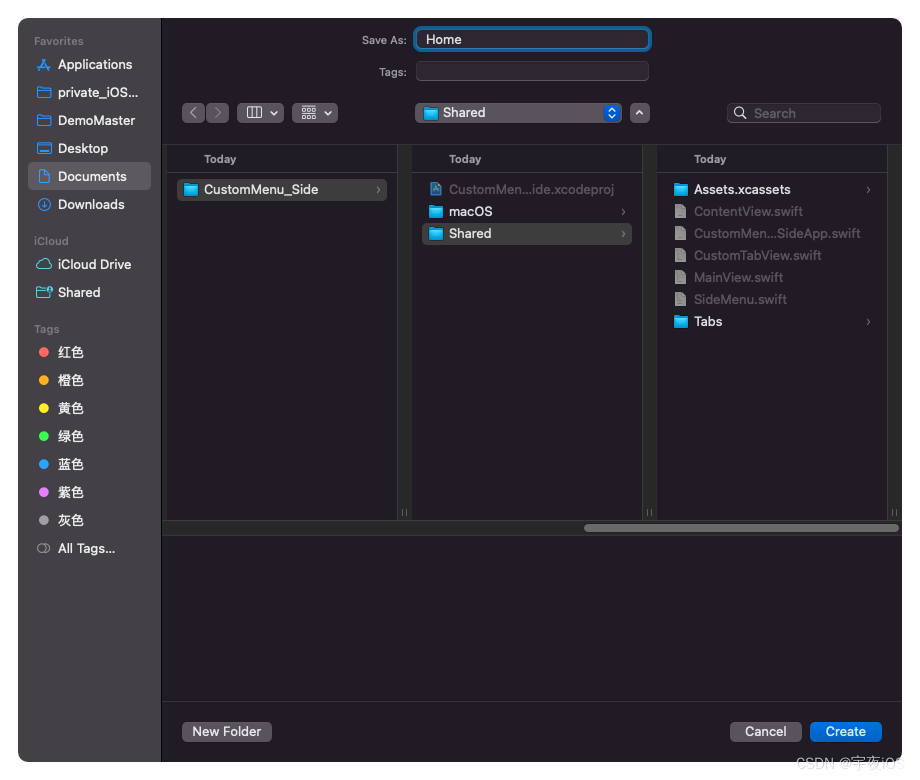
二、项目结构图
三、程序实现 - 过程
思路:
1.创建侧边栏菜单
2.再创建菜单页面(主屏)
3.菜单页面(主屏)展示侧边栏使用 使用位置偏移
4.展示的时候 添加一个3D动画即可
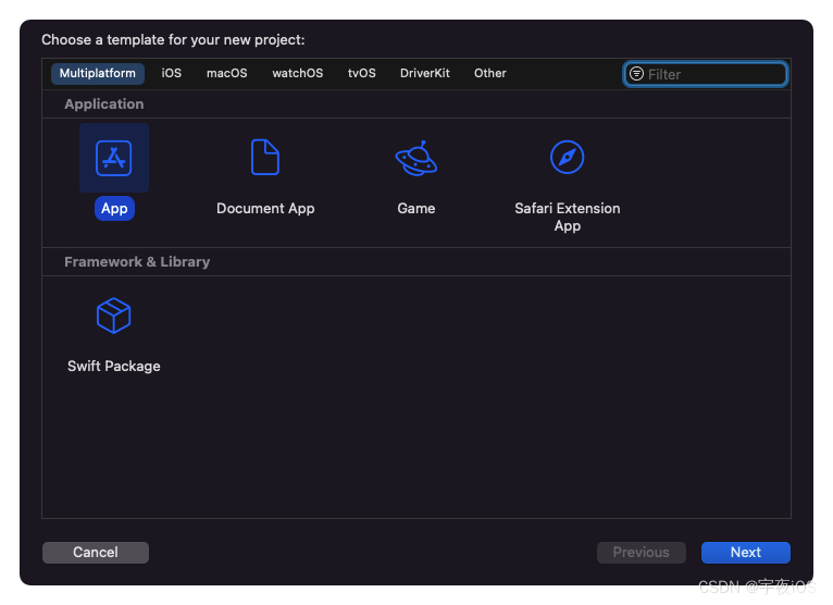
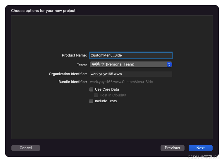
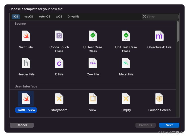
1.创建一个项目命名为 CustomMenu_Side
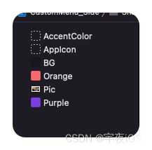
1.1.引入资源文件和配置色调
色调值为:
BG : #171726
Orange : #EE7577
Purple : #8346E8
随机找一张横的图片即可
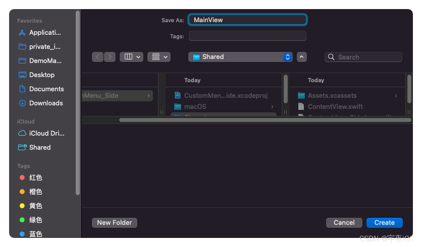
2.创建一个SWiftUI View 命名为MainView
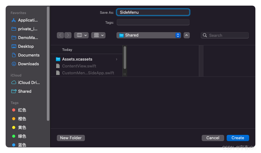
3.创建一个SWiftUI View 命名为SideMenu
4.创建一个SWiftUI View 命名为CustomTabView
5.创建一个SWiftUI View 命名为Home
Code
SideMenu.swift
主要时做侧边栏 抽屉功能
//
//  SideMenu.swift
//  CustomMenu_Side
//
//  Created by 李宇鸿 on 2022/5/7.
//

import SwiftUI

struct SideMenu: View {


    // 由上层传递标记
    @Binding var currentTab : String


    // Adding Smooth Transition between tabs with the help of
    // 在选项卡之间添加平滑过渡的帮助

    // Matched Geometry Effect...
    // 匹配的几何效应……
    @Namespace var animation

    var body: some View {


        VStack(){


            HStack(spacing: 15){


                // icon
                Image("Pic")
                    .resizable()
                    .aspectRatio(contentMode: .fill)
                    .frame(width:45,height: 45)
                    .clipShape(Circle())

                // text

                Text("宇夜iOS")
                    .font(.title2).bold()
                    .foregroundColor(.white)
            }
            .padding()
            .frame(maxWidth:.infinity,alignment: .leading)

            // Tab Buttons
            // For small screens
            // 对于小屏幕进行适配
            ScrollView(getRect().height < 750 ? .vertical : .init(), showsIndicators: false, content: {


                VStack(alignment:.leading,spacing: 25)
                {


                    CustomTabButton(icon: "theatermasks.fill", title: "Home")
                    CustomTabButton(icon: "safari.fill", title: "Discover")
                    CustomTabButton(icon: "applewatch", title: "Devuces")
                    CustomTabButton(icon: "person.fill", title: "Profile")
                    CustomTabButton(icon: "gearshape.fill", title: "Setting")
                    CustomTabButton(icon: "info.circle.fill", title: "About")
                    CustomTabButton(icon: "questionmark.circle.fill", title: "Help")

                    Spacer()

                    // making Logout as costant button with orange color ...
                    // 将注销作为固定按钮,颜色为橙色…
                    CustomTabButton(icon: "rectangle.portrait.and.arrow.right", title: "Logout")


                }
                .padding()
                .padding(.top,60)
                .padding(.leading,10)
            })

            // Max width of screen width
            // 最大屏幕宽度
            .frame(width:getRect().width / 2,alignment: .leading)
            .frame(maxWidth:.infinity,alignment: .leading)

        }
        .frame(maxWidth:.infinity,maxHeight: .infinity,alignment: .top)
        .background(
            Color("BG")
        )
    }


    // Custom Button ....
    // 自定义按钮
    @ViewBuilder
    func CustomTabButton(icon: String,title: String) -> some View {


        Button {


            if title == "Logout" {


                // Do Action here >>>
                // 在这里 做退出操作
                print("Logout")
            }
            else {


                    withAnimation {


                        currentTab = title
                    }
            }
        } label: {


            HStack(spacing: 12){


                Image(systemName: icon)
                    .font(.title3)
                    .frame(width: currentTab == title ? 48: nil, height: 48)
                    .foregroundColor(currentTab == title ? Color("Purple") : (title == "Logout" ? Color("Orange") : .white))
                    .background(

                        ZStack{


                            if currentTab == title {


                                Color.white
                                    .clipShape(Circle())
                                    .matchedGeometryEffect(id: "TABCIRCLE", in: animation)

                            }
                        }

                    )

                Text(title)
                    .font(.callout)
                    .fontWeight(.semibold)
                    .foregroundColor(title == "Logout" ? Color("Orange") : .white)
            }
            .padding(.trailing)
            .background(


                ZStack {


                    if currentTab == title {


                        Color("Purple")
                            .clipShape(Capsule()) // 胶囊形状
                            .matchedGeometryEffect(id: "TABCAPSULE", in: animation)

                    }
                }
            )
        }
        .offset(x: currentTab == title ? 15 : 0)

    }

}

struct SideMenu_Previews: PreviewProvider {


    static var previews: some View {


        ContentView()
    }
}


// Extending View to get Screent Bounds...
// 扩展视图获得屏幕边界…
extension View {


    func getRect() -> CGRect {


        return UIScreen.main.bounds
    }
}
效果图 - SideMenu
CustomTabView.swift
主要是做页面展示
展示侧边栏 时显示左上角按钮显示关闭按钮、并且页面无法操作
显示全屏页面时 时显示左上角按钮显示菜单按钮
//
//  CustomTabView.swift
//  CustomMenu_Side
//
//  Created by 李宇鸿 on 2022/5/7.
//

import SwiftUI

struct CustomTabView: View {


    // 由上层传递标记
    @Binding var currentTab : String

    @Binding var showMenu : Bool


    var body: some View {


        VStack{


            HStack{


                // Menu Button ...
                // 菜单按钮
                Button {


                    // Togging Menu Option ...
                    withAnimation(.spring()){


                        showMenu = true
                    }
                } label: {


                    Image(systemName: "line.3.horizontal.decrease")
                        .font(.title)
                        .foregroundColor(.white)
                }
                // Hiding When Menu is Visible...
                //  当菜单可见时隐藏…
                .opacity(showMenu ? 0 : 1)

                //
                Spacer()

                Button {


                    //
                } label: {


                    Image("Pic")
                        .resizable()
                        .aspectRatio(contentMode: .fill)
                        .frame(width:35,height: 35)
                        .cornerRadius(5)
                }


            }
            // Page Title
            // 覆盖
            .overlay(
                Text(currentTab)
                    .font(.title2.bold())
                    .foregroundColor(.white)
            )
            .padding([.horizontal,.top])
            .padding(.bottom,8)
            .padding(.top,getSfafeArea().top)

            TabView(selection: $currentTab) {


                Home()
                    .tag("Home")

                // Replace Your Cusotm Views here ...
                // 在这里替换你的自定义视图…
                Text("Discover")
                    .tag("Discover")

                Text("Devices")
                    .tag("Devices")

                Text("Profiles")
                    .tag("Profiles")


            }

        }
        // Disabling actions when menu is visible...
        // 当菜单可见时禁用操作…
        .disabled(showMenu)
        .frame(maxWidth:.infinity,maxHeight: .infinity)
        .overlay(
            // Close Button ...
            // 菜单按钮
            Button {


                // Togging Menu Option ...
                withAnimation(.spring()){


                    showMenu = false
                }
            } label: {


                Image(systemName: "xmark")
                    .font(.title)
                    .foregroundColor(.white)
            }
            // Hiding When Menu is Visible...
            //  当菜单可见时隐藏…
                .opacity(showMenu ? 1 : 0)
                .padding()
                .padding(.top)
            ,alignment: .topLeading
        )
        .background(
            Color.black
        )
    }
}

struct CustomTabView_Previews: PreviewProvider {


    static var previews: some View {


        ContentView()
    }
}
MainView.Swift
主要展示2个东西、3D动画操作
- 是侧边栏菜单和主页内容
- 当显示侧边栏菜单时.将主屏页面进行一个3D动画并且 将主屏页面偏移到屏幕中间部分
//
//  MainView.swift
//  CustomMenu_Side
//
//  Created by 李宇鸿 on 2022/5/7.
//

import SwiftUI

struct MainView: View {


    // Current Tab ...
    @State var currentTab : String = "Home"


    // Menu Option ...
    // 菜单选项
    @State var showMenu : Bool = false

    // Hiding Native Tab Bar ...
    // 隐藏本地标签栏…
    init(){


        UITabBar.appearance().isHidden = true
    }

    var body: some View {


        ZStack{


            // Custom Side Menu...
            // 自定义侧菜单……
            SideMenu(currentTab:$currentTab)


            // Main Tab View ....
            // 主标签页的页面....
            CustomTabView(currentTab:$currentTab,showMenu:$showMenu)
            // Appling Corner Radius ...
            // 添加圆角
                .cornerRadius(showMenu ? 25 : 0)

            //  Making 3D rotation
                .rotation3DEffect(.init(degrees:  showMenu ? -15 : 0), axis: (x: 0, y: 1, z: 0),anchor: .trailing)
            // Moving view Apart...
            // 移动视图分开……
                .offset(x : showMenu ? getRect().width / 2 : 0)
                .ignoresSafeArea()

        }
        // Always Dark Mode...
        // 总是黑暗的模式…
        .preferredColorScheme(.dark)
    }
}

struct MainView_Previews: PreviewProvider {


    static var previews: some View {


        MainView()
    }
}

// Extending View to get Safe Area Values
// 扩展视图以获取安全区值
extension View {


    func getSfafeArea() -> UIEdgeInsets {


        guard let screen = UIApplication.shared.connectedScenes.first as? UIWindowScene
        else {


            return .zero
        }
        guard let safeArea = screen.windows.first?.safeAreaInsets else {


            return.zero
        }
        return safeArea
    }
}
Home.swift
主要展示模块的内容
- 显示一个页面
//
//  Home.swift
//  CustomMenu_Side
//
//  Created by 李宇鸿 on 2022/5/7.
//

import SwiftUI

struct Home: View {


    var body: some View {


        ScrollView(.vertical,showsIndicators: false){


            VStack(alignment: .leading, spacing: 15) {


                Image("Pic")
                    .resizable()
                    .aspectRatio(contentMode: .fill)
                    .frame(width:getRect().width - 30,height:250)
                    .cornerRadius(18)

                Text("Tech,Youtuber , Apple Fan,etc.")
                    .font(.caption)
                    .foregroundColor(.gray)
            }
            .padding()
        }

    }
}

struct Home_Previews: PreviewProvider {


    static var previews: some View {


        Home()
    }
}