一、爬虫部分
爬虫说明:
1、本爬虫是以面向对象的方式进行代码架构的
2、本爬虫爬取的数据存入到MongoDB数据库中
3、爬虫代码中有详细注释
4、博客末尾附有源码 源码中包含数据库文件和数据集文件
代码展示
import re
import requests
import json
from pymongo import MongoClient
class COVID_19():
    def __init__(self):
        # 入口url
        self.start_url = 'https://view.inews.qq.com/g2/getOnsInfo?name=disease_h5'
        # 构造响应头
        self.headers = {


            "user-agent": "Mozilla/5.0 (Windows NT 10.0; WOW64) AppleWebKit/537.36 (KHTML, like Gecko) Chrome/87.0.4280.141 Safari/537.36"
        }
        # 初始化MongoDB数据库连接
        self.client = MongoClient()
        self.collection = self.client['test']['covid_19']


    # 请求数据并解析
    def parse(self,url):
        rest = requests.get(url, headers=self.headers)
        return rest.content.decode()

    # 获取数据
    def get_content_list(self,str_html):
        json_html = json.loads(str_html)
        # 获取data对应的数据
        data = json_html['data']
        # 由于data对应的数据是字符串的json数据因此需要进步转换成json数据
        json_data = json.loads(data)

        # 按照省进行分组
        province_list = json_data['areaTree'][0]['children']
        # 遍历省 获取没个省下的区域数据
        for province in province_list:
            # 按照区域进行分组
            area_list = province['children']
            for area in area_list:
                item = {

    }
                item['省'] = province['name']
                item['市'] = area['name']
                item['现有确诊'] = area['total']['nowConfirm']
                item['累计确诊'] = area['total']['confirm']
                item['治愈人数'] = area['total']['heal']
                item['治愈率'] = area['total']['healRate']
                item['死亡人数'] = area['total']['dead']
                item['死亡率'] = area['total']['deadRate']
                print(item)
                self.save(item)

    # 保存数据
    def save(self,item):
        self.collection.insert(item)

    # 主函数
    def run(self):
        str_html = self.parse(self.start_url)
        self.get_content_list(str_html)

if __name__ == '__main__':
    covid = COVID_19()
    covid.run()
响应数据

二、数据分析和数据可视化部分
数据分析和数据可视化说明:
1、本博客通过Flask框架来进行数据分析和数据可视化
2、项目的架构图为

代码展示
- 数据分析代码展示(analysis.py)
from pymongo import MongoClient
import pandas as pd
import numpy as np
import pymysql

# 各省累计确诊人数
def acc_suffer_count(df):
    # 按照省进行分组
    grouped = df.groupby('省')['累计确诊'].sum().reset_index().sort_values('累计确诊',ascending=False)
    data = [[i['省'],i['累计确诊']] for i in grouped.to_dict(orient="records")]
    print(data)
    return data

# 各省现有确诊人数
def now_suffer_count(df):
    grouped = df.groupby(['省'])['现有确诊'].sum().reset_index().sort_values("现有确诊",ascending=False)
    data = [[i['省'],i['现有确诊']] for i in grouped.to_dict(orient="records")]
    print(data)
    return data

# # 各省治愈率
def heal_rate(df):
    # 治愈率 = 治愈人数/累计确诊人数
    # 按照省进行分组并求出累计确诊人数和治愈人数
    grouped = df.groupby('省')[['累计确诊','治愈人数']].sum().reset_index()
    grouped['治愈率'] = grouped['治愈人数']/grouped['累计确诊']
    # 治愈率保留三位小数
    grouped['治愈率'] = grouped['治愈率'].apply(lambda x:round(x,3))
    data = [[i['省'],i['治愈率'],i['治愈人数']] for i in grouped.to_dict(orient="records")]
    print(data)
    return data

# 北上广的疫情情况对比
def four_city_compare(df):
    # 按照省进行分组
    grouped = df.groupby('省').sum()
    # 计算北上广的治愈率与死亡率
    grouped['治愈率'] = grouped['治愈人数']/grouped['累计确诊']
    grouped['死亡率'] = grouped['死亡人数']/grouped['累计确诊']
    # 处理治愈率和死亡率 保留三位小数
    grouped['治愈率'] = grouped['治愈率'].apply(lambda x:round(x,3))
    grouped['死亡率'] = grouped['死亡率'].apply(lambda x:round(x,3))
    # 取出北上广的疫情数据
    cities = grouped.loc[['北京','上海','广东']]
    data = cities.reset_index()
    print(data)
    data = [[i['省'],i['累计确诊'],i['现有确诊'],i['治愈人数'],i['死亡人数'],i['治愈率'],i['死亡率']] for i in data.to_dict(orient="records")]
    print(data)
    return data

if __name__ == '__main__':
    client = MongoClient()
    collection = client['test']['covid_19']
    rest = collection.find({

    },{

    '_id':0})
    df = pd.DataFrame(rest)
    # 打印基础信息
    print(df.info())
    print(df.head(1))

    # 各省累计确诊人数
    # data = acc_suffer_count(df)

    # 各省现有确诊人数
    # data = now_suffer_count(df)

    # 各省治愈率
    # data = heal_rate(df)

    # 北上广深的疫情情况对比
    data = four_city_compare(df)

    # 初始化数据库连接 将数据存入到mysql中
    conn = pymysql.connect(host='localhost',user='root',password='123456',port=3306,database='covid_19',charset='utf8')
    with conn.cursor() as cursor:
        # 各省累计确诊人数
        # sql = 'insert into db_province_acc_count(province,acc_count) values(%s,%s)'
        # 各省现有确诊人数
        # sql = 'insert into db_province_now_count(province,now_count) values(%s,%s)'
        # 各省治愈率
        sql = 'insert into db_province_heal_rate(province,heal_rate,heal_count) values(%s,%s,%s)'
        # 北上广的疫情情况对比
        # sql = 'insert into db_province_bsg(province,acc_count,now_count,heal_count,dead_count,heal_rate,dead_rate) values(%s,%s,%s,%s,%s,%s,%s)'
        try:
            rest = cursor.executemany(sql, data)
            if rest:
                print("插入成功")
            conn.commit()
        except pymysql.MySQLError as err:
            print(err)
            conn.rollback()
        finally:
            conn.close()
- 数据库模型文件展示(models.py)
from api_1_0 import db

# 各省累计确诊人数模型
class ProvinceAccCount(db.Model):
    __tablename__ = "db_province_acc_count"
    id = db.Column(db.Integer,primary_key=True,autoincrement=True)
    province = db.Column(db.String(64),nullable=False)
    acc_count = db.Column(db.Integer,nullable=False)

# 各省累计确诊人数模型
class ProvinceNowCount(db.Model):
    __tablename__ = "db_province_now_count"
    id = db.Column(db.Integer,primary_key=True,autoincrement=True)
    province = db.Column(db.String(64),nullable=False)
    now_count = db.Column(db.Integer,nullable=False)

# 治愈率最高的前16个省模型
class ProvinceHealRate(db.Model):
    __tablename__ = "db_province_heal_rate"
    id = db.Column(db.Integer, primary_key=True, autoincrement=True)
    province = db.Column(db.String(64), nullable=False)
    heal_count = db.Column(db.Integer,nullable=False)
    heal_rate = db.Column(db.Float, nullable=False)

# 北上广的疫情情况模型
class ProvinceBSG(db.Model):
    __tablename__ = "db_province_bsg"
    id = db.Column(db.Integer, primary_key=True, autoincrement=True)
    province = db.Column(db.String(64), nullable=False)
    acc_count = db.Column(db.Integer, nullable=False)
    now_count = db.Column(db.Integer, nullable=False)
    heal_count = db.Column(db.Integer, nullable=False)
    dead_count = db.Column(db.Integer, nullable=False)
    heal_rate = db.Column(db.Float, nullable=False)
    dead_rate = db.Column(db.Float, nullable=False)
- 配置文件代码展示(config.py)
class Config(object):
    SECRET_KEY = "madong19990512"
    SQLALCHEMY_DATABASE_URI = "mysql://root:123456@localhost:3306/covid_19"
    SQLALCHEMY_TRACK_MODIFICATIONS = False

class DevelopmentConfig(Config):
    DEBUG = True


class ProductConfig(Config):
    pass

config_map = {


    'develop':DevelopmentConfig,
    'product':ProductConfig
}
- 主工程目录代码展示(api_1_0/_init_.py)
from flask import Flask
from flask_sqlalchemy import SQLAlchemy
from config  import config_map
import pymysql
pymysql.install_as_MySQLdb()

db = SQLAlchemy()


def createApp(config_name='develop'):
    # 创建app对象
    app = Flask(__name__)
    config_object = config_map[config_name]
    app.config.from_object(config_object)

    # 加载db
    db.init_app(app)

    # 注册蓝图
    from api_1_0 import views
    app.register_blueprint(views.blue,url_prefix="/show")

    return app
- 主程序文件代码展示(manager.py)
from api_1_0 import createApp,db
from flask_migrate import Migrate,MigrateCommand
from flask_script import Manager
from flask import render_template

app = createApp()

manager = Manager(app)

Migrate(app,db)

manager.add_command('db',MigrateCommand)

@app.route('/')
def index():
    return render_template('index.html')


if __name__ == '__main__':
    manager.run()
- 视图文件代码展示(api_1_0/views/_init_.py,show.py)
__init__.py
from flask import Blueprint
from api_1_0 import models
blue = Blueprint('show',__name__)

from . import show
show.py
from api_1_0.models import ProvinceAccCount,ProvinceBSG,ProvinceNowCount,ProvinceHealRate
from . import blue
from flask import render_template
import pandas as pd
import numpy as np

# 各省累计确诊人数分布图&各省现有确诊人数分布图
@blue.route('/drawGeo')
def drawGeo():
    # 获取各省累计确诊人数数据
    pro_acc_count = ProvinceAccCount.query.all()
    # 构造列表嵌套字典格式的数据 方便echarts渲染地图
    data1 = [{

    'name':i.province,'value':i.acc_count} for i in pro_acc_count]
    # 去掉一个最高 去掉一个最低 防止因极差值较大而导致地图颜色显示不明显
    min1 = sorted(data1,key=lambda x:x['value'])[1]['value']
    max1 = sorted(data1,key=lambda x:x['value'])[-2]['value']

    # 获取各省现有确诊人数数据
    pro_now_count = ProvinceNowCount.query.all()
    # 构造列表嵌套字典格式的数据 方便echarts渲染地图
    data2 = [{

    'name': i.province, 'value': i.now_count} for i in pro_now_count]
    # 去掉一个最高 去掉一个最低 防止因极差值较大而导致地图颜色显示不明显
    min2 = sorted(data2, key=lambda x: x['value'])[1]['value']
    max2 = sorted(data2, key=lambda x: x['value'])[-2]['value']
    return render_template('drawGeo.html', **locals())

# 各省治愈率柱状折现图
@blue.route('/drawBar')
def drawBar():
    # 获取各省治愈率和治愈人数数据
    pro_heal_rate = ProvinceHealRate.query.all()
    # 构造列表数据 方便echarts渲染柱状图
    province = [i.province for i in pro_heal_rate]
    rate = [i.heal_rate for i in pro_heal_rate]
    heal_count = [i.heal_count for i in pro_heal_rate]
    return render_template('drawBar.html',**locals())

# 北上广的疫情情况对比雷达图
@blue.route('/drawRadar')
def drawRadar():
    pro_bsg = ProvinceBSG.query.all()
    # 取出数据并将数据构造成列表嵌套字典的形式
    data = [{

    '省':i.province,'累计确诊':i.acc_count
            ,'现有确诊':i.now_count,'治愈人数':i.heal_count,'死亡人数':i.dead_count
            ,'治愈率':i.heal_rate,'死亡率':i.dead_rate} for i in pro_bsg]
    # 将数据转换成dataFrame类型进行处理
    df = pd.DataFrame(data)
    # 分别求出每一个列索引的最大值 并转换成列表嵌套字典的样式 再通过切片操作将省字段剔除
    grouped = df.max().reset_index().to_dict(orient="records")[1:]
    # 将雷达图的最大值在原有值的基础上加上原有数据值的十分之一 使雷达图更加美观
    indicator_data = [{

    'name':i['index'],'max':float(i[0])+float(i[0])/10} for i in grouped if not i['index']=="死亡率" and not i['index']=="治愈率" ]
    indicator_data.append({

    'name':'治愈率','max':1})
    indicator_data.append({

    'name':'死亡率','max':1})
    # 分别去除北京、上海、广州的疫情数据
    # 由于np.int64无法被json解析 所以统一转换成python的int类型
    bj_data = df.loc[0].tolist()[1:]
    bj_data = [float(i) for i in bj_data]
    sh_data = df.loc[1].tolist()[1:]
    sh_data = [float(i) for i in sh_data]
    gd_data = df.loc[2].tolist()[1:]
    gd_data = [float(i) for i in gd_data]
    print(gd_data,bj_data,sh_data)
    return render_template('drawRadar.html',**locals())
- 主页展示(index.html)
主页简单创建了四个超链接指向对应的图表
<!DOCTYPE html>
<html lang="en">
<head>
    <meta charset="UTF-8">
    <title>首页说明</title>
    <style>
        .container{


            width: 100%;
            height: 600px;
            padding: 40px;
            line-height: 60px;
        }
        ul{


            margin: auto;
            width: 60%;
        }
    </style>
</head>
<body>
    <div class="container">
        <ul>
            <li><a href="http://127.0.0.1:5000/show/drawGeo" target="_blank"><h3>各省累计确诊人数分布图&各省现有确诊人数分布图</h3></a></li>
            <li><a href="http://127.0.0.1:5000/show/drawBar" target="_blank"><h3>各省治愈率柱状折现图</h3></a></li>
            <li><a href="http://127.0.0.1:5000/show/drawRadar" target="_blank"><h3>北上广的疫情情况对比雷达图</h3></a></li>
        </ul>
    </div>
</body>
</html>

- 模板文件代码展示(drawBar.html,drawGeo.html,drawRadar.html)
drawGeo.html
<!DOCTYPE html>
<html lang="en">
<head>
    <meta charset="UTF-8">
    <title>各省累计确诊人数分布图&各省现有确诊人数分布图</title>
    <script src="../static/js/echarts.min.js"></script>
    <script src="../static/js/jquery.min.js"></script>
    <script src="../static/theme/vintage.js"></script>
    <style>
        .cart_group{


            width: 100%;
            padding: 40px;
            display: flex;
            justify-content: space-between;
            box-sizing: border-box;
        }
    </style>
</head>
<body>
<div class="cart_group">
    <div class="cart1" style="width: 700px;height: 500px"></div>
    <div class="cart2" style="width: 700px;height: 500px"></div>
</div>
<script>
    var myCharts1 = echarts.init(document.querySelector('.cart1'),'vintage')
    var myCharts2 = echarts.init(document.querySelector('.cart2'),'vintage')
    var data1 = {

    {

     data1|tojson }}
    var max1 = {

    {

     max1|tojson }}
    var min1 = {

    {

     min1|tojson }}

    var data2 = {

    {

     data2|tojson }}
    var max2 = {

    {

     max2|tojson }}
    var min2 = {

    {

     min2|tojson }}
    function getCart(myCharts,data,max,min,title_text,legend_text){


        var myOption = ''
        $.get('../static/json/map/my_china.json',res=>{


        echarts.registerMap('myMap',res)
        var option = {


            title:{


                text:title_text,
                textStyle:{


                    fontFamily:'楷体',
                    fontSize:21
                },
                top:10,
                left:10
            },
            tooltip:{


                trigger:'item',
                triggerOn:'mousemove',
                formatter:function(res){


                    return '地区:'+res.name+"<br>"+'感染人数:'+res.value
                }
            },
            geo:{


                type:'map',
                map:'myMap',
                roma:true,
                zoom:1,
                label:{


                    show:true
                }
            },
            legend:{


                name:[legend_text]
            },
            series:[
                {


                    name:legend_text,
                    type:'map',
                    geoIndex:0,
                    data:data
                }
            ],
            visualMap:{


                min:min,
                max:max,
                inRange:{


                    color:['white','red']
                },
                calculable: true,
                left: 10,
                bottom:10
            }
        }
        myCharts.setOption(option)
    })
    }
    getCart(myCharts1,data1,max1,min1,'各省累计确诊人数分布图','累计感染人数')
    getCart(myCharts2,data2,max2,min2,'各省现有确诊人数分布图','现有感染人数')
</script>
</body>
</html>

结论:
湖北省累计确诊人数较多但现有确诊人数较少,湖北省正逐渐向好;现有确诊人数主要集中在河北、黑龙江、吉林三个省份,成为重度感染地区,其他地区疫情感染程度普遍较低。
drawBar.html
<!DOCTYPE html>
<html lang="en">
<head>
    <meta charset="UTF-8">
    <title>各省治愈率柱状折现图</title>
    <script src="../static/js/echarts.min.js"></script>
    <script src="../static/theme/vintage.js"></script>
</head>
<body>
<div class="cart" style="width: 90%;height: 600px;margin: auto"></div>
<script>
    var myCharts = echarts.init(document.querySelector('.cart'),'vintage')
    var province = {

    {

     province|tojson }}
    var rate = {

    {

     rate|tojson }}
    var heal_count = {

    {

     heal_count|tojson }}
    var option = {


        title:{


            text:"各省治愈率柱状折现图",
            textStyle:{


                fontFamily:'楷体',
                fontSize:21
            }
        },
        legend:{


          name:['治愈人数','治愈率']
        },
        xAxis:{


            type:'category',
            data:province,
            axisLabel:{


                interval:0,
                margin:10,
                rotate:40
            }
        },
        yAxis:[
            {


                type: 'value',
                scale:true,
            },
            {


                type: 'value',
                scale:true,
            }
        ],
        tooltip:{


            trigger:'item',
            triggerOn:'mousemove',
            formatter:function (res){


                if(res.componentSubType=='line')
                {


                    return '地区:'+res.name+'<br>'+'治愈率:'+res.value+'%'
                }else{


                    return '地区:'+res.name+'<br>'+'治愈人数:'+res.value
                }
            }
        },
        series:[
            {


                type:'bar',
                name:'治愈人数',
                label:{


                    show:true,
                    position:'top',
                    rotate:40,
                    distance:10
                },
                yAxisIndex:0,
                data:heal_count,
            },
            {


                type:'line',
                name:'治愈率',
                label:{


                    show:true,
                    position:'top',
                },
                itemStyle:{


                  color:'#D7AB82'
                },
                yAxisIndex:1,
                data: rate,
                markPoint:{


                    data:[
                        {


                            name:'最大值',
                            type:'max',
                            symbolSize:[40,40],//容器大小,
                            symbolOffset:[0,-20],
                            show:true,
                            itemStyle:{


                              color:'red'
                            },
                            label:{


                                formatter:function(res)
                                {


                                    return res.name
                                }
                            }
                        },
                        {


                            name:'最小值',
                            type:'min',
                            symbolSize:[40,40],//容器大小,
                            symbolOffset:[0,-20],
                            itemStyle:{


                              color:'red'
                            },
                            label:{


                                show:true,
                                formatter:function(res)
                                {


                                    return res.name
                                }
                            }
                        }
                    ]
                },
                markLine:{


                    data:[
                        {


                            type:'average',
                            name:'平均值',
                            itemStyle:{


                                color:'red'
                            },
                            label:{


                                show:true,
                                formatter:function(res){


                                    return res.name+':'+res.value+'%'
                                }
                            }
                        }
                    ]
                }

            }
        ]
    }
    myCharts.setOption(option)
</script>
</body>
</html>
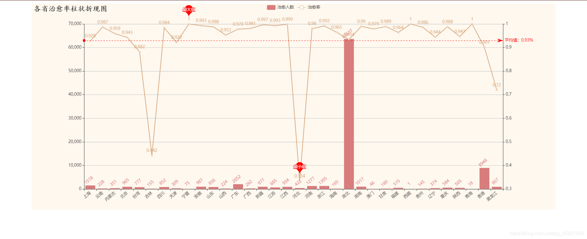
结论:
全国累积确诊人数,除湖北省外,相对较低,疫情治愈率普遍较高,平均值达到了90%以上,中国完全战胜疫情将指日可待。
drawRadar.html
<!DOCTYPE html>
<html lang="en">
<head>
    <meta charset="UTF-8">
    <title>北上广的疫情情况对比雷达图</title>
    <script src="../static/js/echarts.min.js"></script>
    <script src="../static/theme/vintage.js"></script>
</head>
<body>
    <div class="cart" style="width: 800px;height: 600px;margin: auto"></div>
<script>
    var myCharts = echarts.init(document.querySelector('.cart'),'vintage')
    var indicator_data = {

    {

     indicator_data|tojson }}
    var bj_data = {

    {

     bj_data|tojson }}
    var sh_data = {

    {

     sh_data|tojson }}
    var gd_data = {

    {

     gd_data|tojson }}
    var option = {


        radar:{


            indicator:indicator_data,
            shape:'polygon'
        },
        title:{


            text:'北上广的疫情情况对比',
            textStyle:{


                fontFamilt:'楷体',
                fontSize:21,
            },
            top:20,
            left:20
        },
        tooltip:{


            trigger:'item',
            triggerOn:'mousemove',
            formatter:function (res)
            {


                return '地区:'+res.name+'<br>'+'累计确诊:'+res.value[0]+'<br>'+'现有确诊:'+res.value[1]+
                    '<br>'+'治愈人数:'+res.value[2]+'<br>'+'死亡人数:'+res.value[3]+'<br>'+'治愈率:'+res.value[4]*1000/10+'%'+
                    '<br>'+'死亡率:'+res.value[5]*1000/10+'%腾讯疫情数据.json'
                console.log(res)
            }
        },
        legend:{


          name:['北京','上海','广东']
        },
        series:[
            {


                type:'radar',
                data:[
                    {


                        name:'北京',
                        value: bj_data,
                    },
                    {


                        name:'上海',
                        value: sh_data,
                    },
                    {


                        name:'广州',
                        value: gd_data,
                    }
                ],
                label:{


                    show:true,
                    formatter:function(res)
                    {


                        if(res.dimensionIndex==4||res.dimensionIndex==5)
                        {


                            return (res.value*1000)/10+'%'
                        }
                    },
                    position:''
                }
            }
        ]
    }
    myCharts.setOption(option)
</script>
</body>
</html>

结论:
北京累计确诊人数相对较高,而现有确诊人数较少,北京疫情正逐渐转好;上海现有确诊人数较多,疫情情况相对严重;三省死亡率普遍较低,治愈率较高,疫情对生命健康的威胁可控。
以下是项目源码,希望能够帮助你们,如有疑问,下方评论
flask项目代码链接