形成3D滚动盒子:
overflow: scroll;
transform-style: preserve-3d;
perspective: 10px;
3D重叠、滚动视差
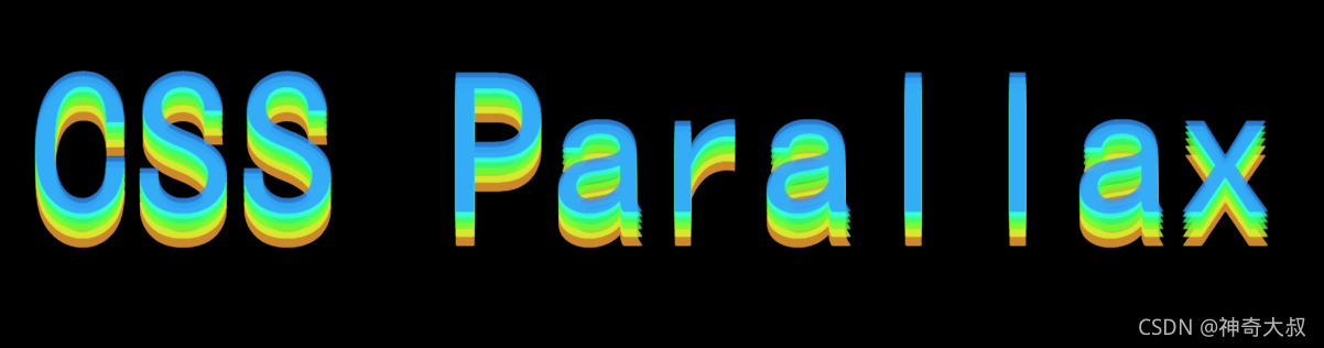
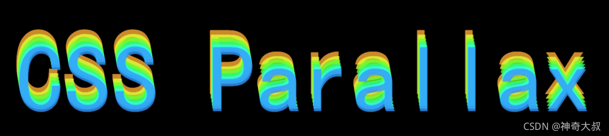
先将多个相同文字定位,依次设置transform: translateZ(-npx)加大,即依次往里缩,形成重叠,滚动形成视差
效果图:

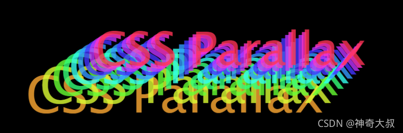
效果图2:改变perspective距离,实现从远到近的特效
代码示例:
 html,body {


     /* background: #000; */
     /* background: linear-gradient(90deg, hsl(199, 98%, 50%), hsl(199, 98%, 38%)); */
     width: 100%;
     height: 100%;
     /* background-color: #ebecf0; */
     background-color: #000;
     font-family: 'Lobster', cursive;
     /* overflow: hidden; */
 }
 .g-container {


     width: 100vw;
     height: 100vh;
     overflow-x: hidden;
     overflow: scroll;
     transform-style: preserve-3d;
     perspective: 10px;
     filter: blur(5px) contrast(5px);
 }

 .g-section {


     position: absolute;
     top: 0;
     left: 0;
     width: 100vw;
     text-align: center;
     padding: 50vh 0;
     font-size: 15vh;
 }


 .g-section:nth-child(1) {


     transform: translateZ(-1px) scale(1.1);
     color:hsla(35deg, 100%, 60%, .8);;
     z-index:1;
 }

 .g-section:nth-child(2) {


     transform: translateZ(-2px) scale(1.2);
     color:hsla(70deg, 100%, 60%, .8);
     z-index:2;
 }
 .g-section:nth-child(3) {


     transform: translateZ(-3px) scale(1.3);
     color:hsla(105deg, 100%, 60%, .8);;
     z-index:3;
 }

 .g-section:nth-child(4) {


     transform: translateZ(-4px) scale(1.4);
     color:hsla(140deg, 100%, 60%, .8);
     z-index:4;
 }
 .g-section:nth-child(5) {


     transform: translateZ(-5px) scale(1.5);
     color:hsla(175deg, 100%, 60%, .8);;
     z-index:5;
 }

 .g-section:nth-child(6) {


     transform: translateZ(-6px) scale(1.6);
     color:hsla(210deg, 100%, 60%, .8);
     z-index:6;
 }


 <div class="g-container">
    <div class="g-section">CSS Parallax</div>
    <div class="g-section">CSS Parallax</div>
    <div class="g-section">CSS Parallax</div>
    <div class="g-section">CSS Parallax</div>
    <div class="g-section">CSS Parallax</div>
    <div class="g-section">CSS Parallax</div>

</div>
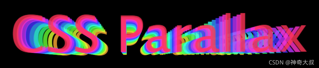
效果图2示例:
.g-container{


	...
	animation: perspectiveChange 10s infinite ease-in;
}
...
@keyframes perspectiveChange {


    0% {


        perspective: 5px;
    }
    100% {


        perspective: 200px;
    }
}