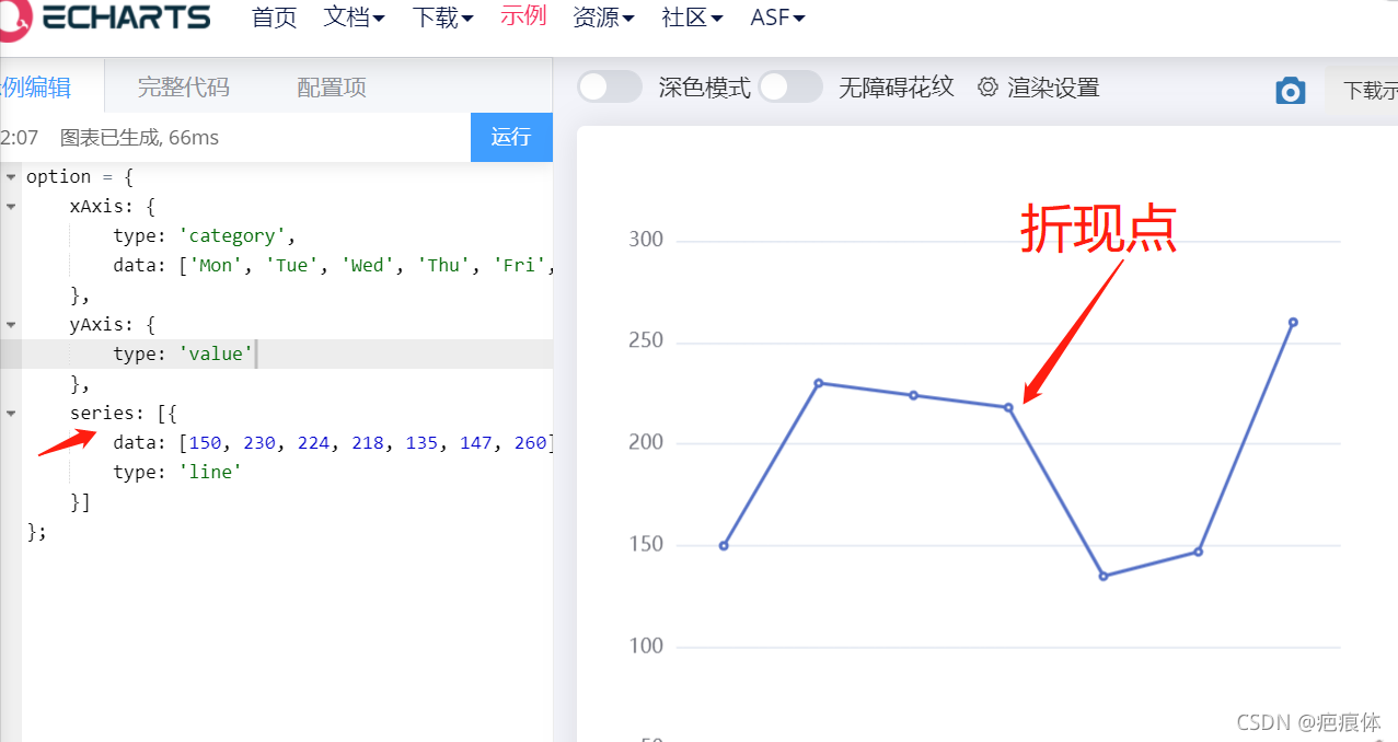
折线图
折现点
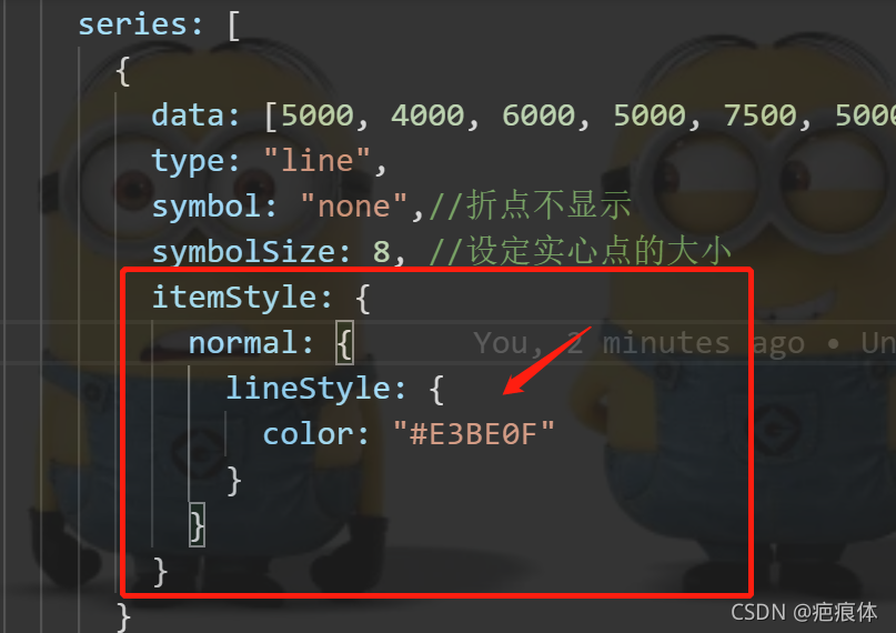
在 series里面来写
symbol: "none",//折点不显示
 symbol: "circle", //折点设定为实心点
symbolSize: 8, //设定实心点的大小
Echarts折线图样式修改(拐点大小,拐点边框大小及颜色,hover拐点内填充颜色等)
自定义legend的icon

    legend: {


        top: '5%',
        left: 'center',
        itemWidth: 20,//对应的宽度
        itemHeight: 20,//对应的高度
        data: [
            {

    icon: 'path://M78.625,93.094L66.494,72.081l12.132-21.013h24.264l12.132,21.013l-12.132,21.013H78.625z M95.547,80.377l4.79-8.296  l-4.79-8.296h-9.579l-4.79,8.296l4.79,8.296H95.547z', name: '搜索引擎'},
            {

    icon: 'path://M153.651,224.468c-21.867,0-39.658-17.791-39.658-39.658c0-21.87,17.791-39.661,39.658-39.661  c21.869,0,39.66,17.791,39.66,39.661C193.312,206.677,175.521,224.468,153.651,224.468z M153.651,159.149  c-14.148,0-25.658,11.512-25.658,25.661c0,14.148,11.51,25.658,25.658,25.658s25.66-11.51,25.66-25.658  C179.312,170.661,167.8,159.149,153.651,159.149z M165.791,172.67h-24.277v24.277h24.277V172.67z', name: '直接访问'}
        ]
    },
定义legend宽高与样式
https://blog.csdn.net/WangShuoQing/article/details/103873671
y轴数据过大溢出边界
https://blog.csdn.net/github_38222176/article/details/105813354
多条折线图 y轴数值与实际值不符解决方法
https://blog.csdn.net/yhj198927/article/details/116200595
折现颜色/线宽
在 series里面来写
itemStyle: {


   normal: {


   color: "#E3BE0F",//这个是折现点的颜色
    lineStyle: {


     color: "#E3BE0F",//这个是改变折现的颜色
     width:3//线宽
      }
       }
      }
拐点上显示数值/拐点边框颜色/线宽
*在 series里面来写
 itemStyle:{


              normal:{


                // 拐点上显示数值
                label : {


                show: true
                },
                borderColor:'red',  // 拐点边框颜色
                lineStyle:{


                  width:5,  // 设置线宽
                  type:'dotted'  //'dotted'虚线 'solid'实线
                }
              }
折点图的折现分不同颜色来显示
案列
!<template>
  <div ref="chart" :style="{ width: '500px', height: '500px' }"></div>
</template>

<script>
export default {


  mounted() {


    //模板挂载完成后调用
    this.drawEcharts();
  },
  methods: {


    drawEcharts() {


      // 基于准备好的dom,初始化echarts实例
      let myChart = this.$echarts.init(this.$refs.chart);
      // 绘制图表
      myChart.setOption({


        toolbox: {


          show: true,
          feature: {


            saveAsImage: {

    }
          }
        },
        xAxis: {


          type: "category",
          boundaryGap: false,
          data: [
            "0",
            "1",
            "2",
            "3",
            "4",
            "5",
            "6",
            "7",
            "8",
            "9",
            "10",
            "11",
            "12",
            "13",
            "14",
            "15",
            "16",
            "17",
            "18",
            "19"
          ]
        },
        yAxis: {


          type: "value",
          axisLabel: {


            formatter: "{value}"
          },
          axisPointer: {


            snap: true
          }
        },
        visualMap: [
          {


            type: "piecewise",
            show: false,
            dimension: 0,
            seriesIndex: 0, //第一部分数据
            pieces: [
              {


                lte: 6,//小于等于
                color: "orange"
              },
              {


                gt: 6,//大于6 小于等于8
                lte: 19,
                color: "red"
              },
              {


                gt: 8,//大于6 小于等于8
                lte: 14,
                color: "purple"
              },
              {


                gt: 14,
                lte: 17,
                color: "Chocolate"
              },
              {


                gt: 17,//大于6
                color: "pink"
              }
            ]
          },
          {


            show: false,
            type: "piecewise",
            dimension: 0,
            seriesIndex: 1, //第二部分数据
            pieces: [
              {


                lte: 8,//小于等于
                color: "blue"
              },
              {


                gt: 3,
                lte: 8,
                color: "black"
              },
              {


                gt: 8,
                lte: 14,
                color: "green"
              },
              {


                gt: 14,
                lte: 17,
                color: "grey"
              },
              {


                gt: 17,
                color: "DodgerBlue"
              }
            ]
          }
        ],
        series: [
          {


            name: "用电量",
            type: "line",
            smooth: true,
            data: [
              300,
              280,
              250,
              260,
              270,
              300,
              550,
              500,
              400,
              390,
              380,
              390,
              400,
              500,
              600,
              750,
              800,
              700,
              600,
              400
            ]
          },
          {


            name: "费用",
            type: "line",
            smooth: true,
            data: [
              200,
              180,
              150,
              160,
              170,
              200,
              450,
              400,
              300,
              290,
              280,
              290,
              300,
              400,
              400,
              650,
              700,
              600,
              450,
              300
            ]
          }
        ]
      });
    }
  }
};
</script>
<style>
</style>
X坐标值得具体的颜色/字体大小
在xAxis里面写
 xAxis: {


          type: "category",
          splitLine: {

    },
          data: ["职工", "城乡居民", "少儿", "大学生"],
          axisLabel: {


            textStyle: {


              color: "#fff", //坐标值得具体的颜色
              fontSize: 15 //字体的大小
            },
          }
调整位置
与title xAxis同级
 grid: {


          top: 46,
          bottom: 170
        },
echarts tooltip提示框
tooltip: {


  trigger: "item",
  backgroundColor: "rgba(255,255,255,0.8)", //设置背景图片 rgba格式
  color: "black",
  borderWidth: "1", //边框宽度设置1 设置0为去掉边框
  borderColor: "gray", //设置边框颜色
  textStyle: {


    color: "black" //设置文字颜色
  },
},
定义tooltip的formatter的数据
tooltip: {
//这个是悬停时的样式
show: true,
// triggerOn: 'click',//这个是当点击
extraCssText: "text-align:left",
trigger: "axis",
padding: [20, 60], //提示框大小
axisPointer: {
//去掉移动的指示线
// type: "none"
},
backgroundColor: "#054e68", //tooltip背景色
textStyle: {
fontSize: 12,
color: "#fff"
},
// 添加自定义的数据
formatter(params) {
console.log(params)//这个是打印固有的样式
let html = '';
params.forEach(v => {
html += `
<div style="color: #fff; margin-left:-50px; font-size: 14px; width:400px;line-height: 40px;">
<div>
<div class="allspan">
<span class="listspan" style="display:inline-block;position: relative;margin-right:-4px;vertical-align: middle;border-radius:10px;width:8px;height:8px;background-color:${
v.color}
"></span>
<span style="display:inline-block;margin-right:5px;border-radius:50%;width:10px;height:10px;left:5px;background-color:'${
v.seriesName}'"></span>
<span style="display:inline-block;font-size: 18px; width: 120px;margin-left:5px">${
v.seriesName}</span>
<span style="font-size: 18px;display:inline-block;;margin-left:30px; width: 120px;color:#6CEEF1;">${
v.value}</span>
<span style=" display:inline-block;font-size: 18px;margin-left:20px;margin-right:15px;">同比 ${
v.value}</span>
<img style="width:12px;height: 12px;" src='../../../static/img/升.png' />
</div></div>
</div>`;
})
return html}
},
定义tooltip提示框保留两位小数
https://blog.csdn.net/qq_28065983/article/details/81060200
tooltip属性加背景图片
https://blog.csdn.net/qq_43291759/article/details/110544484
去除网格线
在xAxis yAxis写
 splitLine:{

    show: false},//去除网格线
 splitArea : {

    show : true},//保留网格区域
列如
yAxis : [
           {


               type : 'value',
               splitLine:{

    show: false},//去除网格线
               splitArea : {

    show : true},//保留网格区域
               axisLine: {


                   lineStyle: {


                       type: 'solid',
                       color:'#fff',
                       width:'2'
                   }
               },
               axisLabel: {


                   textStyle: {


                       color: '#fff'
                   }
               }
           }
       ]
网格图的颜色
在xAxis yAxis写
      splitLine: {


        show: true
            lineStyle: {


              color:"#354058"
            }
          },
显示x/y轴坐标
写在xAxis/yAxis
 axisLine: {


 lineStyle: {


    color: '#fff'
      }
      },
去掉x轴的刻度线
** 写在xAxis**
 axisTick: {


    show: false
      },
折现点显示数值
在 series中添加
itemStyle : {

     normal: {

    label : {

    show: true}}}
坐标轴刻度与标签对齐
Echarts中 横坐标 X 轴刻度 alignWithLabel 说明
 axisTick: {


            show: false,//不显示坐标轴刻度
            alignWithLabel: true//坐标轴刻度与标签对齐
          }
柱状图
参考1 echarts折线图柱状图的坐标轴的颜色及样式的设置
调整位置
与title xAxis同级
    grid: {


          top: "20%",
          left: "3%",
          right: "4%",
          bottom: "10%",
          containLabel: true
        },
坐标轴刻度与标签对齐
Echarts中 横坐标 X 轴刻度 alignWithLabel 说明
xAxis写
 axisTick: {


            show: false,//不显示坐标轴刻度
            alignWithLabel: true//坐标轴刻度与标签对齐
          }
柱状图变成圆角
** series写入**
底部不变头部变
  itemStyle: {


     normal: {


     color:'#1C68DA',
      barBorderRadius:[10, 10, 0, 0],
      //柱形图圆角,初始化效果}}
底部头部都变
  itemStyle: {


          normal: {


            color:'#1C68DA',
            barBorderRadius:[10, 10, 10, 10],
            //柱形图圆角,初始化效果}}
柱状图变宽
** series写入 与name/data同级**
barWidth: "20%",//百分比越大越宽 否则相反
柱状图设置颜色渐变色
** series写入**
  itemStyle: {


          normal: {


            // color:'#1C68DA',//这个是显示对应的颜色
            color: new echarts.graphic.LinearGradient(0, 0, 0, 1, [
              {

    //这个是显示对应的渐变色 有低到顶
                offset: 0,
                color: "#00B6FF"
              },
              {


                offset: 1,
                color: "#1C68DA"
              }
            ]),
            barBorderRadius: [10, 10, 0, 0],//这个是变圆角显示 顶部的
          }
        }
legend文字与图形换位置
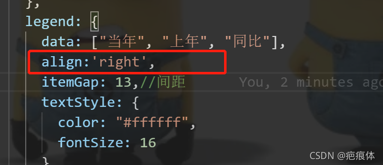
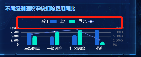
默认为左
align:'right',
echarts 柱形图数据位置显示
https://blog.csdn.net/lucky569/article/details/104939543
legend常见配置
legend: {


            icon: 'rect',//长方形
             itemHeight  :9,//改变圆圈大小
            //icon: "circle",   //  这个字段控制形状  类型包括 circle,rect ,     roundRect,triangle,
            data: ['计划劳务资源', "实际劳务资源"],
            //align: 'left',
            right: 10,//legend距离canvas右边的距离
            //left: 20,
            top:10,//legend距离canvas上面的距离
            textStyle: {

    //文字颜色
                 fontSize: 12,
                 color: '#F1F1F3',
                 padding:6,//这个是文字与图标的间隙
            },
            itemWidth: 14,//图标宽
            itemHeight: 10,//图标高
            itemGap: 13,//间距
        },
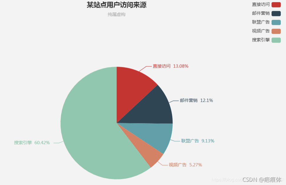
饼图
点击对应区域内部显示文字
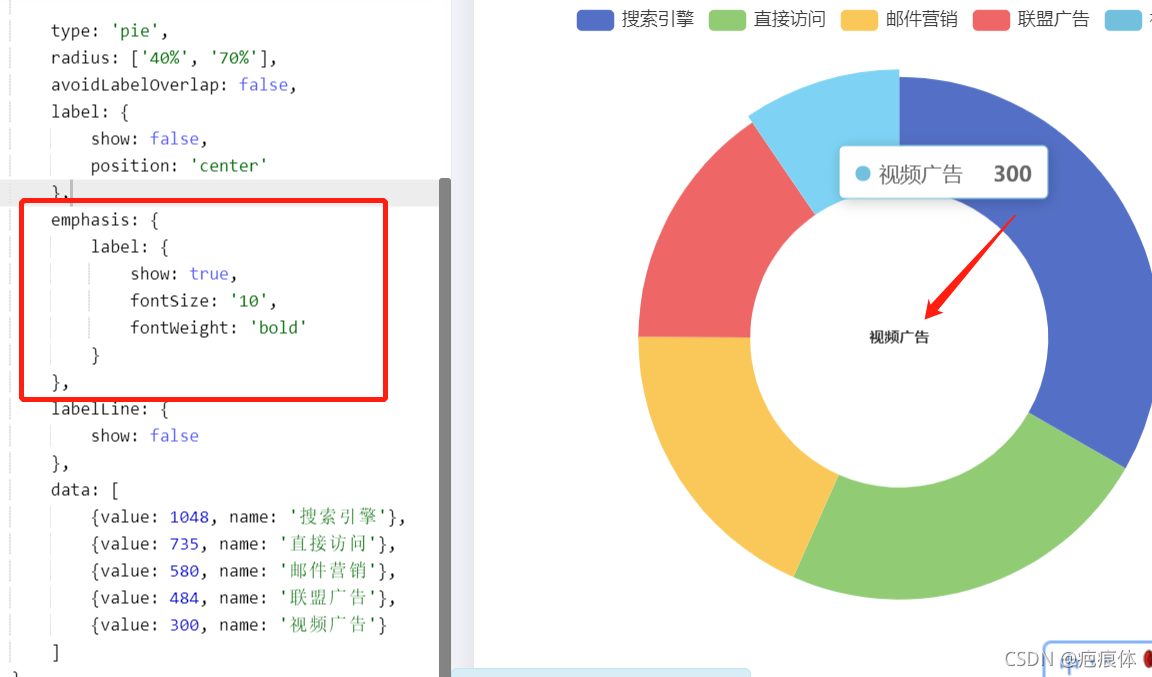
在 series写与data同级
  emphasis: {


                label: {


                    show: true,//这个是点击对应区域显示
                    fontSize: '10',//文字大小
                    fontWeight: 'bold'//文字粗细
                }
            },
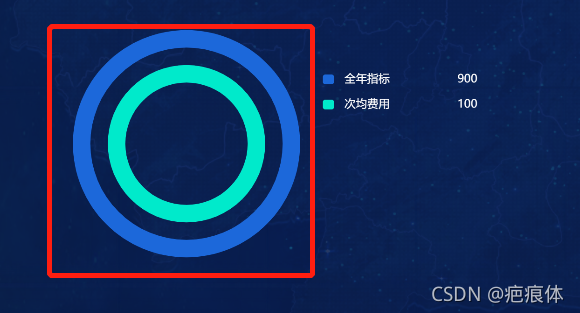
显示内部的空白区域大小
在 series写与data同级
radius: ['40%', '70%'],
对应的位置
series: {


name: "流量占比分布",
type: "pie",
radius: ["40%", "60%"],//这个是调整对应的大小形状
center: ["35%", "53%"], //这个属性调整图像的位置

},
},
区域内部显示文字的位置
 label: {


                show: false,//这个设置为true是初始化显示出来 为false初始化不显示
                position: 'center'//这个是显示对应的位置
            },
顶部提示
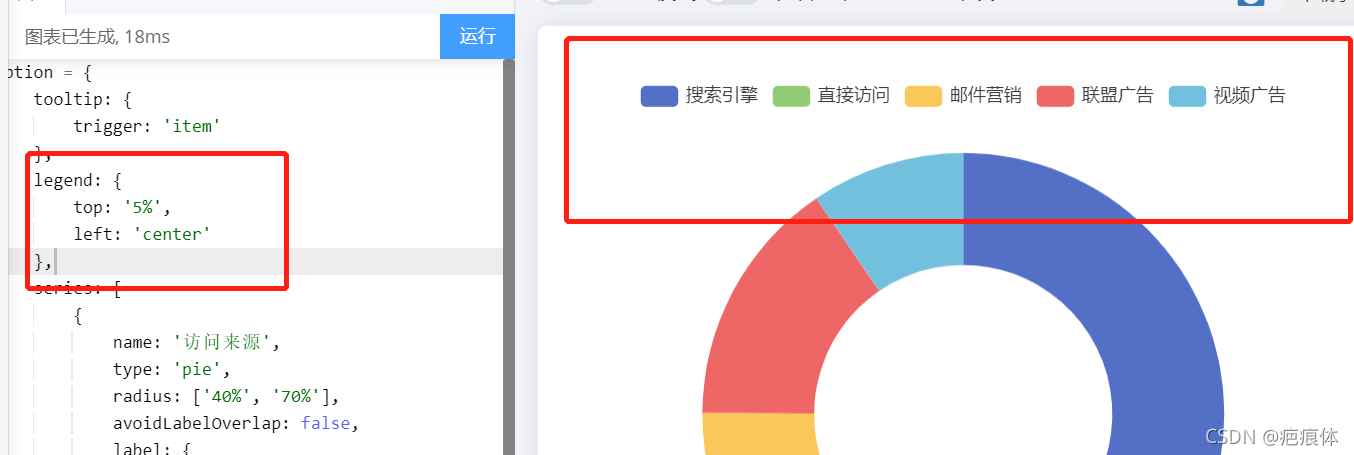
与series同级
 legend: {


        top: '5%',
        left: 'center'
    },
legend显示添加百分比
legend显示添加数值
https://blog.csdn.net/dk2290/article/details/79113921
legend显示添加数值/百分比
https://blog.csdn.net/liuzc0221/article/details/109511074
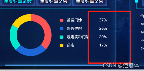
legend显示百分比居右靠齐

参考
使用第2种提供的方法
formatter: name => {


            let space = `\u3000\u3000\u3000\u3000\u3000\u3000\u3000\u3000`
            space = space.slice(0, 7 - name.length)
           // return `${name}${space}${this.objData[name]}`//这个使用不是固定的
           按照这个逻辑来${

    space}的话代表的是空隙
           /*
            // return name + "  " + clientcounts[index];//这个没有使用这个方法时

            return`${name}${space}${space}${clientcounts[index]}`;
            //使用这个方法这样写
          */
          }
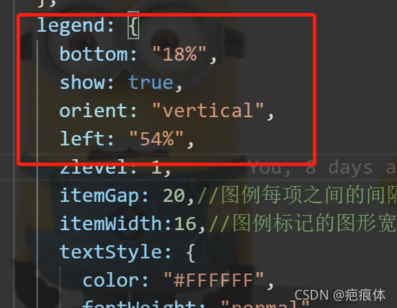
legend每项的间隙与图形宽度
 itemGap: 20,//图例每项之间的间隔
 itemWidth:16,//图例标记的图形宽度。

legend的位置显示
去掉指示线指示文字
没去掉之前
去掉后
** series**
//在series里加这个
     label: {


          show: false,
            },
添加指示线指示文字
https://blog.csdn.net/weixin_39003573/article/details/81842367
雷达图
根据数值自定义radar雷达图拐点颜色
https://www.jianshu.com/p/b8b19b5b9909
雷达图的参数
https://blog.csdn.net/csdn_zsdf/article/details/81366738
https://www.cnblogs.com/freely/p/11936659.html
https://blog.csdn.net/csdn_zsdf/article/details/81366738