前端的第九天(CSS进阶:字体图标、平面转换、渐变)
一、字体图标
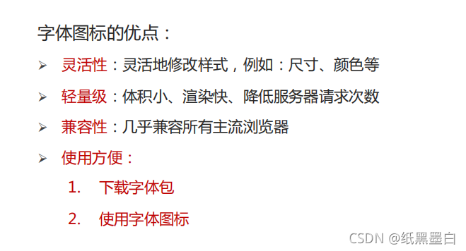
1、字体图标简介
2、使用流程:
打开iconfont官网:https://www.iconfont.cn/
下载字体包: 登录(新浪微博) → 选择图标库 → 选择图标,加入购物车 → 购物车 → 添加至项目 → 下载至本地
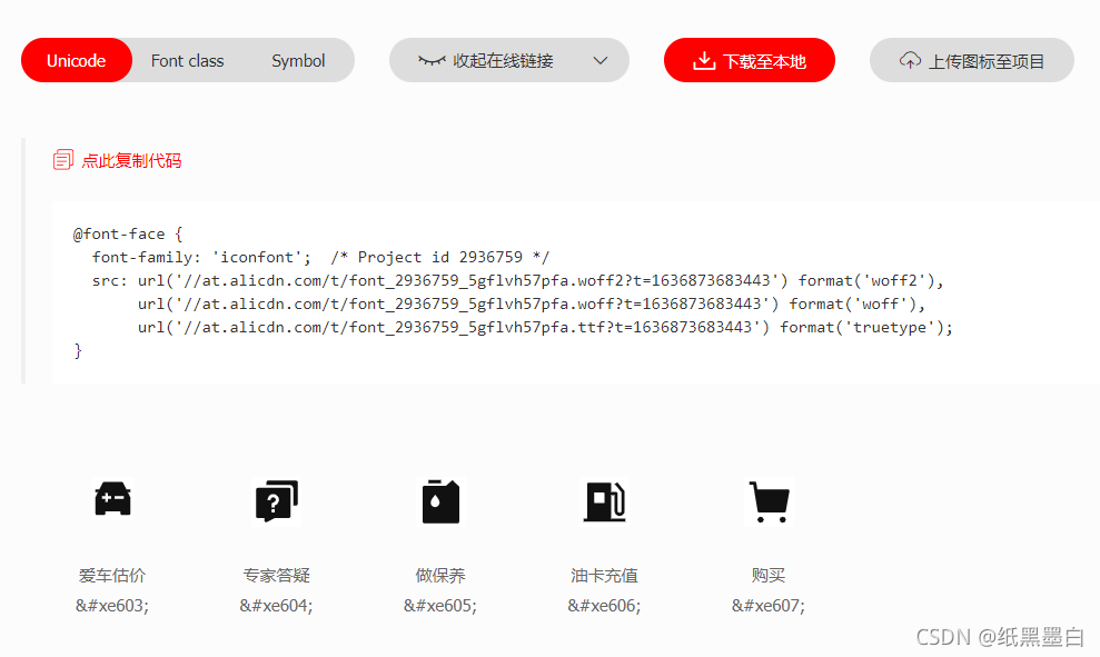
引入字体图标样式表

调用图标对应的类名,必须调用2个类名
iconfont类:基本样式,包含字体的使用等
icon-xxx:图标对应的类名

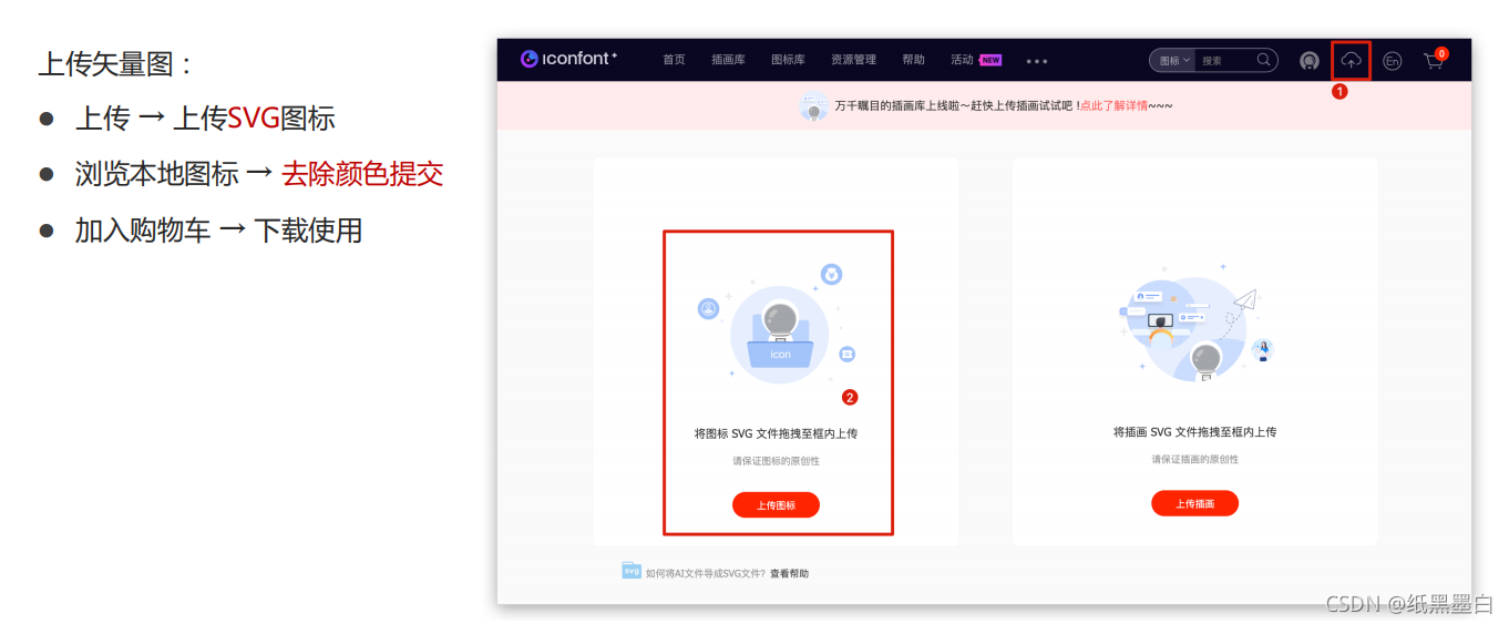
3、上传矢量图
二、平面转换
1、平面转换概念
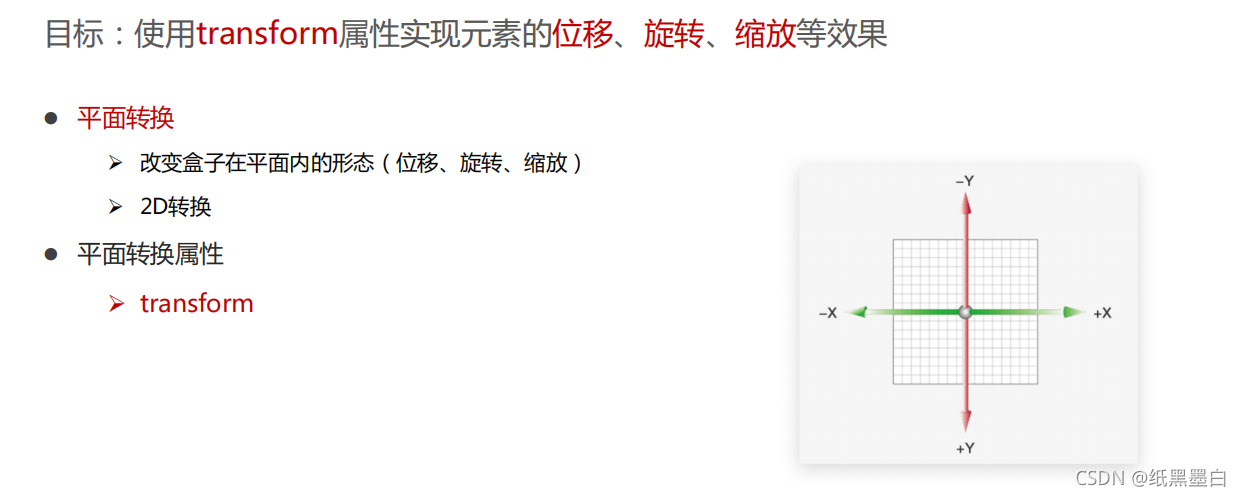
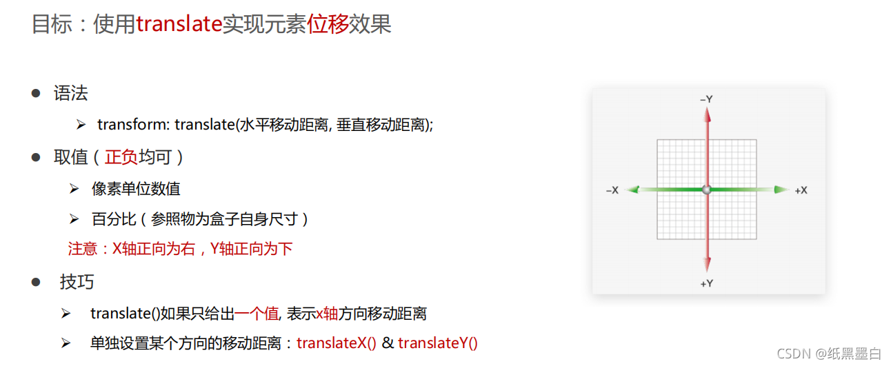
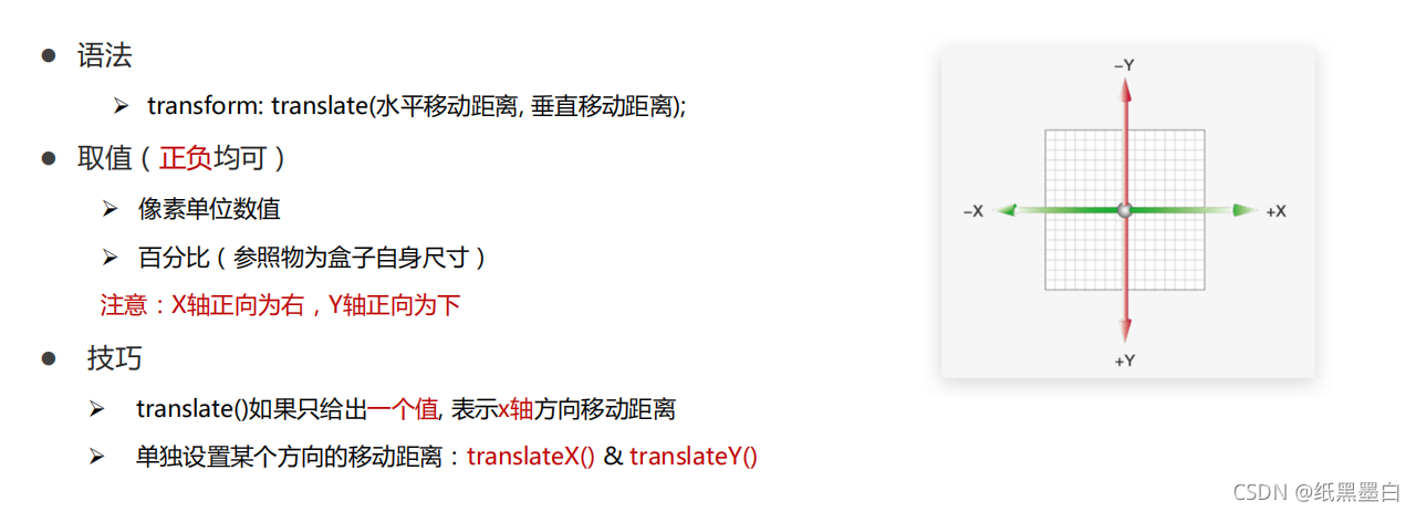
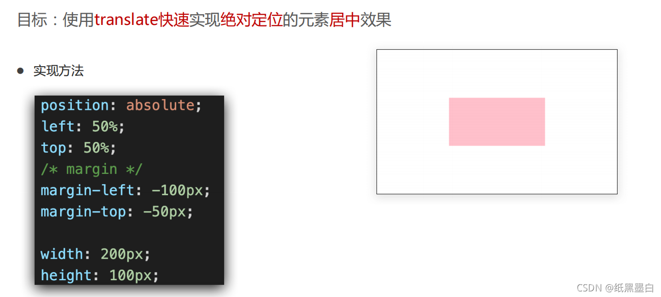
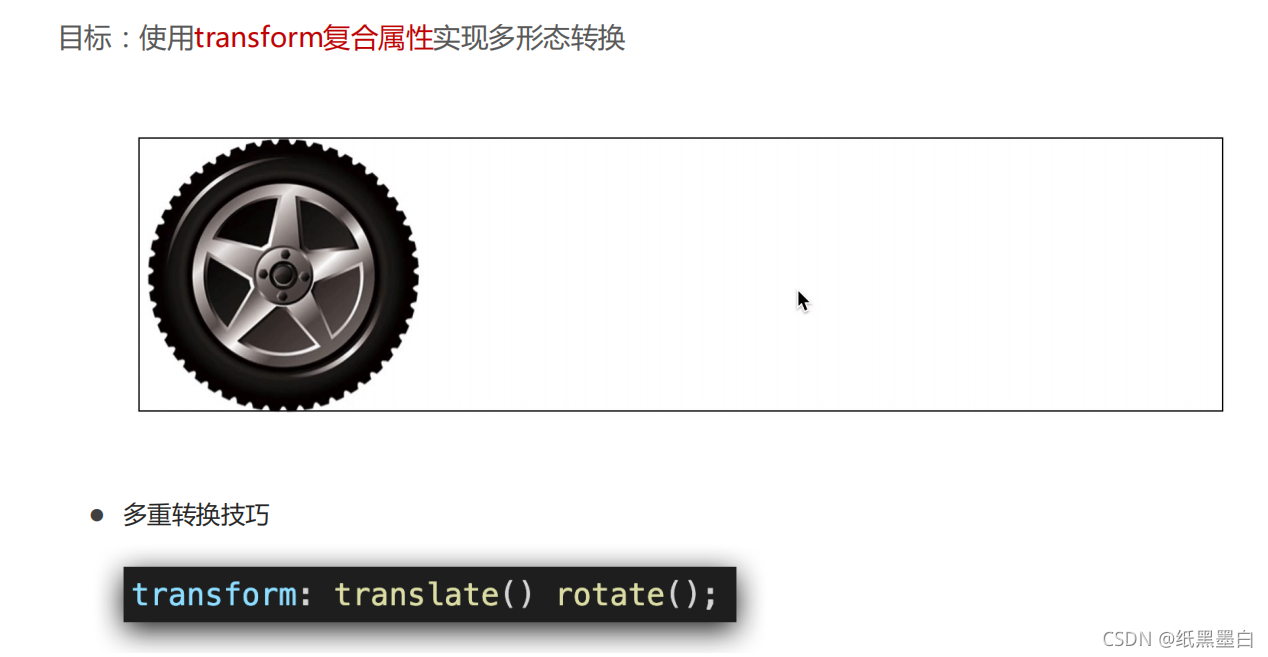
2、位移
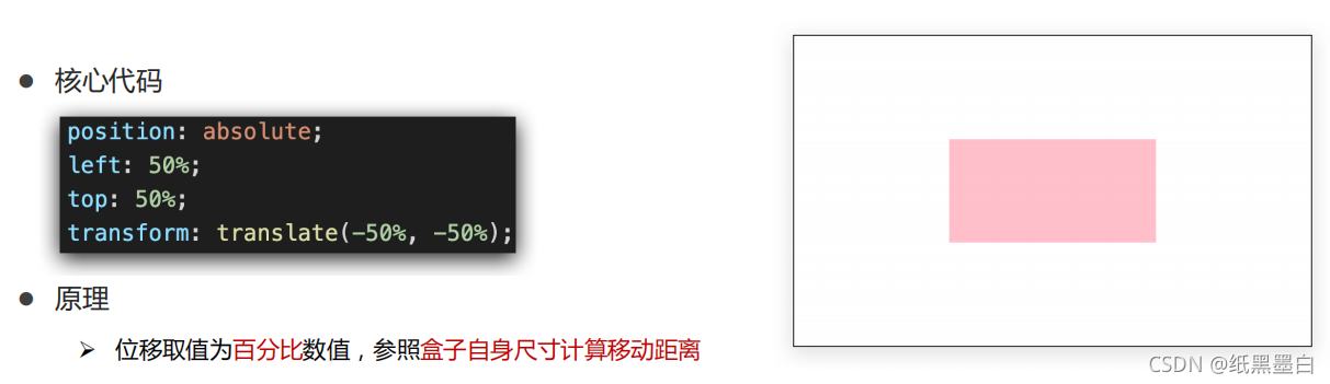
3、案例
<!DOCTYPE html>
<html lang="en">
<head>
<meta charset="UTF-8">
<meta http-equiv="X-UA-Compatible" content="IE=edge">
<meta name="viewport" content="width=device-width, initial-scale=1.0">
<title>Document</title>
<style>
.father {
position: relative;
width: 600px;
height: 400px;
border: 1px solid #ccc;
margin:0 auto;
}
.lover {
width: 600px;
height: 100px;
margin-top: 150px;
background-color: orange;
color: pink;
text-align: center;
line-height: 100px;
font-size: 40px;
font-weight: bold;
}
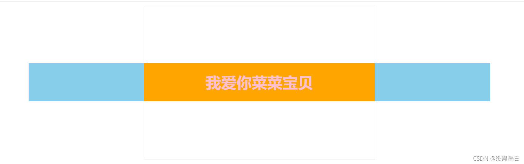
.son1 {
position: absolute;
top: 150px;
width: 300px;
height: 100px;
background-color: skyblue;
transition: all 1s;
}
.son2 {
position: absolute;
top: 150px;
right: 0px;
width: 300px;
height: 100px;
background-color: skyblue;
transition: all 1s;
}
.father:hover .son1 {
transform: translate(-300px,0);
}
.father:hover .son2 {
transform: translate(300px,0);
}
</style>
</head>
<body>
<div class="father">
<div class="son1"></div>
<div class="lover">
我爱你菜菜宝贝
</div>
<div class="son2"></div>
</div>
</body>
</html>
<!DOCTYPE html>
<html lang="en">

<head>
    <meta charset="UTF-8">
    <meta http-equiv="X-UA-Compatible" content="IE=edge">
    <meta name="viewport" content="width=device-width, initial-scale=1.0">
    <title>Document</title>
    <style>
        * {


            margin: 0;
            padding: 0;
        }

        .box {


            width: 1366px;
            height: 600px;
            margin: 0 auto;
            background: url('./images/bg.jpg');
            overflow: hidden;
        }

        .box::before,
        .box::after {


            float: left;
            content: '';
            width: 50%;
            height: 600px;
            background-image: url(./images/fm.jpg);
            transition: all 2s;
        }

        .box::after {


            background-position: right 0;
        }

        /* 鼠标移入的时候的位置改变的效果 */
        .box:hover::before {


            transform: translate(-100%);
        }

        .box:hover::after {


            transform: translateX(100%);
        }
    </style>
</head>

<body>
    <div class="box">

    </div>
</body>

</html>
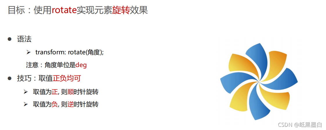
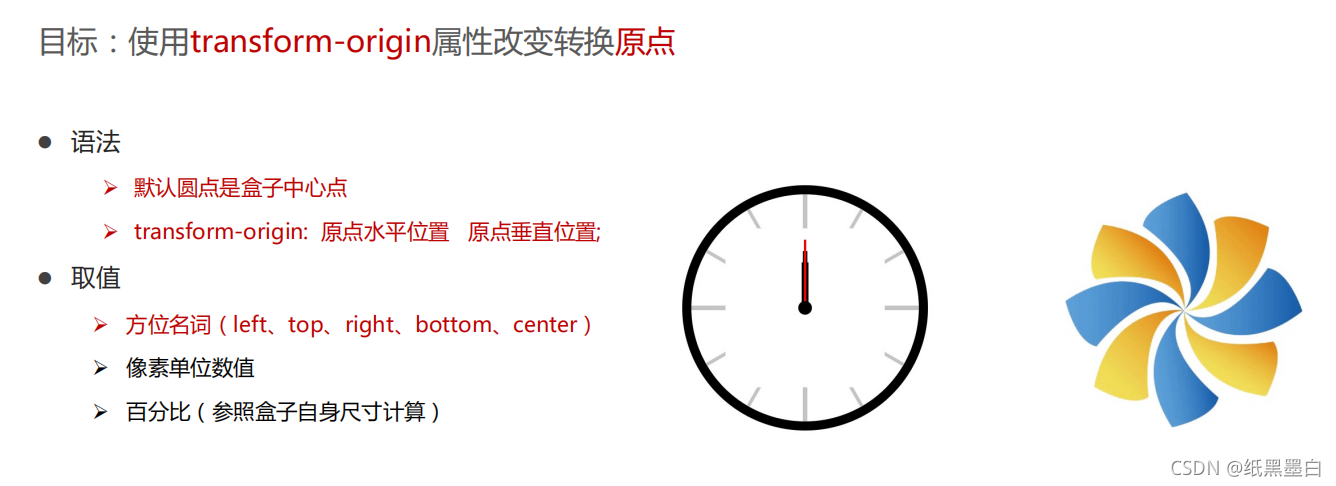
4、旋转

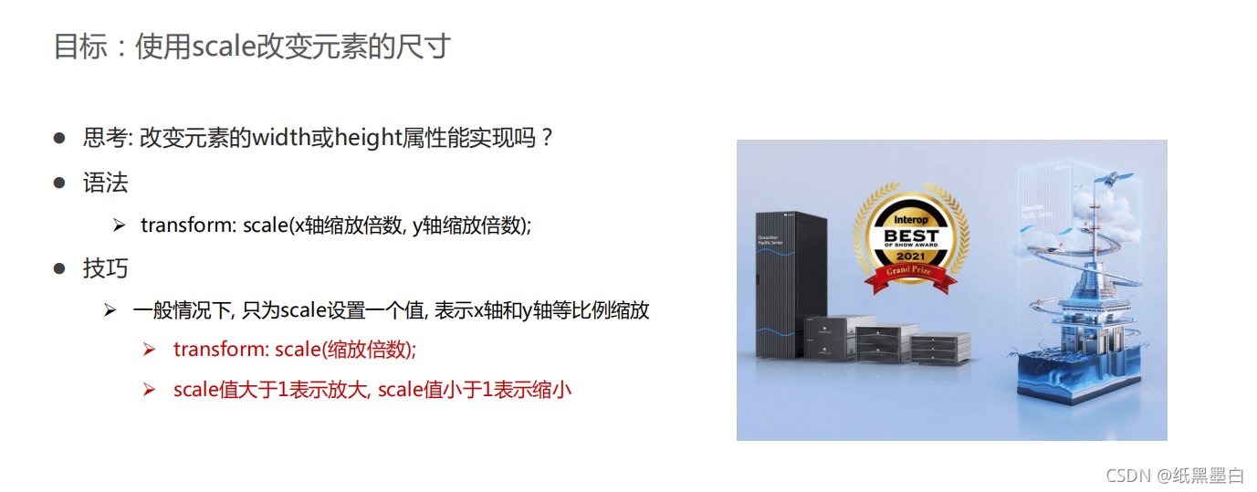
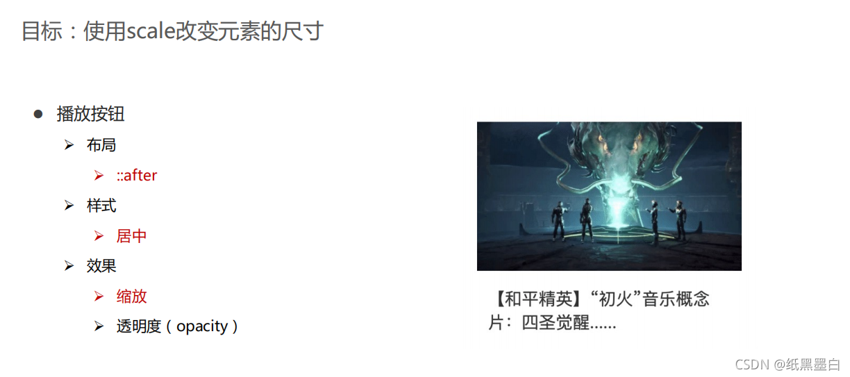
5、缩放
三、渐变
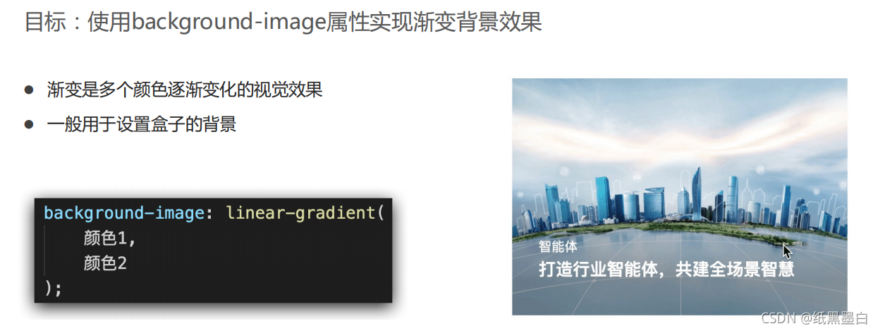
1、渐变背景

2、案例

<!DOCTYPE html>
<html lang="en">
<head>
    <meta charset="UTF-8">
    <meta http-equiv="X-UA-Compatible" content="IE=edge">
    <meta name="viewport" content="width=device-width, initial-scale=1.0">
    <title>Document</title>

    <style>
        * {


    margin: 0;
    padding: 0;
}
.box {


    position: relative;
    width: 960px;
    height: 500px;
    margin: 0 auto;
    /* ps */
    /* background-color: pink; */
}
.box1 {


    position: absolute;
    width: 300px;
    height: 200px;
    margin-top: 150px;
    margin-left: 0;
    /* ps */
    /* background-color: skyblue; */
}
/* -------背景图片 */
.pic {


    position: absolute;
    width: 300px;
    height: 200px;
    /* ps */
    /* background-color: skyblue; */
}
img {


    position: absolute;
    width: 100%;
    height: 100%;
    transition: all .5s;
}


/* ----------文字描述部分 txt */
.txt {


    position: absolute;
    margin-top: 70px;
    margin-left: 30px;
    width: 150px;
    height: 100px;
    color: aliceblue;
    /* ps */
    /* background-color: skyblue; */
}

/* ------------ 背景渐变部分 mask */
.mask {


    position: absolute;
    width: 270px;
    height: 190px;
    margin-left: 17px;
    opacity: 0;
    background: linear-gradient(
        transparent,
        rgba(0,0,0,0.6)
    );
    transition: all .5s;
}

.box1:hover img{


    transform: scale(0.9);
}

.box1:hover .mask{


    opacity: 1;
}

.box2 {


    position: absolute;
    width: 300px;
    height: 200px;
    margin-top: 150px;
    margin-left: 330px;
    /* ps */
    /* background-color: skyblue; */
}

.box2:hover img{


    transform: scale(0.9);
}

.box2:hover .mask{


    opacity: 1;
}

.box3 {


    position: absolute;
    width: 300px;
    height: 200px;
    margin-top: 150px;
    margin-left: 660px;
    /* ps */
    /* background-color: skyblue; */
}

.box3:hover img{


    transform: scale(0.9);
}

.box3:hover .mask{


    opacity: 1;
}
    </style>
</head>
<body>
    <div class="box">
        <div class="box1">
            <div class="pic">
                <img src="./images/product.jpeg">
            </div>
            <div class="txt">
                <h3>产品</h3>
                <h2>2021 Interop金奖</h2>
            </div>
            <div class="mask">
            </div>
        </div>
        <div class="box2">
            <div class="pic">
                <img src="./images/huawei1.jpeg">
            </div>
            <div class="txt">
                <h3>行业洞察</h3>
                <h2>迈向智能世界2030</h2>
            </div>
            <div class="mask">
            </div>
        </div>
        <div class="box3">
            <div class="pic">
                <img src="./images/huawei2.jpeg">
            </div>
            <div class="txt">
                <h3>《ICT新世界》</h3>
                <h2>幸福感、安全感的智能世界</h2>
            </div>
            <div class="mask">
            </div>
        </div>
    </div>
</body>
</html>
