四、定位 Positioning
div、h1 或 p 元素常常被称为块级元素。这意味着这些元素显示为一块内容,即“块框”。与之相反,span 和 strong 等元素称为“行内元素”,这是因为它们的内容显示在行中,即“行内框”。
1.Position(定位)
position 属性指定了元素的定位类型。
position 属性的五个值:
1.1.static 定位,fixed 定位,relative 定位,absolute 定位
<!DOCTYPE html>
<html>
<head>
<style>
    div.static  { position:static;  border: 3px solid #73AD21; }/*static 定位*/
    p.pos_fixed { position:fixed;   top:100px; right:700px; }     /*fixed 定位 */
    h5.pos_left { position:relative;left:-20px; } /*relative定位,从元素的原始左侧位置减去 20 像素 */
    h5.pos_right{ position:relative;left:20px;  } /*relative定位,向元素的原始左侧位置增加 20 像素 */
    h2.pos_top  { position:relative;top:-50px;  } /*relative定位,向元素的原始上侧位置增加 -50 像素*/
    h2.absolute { position:absolute;left:100px; top:500px; }  /*absolute 定位,绝对定位*/
</style>
</head>
<body>
<p>----------------------------------------------------------------------------------</p>
<div class="static"> static 定位 </div>
<p>----------------------------------------------------------------------------------</p>
<p class="pos_fixed">fixed 定位  </p>
<p>----------------------------------------------------------------------------------</p>
<h5 class="pos_left"> relative定位,这个标题相对于其正常位置向左移动 </h5>
<h5 class="pos_right">relative定位,这个标题相对于其正常位置向右移动 </h5>
<p>----------------------------------------------------------------------------------</p>
<h2>这是一个没有定位的标题</h2>
<h2 class="pos_top">  relative定位,这个标题是根据其正常位置向上移动,relative定位 </h2>
<p>----------------------------------------------------------------------------------</p>
<h2 class="absolute">absolute 定位,这是一个绝对定位了的标题        </h2>
</body>
</html>

1.2.sticky 定位
sticky 英文字面意思是粘,粘贴,所以可以把它称之为粘性定位。
position: sticky; 基于用户的滚动位置来定位。
粘性定位的元素是依赖于用户的滚动,在 position:relative 与 position:fixed 定位之间切换。
它的行为就像 position:relative; 而当页面滚动超出目标区域时,它的表现就像 position:fixed;,它会固定在目标位置。
元素定位表现为在跨越特定阈值前为相对定位,之后为固定定位。
这个特定阈值指的是 top, right, bottom 或 left 之一,换言之,指定 top, right, bottom 或 left 四个阈值其中之一,才可使粘性定位生效。否则其行为与相对定位相同。
<!DOCTYPE html>
<html>
<head>
<meta charset="utf-8">
<title>菜鸟教程(runoob.com)</title>
<style>
div.sticky {
  position: -webkit-sticky;
  position: sticky;
  top: 0;
  padding: 5px;
  background-color: #cae8ca;
  border: 2px solid #4CAF50;
}
</style>
</head>
<body>

<p>尝试滚动页面。</p>
<p>注意: IE/Edge 15 及更早 IE 版本不支持 sticky 属性。</p>

<div class="sticky">我是粘性定位!</div>

<div style="padding-bottom:2000px">
  <p>滚动我</p>
  <p>来回滚动我</p>
  <p>滚动我</p>
  <p>来回滚动我</p>
  <p>滚动我</p>
  <p>来回滚动我</p>
</div>

</body>
</html>
1.3.重叠元素
元素的定位与文档流无关,所以它们可以覆盖页面上的其它元素
z-index属性指定了一个元素的堆叠顺序(哪个元素应该放在前面,或后面)
一个元素可以有正数或负数的堆叠顺序:
<!DOCTYPE html>
<html>
<head>
<style>
    img { position: absolute; left:0px; top:0px; z-index:-1; }
</style>
</head>

<body>
<h1>This is a heading</h1>
<img src="./images/image.png" width="100" height="140" />
<p> 因为图像元素设置了 z-index 属性值为 -1, 所以它会显示在文字之后。</p>
</body>
</html> 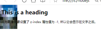
2.浮动元素
浮动的框可以向左或向右移动,直到它的外边缘碰到包含框或另一个浮动框的边框为止。
由于浮动框不在文档的普通流中,所以文档的普通流中的块框表现得就像浮动框不存在一样。
2.1.float属性
<html>
<head>
<style type="text/css">
img.one {
    float:right;                /*向右浮动*/
    border:1px dotted black;  /*点状边框:1px,黑色*/
    margin:0px 0px 15px 20px;   /*图像四个方向的距离*/
 }
div {
    float:right;              /*向右浮动*/
    width:120px;              /*元素的宽度是 120 像素*/
    margin:0 0 15px 20px;     /*图像四个方向的距离*/
    padding:15px;             /*边框大小:15px*/
    border:1px solid black; /*实线边框:1px,黑色*/
    text-align:center;        /*文本对齐方式:居中*/
}
</style>
</head>
<body>
<p>
<img class=one src="./images/image.png" />
    在这个段落中,我们添加了一个样式为 <b>float:right</b> 的图像。结果是这个图像会浮动到段落的右侧。
    向右浮动 float:right;  点状边框:1px,黑色 border:1px dotted black;
</p><br/>
<div>
    <img src="./images/image.png" /><br/>
</div>
<p>
    在这个段落中,div元素的宽度是120像素 width:120px; 它其中包含图像。div 元素浮动到右侧。float:right;
    我们向 div 元素添加了外边距,这样就可以把 div 推离文本。同时,我们还向 div 添加了边框和内边距。
    实线边框:1px,黑色 border:1px solid black;
</p>
</body>
</html>

使用具有一栏超链接的浮动来创建水平菜单
<html>
<head>
<style type="text/css">
ul {
    float:left;            /*向左浮动*/
    width:100%;            /*宽度:100%*/
    padding:0;             /*填充: 0 */
    margin:0;              /*边距: 0 */
    list-style-type:none;  /*列表样式类型:无;*/
}
a {
    float:left;                           /*向左浮动*/
    width:7em;                            /*宽度: 7em*/
    text-decoration:none;                 /*文字装饰: 无*/
    color:white;                        /*白色字体*/
    background-color:rgb(206, 83, 206); /*背景色*/
    padding:0.2em 0.6em;                  /*边框大小*/
    border-right:1px solid white;       /*右边框: 1px 实线 纯白色*/
    border-top:1px solid white;         /*上边框: 1px 实线 纯白色*/
}
a:hover { background-color:#0d6adb }    /*鼠标移动到上面时:浅蓝色*/
li { display:inline }                     /*排列不下,才会新换一行*/
</style>
</head>

<body>
<ul>
<li><a href="#"> Link one </a></li>
<li><a href="#"> Link two </a></li>
<li><a href="#"> Link three </a></li>
<li><a href="#"> Link four </a></li>
<li><a href="#"> Link five </a></li>
<li><a href="#"> Link six </a></li>
<li><a href="#"> Link seven </a></li>
<li><a href="#"> Link eight </a></li>
<li><a href="#"> Link nine </a></li>
<li><a href="#"> Link ten </a></li>
</ul>

<p>
在上面的例子中,我们把 ul 元素和 a 元素浮向左浮动。li 元素显示为行内元素(元素前后没有换行)。这样就可以使列表排列成一行。ul 元素的宽度是 100%,列表中的每个超链接的宽度是 7em(当前字体尺寸的 7 倍)。我们添加了颜色和边框,以使其更漂亮。
</p>

</body>
</html>
2.2.clear 属性 图像的左侧和右侧均不允许出现浮动元素
img {
  float:left;
  clear:both;
}
五、选择器
1.元素选择器
最常见的 CSS 选择器是元素选择器。换句话说,文档的元素就是最基本的选择器。
如果设置 HTML 的样式,选择器通常将是某个 HTML 元素,比如 p、h1、em、a,甚至可以是 html 本身:
<html>
<style type="text/css">
    html {color:black;}
    h1 {color:blue;}
    h2 {color:silver;}
</style>
<h1>这是 heading 1</h1>
<h2>这是 heading 2</h2>
<p>这是一段普通的段落。</p>
</html>

我们也可以为 XML 文档中的元素设置样式:
<?xml version="1.0" encoding="ISO-8859-1"?>
<?xml-stylesheet type="text/css" href="index.css"?>
<note>
<to>George</to>
<from>John</from>
<heading>Reminder</heading>
<body>Don't forget the meeting!</body>
</note>
index.css
note
  {
  font-family:Verdana, Arial;
  margin-left:30px;
  }

to
  {
  font-size:28px;
  display: block;
  }

from
  {
  font-size:28px;
  display: block;
  }

heading
  {
  color: red;
  font-size:60px;
  display: block;
  }

body
  {
  color: blue;
  font-size:35px;
  display: block;
  }
2.子元素选择器
选择器 h1 > strong 可以解释为“选择作为 h1 元素子元素的所有 strong 元素”
h1 > strong {color:red;}table.company td > p { color: blue }3.相邻兄弟选择器
相邻兄弟选择器(Adjacent sibling selector)可选择紧接在另一元素后的元素,且二者有相同父元素。
<!DOCTYPE HTML>
<html>
<head>
<style type="text/css">
    h1 + p { margin-top:50px; }
    h1 + p { position:static;  border: 3px solid #73AD21;  }
    li + li {color:aqua;}
</style>
</head>

<body>
<h1>This is a heading.</h1>
<p>This is paragraph.</p>
<p>This is paragraph.</p>
<p>This is paragraph.</p>

<div>
    <ul>
      <li>List item 1</li>
      <li>List item 2</li>
      <li>List item 3</li>
    </ul>
    <ol>
      <li>List item 1</li>
      <li>List item 2</li>
      <li>List item 3</li>
    </ol>
  </div>
</body>
</html>
4.伪类 (Pseudo-classes)
4.1.:focus的使用
<html>
<style type="text/css">
    input:focus   { background-color:yellow; }  /*超链接 :focus 的使用*/
</style>
<!--超链接 :focus 的使用-->
<form action="form_action.asp" method="get">
    First name: <input type="text" name="fname" value=" :focus 伪类" /><br />
    Last name:  <input type="text" name="lname" value="点击输入框试试" /><br />
<input type="submit" value="Submit" />
</form>
</html>

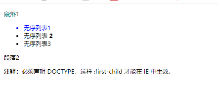
4.2. :first-child的使用
<!DOCTYPE html>
<html>
<head>
<style type="text/css">
    p:first-child  { color: teal; }      /* 匹配第一个 <p> 元素 */
    li:first-child { color: blue; }      /*匹配第一个 <pli> 元素*/
</style>
</head>
<body>
<div>
    <p> 段落1 </p>
    <ul>
        <li> 无序列表1 </li>
        <li> 无序列表 <strong> 2 </strong></li>
        <li> 无序列表3 </li>
    </ul>
    <p> 段落2 </p>
</div>
<p><b>注释:</b>必须声明 DOCTYPE,这样 :first-child 才能在 IE 中生效。</p>
</body>
</html>
选择器匹配所有作为元素的第一个子元素的 <p> 元素中的所有 <i> 元素:
p:first-child i { font-weight:bold; } /*匹配所有 <p> 元素中的第一个 <i> 元素:*/<!DOCTYPE html>
<html>
<head>
<style type="text/css">
p > i:first-child { font-weight:bold; } /*匹配所有 <p> 元素中的第一个 <i> 元素:*/
</style>
</head>
<body>
<p> 第1个p元素: <i> 第1个p元素里面第1个i元素; </i> <i> 第1个p元素里面第2个i元素; </i></p>
<p> 第2个p元素: <i> 第2个p元素里面第1个i元素; </i> <i> 第2个p元素里面第2个i元素; </i></p>
</body>
</html>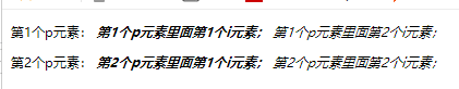
4.3.:lang 伪类
<html>
<head>

<style type="text/css">
    q:lang(no) { quotes: "~" "~" } /*lang 属性添加样式 ~ ~ */
</style>

</head>

<body>
<!--向带有指定 lang 属性的元素添加样式。-->
<p> p元素 <q lang="no"> 段落中的引用的文字 </q> p元素 </p>

</body></html>
5.伪元素 用于向某些选择器设置特殊效果。
5.1. "first-letter" 伪元素用于向文本的首字母设置特殊样式。
5.2. "first-line" 伪元素用于向文本的首行设置特殊样式。
<html>
<head>
<style type="text/css">
    p:first-letter { color: green;   font-size:1cm; }  /*第一个字母:字体颜色 绿色;字体大小1cm*/
    p:first-line   { color: #c300ff; background-color: orange; }/*第一行:紫色字体;橙色背景*/
    </style>
</head>

<body>
<p>
You can use the :first-line pseudo-element to add a special effect to the first line of a text!
</p>
</body>

</html> 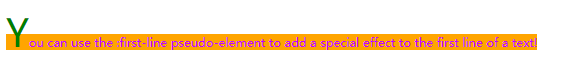
5.3. 伪元素可以与 CSS 类配合使用。
p.article:first-letter { color: green; }
5.4. :before 伪元素 在元素的内容前面插入新内容。
<!DOCTYPE html>
<html>
<head>
<style type="text/css">
    h1:before { content:url(./images/image.png) } /*在每个 <h1> 元素前面插入一幅图片:*/
</style>
</head>

<body>
<h1>h1 This is a heading1</h1>
<p>":before" 伪元素可以在元素的内容前面插入新内容 h1:before { content:url(./images/image.png) } </p>
<h1>h1 This is a heading2</h1>
</body>
</html>
5.5. :after 伪元素 ":after" 伪元素可以在元素的内容之后插入新内容。
<style type="text/css">
    h1:after { content:url(./images/image.png) } /*在每个 <h1> 元素后面插入一幅图片:*/
</style>
6.CSS 属性 选择器
具有特定属性的HTML元素样式不仅仅是class和id。
<!DOCTYPE html>
<html>
<head>
<style>
[title] {
color:blue;
}
[sam~=a] {
color:orange;
}
[sam~=f] {
border:5px solid green; /* 边框:5px纯绿; */
}
</style>
</head>
<body>
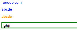
<a title="runoob.com" href="//www.runoob.com/">runoob.com</a>
<h1 title="a b c d e" > abcde </h1>
<h1 sam= "a b c d e" > abcde </h1>
<p sam= "f g h i j" > fghij </p>
</body>
</html>
下面是包含指定值的lang属性的元素样式的例子,使用(|)分隔属性和值:
[lang|=en] { color:blue; }<!DOCTYPE html>
<html>
<head>
<meta charset="utf-8">
<title>菜鸟教程(runoob.com)</title>
<style>
input[type="text"]
{
width:150px;
display:block;
margin-bottom:10px;
background-color:yellow;
}
input[type="button"]
{
width:120px;
margin-left:35px;
display:block;
}
</style>
</head>
<body>
<form name="input" action="demo-form.php" method="get" >
Firstname:<input type="text" name="fname" value=" " size="20">
Lastname: <input type="text" name="lname" value=" " size="20">
<input type="button" value="Example Button">
</form>
</body>
</html> 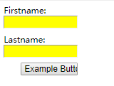
7.CSS表单
7.1. 输入框(input) 样式
以下属性选择器:
input[type=text] - 选取文本输入框
input[type=password] - 选择密码的输入框
input[type=number] - 选择数字的输入框
...
输入框,使用 width 属性来设置输入框的宽度:
<html>
<style>
input {
  width: 100%;
}
</style>
<form>
  <input type="text" id="fname" name="fname">
</form>
</html>
7.2.设置文本框的内边距:
<!DOCTYPE html>
<html>
<style>
input[type=text] {
  width: 100%;
  padding: 12px 20px;
  margin: 8px 0;
  box-sizing: border-box;
}
</style>
<p>设置文本框的内边距:</p>

<form>
  <label for="fname">First Name</label>
  <input type="text" id="fname" name="fname">
  <label for="lname">Last Name</label>
  <input type="text" id="lname" name="lname">
</form>

</html>
六、高级
1. CSS水平对齐
对齐块元素 块元素指的是占据全部可用宽度的元素,并且在其前后都会换行。
1.1.使用 margin 属性来水平对齐,使用 position 属性进行左和右对齐
可通过将左和右外边距设置为 "auto",来对齐块元素
<!DOCTYPE html>
<html>
<head>
<style>
.center1 {
margin:auto; /*使用 margin 属性来水平对齐*/
width:70%;
background-color:#b0e0e6;
}
.center2 {
position:absolute; /*使用 position 属性进行左和右对齐*/
right:100px;
width:700px;
background-color:#b0e0e6;
}
</style>
</head>
<body>
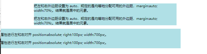
<div class="center1">
<p>把左和右外边距设置为 auto,规定的是均等地分配可用的外边距,margin:auto; width:70%;。结果就是居中的元素。</p>
<p>把左和右外边距设置为 auto,规定的是均等地分配可用的外边距,margin:auto; width:70%;。结果就是居中的元素。</p>
</div>
<div class="center2">
<p>使用 position 属性进行左和右对齐 position:absolute; right:100px; width:700px;。 </p>
<p>使用 position 属性进行左和右对齐 position:absolute; right:100px; width:700px;。 </p>
</div>
</body>
</html>
1.2. 使用 float 属性来进行左和右对齐
.right {
	float:right;
	width:300px;
	background-color:#b0e0e6;
}
2. CSS 尺寸属性
CSS 尺寸属性允许你控制元素的高度和宽度。同样,还允许你增加行间距。
| 属性 | 描述 |
|---|---|
| height | 设置元素的高度。 |
| line-height | 设置行高。 |
| max-height | 设置元素的最大高度。 |
| max-width | 设置元素的最大宽度。 |
| min-height | 设置元素的最小高度。 |
| min-width | 设置元素的最小宽度。 |
| width | 设置元素的宽度。 |
3. CSS 分类属性 (Classification)
CSS 分类属性允许你控制如何显示元素,设置图像显示于另一元素中的何处,相对于其正常位置来定位元素,使用绝对值来定位元素,以及元素的可见度。
| 属性 | 描述 |
|---|---|
| clear | 设置一个元素的侧面是否允许其他的浮动元素。 |
| cursor | 规定当指向某元素之上时显示的指针类型。 |
| display | 设置是否及如何显示元素。 |
| float | 定义元素在哪个方向浮动。 |
| position | 把元素放置到一个静态的、相对的、绝对的、或固定的位置中。 |
| visibility | 设置元素是否可见或不可见。 |
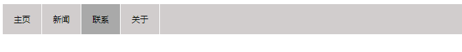
4.导航栏
<html>
<style>
ul{
	list-style-type:none;    /*移除列表前小标志*/
	margin:0;    /*将边距设置为0*/
	padding:0;   /*将填充设置为0*/
}
</style>
<ul>
<li><a href="#home">主页</a></li>
<li><a href="#news">新闻</a></li>
<li><a href="#contact">联系</a></li>
<li><a href="#about">关于</a></li>
</ul>
</html>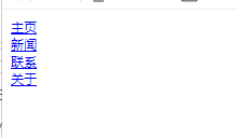
4.1.水平导航栏
有两种方法创建横向导航栏。使用内联(inline)或浮动(float)的列表项。
ul{
	list-style-type:none;
	margin:0;
	padding:0;
}
li {
    display:inline;
}浮动(float)的列表项
li {
	float:left;
}
a {
	display:block;
	width:60px;
	background-color:#dddddd;
} 
4.2.激活/当前导航条实例
在点击了选项后,我们可以添加 "active" 类来标准哪个选项被选中:
.active { background-color: #4CAF50; color: white; }4.3. 鼠标移动到选项上修改背景颜色
li a:hover { background-color: #111; } /*鼠标移动到上面显示黑色*/4.4. 添加分割线 <li> 通过 border-right 样式来添加分割线:
/* 除了最后一个选项(last-child) 其他的都添加分割线 */
li {
    border-right: 1px solid #bbb;
}

li:last-child {
    border-right: none;
}
4.5. 固定导航条
固定在头部
ul { position: fixed; top: 0; width: 100%; } /*固定在头部*/index.html
<html>
<link rel="stylesheet" type="text/css" href="./index.css" >
<ul>
<li><a href=home.html>主页</a></li>
<li><a href=login.html target="_blank">新闻</a></li>  <!--打开新窗口-->
<li><a href=login.html target="_blank">联系</a></li>  <!--打开新窗口-->
<li><a href=login.html target="_blank">关于</a></li>  <!--打开新窗口-->
</ul>
</html>
index.css
ul {
    list-style-type: none; /*移除列表前小标志*/
    margin: 0;             /*将边距设置为0*/
    padding: 0;            /*将填充设置为0*/
    overflow: hidden;
    background-color: rgb(209, 205, 205);   /*背景颜色*/
}
li {
    border-right: 1px solid white;  /*右侧 1px实体白色边框*/
    float: left;             /*使用浮动块元素的幻灯片彼此相邻*/
}
li a {
    display: block;     /*显示块元素的链接,让整体变为可点击链接区域(不只是文本)*/
    color: black;     /*白色字体*/
    text-align: center; /*文本对齐:居中;*/
    padding: 14px 16px; /*填充:14px 16px;*/
    text-decoration: none;  /*文字装饰:无;*/
}
li a:hover:not(.active) {
    background-color: Darkgray; /*鼠标移上来时:深灰色*/
}
li a.active {   /*激活当前导航*/
    color: cyan;
    background-color: #a8699c;
}
4.6.下拉菜单
<!DOCTYPE html>
<html>
<head>
<title>下拉菜单实例|菜鸟教程(runoob.com)</title>
<meta charset="utf-8">
<link rel="stylesheet" type="text/css" href="index.css" >
</head>
<body>

<ul>
  <li><a class="active" href="#home">主页</a></li>
  <li><a href="#news">新闻</a></li>
  <div class="dropdown">
    <a href="#" class="dropbtn">下拉菜单</a>
    <div class="dropdown-content">
      <a href="#">链接 1</a>
      <a href="#">链接 2</a>
      <a href="#">链接 3</a>
    </div>
  </div>
</ul>

<h3>导航栏上的下拉菜单</h3>
<p>鼠标移动到 "下拉菜单" 链接先显示下拉菜单。</p>

</body>
</html>
index.css
  ul{
    list-style-type:none;
    margin:0;
    padding:0;
    overflow:hidden;
    background-color:#333;
  }

  li{
    float:left;
  }

  /* 下拉按钮样式 */
  li a, .dropbtn {
    display:inline-block;
    color:white;
    text-align:center;
    padding:14px 16px;
    text-decoration:none;
  }

  /* 鼠标移上去后修改下拉按钮样式 */
  li a:hover, .dropdown:hover, .dropbtn {
    background-color:#111;
  }

  /* 容器(div)-需要定位下拉内容 */
  .dropdown {
    display:inline-block;
  }

  /*下拉内容(默认隐藏)*/
  .dropdown-content  {
    display:none;
    position:absolute;
    background-color:#f9f9f9;
    min-width:160px;
    box-shadow:0px 8px 16px 0px rgba(0,0,0,0.2);
  }

  /* 下拉菜单的链接 */
  .dropdown-content a {
    color:black;
    padding:12px 16px;
    text-decoration:none;
    display:block;
  }

  /* 鼠标移上去后修改下拉菜单链接颜色 */
  .dropdown-content a:hover  {
    background-color: #f1f1f1
  }

  /* 在鼠标移上去后显示下拉菜单 */
  .dropdown:hover .dropdown-content {
    display:block;
  }

HTML 部分:
我们可以使用任何的 HTML 元素来打开下拉菜单,如:<span>, 或 a <button> 元素。
使用容器元素 (如: <div>) 来创建下拉菜单的内容,并放在任何你想放的位置上。
使用 <div> 元素来包裹这些元素,并使用 CSS 来设置下拉内容的样式。
CSS 部分:
.dropdown 类使用 position:relative, 这将设置下拉菜单的内容放置在下拉按钮 (使用 position:absolute) 的右下角位置。
.dropdown-content 类中是实际的下拉菜单。默认是隐藏的,在鼠标移动到指定元素后会显示。 注意 min-width 的值设置为 160px。你可以随意修改它。 注意: 如果你想设置下拉内容与下拉按钮的宽度一致,可设置 width 为 100% ( overflow:auto 设置可以在小尺寸屏幕上滚动)。
我们使用 box-shadow 属性让下拉菜单看起来像一个"卡片"。
:hover 选择器用于在用户将鼠标移动到下拉按钮上时显示下拉菜单。
4.7.1. 提示工具-在左侧显示提示文本
<!DOCTYPE html>
<html>
<head>
<meta charset="utf-8">
</head>
<style>
 /* Tooltip 容器 */
.tooltip {
    position: relative; left: 500px;/*relative定位,从元素的原始左侧位置减去 20 像素 */
    position: relative;       /* 位置:相对; */
    display: inline-block;    /* 显示:内嵌块; */
    border-bottom: 1px dotted rgb(6, 6, 247); /* 边框-底部:1px,点状,颜色); */
}
/* Tooltip 文本 */
.tooltip .tooltiptext {
    visibility: hidden;   /* 可见性:隐藏;*/
    width: 150px;         /* 显示宽度 */
    background-color: black;  /* 黑色背景 */
    color: #fff;        /* 白色字体 */
    text-align: center;   /* text-align: center; */
    border-radius: 6px;   /* 边界半径:6px */
    padding: 5px 0;       /* 填充:5px 0; */

    /* 定位 */
    position: absolute;   /* 位置:绝对; */
    z-index: 1;
    top: -5px; right: 105%;   /* 显示在左侧,容器在右边 */
}
/* 在鼠标停上去后 显示提示文本 */
.tooltip:hover .tooltiptext {
    visibility: visible;  /* 可见性:可见 */
}
</style>
<div class="tooltip">Tooltip容器
  <span class="tooltiptext">Tooltip提示文本</span>
</div>
</body>
</html> 
如果你想要提示工具显示在头部和底部。我们需要使用 margin-left 属性,并设置为 -60px。 这个数字计算来源是使用宽度的一半来居中对齐,即: width/2 (120/2 = 60)。
在头部显示:
.tooltip .tooltiptext {
    width: 120px;
    bottom: 100%;
    left: 50%;
    margin-left: -60px; /* 使用一半宽度 (120/2 = 60) 来居中提示工具 */
}
淡如效果: - 1秒内从 0% 到 100% 显示
<!DOCTYPE html>
<html>
<head>
<meta charset="utf-8">
</head>
<style>
 /* Tooltip 容器 */
.tooltip {
    position: relative; left: 500px;/*relative定位,从元素的原始左侧位置减去 20 像素 */
    position: relative;       /* 位置:相对; */
    display: inline-block;    /* 显示:内嵌块; */
    border-bottom: 1px dotted rgb(6, 6, 247); /* 边框-底部:1px,点状,颜色); */
}
/* Tooltip 文本 */
.tooltip .tooltiptext {
    visibility: hidden;   /* 可见性:隐藏;*/
    width: 150px;         /* 显示宽度 */
    background-color: black;  /* 黑色背景 */
    color: #fff;        /* 白色字体 */
    text-align: center;   /* text-align: center; */
    border-radius: 6px;   /* 边界半径:6px */
    padding: 5px 0;       /* 填充:5px 0; */

    /* 定位 */
    position: absolute;   /* 位置:绝对; */
    z-index: 1;
    top: -5px; right: 105%;   /* 显示在左侧,容器在右边 */
    /* 淡入 - 1秒内从 0% 到 100% 显示: */
    opacity: 0;
    transition: opacity 1s;
}
/* 在鼠标停上去后 显示提示文本 */
.tooltip:hover .tooltiptext {
    visibility: visible;  /* 可见性:可见 */
    /* 淡入 - 1秒内从 0% 到 100% 显示: */
    opacity: 1;
}
</style>
<div class="tooltip">Tooltip容器
  <span class="tooltiptext">Tooltip提示文本</span>
</div>
</body>
</html>
4.7.2. 提示工具-在左侧显示提示文本带箭头
<!DOCTYPE html>
<html>
<head>
<meta charset="utf-8">
</head>
<style>
 /* Tooltip 容器 */
.tooltip {
    position:relative;left:500px;/*relative定位,从元素的原始左侧位置减去 20 像素 */
    position: relative;       /* 位置:相对; */
    display: inline-block;    /* 显示:内嵌块; */
    border-bottom: 1px dotted rgb(6, 6, 247); /* 边框-底部:1px,点状,颜色); */
}
/* Tooltip 文本 */
.tooltip .tooltiptext {
    visibility: hidden;   /* 可见性:隐藏;*/
    width: 150px;         /* 显示宽度 */
    background-color: black;  /* 黑色背景 */
    color: #fff;        /* 白色字体 */
    text-align: center;   /* text-align: center; */
    border-radius: 6px;   /* 边界半径:6px */
    padding: 5px 0;       /* 填充:5px 0; */

    /* 定位 */
    position: absolute;   /* 位置:绝对; */
    z-index: 1;
    top: -5px; right: 105%;   /* 显示在左侧,容器在右边 */
}
/* 箭头 */
.tooltip .tooltiptext::after {
    content: " ";       /* 内容:“”; */
    position: absolute; /* 位置:绝对; */
    top: 50%;   /* 最高:50%; */
    left: 100%; /* 提示工具右侧 */
    margin-top: -5px;     /* 边缘顶端-5px */
    border-width: 5px;    /* 边框宽度:5px */
    border-style: solid;  /* 边框样式:实心; */
    border-color: transparent transparent transparent black;/*边框颜色:透明透明黑色*/
}
/* 在鼠标停上去后 显示提示文本 */
.tooltip:hover .tooltiptext {
    visibility: visible;  /* 可见性:可见 */
}
</style>
<div class="tooltip">Tooltip容器
  <span class="tooltiptext">Tooltip提示文本</span>
</div>
</body>
</html> 
在右侧显示:
.tooltip .tooltiptext::after {
    content: " ";
    position: absolute;
    top: 50%;
    right: 100%; /* 提示工具左侧 */
    margin-top: -5px;
    border-width: 5px;
    border-style: solid;
    border-color: transparent black transparent transparent;
}
在顶部显示:
.tooltip .tooltiptext::after {
    content: " ";
    position: absolute;
    top: 100%; /* 提示工具底部 */
    left: 50%;
    margin-left: -5px;
    border-width: 5px;
    border-style: solid;
    border-color: black transparent transparent transparent;
}
在底部显示:
.tooltip .tooltiptext::after {
    content: " ";
    position: absolute;
    bottom: 100%;  /* 提示工具头部 */
    left: 50%;
    margin-left: -5px;
    border-width: 5px;
    border-style: solid;
    border-color: transparent transparent black transparent;
}
4.8. 图片下拉
<!DOCTYPE html>
<html>
<head>
<title>下拉菜单实例|菜鸟教程(runoob.com)</title>
<meta charset="utf-8">
<style>
/* 容器 <div> - 需要定位下拉内容 */
.dropdown {
    position: relative;     /*位置:相对;*/
    display: inline-block;  /*显示:内联模块;*/
}
/* 下拉内容 (默认隐藏) */
.dropdown-content {
    display: none;      /*显示:无;*/
    position: absolute; /*位置:绝对;*/
    background-color: #f9f9f9;  /*背景色:白色;*/
    min-width: 160px;   /*最小宽度:160px;*/
    box-shadow: 0px 8px 16px 0px rgba(0,0,0,0.2);   /*长方体阴影 */
}

/* 在鼠标移上去后显示下拉菜单 */
.dropdown:hover .dropdown-content {
    display: block;      /*显示:块;*/
}

.desc {
    padding: 15px;      /*填充:15px;*/
    text-align: center; /*文本对齐:居中*/
}
</style>
</head>
<body>

<h2>下拉图片</h2>
<p>移动鼠标到图片上显示下拉内容。</p>

<div class="dropdown">
  <img src="./images/image.png" alt="Trolltunga Norway" width="100" height="50">
  <div class="dropdown-content">
    <img src="./images/image.png" alt="Trolltunga Norway" width="400" height="200">
    <div class="desc">!!image !!</div>
  </div>
</div>

</body>
</html> 
5.图片库
<!doctype html>
<html>
<head>
<style>
/* 图片内框属性 */
div.img {
  margin:3px;     /* 页边距:3px; */
  border:1px solid #bebebe; /* 边框:1px,实心,颜色 */
  height:auto;    /* 高度:自动; */
  width:auto;     /* 宽度:自动; */
  float:left;     /* 浮动:左; */
  text-align:center;  /* 文本对齐:居中; */
}
/* 图片外框属性 */
div.img img {
  display:inline; /* 显示:内联; */
  margin:3px;     /* 页边距:3px; */
  border:1px solid #bebebe; /* 边框:1px,实心,颜色 */
}
/* 鼠标停留在上面时的效果 */
div.img a:hover img {
  border:1px solid #333333; /* 边框:1PX,实心,颜色 */
}
/* 图片下面的文本 */
div.desc {
  text-align:center;  /* 文本对齐:居中 */
  font-weight:normal; /* 字体粗细:正常; */
  width:150px;        /* 宽度:150px; */
  font-size:12px;     /* 字体-大小:12px; */
  margin:10px 5px 10px 5px; /* 页边距:10px 5px 10px 5px; */
}
</style>
</head>
<body>
<div class="img">
  <a target="_blank" href="./images/image.png">
  <img src="./images/image.png" alt="Ballade" width="160" height="160">
  </a>
  <div class="desc">image1</div>
</div>
<div class="img">
  <a target="_blank" href="./images/image.png">
  <img src="./images/image.png" alt="Ballade" width="160" height="160">
  </a>
  <div class="desc">image2</div>
</div>
<div class="img">
  <a target="_blank" href="./images/image.png">
  <img src="./images/image.png" alt="Ballade" width="160" height="160">
  </a>
  <div class="desc">image3</div>
</div>
<div class="img">
  <a target="_blank" href="./images/image.png">
  <img src="./images/image.png" alt="Ballade" width="160" height="160">
  </a>
  <div class="desc">image4</div>
</div>
</body>
</html>
5.1. 透明图片 Hover效果
当用户将鼠标指针移动到图片上时,会改变图片的透明度。
<!DOCTYPE html>
<html>
<head>
<style>
img {
    opacity:0.4;
    filter:alpha(opacity=40); /* For IE8 and earlier */
}
img:hover {
    opacity:1.0;
    filter:alpha(opacity=100); /* For IE8 and earlier */
}
</style>
</head>
<body>
<img src="./images/image.jpg" alt="Peach Blossom" />
</body>
</html>

5.2.创建文本在背景图像上的透明框
<!DOCTYPE html>
<html>
<head>
<style>
div.background {
  width: 400px;
  height: 266px;
  margin:15px;
  background: url('./images/image.png') no-repeat;
  border: 1px solid black;
}
div.transbox {
  width: 338px;
  height: 204px;
  margin:30px;
  padding:0;
  background-color: #ffffff;
  border: 1px solid black;
  /* for IE */
  filter:alpha(opacity=60);
  /* CSS3 standard */
  opacity:0.6;
}
div.transbox p {
  margin: 30px 40px;
  color: #000000;
  font:bold 12px Verdana, Geneva, sans-serif;
  line-height:1.5;
}
</style>
</head>

<body>

<div class="background">
<div class="transbox">
<p>
  创建文本在背景图像上的透明框.创建文本在背景图像上的透明框.创建文本在背景图像上的透明框.
</p>
</div>
</div>

</body>
</html>

5.3图片拼合技术
图像拼合就是单个图像的集合。
有许多图像的网页可能需要很长的时间来加载和生成多个服务器的请求。
使用图像拼合会降低服务器的请求数量,并节省带宽。
<!DOCTYPE html>
<html>
<head>
<meta charset="utf-8">
<title>菜鸟教程(runoob.com)</title>
<style>
#navlist{position:relative;}    /* 位置:相对 */
/* 边缘:0;填充:0;列表样式:无;位置:绝对;顶部:0; */
#navlist li{margin:0;padding:0;list-style:none;position:absolute;top:0;}
#navlist li, #navlist a{height:55px;display:block;} /* 高度:44px;显示:块; */

#index { left:0px;width:55px; } /* 左:0px;宽:46px; */
#index { background:url('./images/image_a.png') 0 0; }  /* 要显示的图片 */
#index a:hover { background: url('./images/image_a.png') 0 -45px; } /* 当鼠标悬停上面时 */

#login{left:63px;width:55px;}
#login{background:url('./images/image_b.png') -47px 0;}
#login a:hover{background: url('./images/image_b.png') -47px -45px;}

#next{left:129px;width:55px;}
#next{background:url('./images/image_c.png') -91px 0;}
#next a:hover{background: url('./images/image_c.png') -91px -45px;}
</style>
</head>

<body>
<ul id="navlist">
  <li id="index"><a href="index.html"></a></li>
  <li id="login"><a href="login.html"></a></li>
  <li id="next"><a href="home.html"></a></li>
</ul>
</body>
</html>

6.视频(Video)
- 使用 width 属性
如果 width 属性设置为 100%,视频播放器会根据屏幕大小自动调整比例:
<!DOCTYPE html>
<html>
<head>
<meta name="viewport" content="width=device-width, initial-scale=1.0">
<meta charset="utf-8">
<title>菜鸟教程(runoob.com)</title>
<style>
video {
    width: 100%;        /* 或者:  max-width: 100%; */
    height: auto;
}
</style>
</head>
<body>

<video width="400" controls>
  <source src="mov_bbb.mp4" type="video/mp4">
  <source src="mov_bbb.ogg" type="video/ogg">
  Your browser does not support HTML5 video.
</video>


<p>调整浏览器窗口大小查看视频播放器变化</p>

</body>
</html>- 使用 max-width 属性
如果 max-width 属性设置为 100%, 视频播放器会根据屏幕自动调整比例,但不会超过其原始大小:
<!DOCTYPE html>
<html>
<head>
<meta name="viewport" content="width=device-width, initial-scale=1.0">
<meta charset="utf-8">
<title>菜鸟教程(runoob.com)</title>
<style>
video {
    max-width: 100%;
    height: auto;
}
</style>
</head>
<body>

<video width="400" controls>
  <source src="mov_bbb.mp4" type="video/mp4">
  <source src="mov_bbb.ogg" type="video/ogg">
  Your browser does not support HTML5 video.
</video>


<p>调整浏览器窗口大小,在宽度小于 400px 时,查看视频播放器的变化。</p>

</body>
</html>
6.媒介类型
媒介类型(Media Types)允许你定义以何种媒介来提交文档。文档可以被显示在显示器、纸媒介或者听觉浏览器等等。
@media 规则允许在相同样式表为不同媒体设置不同的样式。
在下面的例子告诉我们浏览器屏幕上显示一个 14 像素的 Verdana 字体样式。但是如果页面打印,将是 10 个像素的 Times 字体。请注意,font-weight 在屏幕上和纸上设置为粗体:
<html>
<head>

<style>
@media screen { /* 屏幕显示 */
  p.test { font-family:verdana,sans-serif; font-size:14px } /* 宋体,无衬线,14px */
}

@media print {  /* 打印显示 */
  p.test { font-family:times,serif; font-size:10px }  /* times字体,衬线,10px */
}

@media screen,print { /* 屏幕和打印显示 */
  p.test { font-weight:bold } /* 字体粗细:粗体 */
}
</style>

</head>
<p class="test">123456</p>
</html>
| 媒介类型 | 描述 |
|---|---|
| all | 用于所有的媒介设备。 |
| aural | 用于语音和音频合成器。 |
| braille | 用于盲人用点字法触觉回馈设备。 |
| embossed | 用于分页的盲人用点字法打印机。 |
| handheld | 用于小的手持的设备。 |
| 用于打印机。 | |
| projection | 用于方案展示,比如幻灯片。 |
| screen | 用于电脑显示器。 |
| tty | 用于使用固定密度字母栅格的媒介,比如电传打字机和终端。 |
| tv | 用于电视机类型的设备。 |