第一章:使用matplotlib绘制一个简单图形
现在我们将在Matplotlib中显示一个简单的弧度角与正弦值的直线图。首先,导入Matplotlib包中的Pyplot模块,为了约定俗成,它的别名为plt:
import matplotlib.pyplot as plt
接下来我们需要一个数组来绘制。在NumPy库中定义了各种数组函数,它与np别名一起导入:
import numpy as np
现在我们使用NumPy库中的arrange()函数获得0和2π之间的角的ndarray对象:
x = np.arange(0, math.pi*2, 0.05)
ndarray对象作为图形的x轴上的值。在y轴上显示的相应的x轴角度的正弦值可以通过以下语句获得:
y = np.sin(x)
使用 plot() 函数绘制两个数组的值:
plt.plot(x,y)
您可以设置绘图标题,以及X轴和Y轴的标签:
axes.plt.xlabel("angle")
plt.ylabel("sine")
plt.title('sine wave')
Plot查看器窗口是由show()函数调用的:
plt.show()
完整的代码如下:
from matplotlib import pyplot as plt
import numpy as np
import math #needed for definition of pi
x = np.arange(0, math.pi*2, 0.05)
y = np.sin(x)
plt.plot(x,y)
plt.xlabel("angle")
plt.ylabel("sine")
plt.title('sine wave')
plt.show()
显示的结果图片如下:

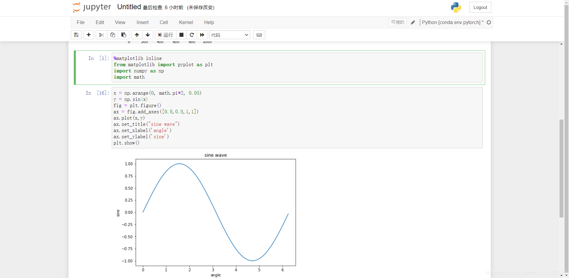
上面的结果是使用pycharm得到的,然而我们在用python做机器学习的时候,常用到Jupyter notebook,其与pycharm的不同的是Jupyter notebook要用%matplotlib inline嵌入显示。
%matplotlib inline
from matplotlib import pyplot as plt
import numpy as np
import math
x = np.arange(0, math.pi*2, 0.05)
y = np.sin(x)
fig = plt.figure()
ax = fig.add_axes([0.8,0.8,1,1])
ax.plot(x,y)
ax.set_title("sine wave")
ax.set_xlabel('angle')
ax.set_ylabel('sine')
plt.show()
显示结果截图如下: