- 北极熊

<!DOCTYPE html>
<html lang="en">
<head>
<meta charset="UTF-8">
<meta http-equiv="X-UA-Compatible" content="IE=edge">
<meta name="viewport" content="width=device-width, initial-scale=1.0">
<title>Document</title>
<style>
body {
background-color: gray;
}
body .window {
width: 200px;
height: 100px;
background: url("img/bear.png") no-repeat;
animation: run 0.4s steps(8) infinite, move 3s linear forwards;
}
@keyframes run {
0% {
background-position: 0 0;
}
100% {
background-position: -1600px 0;
}
}
@keyframes move {
0% {
transform: translateX(0);
}
100% {
transform: translateX(500px);
}
}
</style>
</head>
<body>
<div class="window">
</div>
</body>
</html>
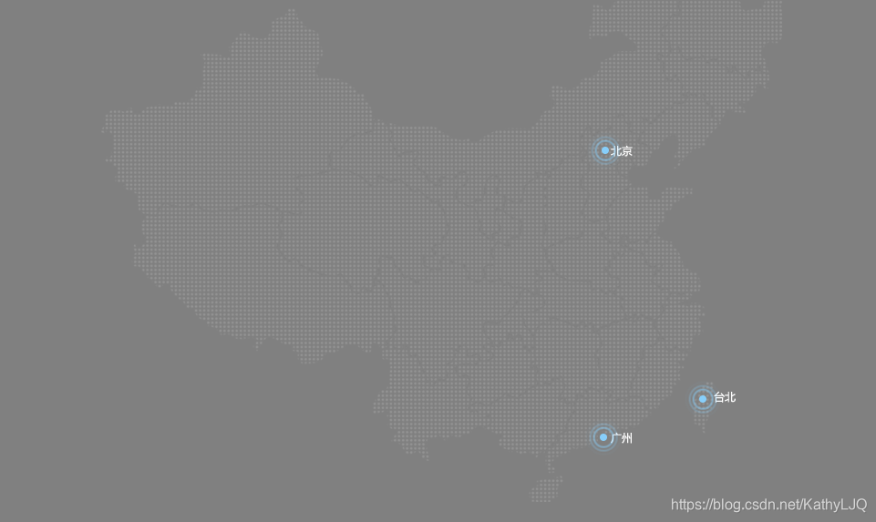
- 热点图
<!DOCTYPE html>
<html lang="en">
<head>
<meta charset="UTF-8">
<meta http-equiv="X-UA-Compatible" content="IE=edge">
<meta name="viewport" content="width=device-width, initial-scale=1.0">
<style>
* {
box-sizing: border-box;
}
body {
background: gray;
}
.map {
position: relative;
margin: 100px auto;
height: 617px;
width: 747px;
background: url("img/map.png") no-repeat;
}
.map .city {
width: 8px;
height: 8px;
}
.map .beijing {
position: absolute;
top: 227px;
right: 190px;
}
.map .taibei {
position: absolute;
top: 500px;
right: 83px;
}
.map .guangzhou {
position: absolute;
top: 542px;
right: 192px;
}
.map .box {
position: relative;
width: 8px;
height: 8px;
}
.map .hotspot,
.map .pulse {
position: absolute;
top: 50%;
left: 50%;
width: 8px;
height: 8px;
transform: translate(-50%, -50%);
background-color: lightskyblue;
border: 2px solid lightskyblue;
border-radius: 50%;
}
body .map .pulse {
background-color: transparent;
animation: circles 2s linear 0s infinite;
}
body .map .box .pulse:nth-child(2) {
animation-delay: 0.5s;
}
body .map .box .pulse:nth-child(3) {
animation-delay: 1s;
}
@keyframes circles {
0% {
width: 8px;
height: 8px;
opacity: 1;
}
100% {
width: 40px;
height: 40px;
opacity: 0;
}
}
</style>
<title>Document</title>
</head>
<body>
<div class="map">
<div class="city beijing">
<div class="box">
<div class="hotspot">
</div>
<div class="pulse">
</div>
<div class="pulse">
</div>
<div class="pulse">
</div>
</div>
</div>
<div class="city taibei">
<div class="box">
<div class="hotspot">
</div>
<div class="pulse">
</div>
<div class="pulse">
</div>
<div class="pulse">
</div>
</div>
</div>
<div class="city guangzhou">
<div class="box">
<div class="hotspot">
</div>
<div class="pulse">
</div>
<div class="pulse">
</div>
<div class="pulse">
</div>
</div>
</div>
</div>
</body>
</html>
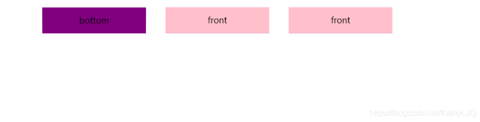
- 立体翻转
<!DOCTYPE html>
<html lang="en">
<head>
<meta charset="UTF-8">
<meta http-equiv="X-UA-Compatible" content="IE=edge">
<meta name="viewport" content="width=device-width, initial-scale=1.0">
<title>Document</title>
<style>
li {
perspective: 500px;
}
li {
float: left;
width: 200px;
height: 50px;
margin-left: 50px;
list-style: none;
}
li .box {
position: relative;
width: 100%;
height: 100%;
transform-style: preserve-3d;
transition: all 1s;
}
.front,
.bottom {
position: absolute;
top: 0;
left: 0;
width: 100%;
height: 100%;
text-align: center;
line-height: 50px;
}
li .front {
background-color: pink;
transform: translateZ(25px);
}
li .bottom {
background-color: purple;
transform: translateY(25px) rotateX(-90deg);
}
.box:hover {
transform: rotateX(90deg);
}
</style>
</head>
<body>
<div class="nav">
<ul>
<li>
<div class="box">
<div class="front">front</div>
<div class="bottom">bottom</div>
</div>
</li>
<li>
<div class="box">
<div class="front">front</div>
<div class="bottom">bottom</div>
</div>
</li>
<li>
<div class="box">
<div class="front">front</div>
<div class="bottom">bottom</div>
</div>
</li>
</ul>
</div>
</body>
</html>
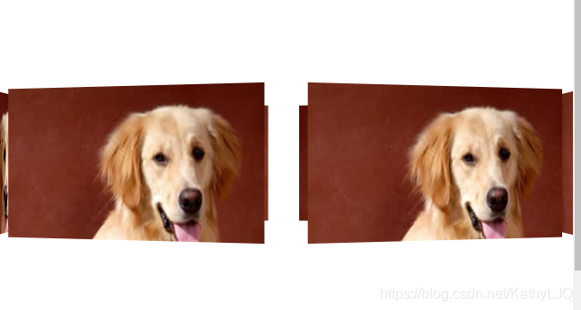
- 旋转的狗
<!DOCTYPE html>
<html lang="en">
<head>
<meta charset="UTF-8">
<meta http-equiv="X-UA-Compatible" content="IE=edge">
<meta name="viewport" content="width=device-width, initial-scale=1.0">
<title>Document</title>
<style>
body {
perspective: 2000px;
}
.section {
position: relative;
margin: 300px auto;
width: 300px;
height: 150px;
transform-style: preserve-3d;
animation: rotate 5s linear infinite;
}
.section div {
position: absolute;
top: 0;
left: 0;
transform: translateX(-50%);
float: left;
width: 300px;
height: 150px;
background: url("img/dog.jpg") no-repeat;
}
.section div:nth-child(1) {
transform: rotateY(0) translateZ(300px);
}
.section div:nth-child(2) {
transform: rotateY(60deg) translateZ(300px);
}
.section div:nth-child(3) {
transform: rotateY(120deg) translateZ(300px);
}
.section div:nth-child(4) {
transform: rotateY(180deg) translateZ(300px);
}
.section div:nth-child(5) {
transform: rotateY(240deg) translateZ(300px);
}
.section div:nth-child(6) {
transform: rotateY(300deg) translateZ(300px);
}
@keyframes rotate {
0% {
transform: rotateY(0);
}
100% {
transform: rotateY(360deg);
}
}
.section:hover {
animation-play-state: paused;
}
</style>
</head>
<body>
<div class="section">
<div></div>
<div></div>
<div></div>
<div></div>
<div></div>
<div></div>
</div>
</body>
</html>