大家好!我叫戴向天。
QQ群:602504799
QQ:809002582
vantUI-TAB组件实现选项卡
只是初步实现,关于一些van-tabs组件的其它API我目前还没有写。不过其它的API也挺简单的。
有时间的话,我会将其它的API进行实现。
代码如下
van-tabs.vue组件文件
<template>
  <div>
    <div class="height-100 over-h width_100 bg-systemColor">
      <ul v-tabScroll ref="tablist" class="flex height_100 posi-r scrollbar over-yh-xa">
        <li
          v-for="(item,key) in getTabSlots.tabProps"
          :key="key"
          class="flex-g-1 flex-1 p-lr-10 height_100 flex flex-center posi-r cursor-pointer fs-14 flex-s-0 flex-basis_22"
          @click="clickHandler(item,key)"
        >
          <span :class="index === key && ['']" class="fs-28 color-f">{

   {item.title}}</span>
        </li>
        <div
          class="tab--line transition-300 width-50 height-5 bg-edit posi-a b0"
          style="left:-100%"
        ></div>
      </ul>
    </div>
    <div ref="tabpanel">
      <slot />
    </div>
  </div>
</template>
<script>
export default {
  value: {
    type: String | Number,
    default: 0,
  },
  directives: {
    tabScroll(el, binding, event) {
      const vue = event.context;
      el.onclick = (e) => vue.changeHandler(el);
      setTimeout(el.onclick, 500);
    },
  },
  data() {
    return {
      index: 0,
    };
  },
  methods: {
    clickHandler(item, key) {
      this.index = key;
      this.$emit('click', {
        ...item,
      });
    },
    changeHandler(el) {
      const elW = el.clientWidth;
      const childW = el.querySelectorAll('li')[this.index].clientWidth;
      const span = el.querySelectorAll('li')[this.index].querySelector('span');
      const pres = el.querySelector('div.tab--line');
      const left = childW * this.index - (elW - childW) / 2;
      el.scrollLeft = left;
      const presW = pres.clientWidth;
      pres.style.left = left + (elW - childW) / 2 + (childW - presW) / 2 + 'px';

      const slots = this.$refs.tabpanel.childNodes;

      for (let i = 0; i < slots.length; i++) {
        slots[i].style.display = this.index === i ? 'block' : 'none';
      }
    },
  },
  computed: {
    getTabSlots() {
      let slots = this.$slots.default;
      const arr = [];
      const tabProps = [];
      for (let i = 0; i < slots.length; i++) {
        if (slots[i].tag) {
          const cmpName = slots[i].tag.split('-')[
            slots[i].tag.split('-').length - 1
          ];
          if (cmpName === 'YcMTab') {
            arr.push(slots[i]);
            tabProps.push(slots[i].componentOptions.propsData);
          }
        }
      }
      this.$slots.default = arr;

      return {
        tabProps,
        slots: arr,
      };
    },
  },
};
</script>
tab.vue组件文件
<template>
  <div style="display:none">
    <slot/>
  </div>
</template>

<script>
export default {
  props:{
    title:{
      type: String,
      default: 'Tab'
    }
  }
}
</script>
样式详情
@systemColor: #393D49;
.height-100 {
  height: 1rem;
}
.over-h {
  overflow: hidden;
}
.width_100 {
  width: 100%;
}
.bg-systemColor {
  background-color: @systemColor;
}
.flex {
  display: flex;
}
.height_100 {
  height: 100%;
}
.posi-r {
  position: relative;
  z-index: 0;
}
/*修改滚动条样式*/
.scrollbar::-webkit-scrollbar {
  width: 0;
  height: 0;
  background-color: transparent;
}

.scrollbar::-webkit-scrollbar-track {
  background-color: transparent;
  border-radius: 0;
}

.scrollbar::-webkit-scrollbar-thumb {
  background: rgba(191, 191, 191, .5);
  background-color: transparent;
  border-radius: 0;
}

.scrollbar:hover::-webkit-scrollbar {
  transition: all 10s ease;
  display: block;
}

.scrollbar:hover::-webkit-scrollbar-thumb {
  background: rgba(191, 191, 191, .5);
  transition: all 10s ease;
}

.over-yh-xa {
  overflow: hidden;
  overflow-x: auto;
}
.flex-g-1 {
  flex-grow: 1;
}
.flex-1 {
  flex: 1;
}
.p-lr-10 {
  padding-left: .1rem;
  padding-right: .1rem;
}
.flex-center {
  display: flex;
  justify-content: center;
  align-items: center;
}
.cursor-pointer {
  cursor: pointer;
}
.fs-14 {
  font-size: .14rem;
}
.flex-s-0 {
  flex-shrink: 0;
}
.flex-basis_22 {
  flex-basis: 22%;
}
.fs-28 {
  font-size: .28rem;
}
.color-f {
  color: #fff;
}
.transition-300{
  transition: all .3s;
}
.width-50 {
  width: .5rem;
}
.height-5 {
  height: .05rem;
}
.bg-edit {
  background-color: #409eff;
}
.posi-a {
  position: absolute;
  z-index: 0;
}
.b0 {
  bottom: 0;
}
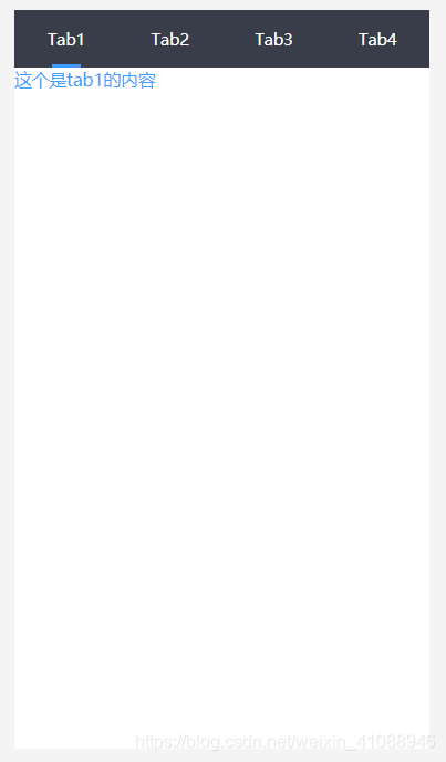
使用方式
<Tabs>
      <Tab title="Tab1">
        <div class="fs-30 color-edit">这个是tab1的内容</div>
      </Tab>
      <Tab title="Tab2">
        <div>这个是tab2的内容</div>
      </Tab>
      <Tab title="Tab3">
        <div>这个是tab3的内容</div>
      </Tab>
      <Tab title="Tab4">
        <div>这个是tab4的内容</div>
      </Tab>
</Tabs>