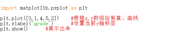
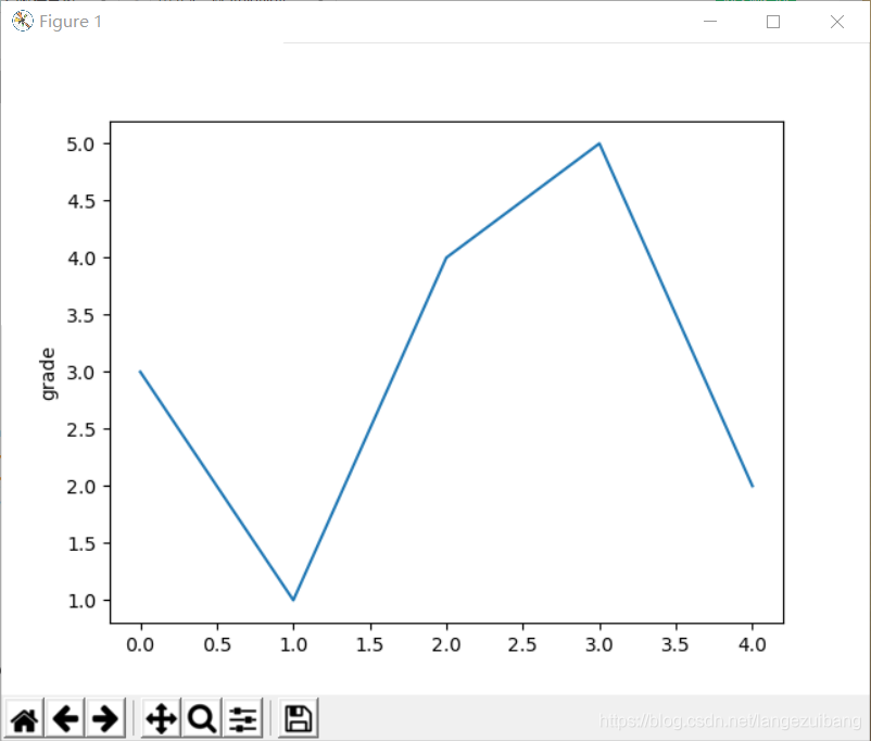
上嵩老师的慕课学python.
import numpy as np
import matplotlib.pyplot as plt
def f(t):
return np.exp(-t) * np.cos(2*np.pi*t) #绘制基本的三角函数
a = np.arange(0.0, 5.0, 0.02)
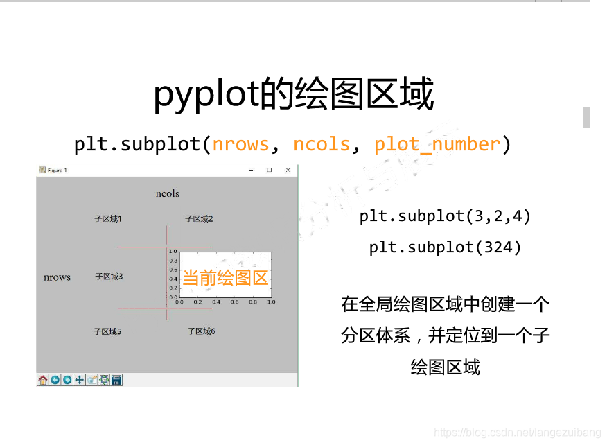
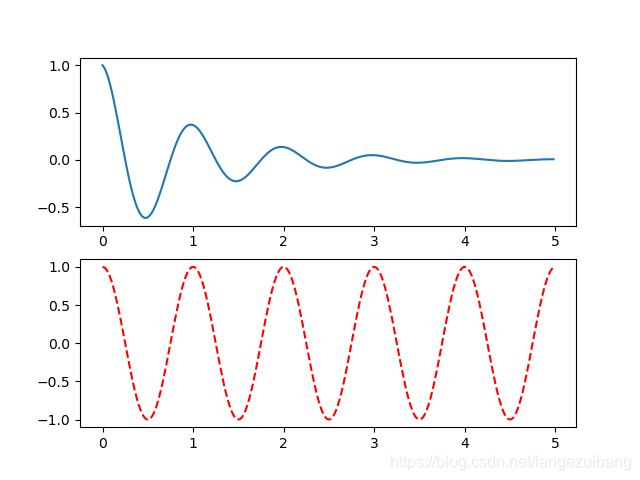
plt.subplot(211) #绘图区域分为2行1列,1为上面
plt.plot(a, f(a))
plt.subplot(2,1,2) #绘图区域分为2行1列,2为下面
plt.plot(a, np.cos(2*np.pi*a),'r--')
plt.show()
结果为:
实例:
import matplotlib.pyplot as plt
import numpy as np
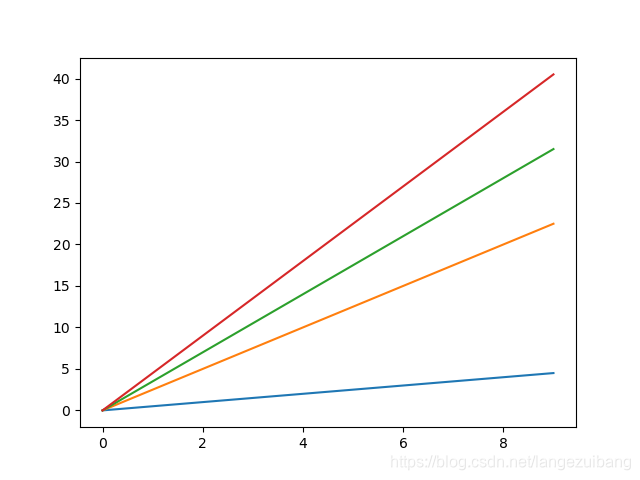
a = np.arange(10)
plt.plot(a,a*0.5,a,a*2.5,a,a*3.5,a,a*4.5)
plt.show()
结果:
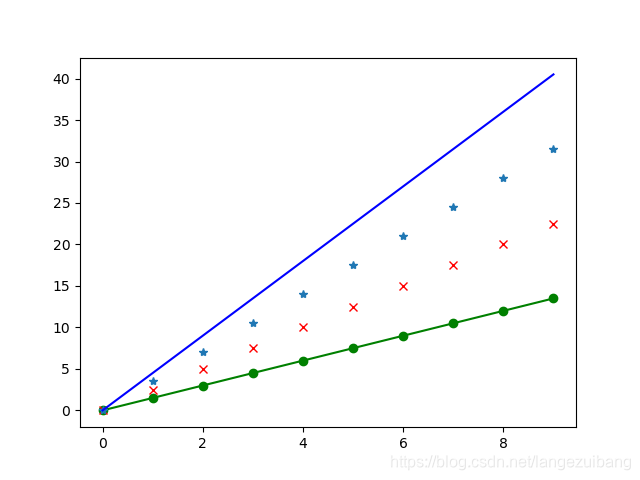
实例:
import matplotlib.pyplot as plt
import numpy as np

a = np.arange(10)
plt.plot(a,a*1.5,'go-',a,a*2.5,'rx',a,a*3.5,'*',a,a*4.5,'b-')
plt.show()
结果:
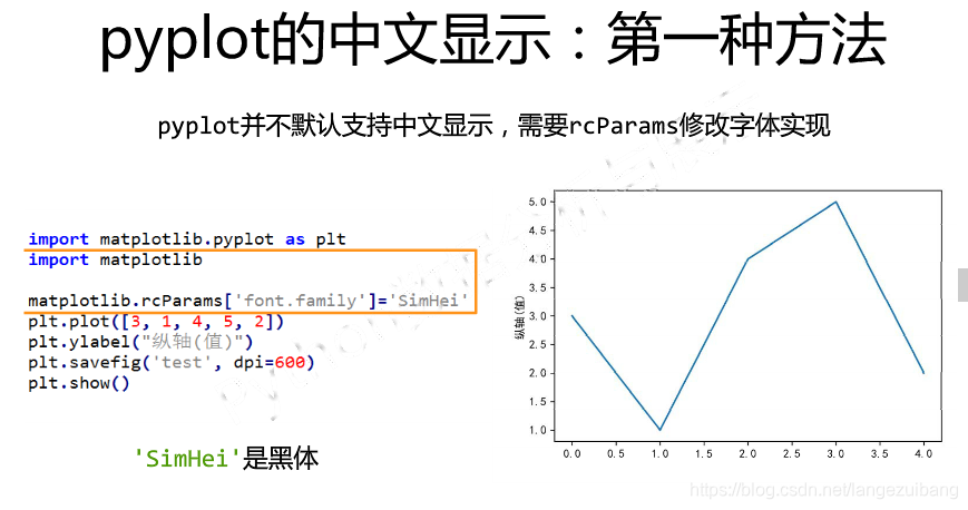
实例:
import numpy as np
import matplotlib.pyplot as plt
import matplotlib
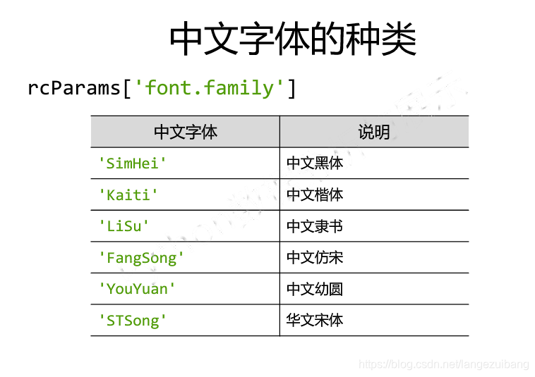
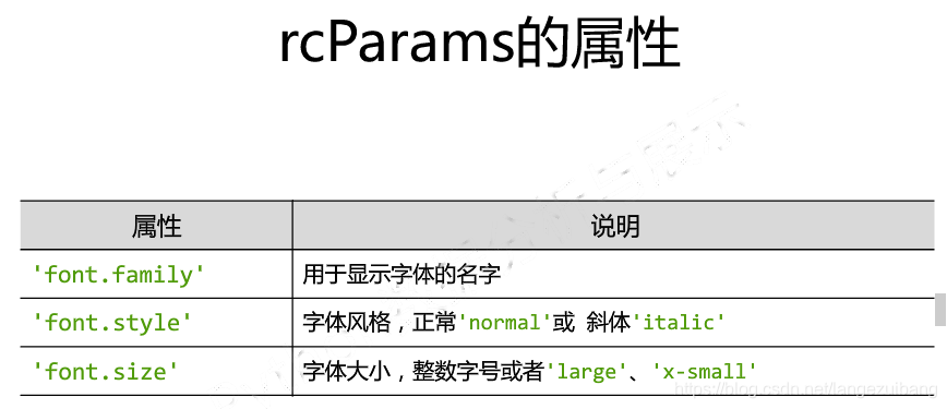
matplotlib.rcParams['font.family']='Kaiti'
matplotlib.rcParams['font.size']=20
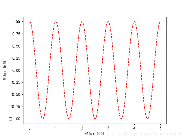
a = np.arange(0.0,5.0,0.02)
plt.xlabel('横轴:时间')
plt.ylabel('纵轴:振幅')
plt.plot(a, np.cos(2*np.pi*a),'r--')
plt.show()
结果:
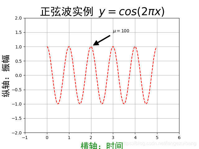
实例:
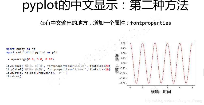
import numpy as np
import matplotlib.pyplot as plt

a = np.arange(0.0,5.0,0.02)
plt.plot(a, np.cos(2*np.pi*a),'r--')

plt.xlabel('横轴:时间',fontproperties='SimHei',fontsize=20,color='green')
plt.ylabel('纵轴:振幅',fontproperties='SimHei',fontsize=20)
plt.title(r'正弦波实例 $y=cos(2\pi x)$',fontproperties='SimHei',fontsize=25)
plt.annotate(r'$\mu=100$',xy=(2,1),xytext=(3,1.5),
    #用箭头在指定数据创建一个注释
         arrowprops=dict(facecolor='black',shrink=0.1,width=2))

plt.axis([-1,6,-2,2])
plt.grid(True)
plt.show()
结果:
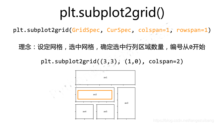
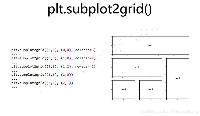
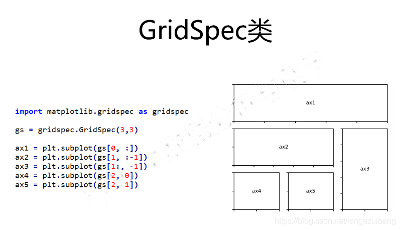
设置复杂的绘图区域