text-shadow
基本使用
text-shadow:x y 阴影模糊大小 颜色;
<div>TEXT SHADOW</div>
--------------------------
*{
	margin: 0;
	padding: 0;
}
div{
	position:  absolute;
	width: 700px;
	heigth: 100px;
	left: calc(50% - 350px);
	top: calc(50% - 50px);
	font-size: 80px;
    color: #ddd;

    text-shadow: 10px 10px 10px #000;

}

浮雕效果
<div>TEXT SHADOW</div>
--------------------------
*{
	margin: 0;
	padding: 0;
}
body{
	background: #0ff;
}
div{
	position: absolute;
	width: 700px;
	height: 100px;
	left: calc(50% - 350px);
	top: calc(50% - 50px);
	font-size: 80px;
	color: #ddd;

	text-shadow: 2px 2px #000,
				-1px -1px #fff;
}

镂刻
将浮雕的对换
text-shadow: -1px -1px #000,
              1px 1px #fff;

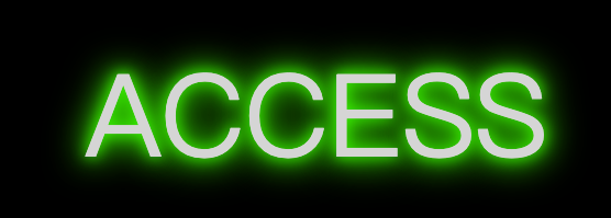
鼠标移入和移出的动画效果
<div>ACCESS</div>
---------------------
*{
margin: 0;
padding: 0;
}
body{
background: #000;
}
div{
position: absolute;
width: 700px;
height: 100px;
left: calc(50% - 350px);
top: calc(50% - 50px);
font-size: 80px;
color: #ddd;
text-shadow: 0px 0px 10px #0f0,
0px 0px 20px #0f0,
0px 0px 30px #0f0;
/* 动画效果 */
transition: all 2s;
}
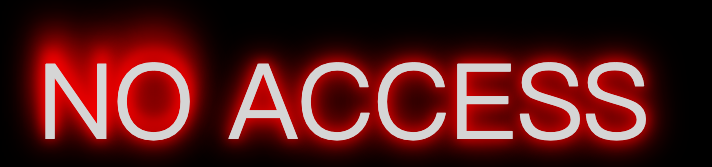
div:hover{
text-shadow:0px 0px 10px #f00,
0px 0px 20px #f10,
0px 0px 30px #f20;
}
div::before{
content: "NO ";
opacity: 0;
text-shadow:0px 0px 10px #f00,
0px 0px 20px #f10,
0px 0px 30px #f20,
0px -10px 10px #f20,
0px -20px 20px #f10,
0px -30px 30px #f00;
/* 动画效果 */
transition: all 2s;
}
div:hover::before{
opacity: 1;
}
鼠标移入之前
鼠标移入之后
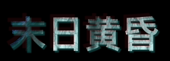
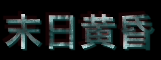
文字切割背景图片加阴影
<div>末日黄昏</div>
------------------
*{
    margin: 0;
    padding: 0;
}
body{
    background: black;
}
div{
    position: absolute;
    width: 800px;
    height: 200px;
    left: calc(50% - 200px);
    top: 200px;
    font-size: 120px;
    font-weight: bold;

    background-image: url("/Users/biaofeng/Desktop/eye.jpg");
    background-size: 600px 500px;
    background-repeat: no-repeat;
    background-position: 0px 0px;

    -webkit-background-clip: text;
    background-clip: text;
    -webkit-text-fill-color: transparent;
    /* text-fill-color: transparent; */
    /* 由于用文字剪切图片后就变成了背景图片的一部分
        所以阴影就在背景图片的上面
        解决方法:
            颜色用rgba格式调整透明度
     */
    text-shadow: -10px -10px 3px rgba(223, 66, 66, 0.1),
                5px 5px 3px rgba(0, 255, 255, 0.2);
    transition: all 1s;
}
div:hover{
    background-position: -80px -100px;
}
影分身
<div>末日黄昏</div>
-----------------------
*{
    margin: 0;
    padding: 0;
}
div{
    position: absolute;
    width: 300px;
    height: 100px;
    left: calc(50% - 150px);
    top: 100px;
    font-size: 100px;
    font-weight: 100px;
    /* color: red; */
    text-shadow: 0px 0px 10px #f10,
                0px 0px 15px #f20,
                0px 0px 20px #f30;
    transition: all 1s;
}
div:hover{
    text-shadow: 10px -10px 10px #0f0,
                10px  10px  20px #00f,
              -10px 10px 30px #0ff,
              -10px -10px 20px #f0f,
              20px -20px 10px #f40,
                30px  10px  20px #ffa,
              -20px 40px 30px #ff0,
              -100px -40px 20px #f10;
}

描边
<div>你很帅</div>
--------------------
*{
    margin: 0;
    padding: 0;
}
div{
    position: absolute;
    width: 400px;
    height: 100px;
    left: calc(50% - 200px);
    top: 200px;
    font-size: 100px;
    /* font-family:simsun; */
    color: transparent;

    -webkit-text-stroke: 1px red;
}
