Android系统为我们提供了许多的原生控件,但是在某些情况系统原生控件并不能很好的满足我们的需求,这时就需要用到自定义控件了,并且自定义控件还可以实现很多炫酷的效果。
按类型来划分的话,自定义控件的实现方式基本可以分为三种,自绘控件、组合控件、继承控件。
- 自绘控件:这个控件上所展现的内容全部都是自己绘制出来的,自己绘制不同于系统原生的控件,许多炫酷的自定义控件效果大多属于这种;
- 组合控件:有时应用界面需要重复的将几种原生控件组合到一起使用,这时我们就可以把这个几个控件组合成一个控件,方便使用,此时我们并不需要自己去绘制视图上显示的内容;
- 继承控件:有时候系统原生的控件可以满足我们的大部分需求但又不能满足一些特殊要求,此时我们并不需要自己从头去实现一个控件,只需继承原生控件,在其基础上扩展我们需要的功能即可。
〇、View的绘制流程
Android中的所有控件都是直接或间接继承自View的,任何一个控件View的展示都是要经过系统的绘制,系统绘制View过程中要经历三个主要阶段分别是:1、measure方法来确定控件尺寸;2、layout方法确定控件位置;3. draw方法绘制控件内容。
    //measure方法
    public final void measure(int widthMeasureSpec, int heightMeasureSpec) {
        ......
        onMeasure(widthMeasureSpec, heightMeasureSpec);
        ......
    }
//layout方法
public void layout(int l, int t, int r, int b) {
......
onLayout(changed, l, t, r, b);
......
} //draw方法
public void draw(Canvas canvas) {
......
if (!dirtyOpaque) onDraw(canvas);
......
}这三个方法又分别调用了onMeasure()、onLayout()、onDraw()方法;当我们需要自定义控件时就需要按照功能重写这三个方法中的一个或多个执行自己的绘制逻辑:在onMeasure()方法中确定控件尺寸、在onLayout()确定控件位置、在onDraw()方法绘制控件内容:
package com.mliuxb.mycustomview0328;

import android.content.Context;
import android.graphics.Canvas;
import android.support.annotation.Nullable;
import android.util.AttributeSet;
import android.util.Log;
import android.view.View;

/**
 * Description: View的绘制流程
 */
public class CustomView extends View {
    private static final String TAG = "CustomView";

    public CustomView(Context context) {
        super(context);
    }

    public CustomView(Context context, @Nullable AttributeSet attrs) {
        super(context, attrs);
    }

    public CustomView(Context context, @Nullable AttributeSet attrs, int defStyleAttr) {
        super(context, attrs, defStyleAttr);
    }

    public CustomView(Context context, @Nullable AttributeSet attrs, int defStyleAttr, int defStyleRes) {
        super(context, attrs, defStyleAttr, defStyleRes);
    }

    @Override
    protected void onMeasure(int widthMeasureSpec, int heightMeasureSpec) {
        Log.i(TAG, "onMeasure: ");
        super.onMeasure(widthMeasureSpec, heightMeasureSpec);
    }

    @Override
    protected void onLayout(boolean changed, int left, int top, int right, int bottom) {
        Log.i(TAG, "onLayout: ");
        super.onLayout(changed, left, top, right, bottom);
    }

    @Override
    protected void onDraw(Canvas canvas) {
        Log.i(TAG, "onDraw: ");
        super.onDraw(canvas);
    }
}
一、自绘控件
下面自己绘制一个简单的圆环控件,效果如下所示:

首先需要自己写一个MyRing类继承View,并实现构造方法,在构造方法中进行初始化,然后在onDraw()方法中进行绘制。
package com.mliuxb.mycustomview0328;

import android.content.Context;
import android.graphics.Canvas;
import android.graphics.Color;
import android.graphics.Paint;
import android.support.annotation.Nullable;
import android.util.AttributeSet;
import android.util.Log;
import android.view.View;

/**
 * Description: 自定义圆环
 */
public class MyRing extends View{
    private static final String TAG = "MyRing";

    private Paint paint;

    public MyRing(Context context) {
        this(context, null);
    }

    public MyRing(Context context, @Nullable AttributeSet attrs) {
        this(context, attrs, 0);
    }

    public MyRing(Context context, @Nullable AttributeSet attrs, int defStyleAttr) {
        this(context, attrs, defStyleAttr, 0);
    }

    public MyRing(Context context, @Nullable AttributeSet attrs, int defStyleAttr, int defStyleRes) {
        super(context, attrs, defStyleAttr, defStyleRes);
        init();
    }

    private void init() {
        //创建画笔
        paint = new Paint();
        paint.setColor(Color.BLUE);
        paint.setStyle(Paint.Style.STROKE);//空心
        paint.setStrokeWidth(20); //设置圆环宽度
        paint.setAntiAlias(true); //消除锯齿
    }

    @Override
    protected void onDraw(Canvas canvas) {
        super.onDraw(canvas);
        Log.i(TAG, "onDraw: ");
        //绘制圆形:参1,2: 圆心坐标; 参3:半径
        canvas.drawCircle(getWidth()/2,getHeight()/2, 200, paint);
    }
}
这样自定义的圆环控件就完成了,接下来让这个圆环显示在界面上,在布局文件中加入圆环控件(注意要使用全类名)
<?xml version="1.0" encoding="utf-8"?>
<android.support.constraint.ConstraintLayout
    xmlns:android="http://schemas.android.com/apk/res/android"
    xmlns:app="http://schemas.android.com/apk/res-auto"
    xmlns:tools="http://schemas.android.com/tools"
    android:layout_width="match_parent"
    android:layout_height="match_parent"
    tools:context=".MainActivity">

    <com.mliuxb.mycustomview0328.MyRing
        android:layout_width="wrap_content"
        android:layout_height="wrap_content"/>

</android.support.constraint.ConstraintLayout>
这样圆环控件就能显示在主页面上面了,如上面的效果图所示。这样一个简单的自己绘制控件就完成了。
二、组合控件
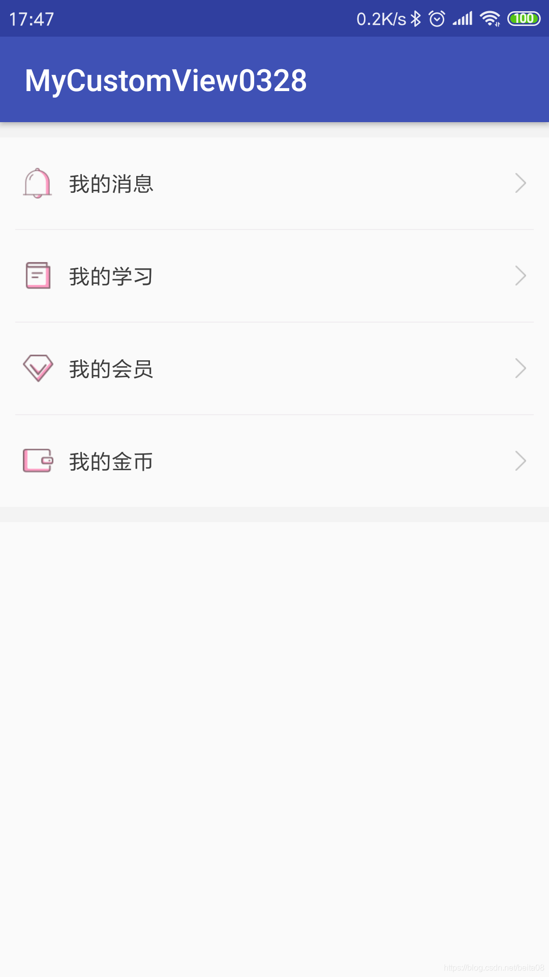
如下图所示,想必类似的条目布局大家都不陌生,在应用的个人信息页面或者设置页面很常见,我们需要重复的将几种原生控件组合到一起使用:


这时我们就可以把这个几个控件组合成一个控件(自定义组合控件),方便使用。
首先,根据条目的需求新建一个条目的布局文件view_item.xml:
<?xml version="1.0" encoding="utf-8"?>
<RelativeLayout
    xmlns:android="http://schemas.android.com/apk/res/android"
    android:layout_width="match_parent"
    android:layout_height="60dp"
    android:padding="15dp">

    <ImageView
        android:id="@+id/iv_image"
        android:layout_width="wrap_content"
        android:layout_height="wrap_content"
        android:layout_centerVertical="true"/>

    <TextView
        android:id="@+id/tv_title"
        android:layout_width="wrap_content"
        android:layout_height="wrap_content"
        android:layout_centerVertical="true"
        android:layout_marginStart="10dp"
        android:layout_toEndOf="@+id/iv_image"
        android:textColor="#3C3C3C"
        android:textSize="14sp"/>

    <ImageView
        android:layout_width="wrap_content"
        android:layout_height="wrap_content"
        android:layout_alignParentEnd="true"
        android:layout_centerVertical="true"
        android:src="@drawable/more_arrow"/>
</RelativeLayout>
如上,以RelativeLayout布局为根布局,包含一个条目的ImageView、TextView、以及一个更多的箭头ImageView。然后需要创建一个自定义控件ItemView并继承自FrameLayout,并实现构造方法,在构造方法中进行初始化,代码如下:
package com.mliuxb.mycustomview0328;

import android.content.Context;
import android.support.annotation.DrawableRes;
import android.support.annotation.NonNull;
import android.support.annotation.Nullable;
import android.util.AttributeSet;
import android.view.LayoutInflater;
import android.widget.FrameLayout;
import android.widget.ImageView;
import android.widget.TextView;

/**
 * Description:自定义组合控件
 */
public class ItemView extends FrameLayout {
    private static final String TAG = "ItemView";

    private ImageView ivImage;
    private TextView  tvTitle;

    public ItemView(@NonNull Context context) {
        this(context, null);
    }

    public ItemView(@NonNull Context context, @Nullable AttributeSet attrs) {
        this(context, attrs, 0);
    }

    public ItemView(@NonNull Context context, @Nullable AttributeSet attrs, int defStyleAttr) {
        this(context, attrs, defStyleAttr, 0);
    }

    public ItemView(@NonNull Context context, @Nullable AttributeSet attrs, int defStyleAttr, int defStyleRes) {
        super(context, attrs, defStyleAttr, defStyleRes);

        initItemView(context);
    }

    private void initItemView(@NonNull Context context) {
        //加载布局,注意参二传入this对象,表示指定当前的 ItemView 对象为加载的布局文件的父控件
        LayoutInflater.from(context).inflate(R.layout.view_item, this);
        ivImage = findViewById(R.id.iv_image);
        tvTitle = findViewById(R.id.tv_title);
    }

    public void setTitle(CharSequence text) {
        tvTitle.setText(text);
    }


    public void setImageResource(@DrawableRes int resId) {
        ivImage.setImageResource(resId);
    }

}
在初始化的方法中,首先我们使用布局填充器 LayoutInflater 的 inflate() 方法来加载刚刚定义的 view_item.xml 布局,并且要特别注意【参二】传入了一个 this 对象,表示指定当前的 ItemView 对象为加载的布局文件的父控件,即 view_item.xml 布局为 ItemView 的子布局。否则,如果传入 null 的话,则就需要我们再使用 addView(child) 方法为当前 ItemView 添加子布局。
然后使用 findViewById() 方法获取控件,并且提供了 setTitle() 和 setImageResource() 方法用于在外部分别设置每个条目的图片和标题,这样就可以在页面的布局文件中引用 ItemView 控件,并且在代码中为每个条目设置不用的内容,这样一个自定义组合控件就告一段落了。
现在我们可以在代码中为每个条目设置不用的内容(图片和标题),但是如果我们想直接在页面布局文件的 ItemView 标签内控制每个条目的内容,就像系统控件的各个属性那样,这就需要再为 ItemView 控件自定义一些属性了。
首先在 res/values 目录下创建 attrs.xml 属性文件,然后仿照系统的 attrs.xml 属性文件中的格式为 ItemView控件自定义属性,如下所示:
<?xml version="1.0" encoding="utf-8"?>
<resources>

    <!--自定义ItemView的属性-->
    <declare-styleable name="ItemView">

        <!--条目的标题,格式为string-->
        <attr name="item_title" format="string"/>

        <!--条目的图片,格式为drawable-->
        <attr name="item_image" format="reference"/>
    </declare-styleable>

</resources>
我们知道,当我们在布局文件中为控件设置属性后,系统在底层创建这个控件时,会将布局文件中的所有属性的值通过构造方法中的 AttributeSet 参数传递过来,自定义的属性也是一样的,所以我们需要在自定义属性的值传递过来时做相应操作,这样我们在 ItemView 中添加 initAttributes() 方法处理自定义属性的相关数据:
package com.mliuxb.mycustomview0328;

import android.content.Context;
import android.support.annotation.DrawableRes;
import android.support.annotation.NonNull;
import android.support.annotation.Nullable;
import android.util.AttributeSet;
import android.view.LayoutInflater;
import android.widget.FrameLayout;
import android.widget.ImageView;
import android.widget.TextView;

/**
 * Description:自定义组合控件
 */
public class ItemView extends FrameLayout {
    private static final String TAG = "ItemView";
    private static final String NAME_SPACE = "http://schemas.android.com/apk/res-auto";

    private ImageView ivImage;
    private TextView  tvTitle;

    public ItemView(@NonNull Context context) {
        this(context, null);
    }

    public ItemView(@NonNull Context context, @Nullable AttributeSet attrs) {
        this(context, attrs, 0);
    }

    public ItemView(@NonNull Context context, @Nullable AttributeSet attrs, int defStyleAttr) {
        this(context, attrs, defStyleAttr, 0);
    }

    public ItemView(@NonNull Context context, @Nullable AttributeSet attrs, int defStyleAttr, int defStyleRes) {
        super(context, attrs, defStyleAttr, defStyleRes);

        initItemView(context);
        if (attrs != null) {
            initAttributes(attrs);
        }
    }

    private void initItemView(@NonNull Context context) {
        //加载布局,注意参二传入this对象,表示指定当前的 ItemView 对象为加载的布局文件的父控件
        LayoutInflater.from(context).inflate(R.layout.view_item, this);
        ivImage = findViewById(R.id.iv_image);
        tvTitle = findViewById(R.id.tv_title);
    }

    public void setTitle(CharSequence text) {
        tvTitle.setText(text);
    }

    public void setImageResource(@DrawableRes int resId) {
        ivImage.setImageResource(resId);
    }

    //初始化自定义属性
    private void initAttributes(@NonNull AttributeSet attrs) {
        //从AttributeSet中取出自定义的属性
        String itemTitle = attrs.getAttributeValue(NAME_SPACE, "item_title");
        int itemImage = attrs.getAttributeResourceValue(NAME_SPACE, "item_image", 0);

        //根据自定义属性的值更新相关控件
        setTitle(itemTitle);
        setImageResource(itemImage);
    }
}
到这里我们就可以在布局页面中直接引用自定义组合控件 ItemView 了,并且在布局文件中为控件设置不同的属性,布局文件如下:
<?xml version="1.0" encoding="utf-8"?>
<LinearLayout
    xmlns:android="http://schemas.android.com/apk/res/android"
    xmlns:app="http://schemas.android.com/apk/res-auto"
    xmlns:tools="http://schemas.android.com/tools"
    android:layout_width="match_parent"
    android:layout_height="match_parent"
    android:orientation="vertical"
    tools:context=".MainActivity">

    <include layout="@layout/layout_line_10dp"/>

    <com.mliuxb.mycustomview0328.ItemView
        android:layout_width="match_parent"
        android:layout_height="wrap_content"
        app:item_image="@drawable/my1_message"
        app:item_title="我的消息"/>

    <include layout="@layout/layout_line_1dp"/>

    <com.mliuxb.mycustomview0328.ItemView
        android:layout_width="match_parent"
        android:layout_height="wrap_content"
        app:item_image="@drawable/my2_learn"
        app:item_title="我的学习"/>

    <include layout="@layout/layout_line_1dp"/>

    <com.mliuxb.mycustomview0328.ItemView
        android:layout_width="match_parent"
        android:layout_height="wrap_content"
        app:item_image="@drawable/my3_member"
        app:item_title="我的会员"/>

    <include layout="@layout/layout_line_1dp"/>

    <com.mliuxb.mycustomview0328.ItemView
        android:layout_width="match_parent"
        android:layout_height="wrap_content"
        app:item_image="@drawable/my4_gold"
        app:item_title="我的金币"/>

    <include layout="@layout/layout_line_10dp"/>
</LinearLayout>
此时并没有在代码中为条目设置内容,布局文件的自定义属性已经生效,如下所示。现在的界面看起来和最开始开始的写四个 RelativeLayout 布局并没有什么变化,但是我们的处理方式已经完全不一样了,如果有很多这样的条目,那么后续使用将非常方便,而且布局文件的条理也会非常清晰。
三、继承控件
继承控件的特点就是不仅能够按照我们的需求加入相应的功能,还可以保留原生控件的所有功能,所以在实际开发中这种自定义控件应该是我们使用频率最高的。
比如关于输入框控件,iOS的输入框右边就自带一个删除按键,点击之后一键删除输入框的内容;Android的 EditText 并没有相应的功能,我们也可以在布局文件中使用 RelativeLayout 包裹一个 EditText 和 ImageView ,并且在代码中为 EditText 添加文本改变的监听以及设置 ImageView 的点击事件以实现相应功能,这样做简单方便但是每个输入框都需要这样的流程,如果输入框比较多的话光这个一键删除的功能就会占据很多代码。此时我们可以考虑实现一个继承EditText的自定义控件,为EditText扩展该功能。

实现思路还是首先自定义ClearEditText类继承AppCompatEditText(Studio建议继承AppCompatEditText而不是EditText),这样就保证了我们的ClearEditText输入框保留了原生 EditText 的所有功能,然后实现构造方法,并且为 ClearEditText 添加文本变化的监听 以及 设置 ImageView 的点击事件,当点击到删除图标上时清空输入框内容,代码如下:
package com.mliuxb.mycustomview0328;

import android.annotation.SuppressLint;
import android.content.Context;
import android.graphics.drawable.Drawable;
import android.support.v7.widget.AppCompatEditText;
import android.text.Editable;
import android.text.TextUtils;
import android.text.TextWatcher;
import android.util.AttributeSet;
import android.view.MotionEvent;

/**
 * Description:自定义带删除功能的ClearEditText
 */
public class ClearEditText extends AppCompatEditText {
    private static final String TAG = "ClearEditText";

    public ClearEditText(Context context) {
        this(context, null);
    }

    public ClearEditText(Context context, AttributeSet attrs) {
        //这个构造方法也很重要,xml中的属性值通过AttributeSet参数传递过来。
        this(context, attrs, android.support.v7.appcompat.R.attr.editTextStyle);
    }

    public ClearEditText(Context context, AttributeSet attrs, int defStyleAttr) {
        super(context, attrs, defStyleAttr);
        initView();
    }

    private void initView() {
        //获取clear图片的Drawable对象
        final Drawable drawable = getResources().getDrawable(R.mipmap.clear, null);
        //添加监听
        addTextChangedListener(new TextWatcher() {
            @Override
            public void beforeTextChanged(CharSequence s, int start, int count, int after) {
            }

            @Override
            public void onTextChanged(CharSequence s, int start, int before, int count) {
            }

            @Override
            public void afterTextChanged(Editable s) {
                if (TextUtils.isEmpty(s)) {
                    setCompoundDrawablesWithIntrinsicBounds(null, null, null, null);
                } else {
                    //drawable.setBounds(0, 0, drawable.getMinimumWidth(), drawable.getMinimumHeight());
                    setCompoundDrawablesWithIntrinsicBounds(null, null, drawable, null);
                }
            }
        });
    }

    @SuppressLint("ClickableViewAccessibility")
    @Override
    public boolean onTouchEvent(MotionEvent event) {
        //获取rightDrawable
        Drawable rightDrawable = getCompoundDrawables()[2];
        if (event.getAction() == MotionEvent.ACTION_UP && rightDrawable != null) {
            float eventX = event.getX();//获取点击的X轴坐标
            float eventY = event.getY();//获取点击的Y轴坐标
            int width = getWidth();     //获取控件的宽度
            int height = getHeight();   //获取控件的高度
            int paddingEnd = getPaddingEnd();//获取右内边距
            int intrinsicWidth = rightDrawable.getIntrinsicWidth();  //获取rightDrawable的固有宽度
            int intrinsicHeight = rightDrawable.getIntrinsicHeight();//获取rightDrawable的固有高度

            //判断点击位置的X轴范围
            boolean touchedX = (eventX > (width - paddingEnd - intrinsicWidth)) && (eventX < (width - paddingEnd));
            //判断点击位置的Y轴范围
            boolean touchedY = (eventY > (height - intrinsicHeight) / 2) && (eventY < (height + intrinsicHeight) / 2);

            //清除文本
            if (touchedX && touchedY)
                setText("");
        }
        return super.onTouchEvent(event);
    }
}
首先可以看到:在初始化方法中获取Drawable对象,并且添加文本变化的监听addTextChangedListener(),这样输入框文本变化时就会回调TextWatcher中的三个方法,然后在afterTextChanged(Editable s)方法中判断变化后的文本是否为空,为其设置删除图标的显示和消失。此时我们这里不是调用setVisibility()方法,因为setVisibility()这个方法是针对View的,而是调用setCompoundDrawablesWithIntrinsicBounds(left, top, right, bottom)方法来设置右边的图标。
另外:setCompoundDrawables(left, top, right, bottom) 和 setCompoundDrawablesWithIntrinsicBounds(left, top, right, bottom) 两个方法都可为TextView 设置 左上右下的图标,区别在于 setCompoundDrawables(left, top, right, bottom) 方法调用之前还必须调用 drawable.setBounds() 方法为drawable设置宽高,而 setCompoundDrawablesWithIntrinsicBounds(left, top, right, bottom) 则不需要。
然后可以看到:在onTouchEvent(MotionEvent event)方法中判断相关点击事件,这是因为Android中并没有方法让我们给右边的图标设置点击监听的事件,于是我们认为MotionEvent中的ACTION_UP(抬起)事件发生时点击已经发生了,然后判断点击的位置坐标,点击坐标在删除图标的范围内即认为删除图标被点击了,此时清空文本内容。
这样一个自带一键删除功能的输入框就完成了,在布局文件中使用即可:
<?xml version="1.0" encoding="utf-8"?>
<android.support.constraint.ConstraintLayout
    xmlns:android="http://schemas.android.com/apk/res/android"
    xmlns:app="http://schemas.android.com/apk/res-auto"
    xmlns:tools="http://schemas.android.com/tools"
    android:layout_width="match_parent"
    android:layout_height="match_parent"
    tools:context=".MainActivity">

    <com.mliuxb.mycustomview0328.ClearEditText
        android:layout_width="match_parent"
        android:layout_height="wrap_content"
        android:textSize="20sp"/>

</android.support.constraint.ConstraintLayout>
以上分别就是自绘控件、组合控件、继承控件三种自定义控件的基本实现。