这周学完了css的所有视频,开始做仿微博的页面
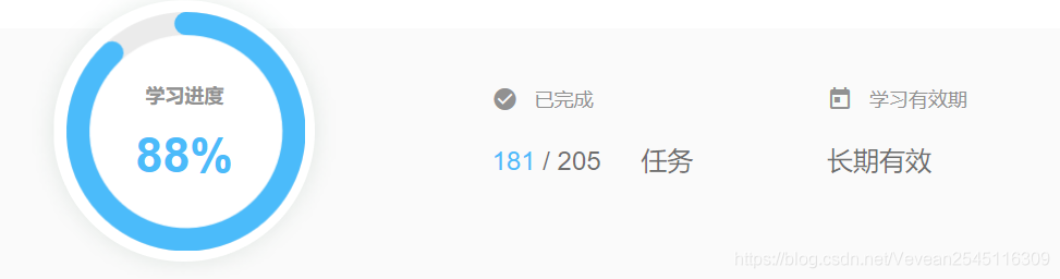
1.下面是学习视频的进度
2.2D转换模块
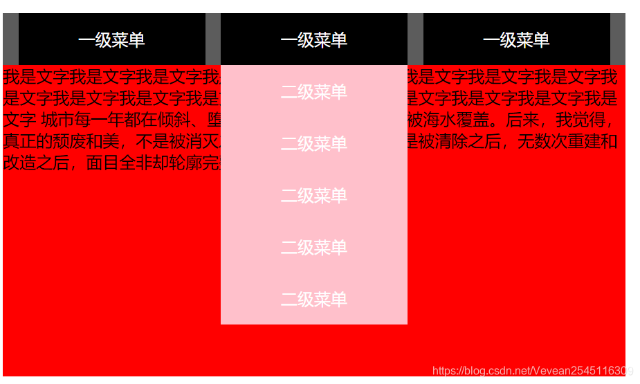
- 做了翻转菜单的练习
代码如下:
<!DOCTYPE html>
<html lang="en">
<head>
    <meta charset="UTF-8">
    <meta name="viewport" content="width=device-width, initial-scale=1.0">
    <meta http-equiv="X-UA-Compatible" content="ie=edge">
    <title>Document</title>
    <style>
        *{


            margin:0;
            padding:0;
        }
        .nave{


            width:600px;
            height:50px;
            background-color: #5c5c5c;
            margin:0 auto;
            margin-top:100px;
            list-style:none;
            width:600px;
            color:white;
        }
        div{


            width:600px;
            height:300px;
            background-color: red;
            margin:0 auto;

        }
        .nave>li{


            float:left;
            line-height:50px;
            text-align:center;
            width:180px;
            margin-left:15px;
            background-color: black;
            position:relative;
            left:0;
            top:0;
        }
        .sub{


            /*display:none;不显示元素*/
            position:absolute;
            width:180px;
        }

        .sub li{


            list-style:none;
            background-color: pink;
            transform:rotate(180deg);
            transition:all 1s;
            opacity:0;
        }
        /*.nave>li:hover .sub{
            display:block;
        }*/
        .nave>li:hover .sub li{


            transform:none;
            opacity:1;
        }
        .nave>li:hover .sub li:nth-child(1){


            transition-delay:0ms;
        }
        .nave>li:hover .sub li:nth-child(2){


        transition-delay:200ms;
        }
        .nave>li:hover .sub li:nth-child(3){


            transition-delay:400ms;
        }
        .nave>li:hover .sub li:nth-child(4){


            transition-delay:600ms;
        }
        .nave>li:hover .sub li:nth-child(5){


            transition-delay:800ms;
        }
        .nave>li.sub li:nth-child(5){


            transition-delay:800ms;
        }
        .nave>li .sub li:nth-child(4){


            transition-delay:0ms;
        }
        .nave>li.sub li:nth-child(3){


            transition-delay:200ms;
        }
        .nave>li .sub li:nth-child(2){


            transition-delay:400ms;
        }
        .nave>li .sub li:nth-child(1){


            transition-delay:600ms;
        }
    </style>
</head>
<body>
        <ul class="nave">
            <li>一级菜单
                <ul class="sub">
                    <li>二级菜单</li>
                    <li>二级菜单</li>
                    <li>二级菜单</li>
                    <li>二级菜单</li>
                    <li>二级菜单</li>
                </ul>
            </li>
            <li>一级菜单
                <ul class="sub">
                    <li>二级菜单</li>
                    <li>二级菜单</li>
                    <li>二级菜单</li>
                    <li>二级菜单</li>
                    <li>二级菜单</li>
                </ul>
            </li>
            <li>一级菜单
                <ul class="sub">
                    <li>二级菜单</li>
                    <li>二级菜单</li>
                    <li>二级菜单</li>
                    <li>二级菜单</li>
                    <li>二级菜单</li>
                </ul>
            </li>

        </ul>
    <div>
        我是文字我是文字我是文字我是文字我是文字我是文字我是文字我是文字我是文字我是文字我是文字我是文字我是文字我是文字我是文字我是文字我是文字我是文字我是文字
        城市每一年都在倾斜、堕落、向海洋移动,最终会被海水覆盖。后来,我觉得,真正的颓废和美,不是被消灭之前苟延残喘的存在,而是被清除之后,无数次重建和改造之后,面目全非却轮廓完整的一具残骸
    </div>
</body>
</html>
效果如下
3.动画模块
- 做了练习无限滚动
代码如下:
<!DOCTYPE html>
<html lang="en">
<head>
    <meta charset="UTF-8">
    <meta name="viewport" content="width=device-width, initial-scale=1.0">
    <meta http-equiv="X-UA-Compatible" content="ie=edge">
    <title>Document</title>
    <style>
    *{


        margin:0;
        padding:0;
    }
    div{


        width:500px;/*width:1000px*/
        height:280px;
        background-color: pink;
        margin:0 auto;
        margin-top:100px;
        overflow:hidden;
    }
    ul{


        width:2000px;
        height:280px;
        background-color: black;
        animation:move 5s linear 0s infinite normal;
    }
    @keyframes move{


        from{


            margin-left:0;
        }
        to{


            margin-left:-1000px;
        }
    }
    ul li{


        list-style:none;
        width:500px;
        height:280px;
        border: 1px solid #000;
        background-color: red;
        box-sizing:border-box;
        float:left;

    }
    ul:hover{


        animation-play-state:paused;
    }
    ul:hover li{


        opacity:0.5;
    }
    ul li:hover{


        opacity:1;
    }
    </style>
</head>
<body>
    <div>
        <ul>
            <li><img src="images/手风琴1.webp"></li>
            <li><img src="images/手风琴2.webp"></li>
            <li><img src="images/手风琴3.jpg"></li>
            <li><img src="images/手风琴4.jpg"></li>
            <li><img src="images/手风琴1.png"></li>
            <li><img src="images/手风琴2.jpg"></li>
        </ul>
    </div>
</body>
</html>
效果如下:

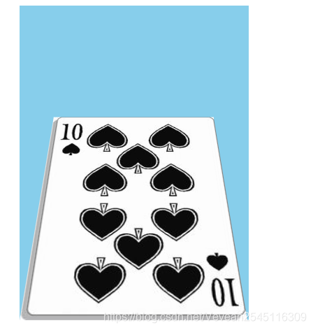
- 做了扑克牌练习
代码如下:
<!DOCTYPE html>
<html lang="en">
<head>
    <meta charset="UTF-8">
    <meta name="viewport" content="width=device-width, initial-scale=1.0">
    <meta http-equiv="X-UA-Compatible" content="ie=edge">
    <title>Document</title>
    <style>
        *{


            margin:0;
            padding:0;
        }
        div{


            background-color:skyblue;
            margin:0 auto;
            width:219px;
            height:300px;
            perspective:500px;
        }
        div img{


            transform-origin:center bottom;
            transform:transform 5s;
        }
        div img:hover{


            transform:rotateX(45deg);
        }
    </style>
</head>
<body>
    <div>
        <img src="images/扑克牌.jpg">
    </div>
</body>
</html>
效果图: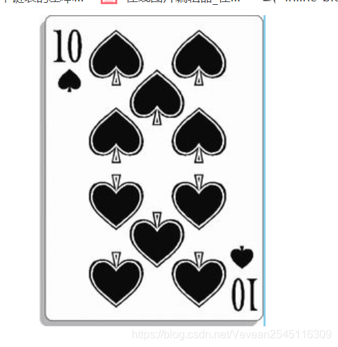
4.3D转换模块
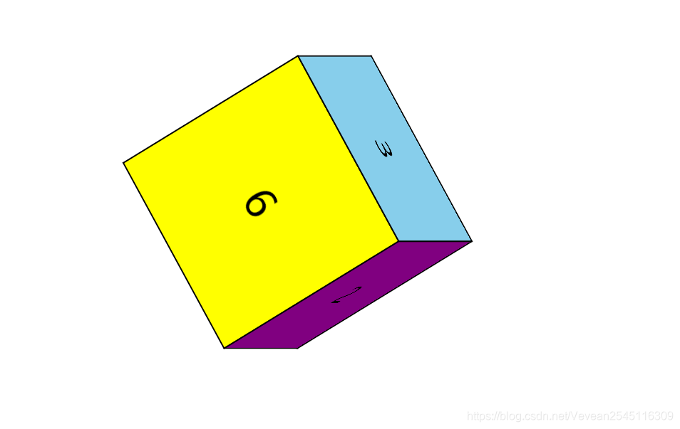
- 做了正方体的练习(有两种方法)
1.先平移再旋转
<!DOCTYPE html>
<html lang="en">
<head>
    <meta charset="UTF-8">
    <meta name="viewport" content="width=device-width, initial-scale=1.0">
    <meta http-equiv="X-UA-Compatible" content="ie=edge">
    <title>Document</title>
    <style>
        *{


            padding:0;
            margin:0;
        }
        ul{


            width:200px;
            height:200px;
            box-sizing:border-box;
            margin:100px auto;
            position:relative;
            transform-style:preserve-3d;
            transform:rotateY(0deg) rotate(0deg);
        }
        ul li{


            width:200px;
            height:200px;
            list-style:none;
            border: 1px solid #000;
            text-align:center;
            line-height:200px;
            position:absolute;
            left:0;
            top:0;
            font-size:40px;
        }
        li:nth-child(1)
        {


            background-color:pink;
            transform:translateX(-100px) rotateY(90deg);
        }
        li:nth-child(2)
        {


            background-color:purple;
            transform:translateX(100px) rotateY(90deg);
        }
        li:nth-child(3)
        {


            background-color:skyblue;
            transform:translateY(-100px) rotateX(90deg);
        }
        li:nth-child(4)
        {


            background-color:red;
            transform:translateY(100px) rotateX(90deg);

        }
        li:nth-child(5)
        {


            background-color:violet;
            transform:translateZ(-100px);
        }
        li:nth-child(6)
        {


            background-color:yellow;
            transform:translateZ(100px);
        }
    </style>
</head>
<body>
    <ul>
        <li>1</li>
        <li>2</li>
        <li>3</li>
        <li>4</li>
        <li>5</li>
        <li>6</li>
    </ul>
</body>
</html>
2.先旋转再平移
<!DOCTYPE html>
<html lang="en">
<head>
    <meta charset="UTF-8">
    <meta name="viewport" content="width=device-width, initial-scale=1.0">
    <meta http-equiv="X-UA-Compatible" content="ie=edge">
    <title>Document</title>
    <style>
        *{


            padding:0;
            margin:0;
        }
        ul{


            width:200px;
            height:200px;
            box-sizing:border-box;
            margin:100px auto;
            position:relative;
            transform-style:preserve-3d;
            transform:rotateY(0deg) rotateX(0deg);
        }
        ul li{


            width:200px;
            height:200px;
            list-style:none;
            border: 1px solid #000;
            text-align:center;
            line-height:200px;
            position:absolute;
            left:0;
            top:0;
            font-size:40px;
        }
        li:nth-child(1)
        {


            background-color:pink;
            transform:rotateX(90deg) translateZ(-100px);

        }
        li:nth-child(2)
        {


            background-color:purple;
            transform:rotateX(180deg) translateZ(100px);


        }
        li:nth-child(3)
        {


            background-color:skyblue;
            transform:translateX(100px) rotateY(90deg);

        }
        li:nth-child(4)
        {


            background-color:red;
            transform:translateX(-100px) rotateY(90deg);


        }
        li:nth-child(5)
        {


            background-color:violet;
            transform:rotateY(270deg) translateZ(100px);
        }
        li:nth-child(6)
        {


            background-color:yellow;
            transform:rotateY(360deg) translateZ(-100px);

        }
    </style>
</head>
<body>
    <ul>
        <li>1</li>
        <li>2</li>
        <li>3</li>
        <li>4</li>
        <li>5</li>
        <li>6</li>
    </ul>
</body>
</html>
间接旋转后效果如下:
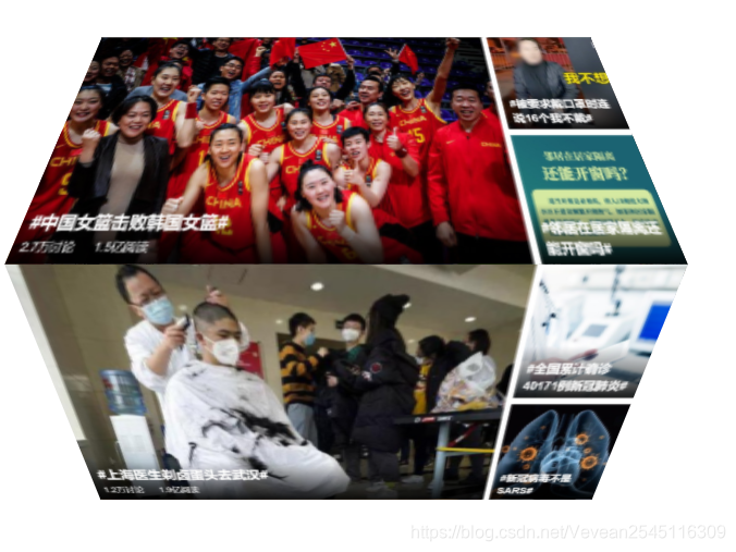
- 做了3D轮播图的练习
<!DOCTYPE html>
<html lang="en">
<head>
    <meta charset="UTF-8">
    <meta name="viewport" content="width=device-width, initial-scale=1.0">
    <meta http-equiv="X-UA-Compatible" content="ie=edge">
    <title>Document</title>
    <style>
        *{


            padding:0;
            margin:0;
        }
        body{


            perspective:500px;
        }
        ul{


            width:200px;
            height:200px;
            box-sizing:border-box;
            margin:100px auto;
            position:relative;
            transform-style:preserve-3d;
            transform:rotateY(0deg) rotateX(0deg);
            transform-style:preserve-3d;
            animation:move 5s linear 0s infinite normal;
        }
        @keyframes move{


            from{


                transform:rotateX(0deg);
            }
            to{


                transform:rotateX(360deg);
            }
        }
        ul li{


            width:200px;
            height:200px;
            list-style:none;
            text-align:center;
            line-height:200px;
            position:absolute;
            left:0;
            top:0;
            font-size:40px;
            overflow:hidden;
        }
        ul li img{


            width:200px;
            height:200px;
        }
        li:nth-child(1)
        {


            background-color:pink;
            transform:rotateX(90deg) translateZ(100px) scale(1.5,1);

        }
        li:nth-child(2)
        {


            background-color:purple;
            transform:rotateX(180deg) translateZ(100px) scale(1.5,1);


        }
        li:nth-child(3)
        {


            background-color:skyblue;
            transform:translateX(150px) rotateY(90deg) scale(1,1);

        }
        li:nth-child(4)
        {


            background-color:red;
            transform:translateX(-150px) rotateY(90deg) scale(1,1);


        }
        li:nth-child(5)
        {


            background-color:violet;
            transform:rotateX(270deg) translateZ(100px) scale(1.5,1);
        }
        li:nth-child(6)
        {


            background-color:yellow;
            transform:rotateY(360deg) translateZ(100px) scale(1.5,1);

        }
    </style>
</head>
<body>
    <ul>
        <li><img src="images/轮播图1.png"></li>
        <li><img src="images/轮播图2.png"></li>
        <li><img src="images/轮播图4.png"></li>
        <li><img src="images/轮播图5.png"></li>
        <li><img src="images/轮播图7.png"></li>
        <li><img src="images/轮播图8.png"></li>
    </ul>
</body>
</html>
效果如下:(它可以动的…)
- 学习做了长方体
只需要给正方体加上transform:scale(,);就好了,它会拉伸正方体的四个面
代码如下
<!DOCTYPE html>
<html lang="en">
<head>
    <meta charset="UTF-8">
    <meta name="viewport" content="width=device-width, initial-scale=1.0">
    <meta http-equiv="X-UA-Compatible" content="ie=edge">
    <title>Document</title>
    <style>
        *{


            padding:0;
            margin:0;
        }
        ul{


            width:200px;
            height:200px;
            box-sizing:border-box;
            margin:100px auto;
            position:relative;
            transform-style:preserve-3d;
            transform:rotateY(0deg) rotateX(0deg);
        }
        ul li{


            width:200px;
            height:200px;
            list-style:none;
            border: 1px solid #000;
            text-align:center;
            line-height:200px;
            position:absolute;
            left:0;
            top:0;
            font-size:40px;
        }
        li:nth-child(1)
        {


            background-color:pink;
            transform:rotateX(90deg) translateZ(-100px) scale(1.5,1);

        }
        li:nth-child(2)
        {


            background-color:purple;
            transform:rotateX(180deg) translateZ(100px) scale(1.5,1);


        }
        li:nth-child(3)
        {


            background-color:skyblue;
            transform:translateX(100px) rotateY(90deg) scale(1.5,1);

        }
        li:nth-child(4)
        {


            background-color:red;
            transform:translateX(-100px) rotateY(90deg) scale(1.5,1);


        }
        li:nth-child(5)
        {


            background-color:violet;
            transform:rotateY(270deg) translateZ(100px) scale(1.5,1);
        }
        li:nth-child(6)
        {


            background-color:yellow;
            transform:rotateY(360deg) translateZ(-100px) scale(1.5,1);

        }
    </style>
</head>
<body>
    <ul>
        <li>1</li>
        <li>2</li>
        <li>3</li>
        <li>4</li>
        <li>5</li>
        <li>6</li>
    </ul>
</body>
</html>
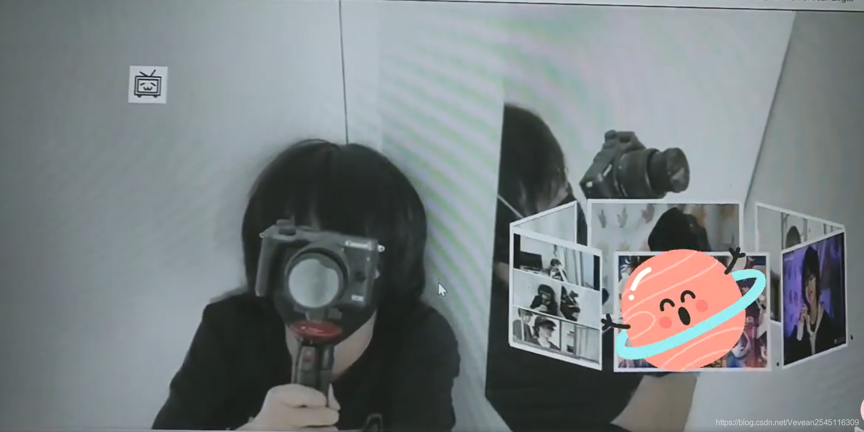
- 做了3D播放器的练习
<!DOCTYPE html>
<html lang="en">
<head>
    <meta charset="UTF-8">
    <meta name="viewport" content="width=device-width, initial-scale=1.0">
    <meta http-equiv="X-UA-Compatible" content="ie=edge">
    <title>Document</title>
    <style>
        *{


            margin:0;
            padding:0;
        }
        body{


            background:pink url("images/QQ图片20200101221107.jpg") no-repeat fixed;
            background-size:cover;
        }
        ul{


            width:200px;
            height:150px;
           position:absolute;
           left:50%;
           margin-left:200px;
           bottom:130px;
           transform-style:preserve-3d;
           animation:move 12s linear 0s  infinite  normal;

        }
        @keyframes move{


            from{


                transform:rotateX(-10deg) rotateY(0deg);
            }
            to{


                transform:rotateX(-10deg) rotateY(360deg);
            }
        }
        ul li{


            width:200px;
            height:150px;
            border: 1px solid #000;
            position:absolute;
            left:0;
            top:0;
            border: 5px solid white;
            box-sizing:boder-box;
            background-color: black;
        }
        ul:hover{


            animation-play-state:paused;
        }
        ul:hover li img{


            opacity:0.5;
        }
        ul li:hover img{


            opacity:1;
        }
        ul li img{


            width:200px;
            height:150px;
        }
        ul li:nth-child(1){


            background-color: black;
            transform:rotateY(60deg) translateZ(200px) ;

        }
        ul li:nth-child(2){


            background-color: black;
            transform:rotateY(120deg) translateZ(200px);
        }
        ul li:nth-child(3){


            background-color:black;
            transform:rotateY(180deg) translateZ(200px) ;
        }
        ul li:nth-child(4){


            background-color: black;
            transform:rotateY(240deg) translateZ(200px);

        }
        ul li:nth-child(5){


            background-color:black;
            transform:rotateY(300deg) translateZ(200px);
        }
        ul li:nth-child(6){


            background-color:black;
            transform:rotateY(360deg) translateZ(200px);
        }
        .bili{


            width:50px;
            height:50px;
            animation:bi 5s linear 0s infinite normal;
            position:absolute;
            left:0;
            bottom:100px;
        }
        @keyframes bi{


            0%{


                left:0;
                top:100px;
            }
            25%{


                left:300px;
                top:100px;
            }
        }
    </style>
</head>
<body>
    <ul>
        <li><img src="images/QQ图片20191204234833.jpg"></li>
        <li><img src="images/QQ图片20191204234857.jpg"></li>
        <li><img src="images/QQ图片20200101220745.jpg"></li>
        <li><img src="images/QQ图片20200101221107.jpg"></li>
        <li><img src="images/QQ图片20200101221114.jpg"></li>
        <li><img src="images/QQ图片20191204234943.jpg"></li>
    </ul>
    <img src="images/扑克牌.jpg" class="bili">
    <audio src="images/封茗囧菌 - 遇见你的时候所有星星都落到我头上.mp3" autoplay="autoplay" loop="loop"></audio>
</body>
</html>
效果如下:(它们都会动!!)
5.背景图片相关
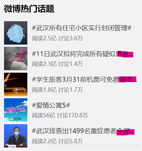
6.仿微博网页的练习(js还没学到 就只是简单的模仿(╹▽╹))
暂时就只做了这么一点

遇到了挺多问题,如下
1.如何使用文字图标
在度娘和同学的帮助下学会使用了iconfont
关键代码:
<head>
<link rel="stylesheet" href="images\font_1632003_es1hwudwjej\iconfont.css">
</head>
<i class="iconfont icon-shouye"> 首页</i>
2.搜索框聚焦时如何变色
使用:focus伪类选择器就可以
关键代码:
 input:focus{


        outline:none;/*去除焦点框*/
        border: 1.5px solid #eb7350;
    }
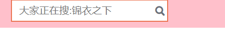
3.制作搜索框时的图标
还是使用那个iconfont文字图标(我觉得它好像比插图片简单一点)
要使用button标签创建按钮,因为它内部可以放置内容(文字和图片)
button{


        height:25px;
        margin-top:13px;
        position:absolute;
        left:455px;
        cursor:pointer;/*改变鼠标的样式*/
        background: transparent;
        border:none;
    }
 <form>
            <input type="text" placeholder="大家正在搜:锦衣之下" class="kuang">
            <button type="submit"><i class="iconfont icon-sousuo"></i></button>
            </form>
效果如下:
4.如何制作登录
可以使用a标签包裹,再设置背景样式
  .kuang1 .dl{


        width:270px;
        height:34px;
        display:block;
        color:white;
        line-height:34px;
        margin:0 auto;
        text-align:center;
        background-color:#eb7350;
    }
5.如何用css控制文字,超出部分显示省略号
- 如果是单行的话
实现方法:
overflow: hidden;
text-overflow:ellipsis;
white-space: nowrap;
width:px;
- 如果是多行的话
实现方法:
display: -webkit-box;
-webkit-box-orient: vertical;
-webkit-line-clamp: 3;
overflow: hidden;
我用这个单行设置的时候一直显示不出来,后来发现应该给直接包裹文字的标签设置这个属性
效果如下:
以上就是这周的总结啦