一、案例效果一

1.1 WXML代码:
<view class="loading-screen">
	<view class="loading">
		<view class="flour" ></view>
		<view class="flour" ></view>
		<view class="flour" ></view>
		<view class="flour" ></view>
	</view>
</view>
1.2 WXSS代码
page{


  margin: 0;
  padding: 0;
}

.loading-screen{


  width: 100%;
  height: 100vh;
  background-color: #2e2e2e;
  position: fixed;
  display: flex;
  align-items: center;
  justify-content: center;
}

.loading{


  width: 80px;
  display: flex;
  flex-wrap: wrap;
  animation: rotate 3s linear infinite;
}

@keyframes rotate{


  to{


      transform: rotate(360deg);
  }
}

.loading .flour{


  width: 32px;
  height: 32px;
  background-color: #00cec9;
  margin: 4px;
  animation: scale 1.5s linear infinite;
}

@keyframes scale{


  50%{


      transform: scale(1.2);
  }
}
二、案例效果二
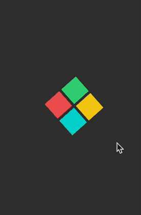
2.1 WXML代码
<view class="loading-screen">
	<view class="loading">
		<view class="flour_1" ></view>
		<view class="flour_2" ></view>
		<view class="flour_3" ></view>
		<view class="flour_4" ></view>
	</view>
</view>
2.2 WXSS代码
page{


  margin: 0;
  padding: 0;
}

.loading-screen{


  width: 100%;
  height: 100vh;
  background-color: #2e2e2e;
  position: fixed;
  display: flex;
  align-items: center;
  justify-content: center;
}

.loading{


  width: 80px;
  display: flex;
  flex-wrap: wrap;
  animation: rotate 4s linear infinite;
}

@keyframes rotate{


  to{


      transform: rotate(360deg);
  }
}

.loading .flour_1{


  width: 32px;
  height: 32px;
  background-color: #eb4d4b;
  margin: 4px;
  animation: scale 2s linear infinite;
}

.loading .flour_2{


  width: 32px;
  height: 32px;
  background-color: #2ecc71;
  margin: 4px;
  animation: scale 2s linear infinite;
}
.loading .flour_3{


  width: 32px;
  height: 32px;
  background-color: #00cec9;
  margin: 4px;
  animation: scale 2s linear infinite;
}
.loading .flour_4{


  width: 32px;
  height: 32px;
  background-color: #f1c40f;
  margin: 4px;
  animation: scale 2s linear infinite;
}
@keyframes scale{


  50%{


      transform: scale(1.2);
  }
}
三、Animation说明
| 属性 |
描述 |
| @keyframes |
规定动画 |
| animation |
所有动画属性的简写属性,除了 animation-play-state 属性 |
| animation-name |
规定 @keyframes 动画的名称 |
| animation-duration |
规定动画完成一个周期所花费的秒或毫秒 |
| animation-timing-function |
规定动画的速度曲线 |
| animation-delay |
规定动画何时开始 |
| animation-iteration-count |
规定动画被播放的次数 |
| animation-direction |
规定动画是否在下一周期逆向地播放 |
| animation-play-state |
规定动画是否正在运行或暂停 |
| animation-fill-mode |
规定对象动画时间之外的状态 |