在一个安卓项目中大量使用了MPAndroidChart的饼图,所以大致总结一下使用方法。
1.引入
app下的build.gradle中加入:
implementation 'com.github.PhilJay:MPAndroidChart:v3.0.2'
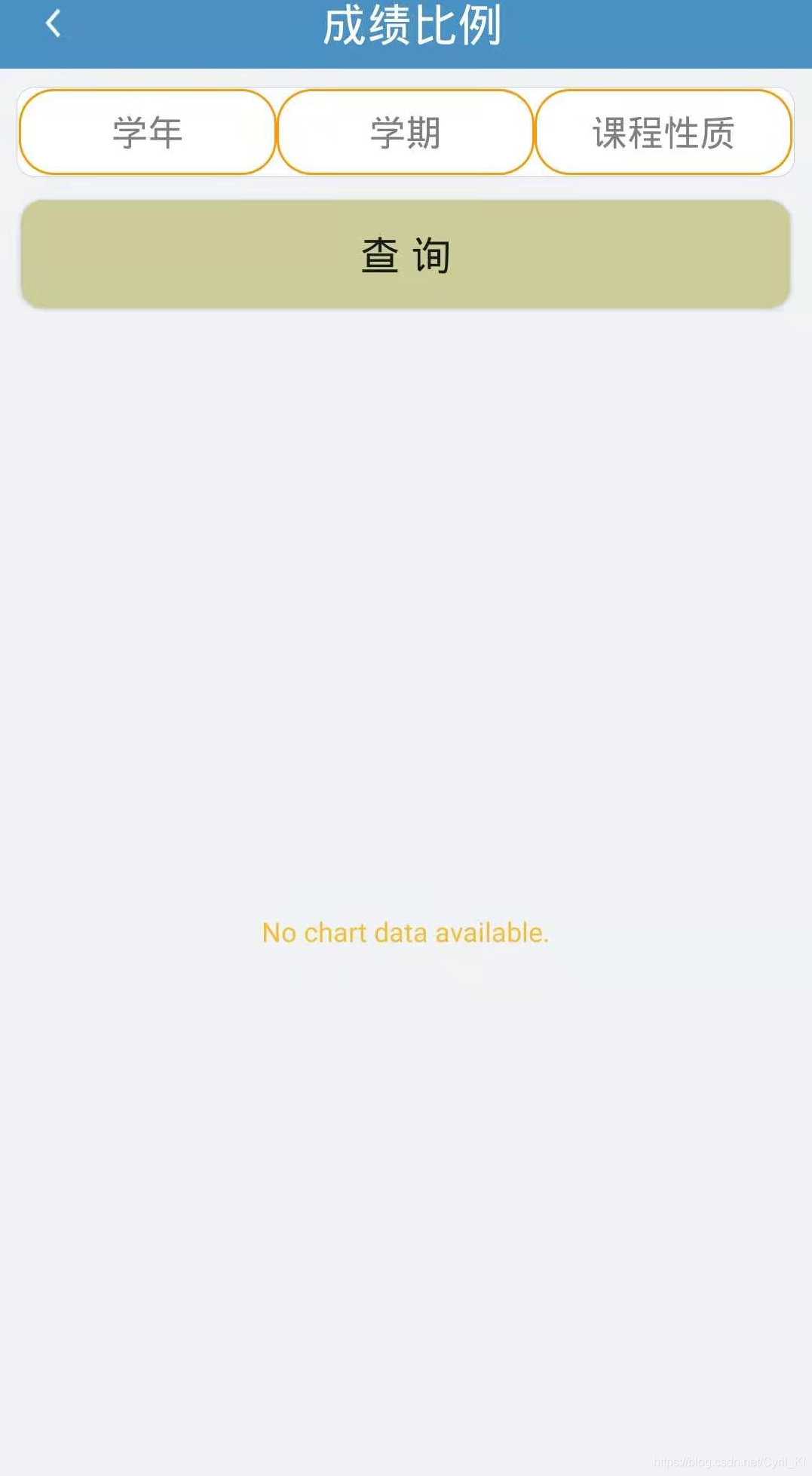
2.初始化
pieChart = findViewById(R.id.pie_chart);
pieChart.setNoDataText("No chart data available.");
初始化后如下所示:
3.添加数据
pieChart添加数据就是一句代码:
pieChart.setData(pieData);
其中pieData是PieData类型数据:
PieData pieData = new PieData(pieDataSet);
所以我们现在要得到pieDataSet:
PieDataSet pieDataSet = new PieDataSet(pieEntries, "");
最终归结到pieEntries上。
生成PieEntry
ArrayList<String> name = new ArrayList<>(Arrays.asList("优秀", "良好", "中等","及格", "不及格"));
List<PieEntry> pieEntries = new ArrayList<>();
ArrayList<String> rate = new ArrayList<>();
        //计算百分比
for(int i = 0; i < 5; i++) {


    DecimalFormat df = new DecimalFormat("0.00%");
    String decimal = df.format(data[i] / (data[0] + data[1] + data[2] + data[3] + data[4]));
    PieEntry pieEntry = new PieEntry(data[i] / (data[0] + data[1] + data[2] + data[3] + data[4]), name.get(i));
    pieEntries.add(pieEntry);
    rate.add(decimal);
            //name[i] = name[i] + decimal;
}
其中data包含五个整数,分别表示五个扇形的占比大小,生成PieEntry:
PieEntry pieEntry = new PieEntry(data[i] / (data[0] + data[1] + data[2] + data[3] + data[4]), name.get(i));
设置扇形数据及颜色:
ArrayList<Integer> colors = new ArrayList<>();
colors.add(Color.parseColor("#6BE61A"));
colors.add(Color.parseColor("#4474BB"));
colors.add(Color.parseColor("#AA7755"));
colors.add(Color.parseColor("#BB5C44"));
colors.add(Color.parseColor("#E61A1A"));

PieDataSet pieDataSet = new PieDataSet(pieEntries, "");
pieDataSet.setSliceSpace(1f); //设置个饼状图之间的距离
pieDataSet.setColors(colors);
pieDataSet.setValueTextSize(0);
考虑到有的人只存在一两种颜色,比如全是优秀或者只有优秀良好两种,这种情况下如果设置标签在扇形图内必然会显得很拥挤,所以将每个扇形的标签字体大小设置为0,不再显示:
pieDataSet.setValueTextSize(0);
设置PieData
PieData pieData = new PieData(pieDataSet);
pieChart.setData(pieData);
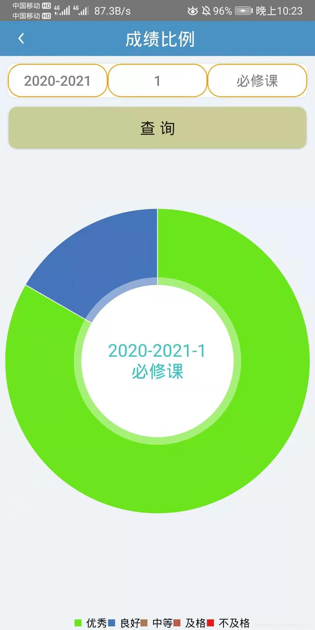
pieChart.setDrawCenterText(true);//显示中间文字
pieChart.setCenterText(text1 + "\n" + text2);
pieChart.setCenterTextSize(20);//中间文字大小
pieChart.setCenterTextColor(Color.parseColor("#3CC4C4"));中间文字颜色
pieChart.setEntryLabelTextSize(0);//标签不显示
Description description = new Description();//设置描述
description.setText("");
pieChart.setDescription(description);
设置Legend
Legend legend = pieChart.getLegend();
legend.setHorizontalAlignment(Legend.LegendHorizontalAlignment.CENTER);
legend.setTextSize(12);
4.点击事件
由于我没有显示每个扇形的占比数据,所以需要在点击后显示相应比例:
pieChart.setOnChartValueSelectedListener(new OnChartValueSelectedListener() {


    @Override
    public void onValueSelected(Entry e, Highlight h) {


        if(e == null) {


            return;
        }
        if(pieEntries.get(0).getValue() == e.getY()) {


            ToastUtil.showMessage(GradeRateActivity.this, name.get(0) + "占比" + rate.get(0));
        }else if(pieEntries.get(1).getValue() == e.getY()) {


            ToastUtil.showMessage(GradeRateActivity.this, name.get(1) + "占比" + rate.get(1));
        }else if(pieEntries.get(2).getValue() == e.getY()) {


            ToastUtil.showMessage(GradeRateActivity.this, name.get(2) + "占比" + rate.get(2));
        }else if(pieEntries.get(3).getValue() == e.getY()) {


            ToastUtil.showMessage(GradeRateActivity.this, name.get(3) + "占比" + rate.get(3));
        }else if(pieEntries.get(4).getValue() == e.getY()) {


            ToastUtil.showMessage(GradeRateActivity.this, name.get(4) + "占比" + rate.get(4));
        }
    }

    @Override
    public void onNothingSelected() {


    }
});
5.invalidate()
pieChart.animateXY(1000, 1000);
pieChart.invalidate();
顺便设置了延迟1秒显示。
6.效果