如何使用echarts给y轴x轴添加单位
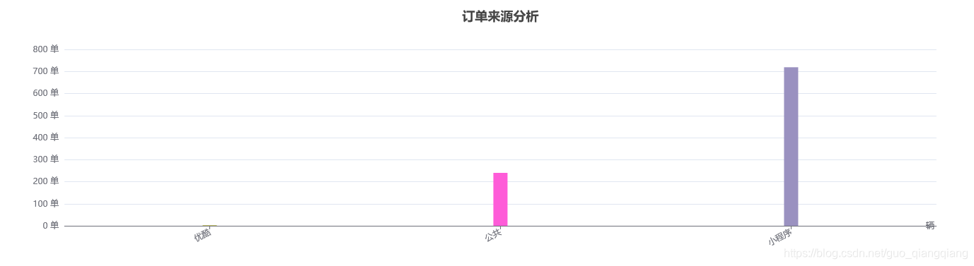
y轴每个单位刻度加单位使用
 yAxis: [
                {


                    type: 'value',
                    axisLabel: {

    formatter: '{value} 单'},
                }
            ],
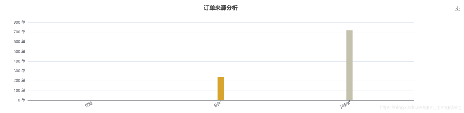
y轴顶部设置单位
使用title来说明y轴的含义数据的就行:
option = {
title: {
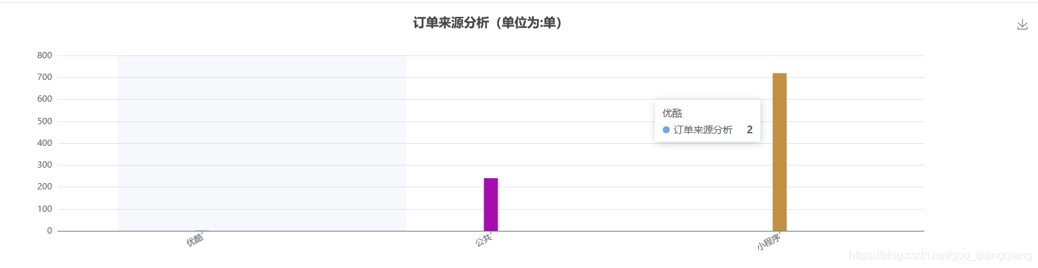
text: 订单来源分析+ '(单位为:单)',
x: 'center'
},
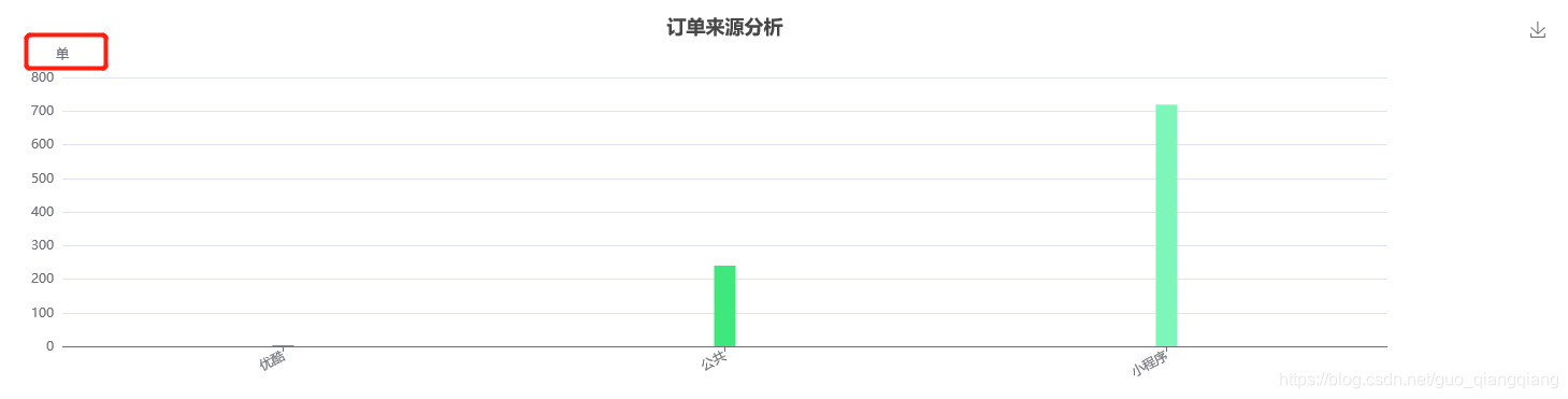
还有一种是
  yAxis: [
                {


                    //单位
                    name: '单',
                    type: 'value',
                }
            ],
x轴添加单位
  xAxis: [
                {


                    name: '辆',     //关键代码
                    nameTextStyle: {

             //关键代码
                        padding: [30, 0, 0, -30],
                    },
                    type: 'category',
                    data: ['优酷','公共','小程序'],
                    axisLabel: {


                        interval: 0,
                        rotate: 28,//倾斜度
                    },
                    axisTick: {


                        alignWithLabel: true
                    }
                }
            ],