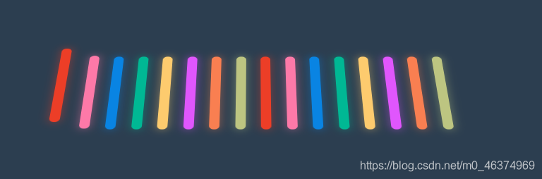
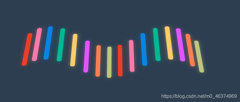
HTML+CSS制作彩色波动
效果图如下:
HTML部分源码如下:
<!DOCTYPE html>
<html lang="en">

<head>
    <meta charset="UTF-8">
    <meta name="viewport" content="width=device-width, initial-scale=1.0">
    <title>彩色波动</title>
    <link rel="stylesheet" href="style.css">
</head>

<body>
    <div class="container">
        <div class="fence"></div>
        <div class="fence"></div>
        <div class="fence"></div>
        <div class="fence"></div>
        <div class="fence"></div>
        <div class="fence"></div>
        <div class="fence"></div>
        <div class="fence"></div>
        <div class="fence"></div>
        <div class="fence"></div>
        <div class="fence"></div>
        <div class="fence"></div>
        <div class="fence"></div>
        <div class="fence"></div>
        <div class="fence"></div>
        <div class="fence"></div>
    </div>
</body>

</html>
CSS部分源码如下:
:root {


    --background-color: #2c3e50;
    --border-color: #7591AD;
    --text-color: #34495e;
    --color1: #EC3E27;
    --color2: #fd79a8;
    --color3: #0984e3;
    --color4: #00b894;
    --color5: #fdcb6e;
    --color6: #e056fd;
    --color7: #F97F51;
    --color8: #BDC581;
}

* {


    margin: 0;
    padding: 0;
}

html {


    font-size: 14px;
}

body {


    width: 100vw;
    height: 100vh;
    background-color: var(--background-color);
    display: flex;
    justify-content: center;
    align-items: center;
    /* 视距1000px */
    perspective: 1000px;
    /* 开启3D效果 ??*/
    /* transform-style: preserve-3d; */
}

.container {


    width: 400px;
    height: 100px;
    /* background-color: var(--border-color); */
    display: flex;
    justify-content: space-around;
    align-items: center;
    perspective: 1000px;
    transform-style: preserve-3d;
    transform: rotateX(45deg);
}

.fence {


    position: relative;
    width: 10px;
    height: 100%;
    border-radius: 10px;
    animation: animate 1s ease-in-out infinite alternate both;
}

.fence::before {


    /* 原视频没有,后增加发光效果 */
    content: '';
    width: 100%;
    height: 100%;
    position: absolute;
    background-color: inherit;
    filter: blur(5px);
    opacity: 0.5;
}

.fence:nth-child(1) {


    background-color: var(--color1);
    animation-delay: 0s;
}

.fence:nth-child(2) {


    background-color: var(--color2);
    animation-delay: 0.2s;
}

.fence:nth-child(3) {


    background-color: var(--color3);
    animation-delay: 0.4s;
}

.fence:nth-child(4) {


    background-color: var(--color4);
    animation-delay: 0.6s;
}

.fence:nth-child(5) {


    background-color: var(--color5);
    animation-delay: 0.8s;
}

.fence:nth-child(6) {


    background-color: var(--color6);
    animation-delay: 1s;
}

.fence:nth-child(7) {


    background-color: var(--color7);
    animation-delay: 1.2s;
}

.fence:nth-child(8) {


    background-color: var(--color8);
    animation-delay: 1.4s;
}

.fence:nth-child(9) {


    background-color: var(--color1);
    animation-delay: 1.6s;
}

.fence:nth-child(10) {


    background-color: var(--color2);
    animation-delay: 1.8s;
}

.fence:nth-child(11) {


    background-color: var(--color3);
    animation-delay: 2.0s;
}

.fence:nth-child(12) {


    background-color: var(--color4);
    animation-delay: 2.2s;
}

.fence:nth-child(13) {


    background-color: var(--color5);
    animation-delay: 2.4s;
}

.fence:nth-child(14) {


    background-color: var(--color6);
    animation-delay: 2.6s;
}

.fence:nth-child(15) {


    background-color: var(--color7);
    animation-delay: 2.8s;
}

.fence:nth-child(16) {


    background-color: var(--color8);
    animation-delay: 3s;
}

@keyframes animate {


    0% {


        transform: translateZ(-30px);
    }
    100% {


        transform: translateZ(30px);
    }
}