MATLAB进阶画图
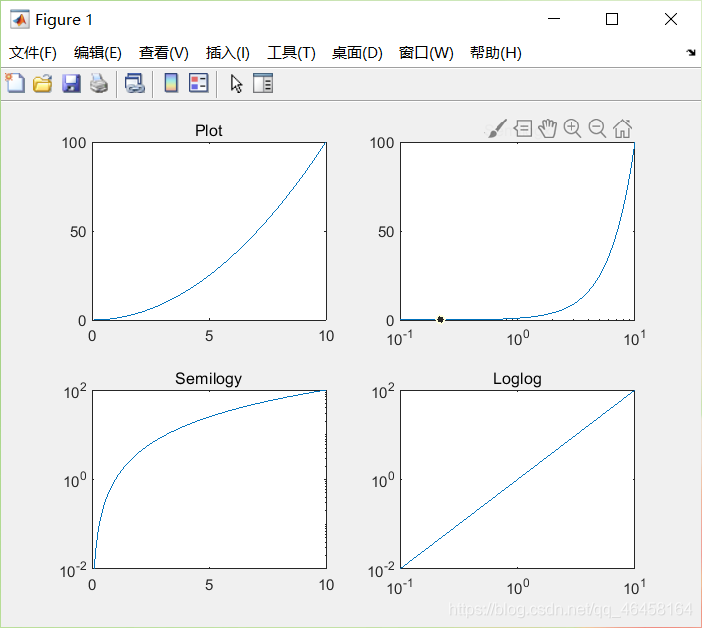
Logarithm Plots
x = logspace(-1,1,100);   % 10的-1~1生成100个等差数列次方,
y = x.^2;
subplot(2,2,1);
plot(x,y);    % 二次函数
title('Plot');
subplot(2,2,2);
semilogx(x,y);     % plot(log10(x),y)
title('Semilogx');
subplot(2,2,3);
semilogy(x,y);     % plot(x,log10(y))
title('Semilogy');
subplot(2,2,4);
loglog(x, y);      % plot(log10(x),log10(y))   正比关系
title('Loglog');
plotyy()
x = 0:0.01:20;
y1 = 200*exp(-0.05*x).*sin(x);
y2 = 0.8*exp(-0.5*x).*sin(10*x);
[AX,H1,H2] = plotyy(x,y1,x,y2);        % 画图并将其属性返回方便后续操作
set(get(AX(1),'Ylabel'),'String','Left Y-axis')   %  将左边的y轴命名
set(get(AX(2),'Ylabel'),'String','Right Y-axis')   %  将右边的y轴命名
title('Labeling plotyy');  %figure的title
set(H1,'LineStyle','--'); set(H2,'LineStyle',':');  %更改line的property
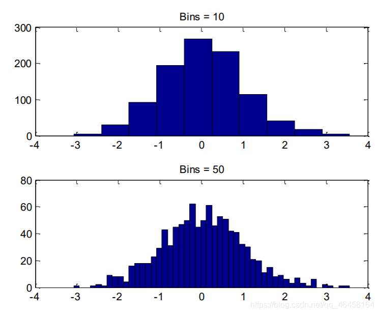
Histogram直方图
y = randn(1,1000);  % 返回一个1*1000的随机项矩阵。
subplot(2,1,1);     % 2行一列第一个图
hist(y,10);         % 分成10分组分
title('Bins = 10');
subplot(2,1,2);
hist(y,50);         % 分成50分等分
title('Bins = 50');
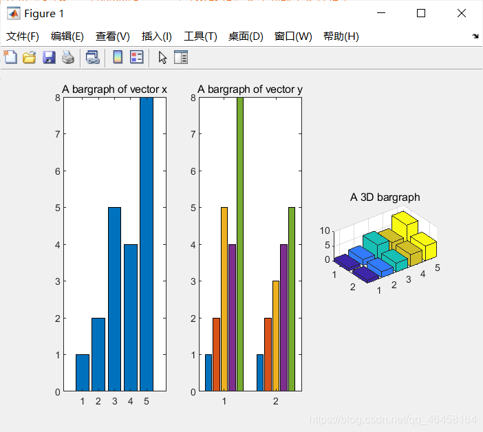
Bar Charts
x = [1 2 5 4 8]; y = [x;1:5];   %  y=[1 2 5 4 8;1 2 3 4 5]
subplot(1,3,1); bar(x); title('A bargraph of vector x');
subplot(1,3,2); bar(y); title('A bargraph of vector y');
subplot(1,3,3); bar3(y); title('A 3D bargraph');
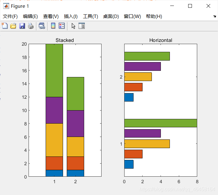
Stacked and Horizontal Bar Charts 堆积的分布直方图
x = [1 2 5 4 8];
y = [x;1:5];
subplot(1,2,1);
bar(y,'stacked');    % bar(y)的堆积图
title('Stacked');
subplot(1,2,2);
barh(y);             % 横着的bar(y)
title('Horizontal');
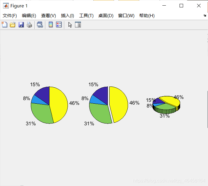
Pie Charts饼图
a = [10 5 20 30];
subplot(1,3,1); pie(a);
subplot(1,3,2); pie(a, [0,0,0,1]);   % 0,1拆分
subplot(1,3,3); pie3(a, [0,0,0,1]);  % 3D视图
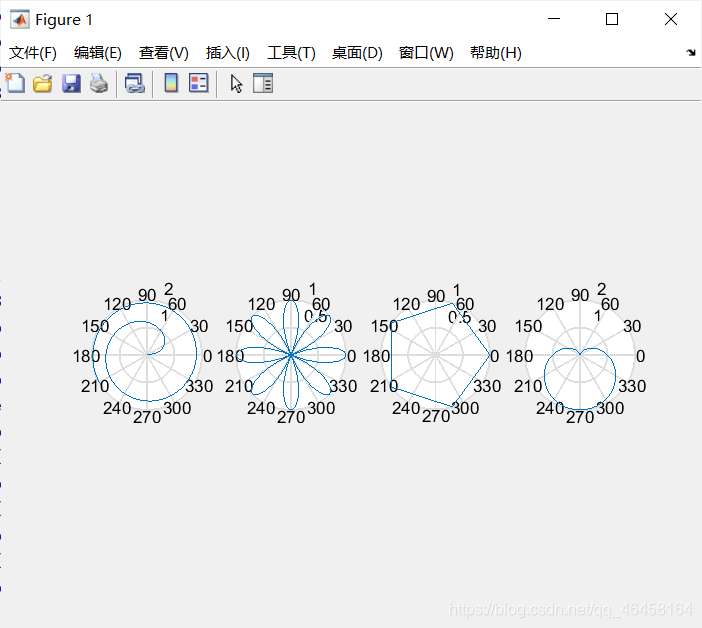
根据极坐标画图
注释subplot(m,n,i)总共画m行n列的图,,选择第i个图进行画
x = 1:100; theta = x/10; r = log10(x);
subplot(1,4,1); polar(theta,r);
theta = linspace(0, 2*pi); r = cos(4*theta);
subplot(1,4,2); polar(theta, r);
theta = linspace(0, 2*pi, 6); r = ones(1,length(theta));
subplot(1,4,3); polar(theta,r);
theta = linspace(0, 2*pi); r = 1-sin(theta);
subplot(1,4,4); polar(theta , r);
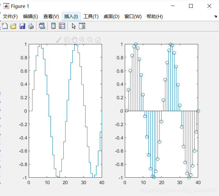
Stairs and Stem Charts阶梯图
x = linspace(0, 4*pi, 40); y = sin(x);
subplot(1,2,1); stairs(y);
subplot(1,2,2); stem(y);
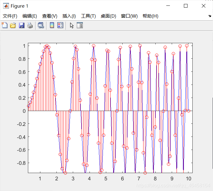
Exercise
hold on;
t1=linspace(0,10,100)
y1=sin(pi.*t1.^2/4);
plot(t1,y1,'b');
t2=linspace(0,10,100)
y2=sin(pi.*t2.^2/4);
stem(t2,y2,'r');
hold off;
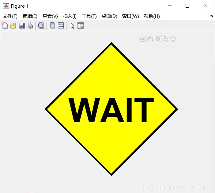
fill
t =[0:pi/2:2*pi]; x = cos(t);y=sin(t);
h=fill(x,y,'y'); axis square off;   %将里面填充颜色
set(h,'LineWidth',3);
text(0,0,'WAIT','Color', 'K','FontSize', 66, ...
	'FontWeight','bold','HorizontalAlignment', 'center');
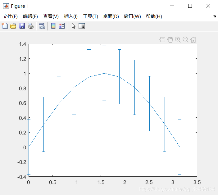
Boxplot and Error Bar
x=0:pi/10:pi; y=sin(x);
e=std(y)*ones(size(x));  %sty(y)列的标准差*行和列都是size(x)大小的  1  矩阵
errorbar(x,y,e)
该函数作用应该是观察数据集在直线分布情况
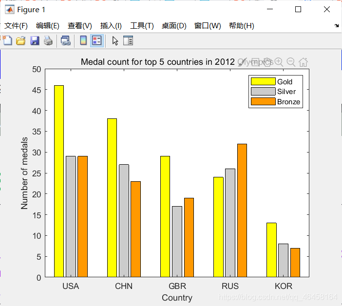
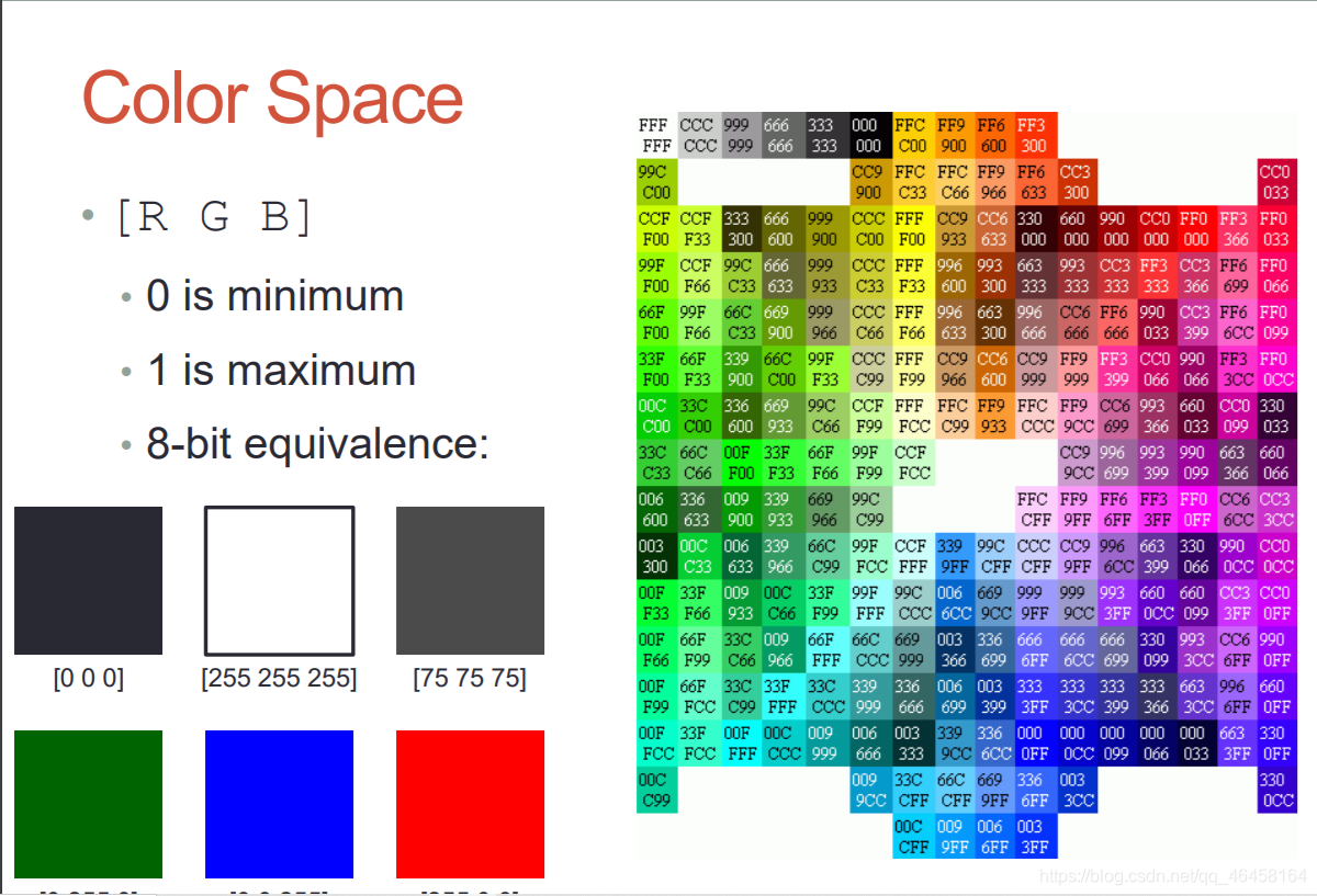
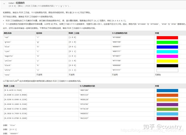
Color Space
G = [46 38 29 24 13]; S = [29 27 17 26 8];
B = [29 23 19 32 7]; h = bar(1:5, [G' S' B']);
set(h(1),'FaceColor',[hex2dec('FF')/255 hex2dec('FF')/255 hex2dec('00')/255])  %设定金牌颜色
set(h(2),'FaceColor',[hex2dec('cc')/255 hex2dec('cc')/255 hex2dec('cc')/255])
set(h(3),'FaceColor',[hex2dec('FF')/255 hex2dec('99')/255 hex2dec('00')/255])
get(gca);
set(gca, 'XTickLabel',{'USA','CHN','GBR','RUS','KOR'})
title('Medal count for top 5 countries in 2012 Olympics');
ylabel('Number of medals'); xlabel('Country');
legend('Gold', 'Silver', 'Bronze')
各种颜色对应的16进制数据表
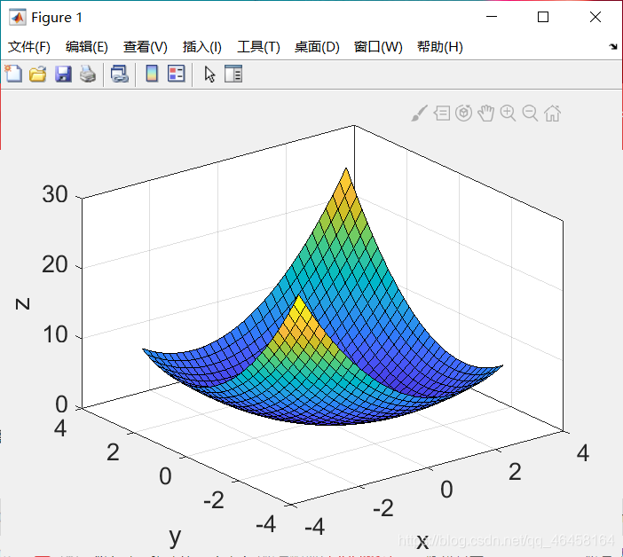
Visualizing Data as An Image:
[x, y] = meshgrid(-3:.2:3,-3:.2:3); %x是横着的,y是竖着的
z = x.^2 + x.*y + y.^2; surf( x, y, z); box on;  % surf画空间图
set(gca,'FontSize', 16); zlabel('z');  %设置字号 命名z轴
xlim([-4 4]); xlabel('x'); ylim([-4 4]); ylabel('y'); % 限定xy的范围且命名
meshgrid函数的作用
axis square/将当前坐标系图形设置为方形。横轴及纵轴比例是1:1
imagesc(z); axis square; xlabel('x'); ylabel('y'); % 从z轴往下看颜色更xy变化
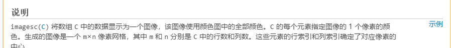
就是将每一个数据都用颜色表示出来
颜色随着参数变化情况
画图中可以使用,比如上面的3D视图颜色可以使用下面哪种颜色变化
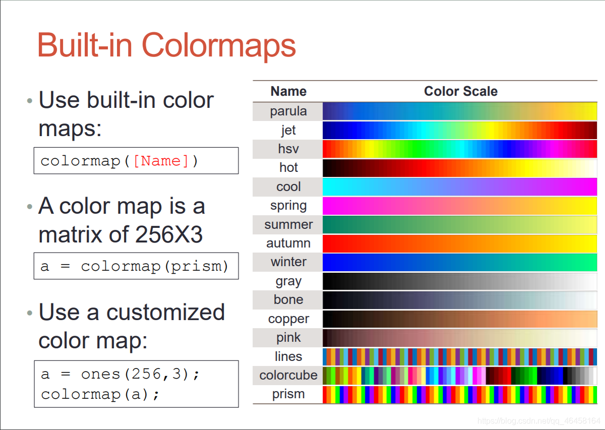
比如说
 [x, y] = meshgrid(-3:.2:3,-3:.2:3);
z = x.^2 + x.*y + y.^2; surf( x, y, z);colormap(gca,jet);   % 设定上面代码的颜色是jet类型
 box on;
set(gca,'FontSize', 16); zlabel('z');
xlim([-4 4]); xlabel('x'); ylim([-4 4]); ylabel('y');
Exercise
x = [1:10;3:12;5:14];
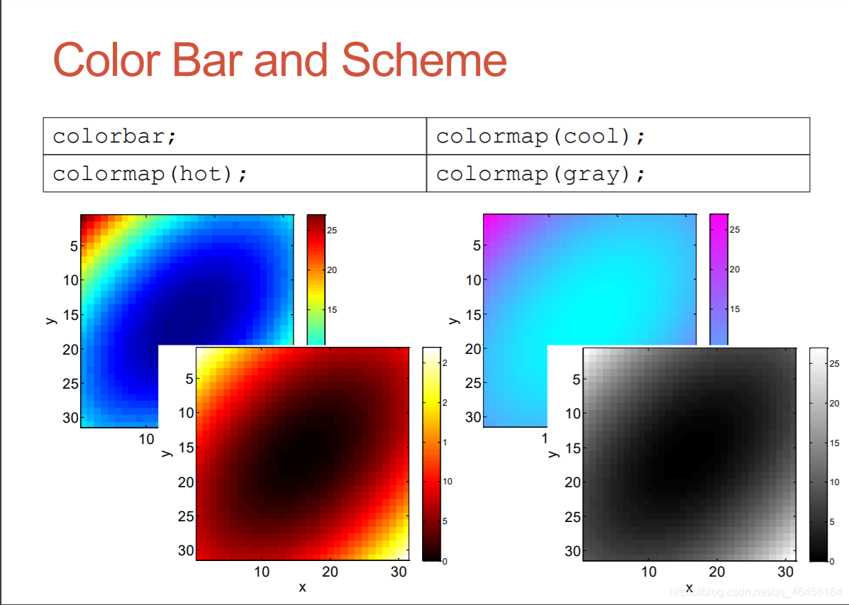
imagesc(x); % 显示使用经过标度映射的颜色的图像
colorbar; % 显示色阶的颜色栏
map = zeros(256,3); % 创建一个256*3的矩阵
map(:,2) = (0:255)/255; % 绿色为(0 1 0),所以只取第2列
colormap(map); % 查看并设置当前颜色图
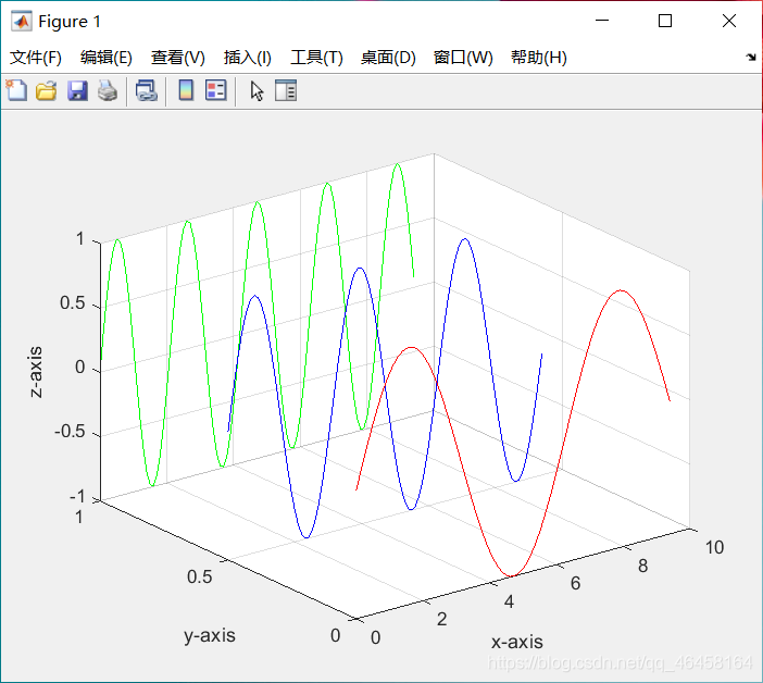
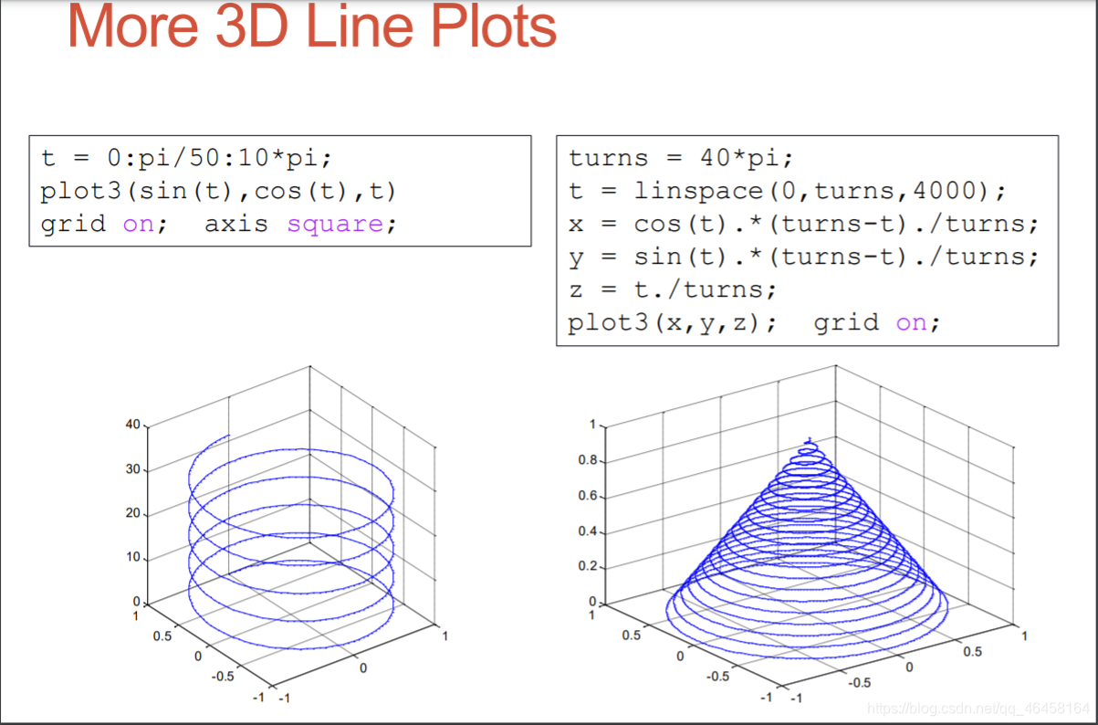
plot3()
x=0:0.1:3*pi; z1=sin(x); z2=sin(2.*x); z3=sin(3.*x);
y1=zeros(size(x)); y3=ones(size(x)); y2=y3./2;  % 行和列都是size(x)大小的零矩阵
plot3(x,y1,z1,'r',x,y2,z2,'b',x,y3,z3,'g'); grid on;
xlabel('x-axis'); ylabel('y-axis'); zlabel('z-axis');
Principles for 3D Surface Plots 三维曲面图
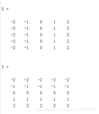
x = -2:1:2;
y = -2:1:2;
[X,Y] = meshgrid(x,y)  % 将x横着,y竖着
原因是画图的时候选取点是(-2,-2),(-1,-2)(0,-2)如果y不竖着的话,将会是(-2,-2),(-1,-1)(0,0),永远都是y=x的一条直线
 x = -3.5:0.2:3.5; y = -3.5:0.2:3.5;
[X,Y] = meshgrid(x,y);
Z = X.*exp(-X.^2-Y.^2);
subplot(1,2,1); mesh(X,Y,Z);
subplot(1,2,2); surf(X,Y,Z);;colormap(gca,jet);
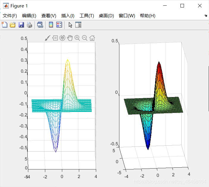
matlab中mesh和surf有什么区别
总结颜色类型和精细程度
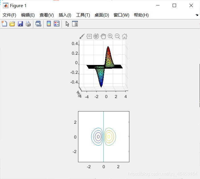
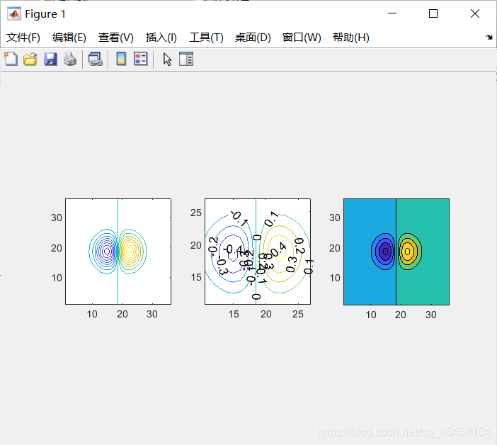
contour() 等高线
x = -3.5:0.2:3.5;
y = -3.5:0.2:3.5;
[X,Y] = meshgrid(x,y);
Z = X.*exp(-X.^2-Y.^2);
subplot(2,1,1);
mesh(X,Y,Z);
axis square;
subplot(2,1,2);
contour(X,Y,Z);   %画等高线
axis square;      %x y
% axis square/将当前坐标系图形设置为方形。横轴及纵轴比例是1:1
x = -3.5:0.2:3.5; y = -3.5:0.2:3.5;
[X,Y] = meshgrid(x,y); Z = X.*exp(-X.^2-Y.^2);
subplot(1,3,1); contour(Z,[-.45:.05:.45]); % 等高线的距离切片
axis square;
subplot(1,3,2); [C,h] = contour(Z);
clabel(C,h); axis square;  % 为每条等高线标注
subplot(1,3,3); contourf(Z); %contourf()会填充等高线。
axis square;

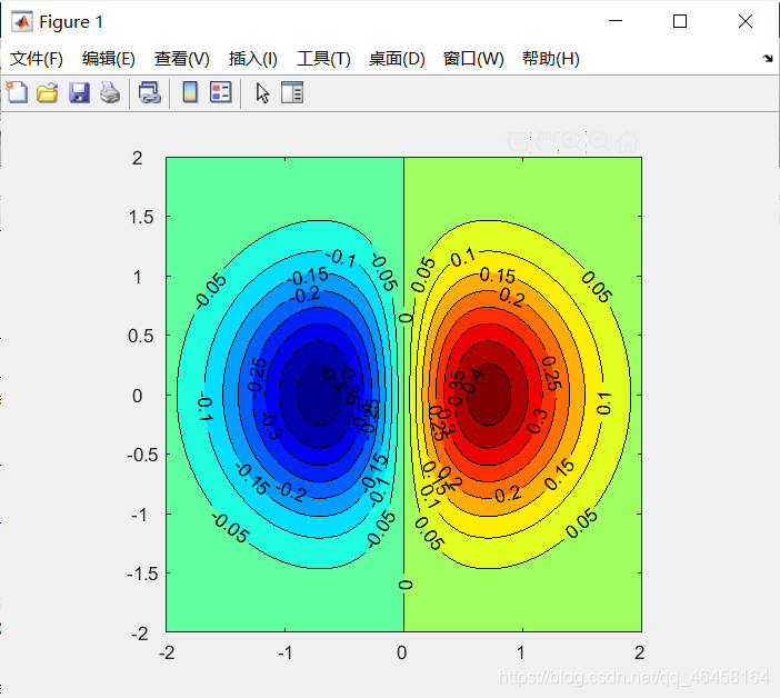
exercise
x= -2:0.05:2;%x共80个点
y= -2:0.05:2;%y共80个点
[X,Y]=meshgrid(x,y);
Z= X.*exp(-X.^2-Y.^2);
[C,h]=contourf(Z,[-.45:.05:.45]);
clabel(C,h);
set(gca,'XTick',1:20:81);%若值要从1开始,否则会不显示第一个数值,81同理
set(gca,'YTick',1:10:81);%因为Y轴间隔较密集,取一半,即10
set(gca,'XTickLabel',-2:1:2);%注意区分 刻度 与 刻度值!
set(gca,'YTicklabel',-2:0.5:2);
colormap(jet);%控制曲面图的颜色
axis square;
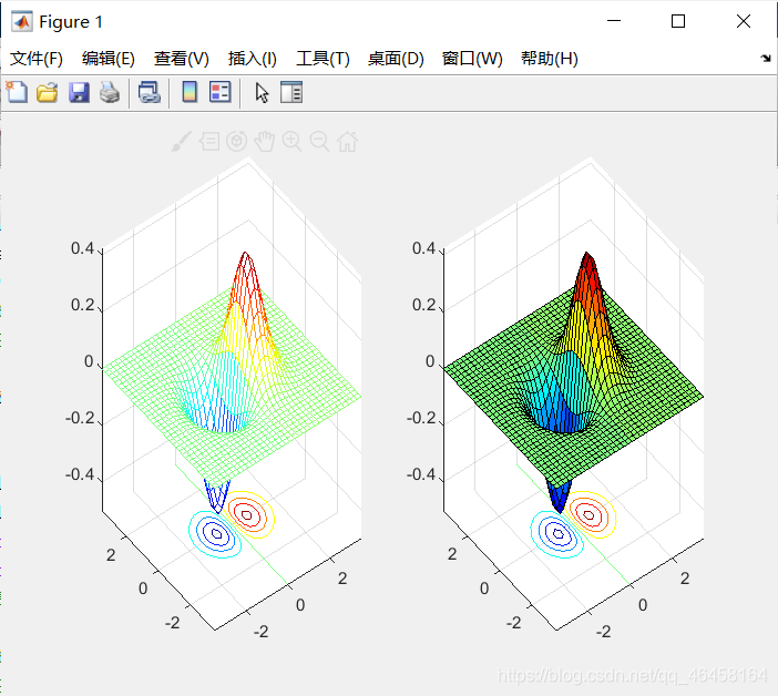
meshc() and surfc()
就是在图形底下画等高线
x = -3.5:0.2:3.5; y = -3.5:0.2:3.5;
[X,Y] = meshgrid(x,y); Z = X.*exp(-X.^2-Y.^2);
subplot(1,2,1); meshc(X,Y,Z);
subplot(1,2,2); surfc(X,Y,Z);
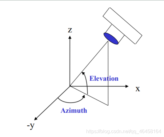
View Angle: view()
%% 使用view设定不同的视角去看图形
clear; clc; close all;
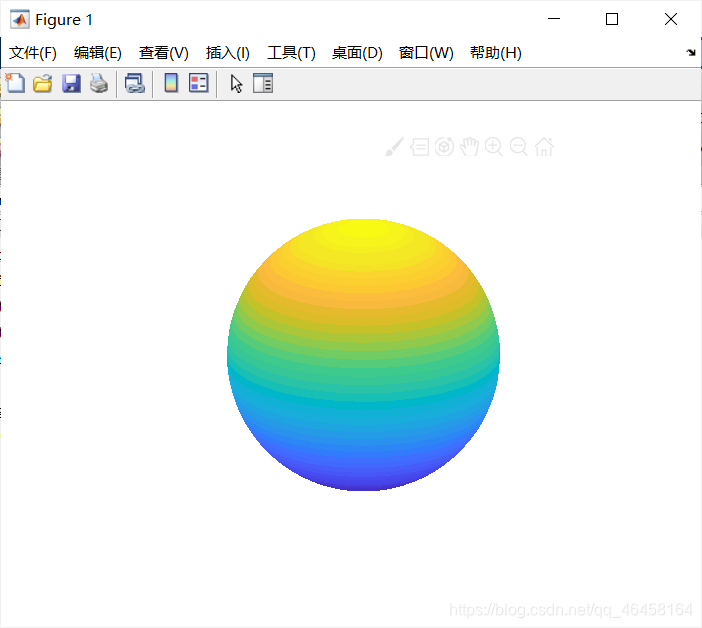
sphere(50); % 画球
shading flat; % 显示风格
material shiny;
axis vis3d off; % axes画板
set(gcf,'Color',[1 1 1]); % 设置figure板为白色
view(-45,20); % 设置固定角度去看图
sphere(50); % 绘制一个划分成50*50面的单位球体
shading flat; %平面着色,就是一个面就一个颜色,不使用更高级着色
light('Position',[1 3 2]);  %增加光照,设置光照位置
light('Position',[-3 -1 3]);
material shiny;
axis vis3d off;
set(gcf,'Color',[1 1 1]); % 画板,球的背景颜色
view(-45,20); % 从这个角度来看
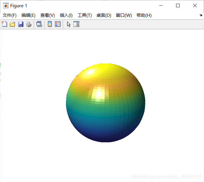
高级着色(不加shading flat;是真的丑)
Light: light()
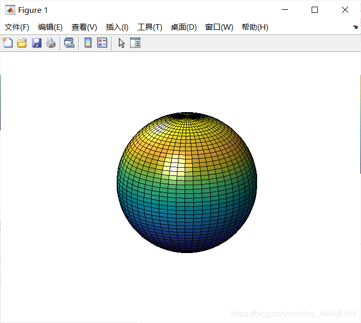
clear; clc; close all;
[X, Y, Z] = sphere(64); % 画球,并且获取坐标值
h = surf(X, Y, Z);
axis square vis3d off; % 坐标尺度相同,并且不显示axes画板
reds = zeros(256, 3);  % 创建一个256*3的零矩阵
reds(:, 1) = (0:256.-1)/255;  % 红色为(0 1 0),所以只取第1列
colormap(reds);   % 显示颜色
shading interp;
lighting phong;  % 设置光照
set(h, 'AmbientStrength', 0.75, 'DiffuseStrength', 0.5);
L1 = light('Position', [-1, -1, -1]);  % 获取光照的位置句柄
set(L1, 'Position', [-1, -1, 1]);  % 补光
set(L1, 'Color', 'g');  % 补绿光
shading interp
patch()
%% 显示光的效果
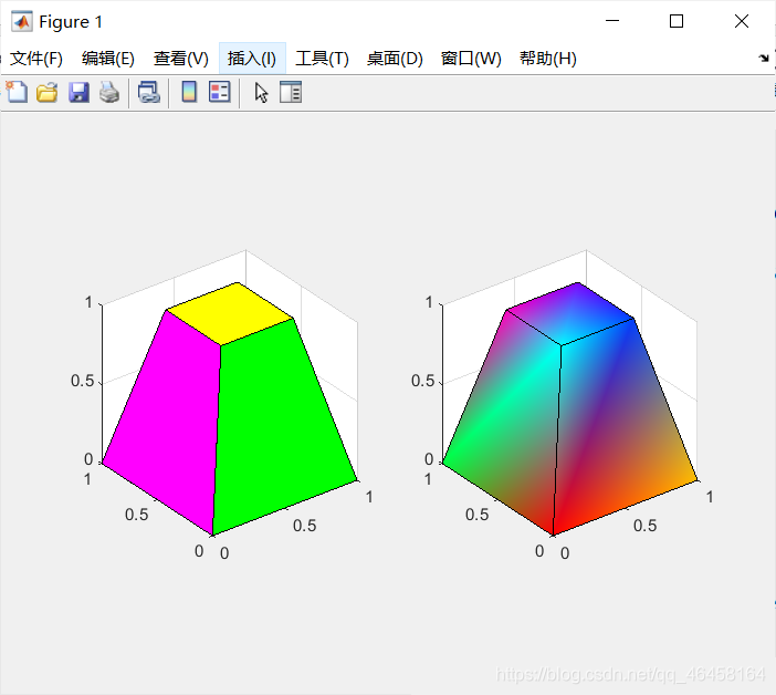
clear; clc; close all;
v = [0 0 0; 1 0 0 ; 1 1 0; 0 1 0; 0.25 0.25 1; ...
0.75 0.25 1; 0.75 0.75 1; 0.25 0.75 1];
f = [1 2 3 4; 5 6 7 8; 1 2 6 5; 2 3 7 6; 3 4 8 7; 4 1 5 8];
subplot(1,2,1);
patch('Vertices', v, 'Faces', f, ...
'FaceVertexCData', hsv(6), 'FaceColor', 'flat');
view(3);
axis square tight;
grid on;
subplot(1,2,2);
patch('Vertices', v, 'Faces', f, ...
'FaceVertexCData', hsv(8), 'FaceColor', 'interp');
view(3);
axis square tight; % square xy轴等长,xy轴与图形相切
grid on;
patch(‘PropertyName’,propertyvalue,…)
利用指定的属性/值参数对来指定补片对象的所有属性。除非用户显式的指定FaceColor和EdgeColor的值,否则,MATLAB会使用缺省的属性值。该调用格式允许用户使用Faces和Vertices属性值来定义补片
MATLAB——patch绘制多边形
matlab——caxis 函数(设置颜色图范围)
MATLAB卷积运算(conv、conv2)解释
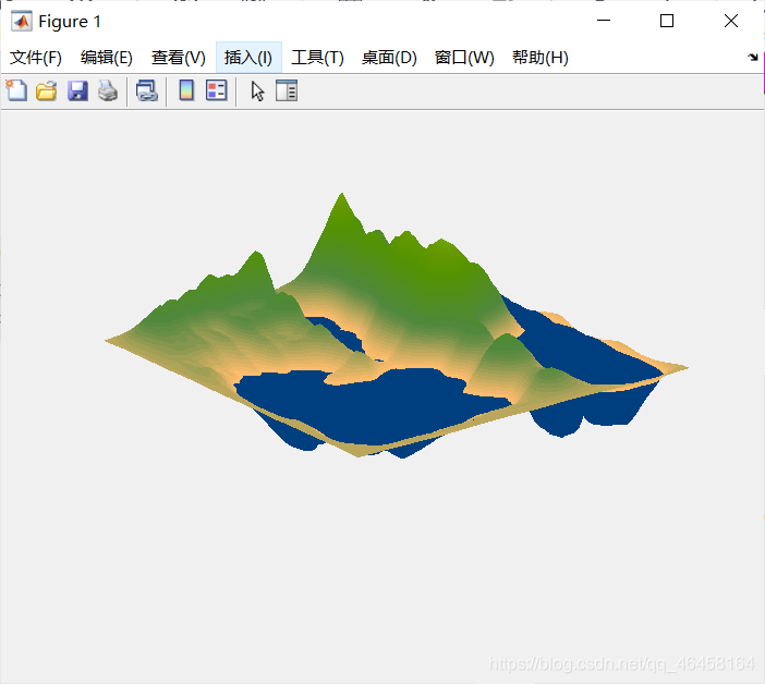
%% 绘制地图
load cape
X=conv2(ones(9,9)/81,cumsum(cumsum(randn(100,100)),2));  % MATLAB卷积运算
surf(X,'EdgeColor','none','EdgeLighting','Phong',...
'FaceColor','interp');
colormap(map);
caxis([-10,300]);  % 大于小于这个范围的就用一个颜色来画
grid off;
axis off;
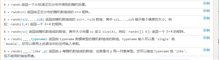
例如:randn(3,4) 返回一个 3×4 的随机数矩阵。
横竖都会sum
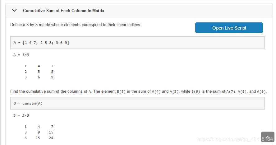
第二列才会sum