VUE项目学习(五):引用echarts组件
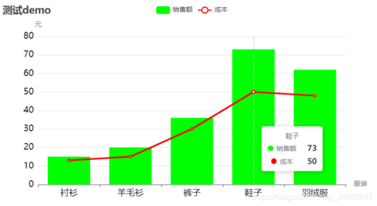
演示效果图:
1、在vue项目中导入echarts
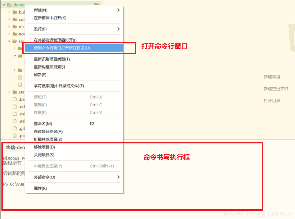
(1)在Hbuilder中打开项目终端的方式如下:
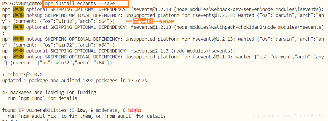
(2)在vue项目终端中,输入以下命令,下载和安装echarts组件
npm install echarts --save
下载成功效果为:
2、在vue中引入echarts
(1)因为是只在局部使用echarts,因此只在单个vue文件中引用。
import * as echarts from 'echarts'
(2)定义一个固定大小的div作为echarts显示的容器,并设置编号
<div id='mychart' style='width: 700px;height:400px;'></div>
(3)在vue的methods定义函数,主要用于定制图表显示设置和数据
(4)在vue项目的mounted调用该函数,并运行vue项目,vue项目路由配置,可以参考博客:https://blog.csdn.net/qq_26666947/article/details/112004867
3、完整vue代码
<template>
  <div>
    <div id='mychart' style='width: 700px;height:400px;'></div>
  </div>
</template>

<script>
import * as echarts from 'echarts'
export default {


  name: 'echart',
  mounted(){


    this.drawLine()
  },
  methods:{


    drawLine(){


      // 初始化实例
      let myChart = echarts.init(document.getElementById('mychart'))

      // 绘制图表,定义数据
      let option = {


        // 设置背景为白色
        backgroundColor: 'white',
        // 定义表的标题
        title: {


          text: '测试demo'
        },
        // 定义类别
        legend: {


          data: ["销售额","成本"]
        },
        // 定义提示类型
        tooltip: {


          trigger: 'axis',  // axis显示每一列的所有类别数据, item只显示单个类别
        },
        // 定义横坐标标签
        xAxis: {


          name: '服装',
          data: ['衬衫', '羊毛衫', '裤子', '鞋子', '羽绒服'],
          axisLabel: {


            show: true,
            textStyle: {


              color: 'black',  //更改X坐标轴文字颜色
              fontSize : 16      //更改坐标轴文字大小
            }
          }
        },
        // 定义纵坐标尺度,一般会自己变化
        yAxis: {


          name: '元',
          axisLabel: {


            show: true,
            textStyle: {


              color: 'black',  //更改Y坐标轴文字颜色
              fontSize : 16      //更改坐标轴文字大小
            }
          }
        },
        // 定义每个标签对应类别的数值
        series: [
          {


          name: '销售额',
          type: 'bar', // bar为条状图
          color: ['#00ff00'], // 设置背景颜色
          data: [15, 20, 36, 73, 62,]
          },
          {


            name: '成本',
            type: 'line', // line为折线图
            color: ['#ff0000'],
            data: [13, 15, 30, 50, 48]
          },
        ]
      }

      // 渲染数据
      myChart.setOption(option, true)
    }
  }
}
</script>
完整项目资源地址:https://download.csdn.net/download/qq_26666947/14110096