前言
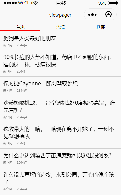
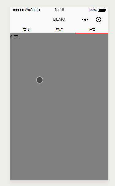
在做Android开发的时候,ViewPager是开发者使用频率很高的一个控件,今天我们就用小程序来实现一个类似的demo,效果图如下:
下面就开始直接撸代码了。
需求分析
通过查看界面元素,发现主要由两部分组成:头部能点击的title和下面能滑动的内容。
头部TAB
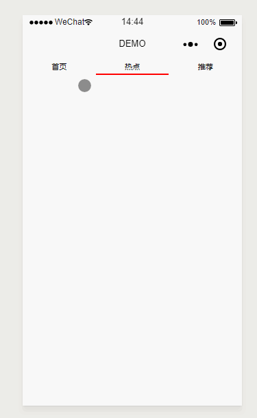
这个比较简单:主要是根据你的业务要分为几块,则将屏幕宽度分成几个等宽的view即可。然后每个tab下面的指示器用view的下边框替代,只有该tab被选中时才显示。代码如下:
// wxml布局文件
<view class='page'>
  <view class='item-parent'>
    <view wx:for='{

    {titles}}' class='title-item' style='border-bottom: 5rpx {

    {current == index ? selectindicatorcolor : normalindicatorcolor}} solid' bindtap='taptab' data-index='{

    {index}}'>{

    {

    item}}</view>
  </view>
</view>
// wxss文件
.page {


  display: flex;
  flex-direction: column;
}
.item-parent {


  display: flex;
  flex-direction: row;
}
.title-item {


  justify-content: center;
  text-align: center;
  width: 350rpx;
  height: 50rpx;
  display: flex;
  flex-direction: row;
  align-items: center;
  font-size: 26rpx;
}
// js文件
Page({


  data: {


    titles: ['首页', '热点', '推荐'],
    current: 0,//此属性暂时没有用到,后面会用到
    selectindicatorcolor: 'red',
    normalindicatorcolor: 'white'
  },
  taptab(e) {


    var index = e.currentTarget.dataset.index
    this.setData({


      current: index
    })
  },
  //此函数后面会用到
  bindChange(e) {


    this.setData({


      current: e.detail.current
    })
  }
})
上面代码很简单,就不赘述了,接下来看效果图:
滑动的内容部分
到这里我们已经实现了头部TAB的功能了,那么下面我们那个可滑动内容需要怎么实现了?其实官方已经给我们提供了一个组件swiper(swiper官方教程)可以用作视图滚动,只不过一般来说我们只是用来做轮播图。既然作为视图滚动容器,肯定可以滚动其他控件的。选好了我们需要的组件,接下来就是动手实现了,我们在原先的wxml中加入swiper组件:
// wxml布局文件
<view class='page'>
  <view class='item-parent'>
    <view wx:for='{

    {titles}}' class='title-item' style='border-bottom: 5rpx {

    {current == index ? selectindicatorcolor : normalindicatorcolor}} solid' bindtap='taptab' data-index='{

    {index}}'>{

    {

    item}}</view>
  </view>
  <swiper current='{

    {current}}' bindchange="bindChange">
    <swiper-item>
      <text>首页</text>
    </swiper-item>
    <swiper-item>
      <text>热点</text>
    </swiper-item>
    <swiper-item>
      <text>推荐</text>
    </swiper-item>
  </swiper>
</view>
其他地方变动不大,这里通过current属性,已经绑定了swiper的change事件,结合前面js中给出的代码,从而实现了上下两部分的联动。接下来看效果图:
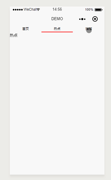
到这里,我们貌似完美实现了类似ViewPager效果了,真相真的是这样的么?细心的朋友可能发现,上面的图片中,我故意用鼠标在下面进行滑动,但是页面并没有跟着滚动,为什么会这样了?通过给swiper增加背景颜色发现,原来swiper的高度是固定的,不会随着里面组件的高度自适应变化,所以只有上面那部分会响应滚动事件,我们加上背景颜色瞧瞧。
这样就看的很清晰了,所以为了能使下面的内容充满屏幕,我们只能给swiper设置一个高度了,那么这个高度要设置多少合适了?从我们界面上看是我们整个可用窗体的高度减掉我们头部TAB的高度,然后我们在js中去计算这个高度。
// js文件
//data中增加一个属性
...
contentheight: 0
...
onLoad: function(res) {


	//减号前面是获取当前窗体的高度单位为px,55是头部tab的高度,单位是rpx,减号后面部分是将rpx转px
    var contentH = wx.getSystemInfoSync().windowHeight - 55 / 750 * wx.getSystemInfoSync().windowWidth;
    this.setData({


      contentheight: contentH
  })
}
wxml中设置swiper高度
// wxml文件增加style
...
<swiper current='{

    {current}}' bindchange="bindChange" style='background: gray;height:{

    {contentheight}}px'>
...
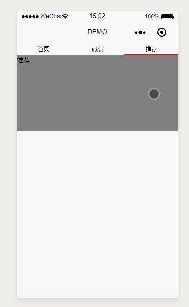
接下来,我们再看下效果:
这个时候我们可以看到,swiper已经充满了整个屏幕了,并且不管从哪个地方都能进行滑动。到了这里,那我们就可以做很多事情了,可以给每个tab加上各种不同的布局来实现不同的业务逻辑了。那么我们这里先来实现一个能滚动的列表试试,修改首页的item中的代码:
// wxml布局文件
//将原来首页swiper-item中的子元素修改如下:
...
<view class='page'>
 <text wx:for='12314312312312312sdfsfsdfsdfsfdfdf'>首页{

    {

    item}}</text>
</view>
...
接下来,我们看下效果图:
我们看到,虽然布局竖向超过了屏幕范围,但是却无法上下滚动。为什么会有这样的现象了?我猜想大概是微信小程序的限制罢了。既然这样无法实现我们常用的上下滚动列表效果,那我们只能曲线救国了,在外层再套一个能竖向滚动的scroll-view,稍微坐下改动:
// wxml布局文件
//将原来首页swiper-item中的子元素修改如下:
...
<scroll-view style='height:100%' scroll-y>
   <view class='page'>
      <text wx:for='12314312312312312sdfsfsdfsdfsfdfdf'>首页{

    {

    item}}</text>
    </view>
</scroll-view>
...
再看效果图:
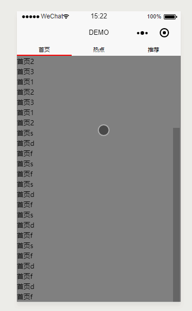
哈哈,完美搞定。
最终版本
在实际应用中,我们每个页面可能有非常复杂的界面和业务逻辑,我们的业务代码和UI代码最好不要都写在一个wxml中,防止业务混乱。为了业务和UI解耦,我们每个swiper-item中的内容最好能单独成一个模块,然后我们再引用,所以我们通过封装组件来解耦UI和业务。这里以首页组件封装为例:
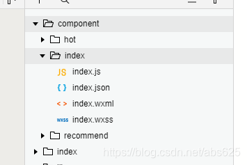
- 项目根目录建立component目录
- 在component目录下右键,选择新建Component子菜单项
- 自定义名字,然后就会生成跟pages中页面一样的目录
我们对index组件目录中的文件稍加修改,使其能展示一个类似新闻列表的页面。
// wxml布局文件
<view class='item' wx:for='{

    {data}}'>
  <view class='title'>{

    {

    item}}</view>
  <view class='bottom'>
    <view>新华网</view>
    <view class='comment'>2344评</view>
  </view>
</view>
// wxss文件
.item {


  display: flex;
  flex-direction: column;
  border-bottom: 1rpx #ccc solid;
  justify-content: center;
  padding: 20rpx;
}
.title {


  font-size: 35rpx;
}
.bottom {


  display: flex;
  flex-direction: row;
  font-size: 20rpx;
  color: gray;
  margin-top: 10rpx;
}
.comment {


  margin-left: 30rpx;
}
// js文件,这里比较简单,只是在data中增加一个data属性
...
  data: {


    data: ['狗狗是人类最好的朋友', '90%长痘的人都不知道,药店里不起眼的东西,睡前抹一抹,祛痘很快', '保时捷Cayenne,即刻驾驭梦想','沙漠极限挑战:三台空调挑战70度极限高温,谁先宕机?','德牧带大的二哈,二哈现在离不开她了,一刻不见就想德牧','为什么说达到第四宇宙速度就可以逃出银河系?','许久没去草坪的边牧,来到公园,开心的像个孩子']
  },
...
})
其他两个页面组件跟这个类似,这里就不演示了。然后我们在需要使用的页面json文件中引用:
// json文件,引用组件,前面的名字可自定义,会在wxml中使用
{


  "usingComponents": {


    "index": "../../component/index/index",
    "hot": "../../component/hot/hot",
    "recommend": "../../component/recommend/recommend"
  }
}
// wxml中使用组件
...
<swiper current='{

    {current}}' bindchange="bindChange" style='height:{

    {contentheight}}px'>
    <swiper-item>
      <scroll-view style='height:100%' scroll-y>
        <index />//引用首页组件,注意名字要和json中的定义的名字相同
      </scroll-view>
    </swiper-item>
    <swiper-item>
      <scroll-view style='height:100%' scroll-y>
        <hot />//引用首页组件
      </scroll-view>
    </swiper-item>
    <swiper-item>
      <scroll-view style='height:100%' scroll-y>
        <recommend />//引用首页组件
      </scroll-view>
    </swiper-item>
</swiper>
...
到这里,我们就完全实现了我们文章开始所展示的效果了,基本做到了和Android中的ViewPager相同的效果。
尾巴
下一篇微信小程序自定义下拉刷新,我将给大家带来自定义下拉刷新功能。如果文章中有错误的地方,欢迎大家留言指正。如果你喜欢我的文章,也欢迎给我点赞,评论,谢谢!