相比于第二版程序(https://blog.csdn.net/wokaoyan1981/article/details/108555126),这一版增加了用Tkinter绘制的图形界面,使用起来更加直观友好。
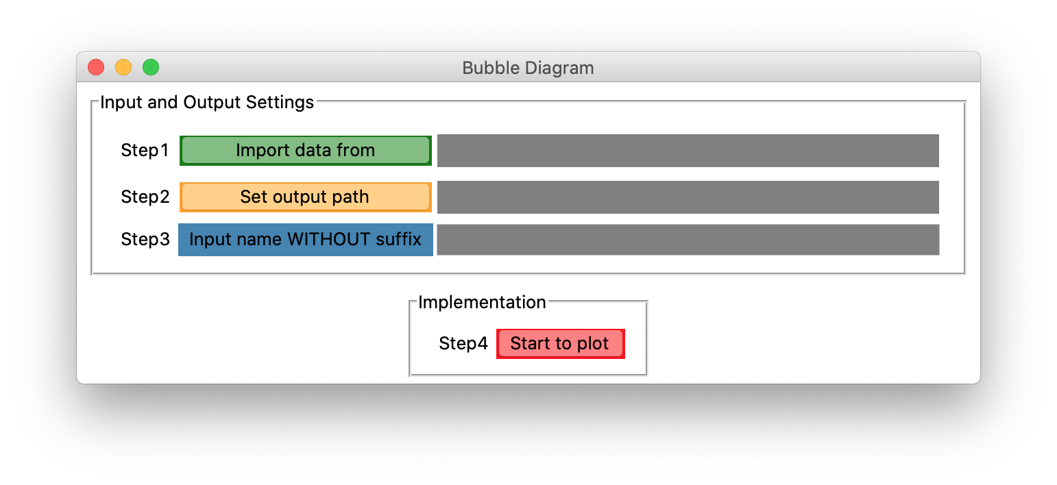
第一步:用户点击“Import data from”按钮,选择一个Excel文件(.xlsx格式,内容与下表类似):
| 1991 | 1992 | 1993 | 1994 | 1995 | 1996 | 1997 | 1998 | 1999 | 2000 | |
| US | 10 | 14 | 16 | 18 | 20 | 42 | 64 | 100 | 50 | 88 |
| JAPAN | 100 | 30 | 70 | 85 | 30 | 42 | 64 | 98 | 24 | 60 |
| CN | 50 | 22 | 30 | 65 | 70 | 66 | 60 | 45 | 45 | 50 |
| INDIA | 90 | 88 | 35 | 50 | 90 | 60 | 40 | 66 | 76 | 70 |
| UK | 40 | 50 | 70 | 50 | 25 | 30 | 22 | 40 | 60 | 55 |
| MALAYSIA | 30 | 50 | 44 | 25 | 30 | 15 | 19 | 22 | 50 | 66 |
然后后面的灰色栏会显示所选文件的路径。
第二步:接着点击第二个按钮“Set output path",选择即将生成的图的位置。同样,其后会显示位置的路径。
第三步:输入想要保存的文件名(不带后缀)。
第四步:点击"Start to plot"
这样就在第二步指定的位置,生成了一个.html文件,浏览器也会弹出显示。

注意国家不超过10个,因为只设置了10组不同的颜色展示。
代码如下:
# Bubble Diagram Version3.0

import tkinter as tk
import tkinter.filedialog as fd
import plotly as py
import plotly.graph_objs as go
import openpyxl
import pandas as pd
import os


class App(tk.Tk):

    def __init__(self):
        super().__init__()
        self.path1 = fd.StringVar()
        self.path2 = fd.StringVar()
        self.name_input = fd.StringVar()
        group_1 = tk.LabelFrame(self, padx=15, pady=10,
                                text="Input and Output Settings")
        group_1.pack(padx=10, pady=5)
        tk.Label(group_1, text='Step1').grid(row=0, column=0)
        tk.Button(group_1, text="Import data from",
                  highlightbackground='green',
                  width=20, command=self.choose_file).grid(row=0, column=1)
        tk.Label(group_1, textvariable=self.path1, width=40, bg='grey', fg='white').grid(row=0, column=2, pady=5)
        tk.Label(group_1, text='Step2').grid(row=1, column=0)
        tk.Button(group_1, text="Set output path", highlightbackground='orange',
                  width=20, command=self.choose_directory).grid(row=1, column=1)
        tk.Label(group_1, textvariable=self.path2, width=40, bg='grey', fg='white').grid(row=1, column=2, pady=5)
        tk.Label(group_1, text='Step3').grid(row=2, column=0)
        tk.Label(group_1, text='Input name WITHOUT suffix', bg='SteelBlue', width=20).grid(row=2, column=1)
        tk.Entry(group_1, textvariable=self.name_input, bg='grey', width=40).grid(row=2, column=2)

        group_2 = tk.LabelFrame(self, padx=15, pady=10, text="Implementation")
        group_2.pack(padx=10, pady=5)
        tk.Label(group_2, text='Step4').grid(row=0, column=0)
        tk.Button(group_2, text="Start to plot", highlightbackground='red',
                  width=10, command=self.start).grid(row=0, column=1)

    def choose_file(self):
        filetypes = (("Excel files", "*.xlsx"),
                     )
        self.filename = fd.askopenfilename(title="Open file",
                                           initialdir="/", filetypes=filetypes)
        self.path1.set(self.filename)

    def choose_directory(self):
        self.directory = fd.askdirectory(title="Open directory",
                                         initialdir="/")
        self.path2.set(self.directory)

    def start(self):
        self.draw(self.filename, self.directory)

    def draw(self, input_file, output_dir):
        self.input_file = input_file
        self.output_dir = output_dir
        wb = openpyxl.load_workbook(self.input_file)
        sheet = wb['Sheet1']
        row_max = sheet.max_row
        col_max = sheet.max_column
        first_row_list = []
        first_col_list = []
        for col_n in range(2, col_max + 1):
            first_row_list.append(sheet.cell(row=1, column=col_n).value)
        for row_n in range(2, row_max + 1):
            first_col_list.append(sheet.cell(row=row_n, column=1).value)

        data_all = pd.read_excel(self.input_file)
        data_selected = data_all.loc[:, first_row_list]

        df = pd.DataFrame(data_selected)
        df.index = first_col_list
        colors = ['rgb(150,204,90)', 'rgb(255, 130, 71)', 'rgb(255, 193, 37)', 'rgb(180,240,190)', 'rgb(255, 10, 1)',
                  'rgb(25, 190, 30)', 'rgb(100, 100, 100)', 'rgb(45,24,200)', 'rgb(33, 58, 108)', 'rgb(35, 208, 232)']

        data = [go.Scatter(
            x=df.columns,
            y=[country] * len(df.columns),
            mode='markers+text',
            marker=dict(
                color=colors[num],
                size=df.loc[country],
                showscale=False,
            ),
            text=list(map(str, df.loc[country])),
            textposition='middle center',
        )
            for num, country in enumerate(reversed(df.index))
        ]

        layout = go.Layout(plot_bgcolor='rgb(10, 10, 10)',
                           paper_bgcolor='rgb(20, 55, 100)',
                           font={
                               'size': 15,
                               'family': 'sans-serif',
                               'color': 'rgb(255, 255, 255)'
                           },
                           width=1000,
                           height=800,
                           xaxis=dict(
                               title='Output of grapes per year in different countries',
                               nticks=col_max + 1,
                               type='category',
                           ),
                           showlegend=False,
                           margin=dict(l=100, r=100, t=100, b=100),
                           hovermode=False,
                           )

        fig = go.Figure(data=data, layout=layout)
        self.name = self.name_input.get() + '.html'
        py.offline.plot(fig, filename=os.path.join(self.output_dir, self.name))


if __name__ == "__main__":
    app = App()
    app.title("Bubble Diagram")
    app.mainloop()