EDA - 数据探索性分析_代码示例部分
代码示例
1.载入各种数据科学以及可视化库
import warnings     # 利用过滤器实现忽略警告语句
import pandas as pd
import numpy as np
import scipy.stats as st
import pandas_profiling
import seaborn as sns
import missingno as msno    # 缺失值可视化的库
import matplotlib as mpl
mpl.use('TkAgg')
import matplotlib.pyplot as plt
warnings.filterwarnings('ignore')
2.载入数据
Train_data = pd.read_csv(r'F:\Users\TreeFei\文档\PyC\used_car\data\used_car_train_20200313.csv', sep=' ')
Test_data = pd.read_csv(r'F:\Users\TreeFei\文档\PyC\used_car\data\used_car_testA_20200313.csv', sep=' ')
# #在kaggle上看一下已知特征的解释
'''
SaleID - 交易ID,唯一编码
name - 汽车交易名称,已脱敏
regDate - 汽车注册日期,例如20160101,2016年01月01日
model - 车型编码,已脱敏
brand - 汽车品牌,已脱敏
bodyType - 车身类型-豪华轿车:0; 微型车:1;  厢型车:2;  大巴车:3;  敞篷车:4;  双门汽车:5; 商务车:6;  搅拌车:7
fuelType - 燃油类型-汽油:0;   柴油:1;   液化石油气:2;   天然气:3;   混合动力:4;   其他:5;   电动:6
gearbox - 变速箱-手动:0;   自动:1
power - 发动机功率:范围 [ 0, 600 ]
kilometer - 汽车已行驶公里,单位万km
notRepairedDamage - 汽车有尚未修复的损坏-是:0; 否:1
regionCode - 地区编码,已脱敏
seller - 销售方-个体:0;  非个体:1
offerType - 报价类型-提供:0;  请求:1
creatDate - 汽车上线时间-即开始售卖时间
price - 二手车交易价格(预测目标)
v系列特征 - 匿名特征:包含v0-14在内15个匿名特征(根据汽车的评论,标签等大量信息得到的embedding向量)
'''
3.简略观察数据
Train_data.head().append(Train_data.tail())     # 显示开头5行和最后5行
Train_data.shape

Test_data.head().append(Test_data.tail())
Test_data.shape
4.数据总览概况
'''
describe - 包括每列的统计量,个数count,平均值mean,方差std,最小值min,中位数25% 50% 75%及最大值
            看这个信息可以瞬间掌握数据的大概范围以及每个值的异常值得判断
            有时会发现999, 9999, -1等值,这些其实可能都是nan得另一种表达方式

info - 了解每列数据得type,有助于了解是否存在除了nan以外得特殊符号异常
'''
Train_data.describe()
Test_data.describe()

Train_data.info()   # 发现model, bodyType, fuelType-缺失的最多, gearbox 这四个特征有缺失值
Test_data.info()    # 发现bodyType, fuelType, gearbox 这三个特征有缺失值


# 我们看下每列存在nan的情况
Train_data.isnull().sum()
Test_data.isnull().sum()
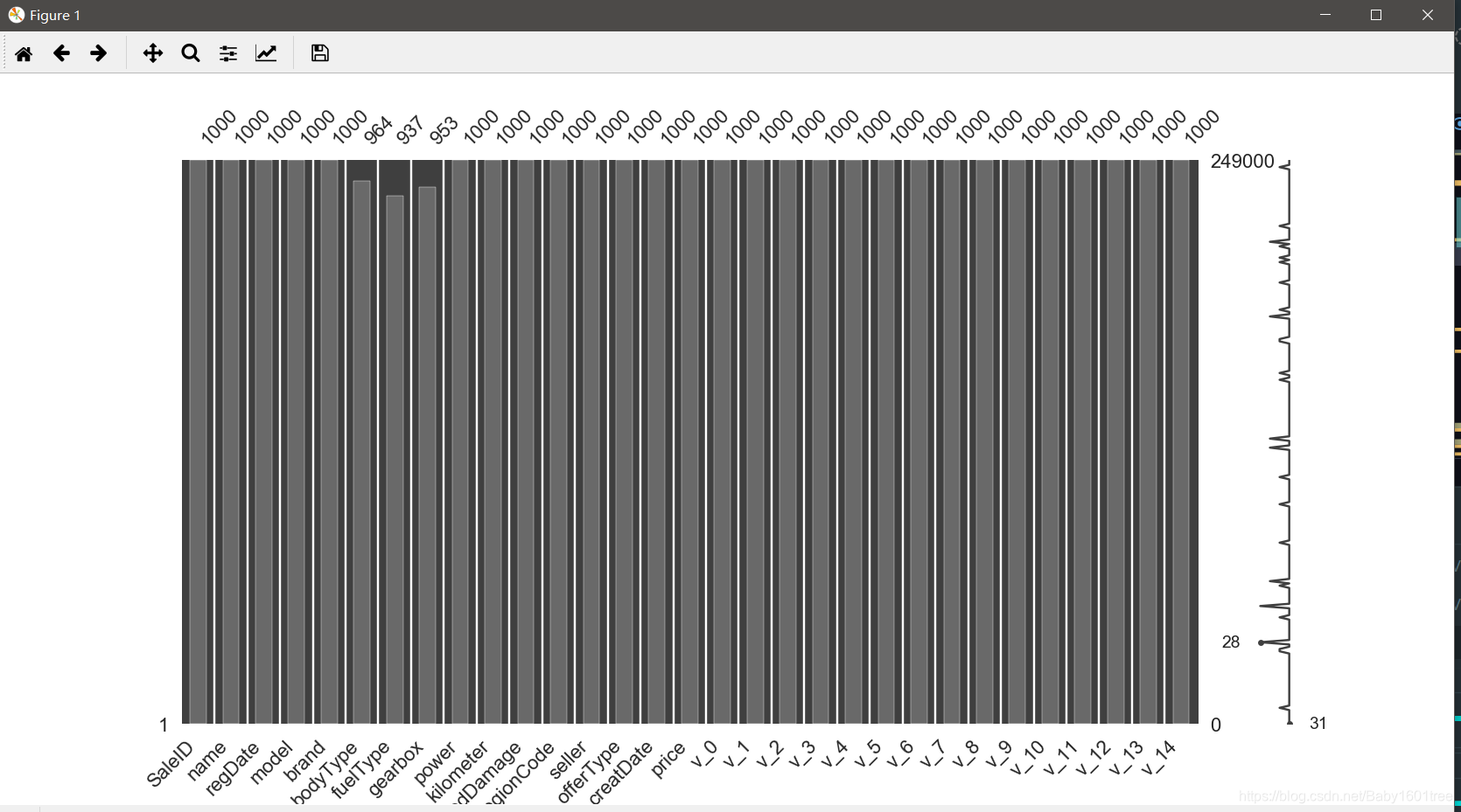
5.我们将训练集的缺失数据可视化
missing = Train_data.isnull().sum()
missing = missing[missing > 0]  # 将有缺失值的列选出
missing.sort_values(inplace=True)   # 升序排序
missing.plot.bar()
可视化看下缺省值
msno.matrix(Train_data.sample(250))     # sample(250) - 随机抽取250个样本,再以列表的形式返回
msno.bar(Train_data.sample(1000))
6.异常值检测
Train_data.info()   # 发现除了notRepairedDamage是object类型,其余特征都是数值型数据
# 我们看一下notRepairedDamage里面有什么
Train_data['notRepairedDamage'].value_counts()      # 发现了有'-'的数据,明显是缺失值,我们将它统一替换成nan
Train_data['notRepairedDamage'].replace('-', np.nan, inplace=True)
Train_data['notRepairedDamage'].value_counts()      # 现在都是数值型数据了
重新看一下缺失值
Train_data.isnull().sum() # 可以发现notRepairedDamage缺失的数据最多,有24324个
把测试集中notRepairedDamage的’-'值也做一下处理
Test_data['notRepairedDamage'].replace('-', np.nan, inplace=True)
Test_data['notRepairedDamage'].value_counts()
Test_data.isnull().sum()        # 发现缺失值最多的也是notRepairedDamage


# 通过这种方法,我们可以发现'seller-销售方' 和'offerType-报价类型' 这两个特征严重倾斜,一般不会对预测有帮助,可以删掉
Train_data['seller'].value_counts()
Train_data['offerType'].value_counts()

del Train_data['seller']
del Train_data['offerType']
del Test_data['seller']
del Test_data['offerType']
7.了解预测值的分布
Train_data['price']
Train_data['price'].value_counts()
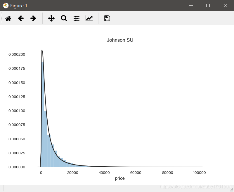
# 看一下price和哪一种分布最贴近
y = Train_data['price']
plt.figure(1)
plt.title('Johnson SU')
'''
st.johnsonsu - 约翰逊分布,是一种经过约翰变换后服从正态分布概率的随机变量的概率分布
'''
sns.distplot(y, kde=False, fit=st.johnsonsu) # kde - bool型变量,控制是否绘制核密度估计曲线,默认为True
plt.figure(2)
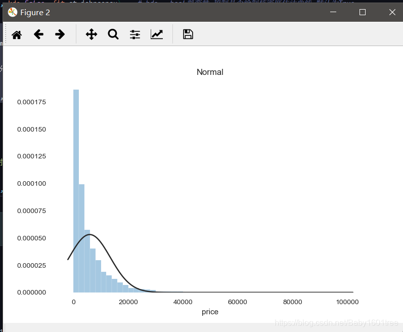
plt.title('Normal')
'''
st.norm - 正态分布
'''
sns.distplot(y, kde=False, fit=st.norm)
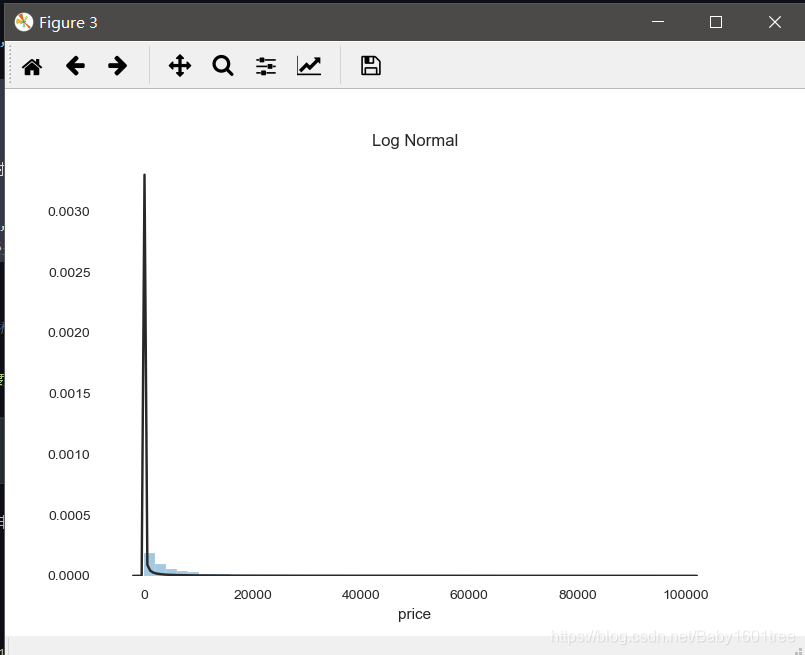
plt.figure(3)
plt.title('Log Normal')
'''
st.lognorm - 对数正态分布,从短期来看,与正态分布非常接近;但长期来看,对数正态分布向上分布的数值更多一些
'''
sns.distplot(y, kde=False, fit=st.lognorm)
约翰逊分布拟合效果:
正态分布拟合效果:
对数正态分布拟合效果:
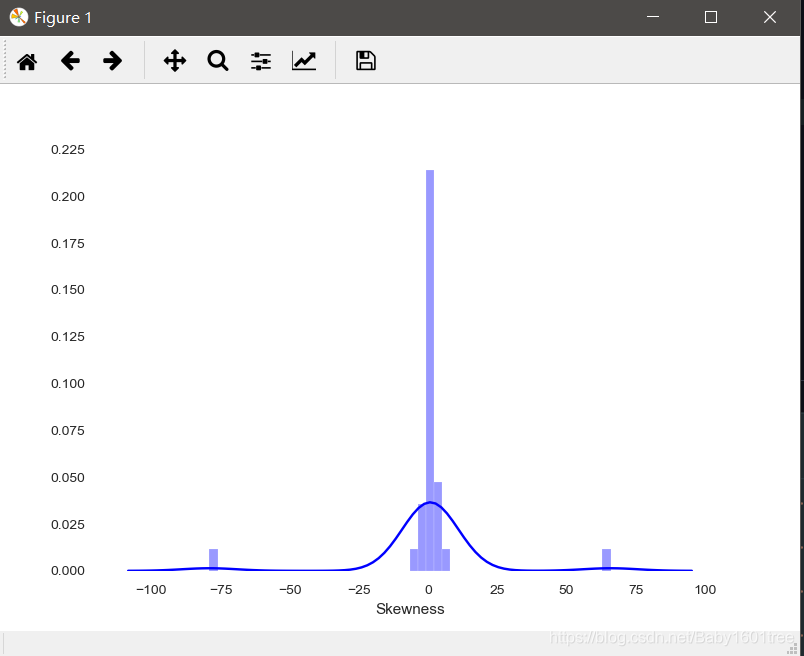
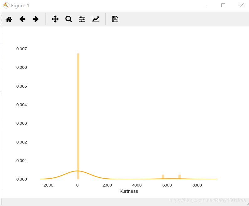
8.查看skewness和kurtosis
'''
skewness - 偏度,也称为偏态/偏态系数,是统计数据分布偏斜方向和程度的度量,是统计数据分布非对称程度的数字特征

kurtosis - 峰度,与偏度类似,是描述总体中所有取值分布形态陡缓程度的统计量
            这个统计量需要与正态分布相比较:
            1.峰度为0表示该总体数据分布与正态分布的陡缓程度相同
            2.峰度大于0表示该总体数据分布与正态分布相比较为陡峭,为尖顶峰
            3.峰度小于0表示该总体数据分布与正态分布相比较为平坦,为平顶峰
            4.峰度的绝对值数值越大表示其分布形态的陡缓程度与正态分布的差异程度越大
'''
sns.distplot(Train_data['price'])
print('Skewness: %f' % Train_data['price'].skew())
print('Kurtosis: %f' % Train_data['price'].kurt())
# 看一下整个训练集的偏度和峰度
Train_data.skew()
Train_data.kurt()
可视化
sns.distplot(Train_data.skew(), color='blue', axlabel='Skewness')
sns.distplot(Train_data.kurt(), color='orange', axlabel='Kurtness')
偏度:
峰度:
9.查看预测值的频数
plt.hist(Train_data['price'], orientation='vertical', histtype='bar', color='red')
'''
参数解释
orientation - 直方图方向
horizontal - 水平方向
vertical - 垂直方向
'''
plt.show()
# 发现价格大于20000的样本极少(其实可以直接填充或者删掉,当作异常值处理)
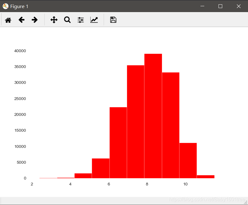
# 试着log变换,看一下价格分布
plt.hist(np.log(Train_data['price']), orientation='vertical', histtype='bar', color='red')
plt.show()
# 发现分布显示变均匀了
log变换之前:
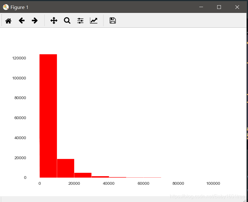
log变换之后
10.将特征分为类别特征和数字特征,并对类别特征查看unique分布
本案例需要人为根据实际含义区分
'''
numeric_features = Train_data.select_dtypes(include=[np.number])
numeric_features.columns
'''
numeric_features = ['power', 'kilometer', 'v_0', 'v_1', 'v_2', 'v_3', 'v_4', 'v_5', 'v_6', 'v_7', 'v_8',
                    'v_9', 'v_10', 'v_11', 'v_12', 'v_13', 'v_14']
categorical_features = ['name', 'model', 'brand', 'bodyType', 'fuelType',
                        'gearbox', 'notRepairedDamage', 'regionCode']
# 在这里,两个日期没有分类
11.看一下训练集类型特征的特征分布
for cat_fea in categorical_features:
    print(cat_fea + '的特征分布如下:')
    print('{}特征有{}个不同值'.format(cat_fea, Train_data[cat_fea].nunique()))
    print(Train_data[cat_fea].value_counts())

# 看一下测试集类型特征的特征分布
for cat_fea in categorical_features:
    print(cat_fea + '的特征分布如下:')
    print('{}特征有{}个不同值'.format(cat_fea, Test_data[cat_fea].nunique()))
    print(Test_data[cat_fea].value_counts())
12.数字特征分析
# #把price加入数字特征中
numeric_features.append('price')
numeric_features
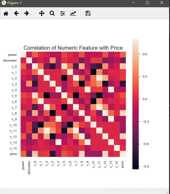
# #相关性分析
price_numeric = Train_data[numeric_features] # 把训练集中样本的价格和数字型特征提取出来
correlation = price_numeric.corr() # corr() - 给出任意两个变量之间的相关系数
print(correlation['price'].sort_values(ascending=False), '\n') # 把其他变量和价格的相关系数降序排列
# #将这个结果可视化
f, ax = plt.subplots(figsize=(7, 7))
plt.title('Correlation of Numeric Feature with Price', y=1, size=16)
'''
sns.heatmap - 热力图
square - 正方形
vmax - 热力图颜色取值的最大值,默认会从data中推导
'''
sns.heatmap(correlation, square=True, vmax=0.8)
对数字特征数据集进行偏度和峰度分析
for col in numeric_features:
    print(col)
    print(Train_data[col].skew())
    print(Train_data[col].kurt())
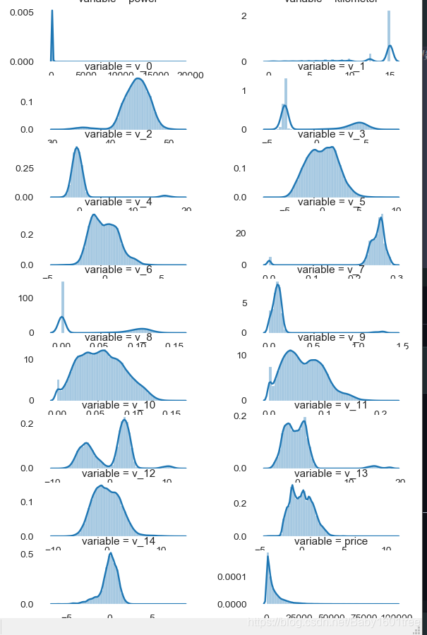
每个数字特征的分布可视化
# 每个数字特征的分布可视化
f = pd.melt(Train_data, value_vars=numeric_features)    # melt() - 将列名转化为列数据; value_vars参数 - 需要转换的列名
g = sns.FacetGrid(f, col='variable', col_wrap=2, sharex=False, sharey=False)
g = g.map(sns.distplot, 'value')
'''
sns.FaceGrid - 构建结构化多绘图网格

参数详解:
data - 处理后的dataframe数据,其中每一列都是一个变量(特征),每一行都是一个样本
row/col/hue - 定义数据子集的变量,这些变量将在网格的不同方面绘制
col_wrap - 图网格列维度限制
share{x,y} - 是否共享x轴或者y轴
'''
# 可以看出匿名特征相对分布均匀
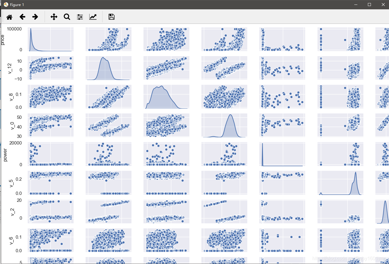
13.数字特征相互之间的关系可视化
sns.set()
columns = ['price', 'v_12', 'v_8', 'v_0', 'power', 'v_5', 'v_2', 'v_6', 'v_1', 'v_14']
sns.pairplot(Train_data[columns], size=2, kind='scatter', diag_kind='kde')
'''
sns.pairplot - 绘制多变量网格图

参数详解:
size - 图的尺寸大小,默认6
kind - 绘图样式    kind='scatter' --> 散点图
diag_kind - 对角线子块的绘图方式      diag_kind='kde' --> 显示核密度分布
'''
plt.show()
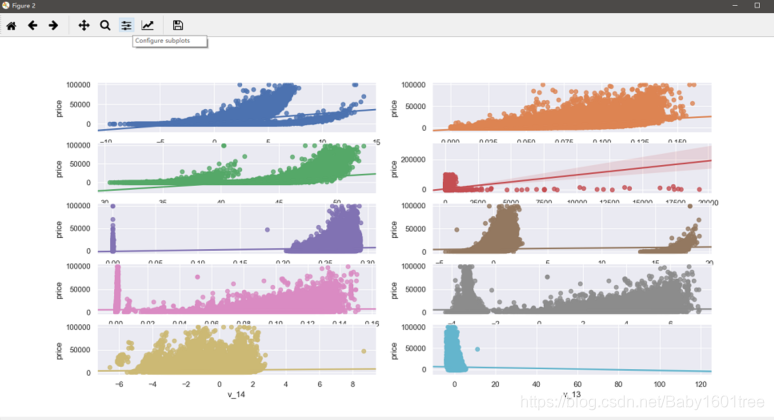
14.多变量互相关系回归可视化
'''
此处设定画布规格 - 5行2列
'''
fig, ((ax1, ax2), (ax3, ax4), (ax5, ax6), (ax7, ax8), (ax9, ax10)) = plt.subplots(nrows=5, ncols=2, figsize=(24, 20))
# ['v_12', 'v_8' , 'v_0', 'power', 'v_5', 'v_2', 'v_6', 'v_1', 'v_14']

'''
sns.regplot - 用于线性关系可视化

参数详解:
x/y - 横纵坐标
data - 数据集
fig_reg - 回归线 --> True:显示    False:不显示
'''
v_12_scatter_plot = pd.concat([Y_train, Train_data['v_12']], axis=1)
sns.regplot(x='v_12', y='price', data=v_12_scatter_plot, scatter=True, fit_reg=True, ax=ax1)

v_8_scatter_plot = pd.concat([Y_train, Train_data['v_8']], axis=1)
sns.regplot(x='v_8', y='price', data=v_8_scatter_plot, scatter=True, fit_reg=True, ax=ax2)
v_0_scatter_plot = pd.concat([Y_train, Train_data['v_0']], axis=1)
sns.regplot(x='v_0', y='price', data=v_0_scatter_plot, scatter=True, fit_reg=True, ax=ax3)
power_scatter_plot = pd.concat([Y_train, Train_data['power']], axis=1)
sns.regplot(x='power', y='price', data=power_scatter_plot, scatter=True, fit_reg=True, ax=ax4)
v_5_scatter_plot = pd.concat([Y_train, Train_data['v_5']], axis=1)
sns.regplot(x='v_5', y='price', data=v_5_scatter_plot, scatter=True, fit_reg=True, ax=ax5)
v_2_scatter_plot = pd.concat([Y_train, Train_data['v_2']], axis=1)
sns.regplot(x='v_2', y='price', data=v_2_scatter_plot, scatter=True, fit_reg=True, ax=ax6)
v_6_scatter_plot = pd.concat([Y_train, Train_data['v_6']], axis=1)
sns.regplot(x='v_6', y='price', data=v_6_scatter_plot, scatter=True, fit_reg=True, ax=ax7)
v_1_scatter_plot = pd.concat([Y_train, Train_data['v_1']], axis=1)
sns.regplot(x='v_1', y='price', data=v_1_scatter_plot, scatter=True, fit_reg=True, ax=ax8)
v_14_scatter_plot = pd.concat([Y_train, Train_data['v_14']], axis=1)
sns.regplot(x='v_14', y='price', data=v_14_scatter_plot, scatter=True, fit_reg=True, ax=ax9)
v_13_scatter_plot = pd.concat([Y_train, Train_data['v_13']], axis=1)
sns.regplot(x='v_13', y='price', data=v_13_scatter_plot, scatter=True, fit_reg=True, ax=ax10)
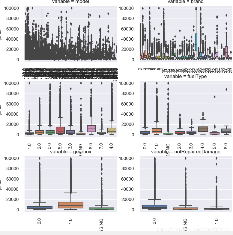
15.类别特征分析
# #unique分布
for fea in categorical_features:
    print(Train_data[fea].nunique())

# #类别特征可视化 - 由于name和regionCode特征过于稀疏,所以选取其他类别特征进行可视化
categorical_features_box = ['model', 'brand', 'bodyType', 'fuelType', 'gearbox', 'notRepairedDamage']
for c in categorical_features_box:
    Train_data[c] = Train_data[c].astype('category')    # 转化成类型数据的格式
    # any() - 判断给定的可迭代参数iterable:如果全部为 False,则返回 False;如果有一个为 True,则返回 True
    if Train_data[c].isnull().any():
        Train_data[c] = Train_data[c].cat.add_categories(['MISSING'])   # 如果有缺失值,那么添加新类别'MISSING'
        Train_data[c] = Train_data[c].fillna('MISSING')     # 缺失值填充为MISSING

# #定义箱型图
def boxplot(x, y, **kwargs):
    sns.boxplot(x=x, y=y)
    x = plt.xticks(rotation=90)     # otation - label显示的旋转角度


f = pd.melt(Train_data, id_vars=['price'], value_vars=categorical_features_box)     # id_vars - 不需要转化的列名
g = sns.FacetGrid(f, col='variable', col_wrap=2, sharex=False, sharey=False, size=5)
g = g.map(boxplot, 'value', 'price')
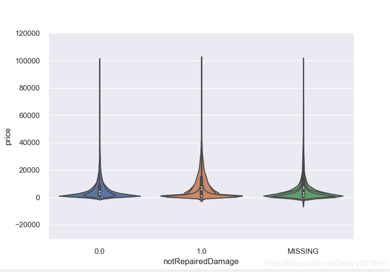
16.类别特征的小提琴图可视化
catg_list = categorical_features_box
target = 'price'
for catg in catg_list:
    sns.violinplot(x=catg, y=target, data=Train_data)
    plt.show()
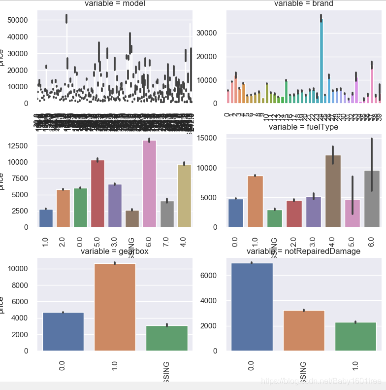
17.类别特征的柱形图可视化
def bar_plot(x, y, **kwargs):
    sns.barplot(x=x, y=y)
    x = plt.xticks(rotation=90)


f = pd.melt(Train_data, id_vars=['price'], value_vars=categorical_features_box)
g = sns.FacetGrid(f, col='variable', col_wrap=2, sharey=False, sharex=False, size=5)
g = g.map(bar_plot, 'value', 'price')