我们进入:面向对象绘图 第二节
本系列第二部分我们详细介绍了各绘图对象;
本系列第三部分第一节详细介绍了fig与ax
本文为面向对象绘图的收尾,将详细介绍子图ax及与子图相关的各个元素
如:坐标轴、坐标轴刻度、图例、轴标题、网格线等。
| 对象 | 常用代号 |
|---|---|
| 画布 | fig |
| 子图(或者坐标系) | ax |
| 绘图对象(如散点,直方、折线等) | ax.scatter、ax.hist、ax.plot |
| 坐标轴 | ax.xaxis |
| 坐标轴刻度 | ax.xaxis.xtick |
| 图例 | ax.legend |
| 轴标题 | ax.xlabel |
| 网格线 | ax.grid |
本文的运行环境为 jupyter notebook
python版本为3.7
本文所用到的库包括
%matplotlib inline
import numpy as np
import matplotlib.pyplot as plt
from matplotlib.ticker import FormatStrFormatter
from matplotlib.ticker import FuncFormatter
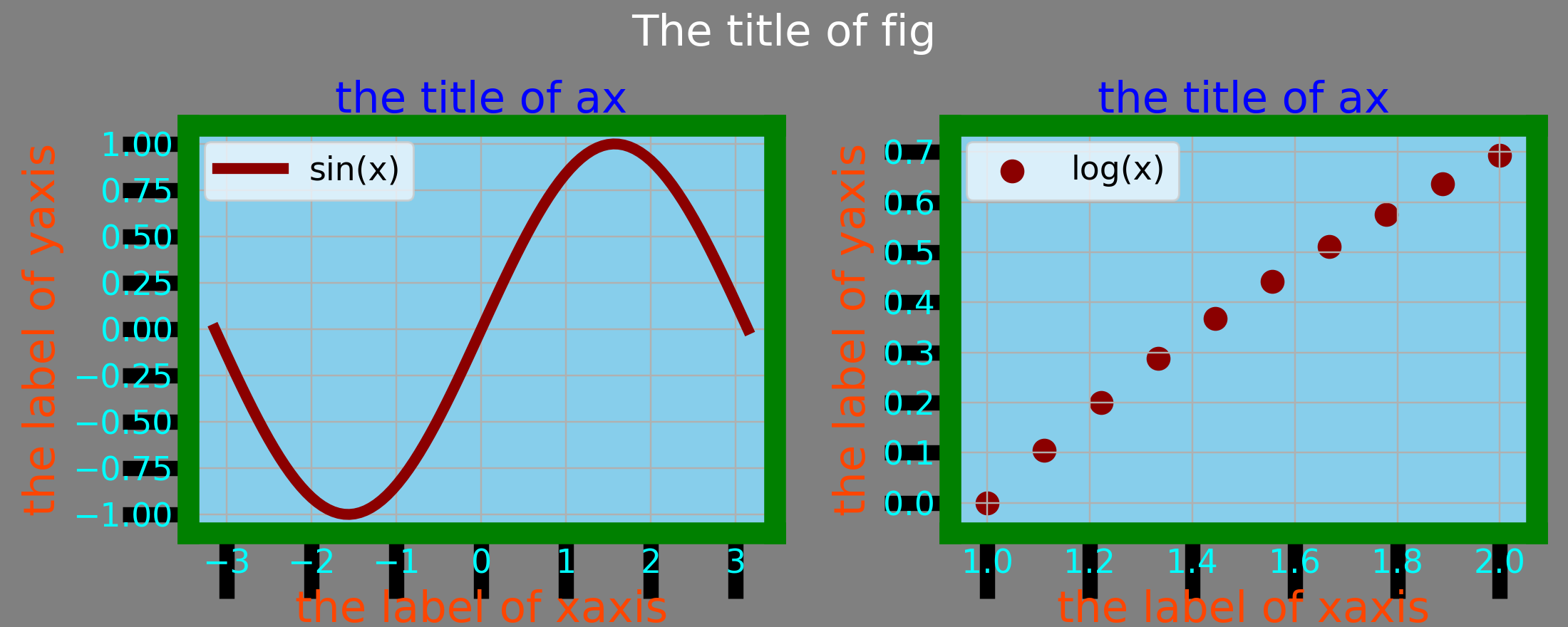
一张图上有多少对象
下图用不同颜色标注了一张matplotlib图上的各个对象:
灰色的画布
白色的画布标题
红色的绘图对象
天蓝色的子图填充
蓝色的子图标题
桔红色的轴标题
地中海蓝色填充的图例
绿色加粗的坐标轴边框
深蓝加粗的坐标轴标签
………………………………
可以看出,一幅图就是各个元素像“积木”一样堆积起来的,每个元素都可以根据相应的接口“定制”。正因为如此,matplotlib的绘图自由度是非常高的,这么设计的好处无疑是给了使用者很大的创作空间。
# 一步生成画布和子图,其中画布填充为灰色
fig, axs = plt.subplots(1, 2, facecolor='grey', figsize=(10, 4))

# 设置画布标题
fig.suptitle('The title of fig', va='top', size=20, color='white')

for i, ax in enumerate(axs):
    # 第一幅子图绘制sin曲线,第二幅子图绘制log曲线
    if i == 0:
        ax.plot(np.linspace(-1*np.pi, np.pi, 100), np.sin(np.linspace(-1*np.pi, np.pi, 100)),
                label='sin(x)', lw=5, color='darkred')
    else:
        ax.scatter(np.linspace(1, 2, 10), np.log(np.linspace(1, 2, 10)),
                   label='log(x)', s=100, c='darkred')

    # 子图填充颜色
    ax.set(facecolor='skyblue')
    # 子图标题
    ax.set_title('the title of ax', fontsize=20, color='blue')
    # 子图x轴,y轴标题
    ax.set_xlabel('the label of xaxis', fontsize=20, color='orangered')
    ax.set_ylabel('the label of yaxis', fontsize=20, color='orangered')
    # 子图图例
    ax.legend(loc=2, fontsize=15, facecolor='aliceblue')
    # 子图网格线
    ax.grid()

    # 子图坐标轴边框
    for position in ['left', 'right', 'top', 'bottom']:
        ax.spines[position].set_linewidth(10)
        ax.spines[position].set_color('green')

    # 子图x,y坐标轴轴标签
    for label in ax.get_xticklabels()+ax.get_yticklabels():
        label.set_color('cyan')
        label.set_fontsize(15)

    # 子图x,y坐标轴轴刻度线
    for line in ax.get_xticklines()+ax.get_yticklines():
        line.set_markeredgewidth(7)
        line.set_markersize(30)
        line.set_markerfacecolor('aqua')

# 微调子图与画布间距,及子图与子图间距
plt.subplots_adjust(left=0.12, right=0.98,
                    bottom=0.15, top=0.8,
                    wspace=0.3
                    )
子图设置
下图通过ax.set将不同子图填充为不同颜色,通过ax.label_outer设置了轴标题和轴标签,仅在最外层一圈的子图上显示轴标题和轴标签。
接口ax.get_geometry返回当前子图的栅格位置,接口ax.is_first_col,ax.is_first_row 可用做判断当前子图是否为第一列或第一行。
fig, axs = plt.subplots(2, 2, facecolor='lightgrey')
colors = 'rgbk'
for i, ax in enumerate(axs.ravel()):
    ax.set(facecolor=colors[i])
    ax.label_outer()  # 仅在外层显示轴标题和轴标签
    print(ax.get_geometry()) # 返回总行数、列数以及每个子图的顺序号,nrows,ncols,loc
    print(ax.is_first_col(),ax.is_first_row()) # 返回布尔型,返回当前子图是否是第一列或者第一行的判断值
以上代码输出为:
(2, 2, 1)
True True
(2, 2, 2)
False True
(2, 2, 3)
True False
(2, 2, 4)
False False

子图换位
可通过ax.change_geometry对任一子图ax调换栅格位置。本例将左上角与右下角子图进行了换位。
fig, axs = plt.subplots(2, 2, facecolor='lightgrey')
colors = 'rgbk'
for i, ax in enumerate(axs.ravel()):
    ax.set(facecolor=colors[i])
    ax.label_outer()

# 以下代码实现将左上角子图与右下角子图对换位置
axs[0,0].change_geometry(2,2,4)
axs[1,1].change_geometry(2,2,1)

坐标轴
坐标系开关
可通过ax.axis(‘off’),关闭坐标系(包括坐标轴、坐标轴刻度,坐标轴标签等)。
fig, axs = plt.subplots(1, 3, facecolor='lightgrey',figsize=(9,3))
for i,ax in enumerate(axs):
    ax.text(0.5,0.5,'ax%d'%(i+1),fontsize=20,ha='center')

# 默认显示上、下、左、右四处坐标轴,可通过以下代码将其关闭
ax=axs[1]
ax.axis('off')

坐标轴是否显示
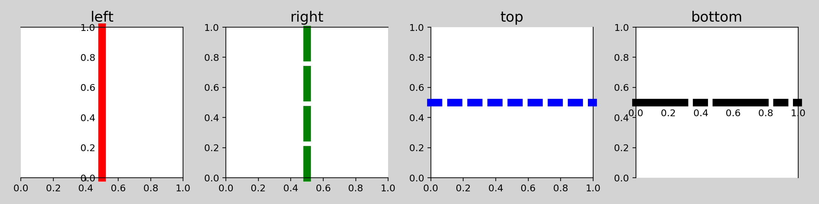
坐标轴通过ax.spines[postion] 对象进行调用,通过set_visible设置相应位置坐标轴可见性。本例分别将左、右、上、下的坐标轴设置为不可见。
fig, axs = plt.subplots(2, 2)
positions=['left', 'right', 'top', 'bottom']
for i,ax in enumerate(axs.ravel()):
    ax.text(0.5,0.5,'ax%d'%(i+1),fontsize=20,ha='center')

    ax.spines[positions[i]].set_visible(False)
    ax.set_title('delete the spines of '+positions[i])

坐标轴设置
以下代码分别设置了坐标轴颜色set_color、线型set_linestyle、线宽set_linewidth、位置set_position,详情请看代码注释。
fig, axs = plt.subplots(1, 4,figsize=(12,3))
positions=['left', 'right', 'top', 'bottom']
colors='rgbk'
linestyles=['-','--',':','-.']
for i,ax in enumerate(axs.ravel()):
    ax.set_title(positions[i],size=15)
    # 坐标轴颜色
    ax.spines[positions[i]].set_color(colors[i])
    # 坐标轴线型
    ax.spines[positions[i]].set_linestyle(linestyles[i])
    # 坐标轴线宽
    ax.spines[positions[i]].set_linewidth(8)
    # 坐标轴位置
    ax.spines[positions[i]].set_position(('axes',0.5))
       # set_position 接口传入一个元组,元组第一项为参照系,第二项为位置值
        # 若元组第一项若'axes',则表示坐标轴交叉至子图归一化后位置
        # 若元组第一项为'data',则表示坐标轴交叉至实际数据坐标位置
笛卡尔坐标系
默认情况下,matplotlib在上、下、左、右各显示一条坐标轴;很多情况下,例如笛卡尔坐标系,仅显示两条坐标轴,且相交于原点。本例中,子图1为默认状态下坐标轴,子图2为笛卡尔坐标系下坐标轴,子图3自定义坐标轴,该坐标轴交叉于(-2.0,0.3)。
fig, axs = plt.subplots(1, 3, figsize=(9, 3))
colors = 'rgb'

for i, ax in enumerate(axs):
    ax.plot(np.linspace(-1*np.pi, np.pi, 100),
            np.sin(np.linspace(-1*np.pi, np.pi, 100)), lw=5, color=colors[i])

axs[1].spines['left'].set_position(('axes', 0.5))  # y轴与x轴交叉于彼此的中心,此处为(0.0,0.0)
axs[1].spines['bottom'].set_position(('axes', 0.5))
axs[1].spines['top'].set_visible(False)
axs[1].spines['right'].set_visible(False)

axs[2].spines['left'].set_position(('data', -2.0))  # y轴与x轴交叉于 (-2.0,0.3)
axs[2].spines['bottom'].set_position(('data', 0.3))
axs[2].spines['top'].set_visible(False)
axs[2].spines['right'].set_visible(False)

轴标题
本例演示了ax.set_xlabel接口中,不同轴标题参数对轴标题的不同设置。
fig, axs = plt.subplots(1, 4, figsize=(12, 3))

for ax in axs.ravel():
    ax.text(0.5,0.5,ax.get_geometry(),ha='center',fontsize=20)

# 不做任何修改
axs[0].set_xlabel(xlabel='x axis')
axs[0].set_ylabel(ylabel='y axis')

# 修改字体,字号,轴标题比子图主体的间距
axs[1].set_xlabel(xlabel='x axis',
                     fontdict={

    'family': 'Times New Roman',
                               'size': 20, },
                     labelpad=10)  # 与子图的相对距离,百分比

# 修改字体,字号,标题旋转角度
axs[2].set_xlabel(xlabel='x axis',
                     fontdict={

    'family': 'Times New Roman',
                               'size': 20,
                               'rotation': 30},)

# 轴标题增加轮廓,轮廓背景用纯色填充,轮廓边框设置为蓝色
# plt.xlabel 与 ax.set_xlabel 接口功能相同,区别是 plt.xlabel 只对当前子图有效
# 当前子图为 axs[3]
plt.xlabel(xlabel='x axis',
           size=20,
           bbox={

    'facecolor': 'cyan',
                 'edgecolor': 'blue',
                 'boxstyle': 'round'})

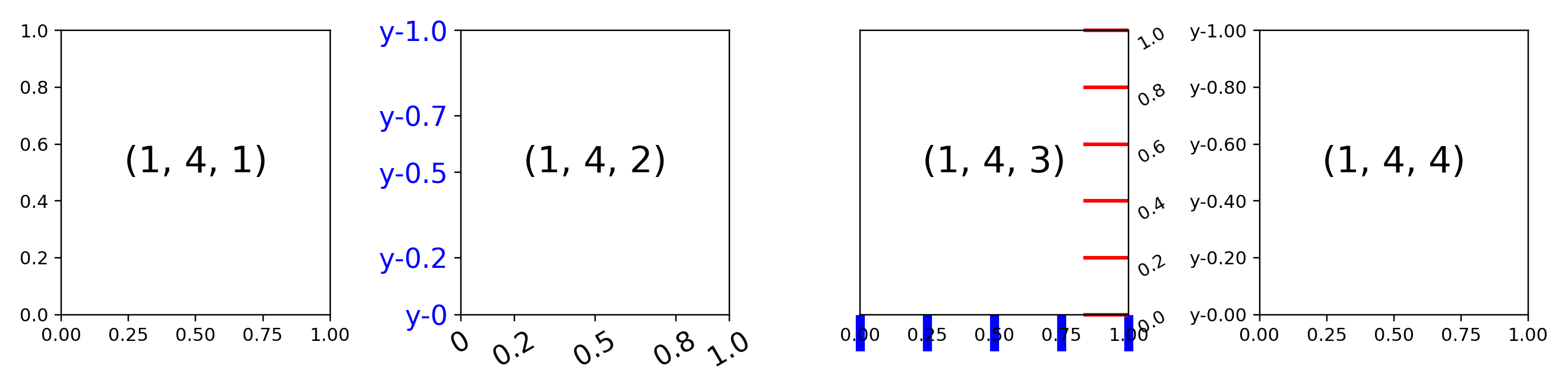
轴刻度与轴标签
轴刻度与轴标签,涉及的接口很多。
本例详细讨论了轴刻度与轴标签的设置方法,分三种方式:
方式一(ax 1):
通过ax.set_xticks设置主/次刻度线
通过ax.xaxis.set_ticklabels设置主/次刻度标签
方式二(ax 2):
通过ax.tick_params设置主/次刻度线及刻度标签
通过ax.xaxis.get_ticklabels、ax.xaxis.get_ticklines的返回对象设置刻度线及刻度标签(分别返回的是Text对象和Line2D对象)
方式三:
通过plt.xticks一步设置主/次刻度线和主/次刻度标签
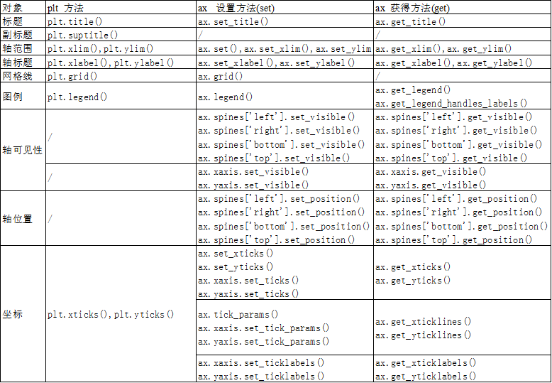
实际应用中,经常会迷惑plt与ax,两者均能对对象进行设置,但他们有所区别:
(1)plt突出的是快捷,ax突出的是详细、精准;
(2)plt的操作对象是当前子图,ax是指定任一子图;
(3)plt相比ax,在设置(set)对象属性上,大部分相同,但是在详细设置(set)与获取(get)对象属性上ax要明显优于plt。
文末会详细列出plt与ax对不同对象属性的set,get接口。
针对x轴、y轴刻度标签的小数位数,格式等,子图4用两种方式演示了对其设置的方法:一种是通过FormatStrFormatter类对象(文本转义格式化输出),另一种是通过FuncFormatter类对象(函数式格式化输出)。
fig, axs = plt.subplots(1, 4, figsize=(12, 3))

for ax in axs.ravel():
    ax.text(0.5, 0.5, ax.get_geometry(), ha='center', fontsize=20)

########################  ax 0 ####################
# 默认,不修改

########################  ax 1 ####################
# x轴刻度标签设置
axs[1].set_xticks(ticks=[0, 0.2, 0.5, 0.8, 1.0])  # 定位刻度线
axs[1].xaxis.set_ticklabels(
    ticklabels=[0, 0.2, 0.5, 0.8, 1.0],  # 设置刻度标签
    size=15,  # 字号
    rotation=30)   # 字体旋转角度
# y轴刻度标签设置
axs[1].set_yticks(ticks=[0, 0.2, 0.5, 0.7, 1.0])
axs[1].yaxis.set_ticklabels(
    ticklabels=['y-0', 'y-0.2', 'y-0.5', 'y-0.7', 'y-1.0'],
    fontsize=15,  # 字号
    color='blue')  # 字体颜色

########################  ax 2 ####################
# x轴刻度线设置
for line in axs[2].get_xticklines():
    # 返回的line为Line2D对象,类似于折线图绘制的曲线
    # 刻度为该对象的marker
    line.set_markeredgewidth(5)   # 刻度宽度
    line.set_markersize(20)   # 刻度长度
    line.set_color('blue')  # 刻度颜色

# y轴刻度线设置
axs[2].tick_params(
    axis='y',
    direction='in',  # 刻度线朝向,in-向内,out-向外
    length=25,  # 刻度线长度
    width=2,   # 刻度线宽度
    color='r',  # 刻度线颜色
    left=False,  # 左侧坐标轴刻度线不显示
    right=True,  # 右侧坐标轴刻度线显示
    labelleft=False,  # 左侧坐标轴标签不显示
    labelright=True,  # 右侧坐标轴标签显示
    labelrotation=30,  # 标签旋转角度
)

########################  ax 3 ####################
ax = plt.gca() # 返回当前子图,此处返回的是最后一个子图,即axs[1,1]

# x轴刻度标签设置
# 通过格式化文本 FormatStrFormatter
from matplotlib.ticker import FormatStrFormatter
ax.xaxis.set_major_formatter(formatter=FormatStrFormatter('%.2f'))

# y轴刻度标签设置
# 通过格式化函数 FuncFormatter
from matplotlib.ticker import FuncFormatter
def major_tick_format(num, pos):
    return 'y-%.2f' % num
formatter = FuncFormatter(major_tick_format)
ax.yaxis.set_major_formatter(formatter=formatter)
轴刻度与网格线
在标记了主、次刻度线的位置,可以通过plt.grid和ax.grid接口进行网格线的设置。
fig, axs = plt.subplots(1, 4, figsize=(12, 3))

########################  ax 0 ####################
# 默认,不修改

########################  ax 1 ####################
ax = axs[1]
ax.grid(b=True)

########################  ax 2 ####################
from matplotlib.ticker import MultipleLocator, AutoMinorLocator

ax = axs[2]
ax.xaxis.set_major_locator(MultipleLocator(0.4))  # 每0.4个刻度分一个主刻度线
ax.xaxis.set_minor_locator(AutoMinorLocator(n=2))  # 将每个主刻度线分成2个次刻度线

ax.yaxis.set_major_locator(MultipleLocator(0.5))  # 每0.5个刻度分一个主刻度线
ax.grid(axis='y', lw=6, color='red')
# 设置主刻度网格线
ax.grid(b=True,
        which='major',
        axis='x',
        color='blue',
        alpha=0.8,
        linewidth=4,
        linestyle=':',)
# 设置次刻度网格线
ax.grid(b=True,
        which='minor',
        axis='x',
        color='gray',
        alpha=0.8,
        linewidth=4,
        linestyle='--',)

########################  ax 2 ####################
plt.grid(b=True,
         which='major',
         axis='both',
         color='green',
         lw=6)

图例
图例位置的设置
可以通过plt.legend和ax.legend接口进行图例的设置
loc参数用来设置图例在子图的位置,loc默认为0,在该状态下,图例将尽可能少地遮挡绘图对象。下图展示了不同位置图例的图像。
fig, axs = plt.subplots(3, 3, figsize=(9, 9), sharey=True, sharex=True)
colors = 'rgbkrgbkr'
for i, ax in enumerate(axs.ravel()):
    ax.plot(np.linspace(-1*np.pi, np.pi, 100),
            np.sin(np.linspace(-1*np.pi, np.pi, 100)), lw=5, label='sin', color=colors[i])
    ax.legend(loc=i+1)
    ax.set_title(label='the legend loc position: %d' % (i+1))

官方文档中图例位置介绍
| Location String | Location Code |
|---|---|
| ‘best’ | 0 |
| ‘upper right’ | 1 |
| ‘upper left’ | 2 |
| ‘lower left’ | 3 |
| ‘lower right’ | 4 |
| ‘right’ | 5 |
| ‘center left’ | 6 |
| ‘center right’ | 7 |
| ‘lower center’ | 8 |
| ‘upper center’ | 9 |
| ‘center’ | 10 |
图例边框的设置
本例演示了不同参数对图例边框、文本、位置的设置,详情请看代码注释。
fig, axs = plt.subplots(1, 4, figsize=(12, 3), sharey=True, sharex=True)
colors = 'rgbk'
for i, ax in enumerate(axs):
    ax.plot(np.linspace(-1*np.pi, np.pi, 100),
            np.sin(np.linspace(-1*np.pi, np.pi, 100)), lw=5, label='sin', color=colors[i])

########################  ax 0 ####################
ax = axs[0]
ax.legend()

########################  ax 1 ####################
ax = axs[1]
ax.legend(frameon=False,  # 去除图例边框
          markerfirst=False,  # 将图例线段放置在文本后方
          prop={

    'family': 'Times New Roman',  # 设置字体
                'size': 20,  # 设置字号
                }
          )

########################  ax 2 ####################
ax = axs[2]
ax.legend(facecolor='skyblue',
          edgecolor='darkred',
          title='title of legend',
          title_fontsize=11,
          fontsize=11,
          framealpha=0.8,
          )

########################  ax 3 ####################
plt.legend(bbox_to_anchor=(1.1, 0.9),
           # 相对位置,一般默认为当前子图归一化位置;如需修改为其他子图,可通过bbox_transform指定
          bbox_transform=axs[3].transAxes)

前文多处均用到了plt与ax,相信很多用了很久matplotlib也常感疑惑,有时甚至经常迷惑自己究竟改用plt还是ax,事实上,两者确实在大多数情况下均能完成相同的任务。以下是个人的一些总结:
(1)plt突出的是快捷,代码思路更侧重于面向过程;ax突出的是详细、精准,代码思路更侧重于面向对象;
(2)plt的操作对象是当前子图,ax是指定任一子图,单子图情况下两者并无较大区别,多子图和栅格子图时,ax将有显著优势;
(3)plt相比ax,在设置(set)对象属性上,大部分相同,但是在详细修饰与获取对象属性上ax要明显优于plt。
希望对你有所启发和帮助!