使用echart完成百分比图
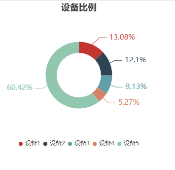
效果图:
上代码:
安装依赖:
npm install echarts --save
import echarts from “echarts”;
<template>
  <div>
    <div id="demo"></div>
  </div>
</template>
<script>
export default {
  data() {
    return {
      option: {
        title: {
          text: "设备比例", //标题设置‘参保情况’
          // subtext: "纯属虚构",
          left: "center", //标题位置
        },
        tooltip: {
          //鼠标hover覆盖提示框

          trigger: "item", //根据item提示信息
          formatter: "{b} : {c} ({d}%)", //提示内容
        },
        legend: {
          //位于右侧的属性按钮
          orient: "vertical", //竖直放置
          icon: "circle", //图标为圆形,默认是方形
          bottom: "bottom",
          itemGap: 6, //两个属性的距离
          itemWidth: 8, //图标的宽度,对应有itemHeight为高度,圆形只有半径
          // x: "60%", //距离左侧位置
          // y: "55%", //距离上面位置
          align: "left", //图标与属性名的相对位置,默认为right,即属性名在左,图标在右
          data: ["设备1", "设备2", "设备3", "设备4", "设备5"], //属性名称
          selectedMode: true, //可选择
          // textStyle: {
          //属性名的字体样式设置
          // fontSize: 10,
          // color: "#000",
          // },
        },

        series: [
          //饼状图设置
          {
            name: "设备", //设置名称,跟数据无相关性
            type: "pie", //类型为饼状
            // hoverAnimation: false, //鼠标悬停效果,默认是true
            center: ["50%", "50%"], //饼状图位置,第一个参数是左右,第二个是上下。
            radius: ["30%", "45%"], //内圈半径,外圈半径
            hoverAnimation: true, //鼠标悬停效果,默认是true
            data: [
              { value: 335, name: "设备1" },
              { value: 310, name: "设备2" },
              { value: 234, name: "设备3" },
              { value: 135, name: "设备4" },
              { value: 1548, name: "设备5" },
            ],
            label: {
              normal: {
                formatter: "{d}%",
                // formatter: function (a, b, c) {
                //   console.log(a);
                //   // console.log(b)
                //   // console.log(c)
                //   if (a.data.value == 1) {
                //     return 100 + "%";
                //   } else {
                //     return parseFloat(a.data.value /()).toFixed(1) + "%";
                //   }
                // },

                textStyle: {
                  fontWeight: "normal",
                  fontSize: 15,
                },
              },
            },
            // itemStyle: {
            //   emphasis: {
            //     shadowBlur: 10,
            //     shadowOffsetX: 0,
            //     shadowColor: "rgba(0, 0, 0, 0.5)",
            //   },
            // },
            // label: {
            //   //设置饼状图圆心属性
            //   //normal,emphasis分别对应正常情况下与悬停效果
            //   normal: {
            //     // show: false,
            //     position: "center",
            //   },
            //   emphasis: {
            //     // show: false,
            //     textStyle: {
            //       fontSize: "20",
            //       fontWeight: "bold",
            //     },
            //   },
            // },
            emphasis: {
              itemStyle: {
                shadowBlur: 10,
                shadowOffsetX: 0,
                shadowColor: "rgba(0, 0, 0, 0.5)",
              },
            },
          },
        ],
      },
    };
  },
  mounted() {
    //   这个方法不能放在greated生命周期,因为那时候dom还没初始化完成
    this.echarts();
  },
  methods: {
    echarts() {
      // 引入 ECharts 主模块
      var echarts = require("echarts/lib/echarts");
      // 引入柱状图(这个例子可以去掉)
      require("echarts/lib/chart/bar");
      // 引入提示框和标题组件
      require("echarts/lib/component/tooltip");
      require("echarts/lib/component/title");
      // 基于准备好的dom,初始化echarts实例
      var myChart1 = echarts.init(document.getElementById("demo"));
      // 绘制饼图
      myChart1.setOption(this.option);
    },
  },
};
</script>

<style lang="scss">
#demo {
  width: 500px;
  height: 300px;
}
</style>