我国18年各省GDP总量
import numpy as np
import matplotlib.pyplot as plt
import pandas as pd

plt.rcParams['font.sans-serif'] = ['SimHei']  # 中文显示
shuju = {'acreade': ['福建','河北','湖南','湖北', '四川', '河南', '浙江',
                     '山东', '江苏', '广东'],
         'value': [35804.05,36010.27,36425.78,
                   39366.55, 40678.13, 48055.86, 56197.15, 76469.67,
                   92595.40, 97277.77]}
pdat = pd.DataFrame(shuju)
# print(pdat)

# 角度
l = pdat['value']
print(l)
N = pdat.shape[0]  # 总数
width = 2 * np.pi / N
rad = np.cumsum([width] * N)  # 每个扇形的起始角度

# color
# colors = ['darkgoldenrod', 'goldenrod', 'orange', 'gold', 'yellow']
colors = ['blue', 'blueviolet', 'orange', 'brown', 'green', 'pink', 'turquoise', 'tomato']

plt.figure(figsize=(10, 6))  # 创建画布
ax = plt.subplot(projection='polar')
# 删除不必要的内容
ax.set_ylim(-4, np.ceil(l.max() + 1))  # 中间空白
ax.set_theta_zero_location('N')  # 设置极坐标的起点(即0度)在正上方向
ax.grid(False)  # 不显示极轴
ax.spines['polar'].set_visible(False)  # 不显示极坐标最外的圆形
ax.set_yticks([])  # 不显示坐标间隔
ax.set_thetagrids([])  # 不显示极轴坐标
# 绘画
ax.bar(rad, l, width=width, color=colors, alpha=1)
ax.bar(rad, 5, width=width, color='white', alpha=0.3)  # 中间添加白色色彩使图案变浅
ax.bar(rad, 8, width=width, color='white', alpha=0.2)  # 中间添加白色色彩使图案变浅
# text
for i in np.arange(N):
    ax.text(rad[i]+0.08,  # 角度
            l[i] ,  # 长度
            shuju['acreade'][i],  # 文本
            rotation=rad[i] * 180 / np.pi,  # 文字角度
            rotation_mode='anchor',  # this parameter is a trick
            alpha=1,
            fontweight='bold', size=18
            )
plt.show()

按大小顺序放,不能放多,否则会出现这样的情况

import numpy as np
import matplotlib.pyplot as plt
import pandas as pd
plt.rcParams['font.sans-serif'] = ['SimHei'] # 中文显示
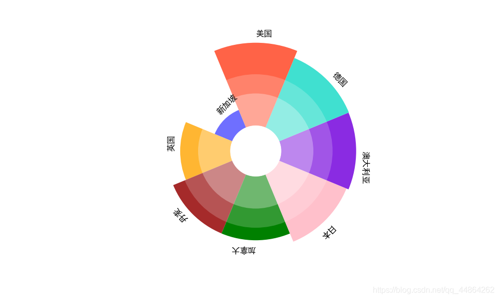
shuju = {'acreade': ['新加坡','英国', '丹麦','加拿大', '日本', '澳大利亚', '德国', '美国'],
'value': [2.94, 7.8, 9.95,9.96, 11.34, 11.68,11.74, 12.93]}
pdat = pd.DataFrame(shuju)
# print(pdat)
# 角度
l = pdat['value']
print(l)
N = pdat.shape[0] # 总数
width = 2 * np.pi / N
rad = np.cumsum([width] * N) # 每个扇形的起始角度
# color
# colors = ['darkgoldenrod', 'goldenrod', 'orange', 'gold', 'yellow']
colors = ['blue', 'orange', 'brown', 'green', 'pink', 'blueviolet', 'turquoise', 'tomato']
plt.figure(figsize=(10, 6)) # 创建画布
ax = plt.subplot(projection='polar')
# 删除不必要的内容
ax.set_ylim(-4, np.ceil(l.max() + 1)) # 中间空白
ax.set_theta_zero_location('N') # 设置极坐标的起点(即0度)在正上方向
ax.grid(False) # 不显示极轴
ax.spines['polar'].set_visible(False) # 不显示极坐标最外的圆形
ax.set_yticks([]) # 不显示坐标间隔
ax.set_thetagrids([]) # 不显示极轴坐标
# 绘画
ax.bar(rad, l, width=width, color=colors, alpha=1)
ax.bar(rad, 5, width=width, color='white', alpha=0.3) # 中间添加白色色彩使图案变浅
ax.bar(rad, 8, width=width, color='white', alpha=0.2) # 中间添加白色色彩使图案变浅
# text
for i in np.arange(N):
ax.text(rad[i], # 角度
l[i] + 1, # 长度
shuju['acreade'][i], # 文本
rotation=rad[i] * 180 / np.pi, # 文字角度
rotation_mode='anchor', # this parameter is a trick
alpha=1,
fontweight='bold', size=12
)
plt.show()