问题概述
UED给开发ui设计稿,这个时候,如果需要给单选控件RadioButton换图标,你知道需要ui给你什么切图吗?
查看一个控件的默认(系统)样式设置的方法
以RadioButton控件来说明
1. 查看RadioButton的两个参数的构造方法,可以看到默认样式com.android.internal.R.attr.radioButtonStyle
    public RadioButton(Context context, AttributeSet attrs) {
        this(context, attrs, com.android.internal.R.attr.radioButtonStyle);
    }
2. 直接点击radioButtonStyle链接不过去,只能找文件了,可以从com.android.internal.R.attr.radioButtonStyle看出,是value资源文件夹中的attrs.xml文件中
项目的sdk的res中

res中的vlues文件夹中的attrs.xml文件可看到定义的
//values文件夹下attrs.xml文件
   <!-- Default RadioButton style. -->
   <attr name="radioButtonStyle" format="reference" />

3. 查看主题themes.xml中的radioButtonStyle属性
//values文件夹下themes.xml文件
<item name="radioButtonStyle">@style/Widget.CompoundButton.RadioButton</item>
点击@style/Widget.CompoundButton.RadioButton可以看到
//styles.xml文件
    <style name="Widget.CompoundButton.RadioButton">
        <item name="button">?attr/listChoiceIndicatorSingle</item>
    </style>
点击?attr/listChoiceIndicatorSingle可以看到
//values文件夹下attrs.xml文件
        <!-- Drawable to use for single choice indicators. -->
        <attr name="listChoiceIndicatorSingle" format="reference" />
又回到attrs.xml,继续在themes.xml中搜索listChoiceIndicatorSingle,可以看到
//values文件夹下themes.xml文件
<item name="listChoiceIndicatorSingle">@drawable/btn_radio</item>
终于找到源头了
//drawable文件夹下btn_radio.xml文件
<selector xmlns:android="http://schemas.android.com/apk/res/android">
    <item android:state_checked="true" android:state_window_focused="false"
          android:drawable="@drawable/btn_radio_on" />
    <item android:state_checked="false" android:state_window_focused="false"
          android:drawable="@drawable/btn_radio_off" />

    <item android:state_checked="true" android:state_pressed="true"
          android:drawable="@drawable/btn_radio_on_pressed" />
    <item android:state_checked="false" android:state_pressed="true"
          android:drawable="@drawable/btn_radio_off_pressed" />

    <item android:state_checked="true" android:state_focused="true"
          android:drawable="@drawable/btn_radio_on_selected" />
    <item android:state_checked="false" android:state_focused="true"
          android:drawable="@drawable/btn_radio_off_selected" />

    <item android:state_checked="false" android:drawable="@drawable/btn_radio_off" />
    <item android:state_checked="true" android:drawable="@drawable/btn_radio_on" />
</selector>
上面定义的状态很精细,而一般只需要选中和未选中状态。如下定义一个btn_radio.xml文件
//在自己的drawable文件夹下定义btn_radio.xml文件
<selector xmlns:android="http://schemas.android.com/apk/res/android">
    <item android:state_checked="false" android:drawable="@drawable/btn_radio_off" />
    <item android:state_checked="true" android:drawable="@drawable/btn_radio_on" />
</selector>
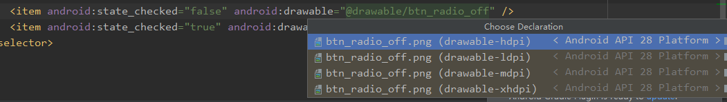
点击btn_radio_off可以看到对应的图片资源,如下图
总结一下:RadioButton控件是由主题中的radioButtonStyle属性控制,而 radioButtonStyle中是设置了控件的button属性,button属性间接引用listChoiceIndicatorSingle属性。这样可以知道RadioButton的按钮图标控件直接由button属性控制,间接的与主题中的radioButtonStyle和listChoiceIndicatorSingle相关,下面举例几种使用方法
RadioButton中直接修改android:button属性
//直接引用上面的btn_radio
<RadioButton
    android:button="@drawable/btn_radio""
              ……     />
styles.xml中定义样式,themes.xml中引用使用或者RadioButton引用使用
//styles.xml中定义样式
    <style name="RadioButtonStyle" parent="android:Widget.CompoundButton.RadioButton">
        <item name="android:button">@drawable/btn_radio</item>
    </style>
//themes.xml中引用使用
 <item name="radioButtonStyle">@style/RadioButtonStyle</item>
 //RadioButton引用使用
 <RadioButton
    style="@style/RadioButtonStyle"
              ……     />
修改themes.xml中listChoiceIndicatorSingle属性(不推荐这种方式,listChoiceIndicatorSingle还被其他控件的属性引用,可能会造成不需要的修改效果)
//修改themes.xml中listChoiceIndicatorSingle属性
     <item name="listChoiceIndicatorSingle">@drawable/btn_radio</item>
此文要是对你有帮助,如果方便麻烦点个赞,谢谢!!!