内容来源: http://lmdvr.r-forge.r-project.org/figures/figures.html
本文只是根据其代码作修改和加注释,希望能帮助大家学习R!!
Figure 5.1
## Figure 5.1
xyplot(lat ~ long | cut(depth, 3), data = quakes, #lattice包里
       main =" Figure 5.1")
#xyplot(y轴 ~ x轴) ;cut(depth, 3) 将depth分成3份画图
- xyplot(y轴 ~ x轴) ;cut(depth, 3) 将depth分成3份画图
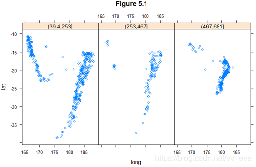
Figure 5.2
## Figure 5.2
xyplot(lat ~ long | cut(depth, 3), data = quakes,
       aspect =1, pch = "点", cex = 1, type = c("p", "g"),
       # aspect长宽比,pch 相当于作图的符号,cex为点的厚度;
       # type “p”描点, “g”网格线
       xlab = "Longitude", ylab = "Latitude",
       # x轴名字; y轴名字
       main ="Figure 5.2",
       strip = strip.custom(strip.names = TRUE, var.name = "Depth")
       #浅红色部分内容:如果strip.names =FALSE,那么var.name 不显示
       )
- aspect长宽比,pch 相当于作图的符号,cex为点的厚度;
- type “p”描点, “g”网格线
- 如果strip.names =FALSE,那么var.name 不显示
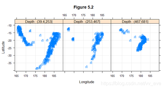
Figure 5.3
## Figure 5.3
xyplot(lat ~ long, data = quakes, aspect = 1,
       groups = cut(depth, breaks = quantile(depth, ppoints(4, 1))),
       auto.key = list(columns = 3, title = "Figure 5.3-Depth"),
       xlab = "Longitude", ylab = "Latitude")
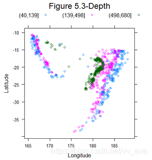
Figure 5.6
depth.col <- gray.colors(100)[cut(quakes$depth, 100, label = FALSE)]
depth.ord <- rev(order(quakes$depth))

quakes$Magnitude <- equal.count(quakes$mag, 4)
summary(quakes$Magnitude)
quakes$color <- depth.col
quakes.ordered <- quakes[depth.ord, ]
depth.breaks <- do.breaks(range(quakes.ordered$depth), 50)
quakes.ordered$color <-
  level.colors(quakes.ordered$depth, at = depth.breaks,
               col.regions = gray.colors)

## Figure 5.6
xyplot(lat ~ long | Magnitude, data = quakes.ordered,
       main="Figure 5.6 ",
       aspect = "iso", groups = color, cex = 2, col = "black",#圈圈边边的颜色
       panel = function(x, y, groups, ..., subscripts) {
         fill <- groups[subscripts]
         panel.grid(h = -1, v = -1)#网格线的设置
         panel.xyplot(x, y, pch = 21, fill = fill, ...)
       },
       legend =
         list(right =
                list(fun = draw.colorkey,
                     args = list(key = list(col = grey.colors,#旁边条条的颜色
                                            at = depth.breaks)))),
       xlab = "Longitude", ylab = "Latitude")
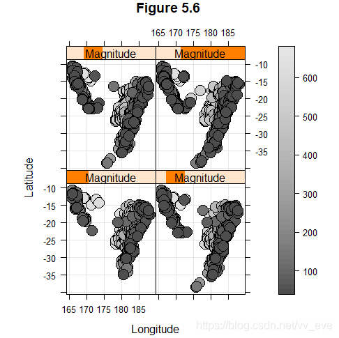
Figure 5.8
data(Earthquake, package ="MEMSS")
#Figure 5.8
xyplot(accel ~ distance, data = Earthquake,
       #xyplot,在里面并没有发现有专门可以加回归线或者加水平线垂直线的参数,所以就只能自定义一个函数来使用了
       panel = function(...){
         panel.xyplot(...)
         panel.loess(...)
         },
       xlab="Distance From Epicenter(km)",
       ylab = "Maximum Horiziontal Acceleration(g)",
       main="#Figure 5.8")
- xyplot,在里面并没有发现有专门可以加回归线或者加水平线垂直线的参数,所以自定义一个函数来使用
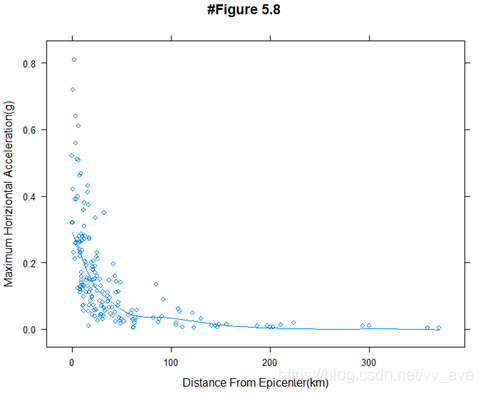
Figure 5.9
xyplot(accel ~ distance, data= Earthquake,
       type = c("g","p","smooth"),
      #type ="g" 网格线; “p"描点;"smooth" 趋势线
       scales =  list (log =2),
       main =" Figure 5.9")
- type =“g” 网格线; “p"描点;“smooth” 趋势线
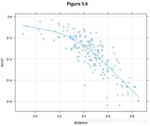
Figure 5.14
library("hexbin")
data(gvhd10, package = "latticeExtra")

## Figure 5.14
xyplot(asinh(SSC.H) ~ asinh(FL2.H) | Days, gvhd10, aspect = 1,
       panel = panel.hexbinplot, .aspect.ratio = 1, trans = sqrt)
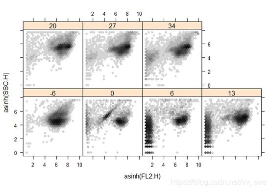
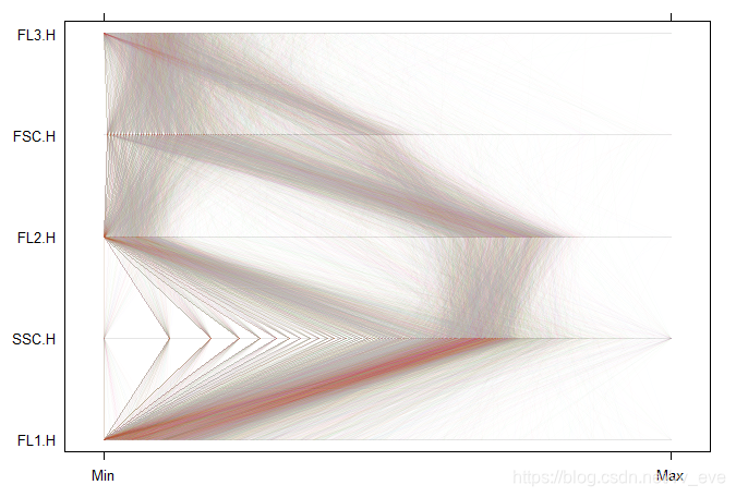
Figure 5.19
data(gvhd10, package = "latticeExtra")

## Figure 5.19
parallel(~ asinh(gvhd10[c(3, 2, 4, 1, 5)]), data = gvhd10,
         subset = Days == "13", alpha = 0.01, lty = 1)