在学习可视化的时候发现了一个非常棒的工具cufflinks,可以交互式的绘制图像,并且非常酷炫, 下面转载一篇博客,记录一下使用方法:
原博客地址:Python动态可视化Cufflinks
一、cufflinks介绍
1.1 简介
学过Python数据分析的朋友都知道,在可视化的工具中,有很多优秀的三方库,比如matplotlib,seaborn,plotly,pyecharts等等。这些可视化库都有自己的特点,在实际应用中也广为大家使用。
就像seaborn封装了matplotlib一样,cufflinks在plotly的基础上做了一进一步的包装,方法统一,参数配置简单。其次它还可以结合pandas的dataframe随意灵活地画图。可以把它形容为"pandas like visualization"。
1.2 安装
pip install cufflinks
'''
Collecting cufflinks
  Using cached https://files.pythonhosted.org/packages/5e/5a/db3d6523ee870ecc229008b209b6b21231397302de34f9c446929a41f027/cufflinks-0.16.tar.gz
...................................................................................
Successfully built cufflinks retrying
Installing collected packages: retrying, plotly, colorlover, cufflinks
Successfully installed colorlover-0.3.0 cufflinks-0.16 plotly-3.10.0 retrying-1.3.3
'''
1.3 cufflinks包介绍
import cufflinks as cf print(cf.help())Use 'cufflinks.help(figure)' to see the list of available parameters for the given figure. Use 'DataFrame.iplot(kind=figure)' to plot the respective figure Figures: bar box bubble bubble3d candle choroplet distplot heatmap histogram ohlc pie ratio scatter scatter3d scattergeo spread surface violin None
1.4 使用方法
使用方法其实很简单,我总结一下,它的格式大致是这样的:DataFrame.Figure.iplot
DataFrame:代表pandas的数据框;
Figure:代表我们上面看到的可绘制图形,比如bar、box、histogram等等;
iplot:代表绘制方法,其中有很多参数可以进行配置,调节符合你自己风格的可视化图形;
二、cufflinks使用
import pandas as pd
import numpy as np
import cufflinks as cf
# 如果使用online模式,那么生成的图形是有限制的。所以,我们这里先设置为offline模式,这样就避免了出现次数限制问题。
cf.set_config_file(offline=True)
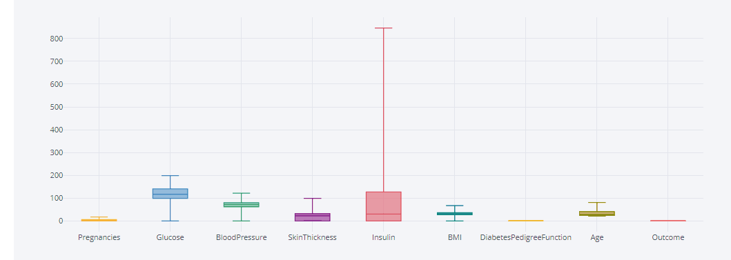
df = pd.read_csv('./PimaIndiansdiabetes.csv')
print(df.shape) #(768, 9)
2.0 条形图 bar
# 随机生成bar 条形图 df1=pd.DataFrame(np.random.rand(12, 4), columns=['a', 'b', 'c', 'd']) df1.iplot(kind='bar',barmode='stack')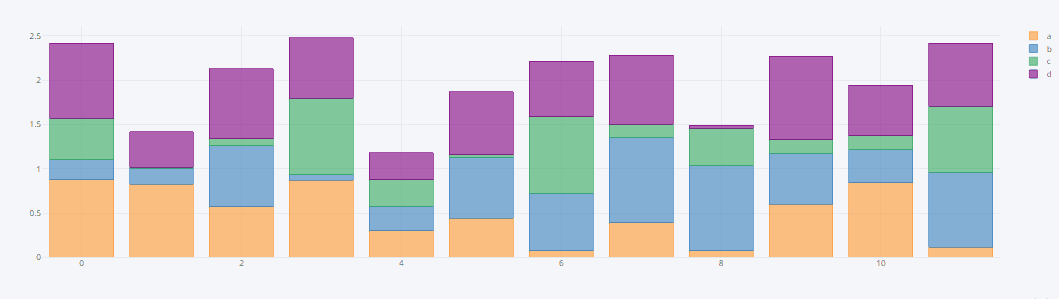
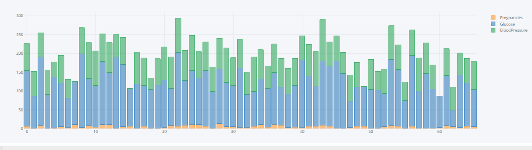
# Pima生成bar 条形图 df.iloc[0:66,0:3].iplot(kind='bar',barmode='stack')
2.1 histogram直方图
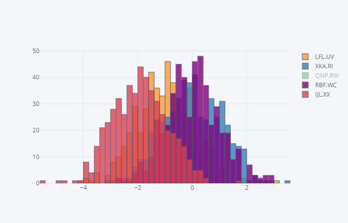
# 随机生成histogram直方图 cf.datagen.histogram(3).iplot(kind='histogram')
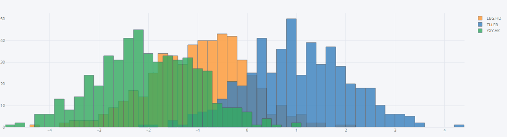
# Pima生成histogram直方图 df.iloc[:,0:3].iplot(kind='histogram')

2.2 box箱型图
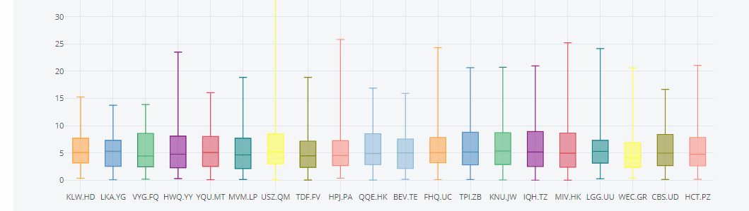
# box箱型图,可以看到,x轴每个box都有对应的名称,这是因为cufflinks通过kind参数识别了box图形,
# 自动为它生成的名字。如果我们只生成随机数,它是这样子的,默认生成100行的随机分布的数据,列数由自己选定。
cf.datagen.box(20).iplot(kind='box',legend=False)
print(df.columns)
'''
Index(['Pregnancies', 'Glucose', 'BloodPressure', 'SkinThickness', 'Insulin',
       'BMI', 'DiabetesPedigreeFunction', 'Age', 'Outcome'],
      dtype='object')
'''
df.iplot(kind='box',legend=False)
2.3 scatter散点图
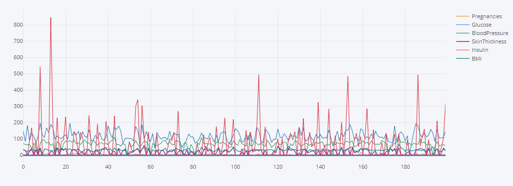
# scatter散点图df.iplot(kind='scatter',
         mode='markers',
         colors=[
             'orange', 'teal', 'blue', 'yellow', 'black', 'red', 'green',
             'magenta', 'cyan'
         ],
         size=5)

2.4 lines 线图
# 随机数绘图,'DataFrame' object has no attribute 'lines'
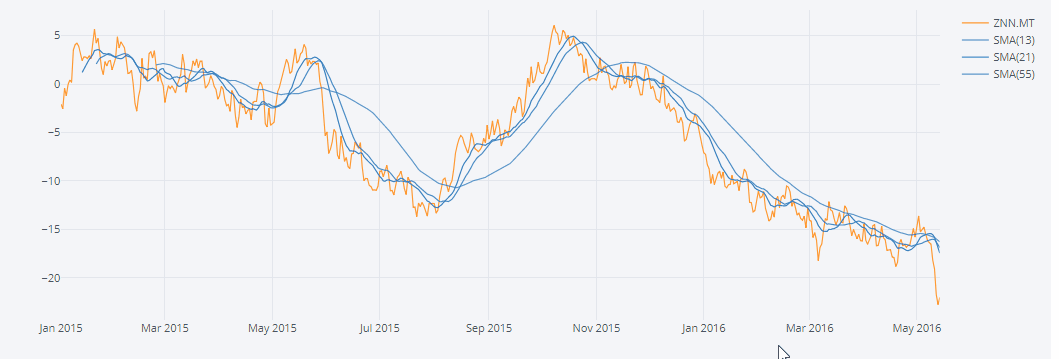
cf.datagen.lines(1,500).ta_plot(study='sma',periods=[13,21,55])
'''
1)cufflinks使用datagen生成随机数;
2)figure定义为lines形式,数据为(1,500);
3)然后再用ta_plot绘制这一组时间序列,参数设置SMA展现三个不同周期的时序分析。
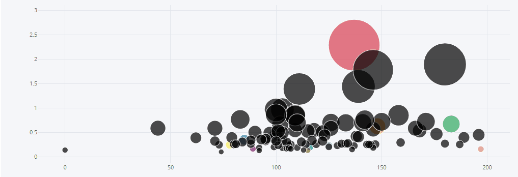
2.5 bubble气泡图
# bubble气泡图 d = pd.DataFrame(np.random.rand(50, 4), columns=['a', 'b', 'c', 'd']) d.iplot(kind='bubble',x='a',y='b',size='a')
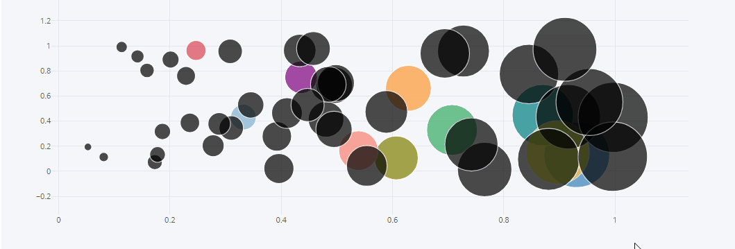
# bubble气泡图 # pPma bubble气泡图 d = df.iloc[0:100,:] #size决定了圈的大小 d.iplot(kind='bubble',x='Glucose',y='DiabetesPedigreeFunction',size='DiabetesPedigreeFunction')
2.6 3d 图
#随机数生成3d 图
cf.datagen.scatter3d(5,4).iplot(kind='scatter3d',x='x',y='y',z='z',text='text',categories='categories')

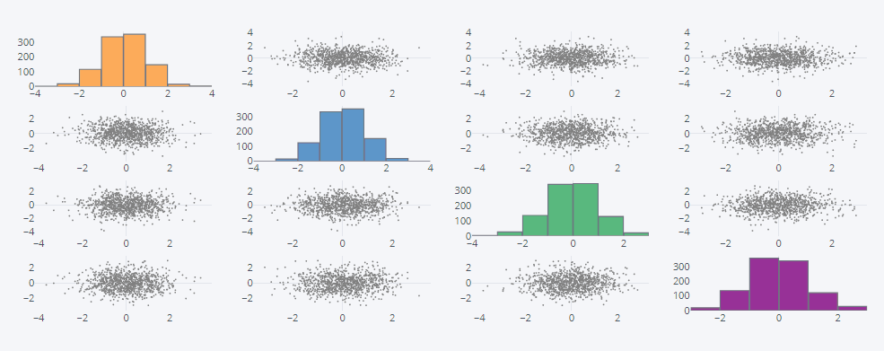
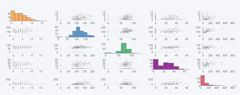
2.7 scatter matrix 散点矩阵图
#随机scatter matrix 散点矩阵图
df2 = pd.DataFrame(np.random.randn(1000, 4), columns=['a', 'b', 'c', 'd'])
df2.scatter_matrix()
#Pima scatter matrix 散点矩阵图
df.iloc[0:200,0:5].scatter_matrix()
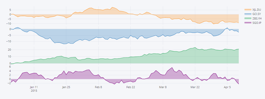
2.8 subplots 子图
#随机subplots 子图 df3=cf.datagen.lines(4) df3.iplot(subplots=True,shape=(4,1),shared_xaxes=True,vertical_spacing=.02,fill=True)
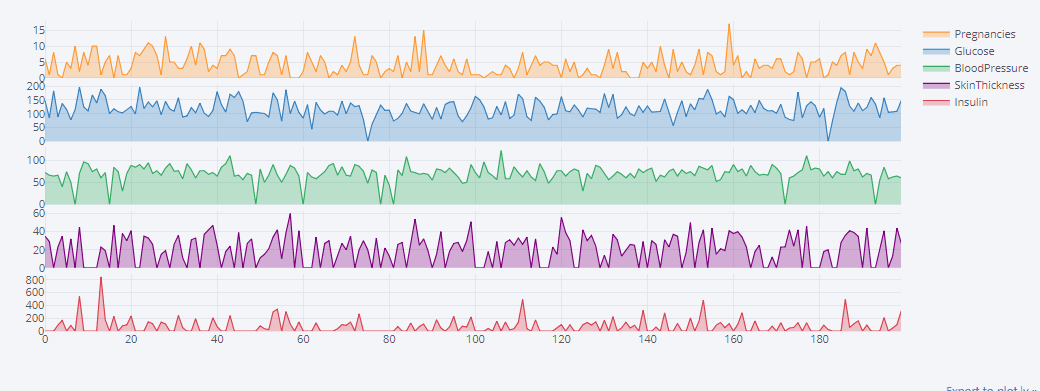
#Pima subplots 子图 df.iloc[0:200,0:5].iplot(subplots=True,shape=(5,1),shared_xaxes=True,vertical_spacing=.02,fill=True)
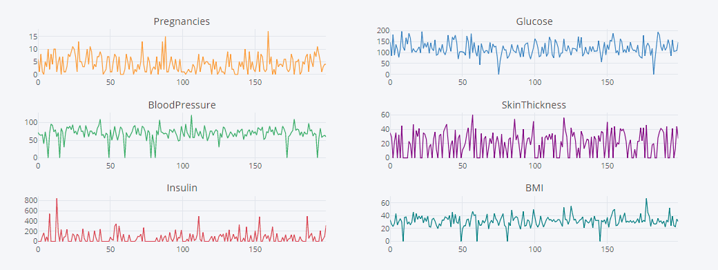
df.iloc[0:200,0:6].iplot(subplots=True,subplot_titles=True,legend=False)
2.9 shapes 形状图
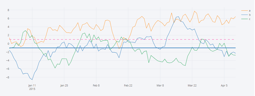
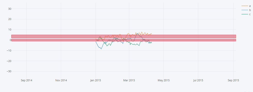
# 随机shapes 形状图
df5=cf.datagen.lines(3,columns=['a','b','c'])
df5.iplot(hline=[dict(y=-1,color='blue',width=3),dict(y=1,color='pink',dash='dash')])
# 将某个区域标记出来,可以使用hspan类型。竖条的区域,可以用vspan类型。
df5.iplot(hspan=[(-1,1),(2,5)])
# Pima shapes 形状图
df.iloc[0:200,0:6].iplot(hline=[dict(y=-1,color='blue',width=3),dict(y=1,color='pink',dash='dash')])
# 将某个区域标记出来,可以使用hspan类型。竖条的区域,可以用vspan类型。
df.iloc[0:200,0:6].iplot(hspan=[(100,120),(220,250)])
三、总结
help(df.iplot)
数据集和jupyter文件链接:https://pan.baidu.com/s/1O5ukYe41iAO9v_czHbs5CA
提取码:by2a
更多参考:[https://www.cnblogs.com/Yang-Sen/p/11226005.html]