方案一:使用 极坐标系 和 bar 实现
效果:
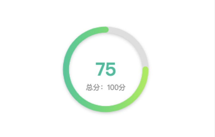
实现代码:
    const chartData = {
      title: {
        text: '75',
        textStyle: {
          color: '#01c4a3',
          fontSize: 30,
        },
        subtext: '总分:100分',
        subtextStyle: {
          color: '#909090',
        },
        itemGap: 0, // 主副标题距离
        left: 'center',
        top: 'center',
      },
      angleAxis: {
        max: 100, // 满分
        clockwise: false, // 逆时针
        // 隐藏刻度线
        axisLine: {
          show: false,
        },
        axisTick: {
          show: false,
        },
        axisLabel: {
          show: false,
        },
        splitLine: {
          show: false,
        },
      },
      radiusAxis: {
        type: 'category',
        // 隐藏刻度线
        axisLine: {
          show: false,
        },
        axisTick: {
          show: false,
        },
        axisLabel: {
          show: false,
        },
        splitLine: {
          show: false,
        },
      },
      polar: {
        center: ['50%', '50%'],
        radius: '100%', // 图形大小
      },
      series: [
        {
          type: 'bar',
          data: [
            {
              name: '作文得分',
              value: 75,
              itemStyle: {
                normal: {
                  color: new echarts.graphic.LinearGradient(1, 0, 0, 0, [
                    {
                      offset: 0,
                      color: '#aaf14f',
                    },
                    {
                      offset: 1,
                      color: '#0acfa1',
                    },
                  ]),
                },
              },
            },
          ],
          coordinateSystem: 'polar',
          roundCap: true,
          barWidth: 10,
          barGap: '-100%', // 两环重叠
          z: 2,
        },
        {
          // 灰色环
          type: 'bar',
          data: [
            {
              value: 100,
              itemStyle: {
                color: '#e2e2e2',
                shadowColor: 'rgba(0, 0, 0, 0.2)',
                shadowBlur: 5,
                shadowOffsetY: 2,
              },
            },
          ],
          coordinateSystem: 'polar',
          roundCap: true,
          barWidth: 10,
          barGap: '-100%', // 两环重叠
          z: 1,
        },
      ],
    };
注:Echarts颜色渐变实现
在使用echarts绘制图表时, 如果需要使用渐变色, 则应使用echarts内置的渐变色生成器echarts.graphic.LinearGradient
  {
    type: 'bar',
      itemStyle: {
      normal: {
        color: new echarts.graphic.LinearGradient(
          0, 0, 0, 1,
          [
            { offset: 0, color: '#000' },
            { offset: 0.5, color: '#888' },
            { offset: 1, color: '#ddd' }
          ]
        )
      }
    }
  }
0,0,0,1分别代表了右、下、左、上四个位置的颜色坐标
通过修改这4个参数, 可以实现不同的渐变方向, 如:
0 1 0 0 代表从正下方向正上方渐变;
1 0 0 1 代表从右上方向左下方渐变,
第5个参数则是一个数组, 用于配置颜色的渐变过程. 每一项为一个对象, 包含offset和color两个参数. offset的范围是0 ~ 1, 用于表示位置, color不用多说肯定是表示颜色了. 像示例代码的配置则表示:
整个渐变过程是从正上方向正下方变化
起始(offset: 0)颜色为#000, 变化到正中间(offset: 0.5)位置时颜色为#888, 变化到结束(offset: 1)位置时颜色为#ddd.
方案二:使用 pie
例子:圆角环形图

通过设置 borderWidth 边框大小会出现一个不是很规则的类圆角,当环形比较细的时候也没问题。但是不是很优雅。
itemStyle: {
    normal: {
        label: {
            show: false,
            position: 'center'
        },
        labelLine: {
            show: false
        },
        borderWidth: 5,
        shadowBlur: 50,
        borderColor: color[i],
        shadowColor: 'rgba(142,152,241, 0.6)'
    },
},