写在前面:
我是「沸羊羊_」,昵称来自于姓名的缩写 fyy ,之前呕心沥血经营的博客因手残意外注销,现经营此账号。
本人是个小菜,正向着全栈工程师的方向努力着,文章可能并不高产,也很基础,但每写一篇都在用心总结,请大佬勿喷。
如果您对编程有兴趣,请关注我的动态,一起学习研究。
感谢每位读者!
文章目录
前言
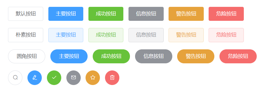
作为本系列专栏第一篇文章,封装最最常用的 button 组件,话不多说,先来看看 element-UI 组件库封装的 button 样式。整篇文章看完,你就可以拥有属于自己的 button 组件了。
知识点
- 组件通讯
- 插槽
- props校验
初始化项目
新建 vue 项目前:
- 确保安装 nodeJs ,终端输入测试命令:node -v 测试是否安装成功
- 安装 vue-cli ,终端输入安装命令:npm install -g vue cli ,测试命令: vue --version
确保完成上述步骤,可以新建我们的 vue 项目了,我们使用 webpack 打包工具,所以 终端输入命令:vue init webpack fyy-ui (项目名称),根据提示信息选择我们的项目配置就可以了。
封装button组件
文件配置
- 首先,新建 button.vue 文件
- App.vue 与 main.js 文件 vue-cli 帮我们生成了,我们只要把 App.vue 文件中默认的数据清空即可。
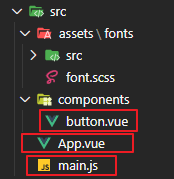
- 在 main.js 文件中,引入并挂载 button.vue 文件。
//main.js
import FyyButton from './components/button.vue'
Vue.use(ElementUI)
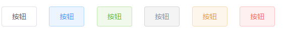
按钮背景色
效果:

// button.vue

<template>
  //:class="[`fyy-button--${type}`]" :代表样式为 "fyy-button--'父组件传递过来的type值'"
  <button class="fyy-button" :class="[`fyy-button--${type}`]">
    //使用插槽,供父组件传递按钮名字
    <slot></slot>
  </button>
</template>

export default {
  //设置组件名称,使用时用此名称
  name: "FyyButton",
  props: {
    //接收参数:type
    type: {
      //参数类型:String
      type: String,
      //默认值为 default
      default: "default"
    }
  }
};

<style lang="scss" scoped>
	//button组件封装,主要是样式展示,关于项目整体代码结构会发布到 github 上。
</style>
//父组件--App.vue
<template>
  <div id="app">
    <div class="row">
      //type为传递给子组件样式类型
      <FyyButton @click="click">按钮</FyyButton>
      <FyyButton type="primary">按钮</FyyButton>
      <FyyButton type="success">按钮</FyyButton>
      <FyyButton type="info">按钮</FyyButton>
      <FyyButton type="warning">按钮</FyyButton>
      <FyyButton type="danger">按钮</FyyButton>
    </div>
  </div>
</template>
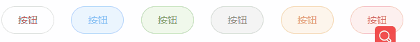
朴素按钮
效果:
//button.vue

<template>
  //朴素按钮在普通按钮上添加了 {'is-plain':plain}  class样式,代表值为父组件传递的 plain 属性
  <button class="fyy-button" :class="[`fyy-button--${type}`,{'is-plain':plain}]">
    <slot></slot>
  </button>
</template>

export default {
  //设置组件名称,使用时用此名称
  name: "FyyButton",
  props: {
    //接收参数:type
    type: {
      //略
    },
    //接收参数:plain
    plain: {
      type: Boolean,
      default: false
    }
  }
};
<style lang="scss" scoped>
	//样式略。button组件封装,主要是样式展示,关于项目整体代码结构会发布到 github 上。
</style>
//父组件--App.vue

<template>
  <div id="app">
    <div class="row">
      //type为传递给子组件样式类型
      <FyyButton @click="click">按钮</FyyButton>
      <FyyButton type="primary">按钮</FyyButton>
      //其他略
    </div>
    <div class="row">
      <FyyButton plain>按钮</FyyButton>
      <FyyButton plain type="primary">按钮</FyyButton>
      //其他略
    </div>
  </div>
</template>
圆角按钮
效果:
//button.vue

<button class="fyy-button" :class="[`fyy-button--${type}`,{'is-plain':plain,'is-round':round}]">
<script>
export default {
	props: {
		round: {
	      type: Boolean,
	      default: false
	    }
	}
}
//父组件-App.vue

<div class="row">
  <FyyButton plain round>按钮</FyyButton>
  <FyyButton plain round type="primary">按钮</FyyButton>
</div>
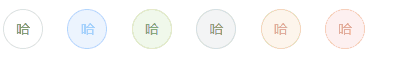
圆形按钮
效果:
//代码略
icon按钮
效果:
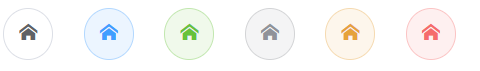
部分代码略。
// 父组件 App.vue

<div class="row">
	<FyyButton plain class="fyy-icon-pencil" round>按钮</FyyButton>
	<FyyButton plain class="fyy-icon-pencil" round type="primary">按钮</FyyButton>
</div>
icon + 文字 按钮
如果用户想要 icon 和 文字 同时存在的 button ,会发现 icon 和 文字紧挨着,如果在中间加个空格是不是会好看些,那如何保证icon 和 文字中间有空格,还能保证只有文字或icon时,没有空格,如何实现呢?
效果:

//button.vue

<template>
  <button
    class="fyy-button"
    :class="[`fyy-button--${type}`,{'is-plain':plain,'is-round':round,'is-circle':circle}]"
  >
    //如果父组件传递 icon
    <i v-if="icon" :class="icon"></i>
    //当父组件没有传入插槽的时候,span标签就不显示;$slots.default可以获取所有插槽,用于判断父组件是否传递 slot
    <span v-if="$slots.default">
      <slot></slot>
    </span>
  </button>
</template>

<style lang="scss" scoped>
	// button中icon和文字同时存在,设置margin值
	.fyy-button [class*="fyy-icon-"] + span {
	  margin-left: 5px;
	}
</style>
click 事件
当我们使用 element 或其他组件库的组件时,会发现除了 button 可以使用 @click 触发单击事件外,其他组件的单击都不可以使用 @click 触发,这是为什么呢?
因为 element 只给 button 组件的 click 事件封装了,因为很常用。而其他组件的click事件都没有封装,如果没封装,我们使用时候怎么用 click 事件呢?如果使用封装的组件的原生事件都需要在 事件后 添加 .native 才可以触发。比如: @click.native 可以触发单击事件。
我们现在给button封装一个 click 事件。
//button.vue

<template>
  <button
    class="fyy-button"
    :class="[`fyy-button--${type}`,{'is-plain':plain,'is-round':round,'is-circle':circle}]"
    @click="handleClick()"
  >略</button>
</template>
<script>
	methods: {
    handleClick(e) {
      this.$emit("click", e);
    }
  }
</script>
这样在父组件中使用 @click 就可以触发单击事件了。
参数支持
| 参数名 | 参数描述 | 类型 | 默认值 |
|---|---|---|---|
| type | 按钮类型 ( primary / success / warning / danger / info ) | string | default |
| plain | 是否是朴素按钮 | boolean | false |
| round | 是否是圆角按钮 | boolean | false |
| circle | 是否是原形按钮 | boolean | false |
| icon | 图标类名 | string | 无 |
事件支持
| 事件名 | 事件描述 |
|---|---|
| click | 单击事件 |
github地址
关于icon
element-ui 有自己的字体库,我们可以选择扒源码把 element-ui 的字体库拿下来,由于小编扒下来源码字体库报错,猜测可能由于element-ui字体库内部有url是相对地址,反正由于小编经过几个小时的奋斗没有解决掉错误,如果读者有扒源码的字体库的,可以交流一下。这里,我下载的是 icomoon 字体库。小编将 icomoon 字体库文件也放到 github托管了,需要的可以去clone。
最后
专栏系列文章中难免会出现错误,还请大佬们指正!不胜感激。最后,希望此专栏顺利诞生!