Button
1.声明button组件 Button(label?:ResourceStr)
label是按钮上面显示的文字 如果不传入label 则需要在内部嵌套其他组件
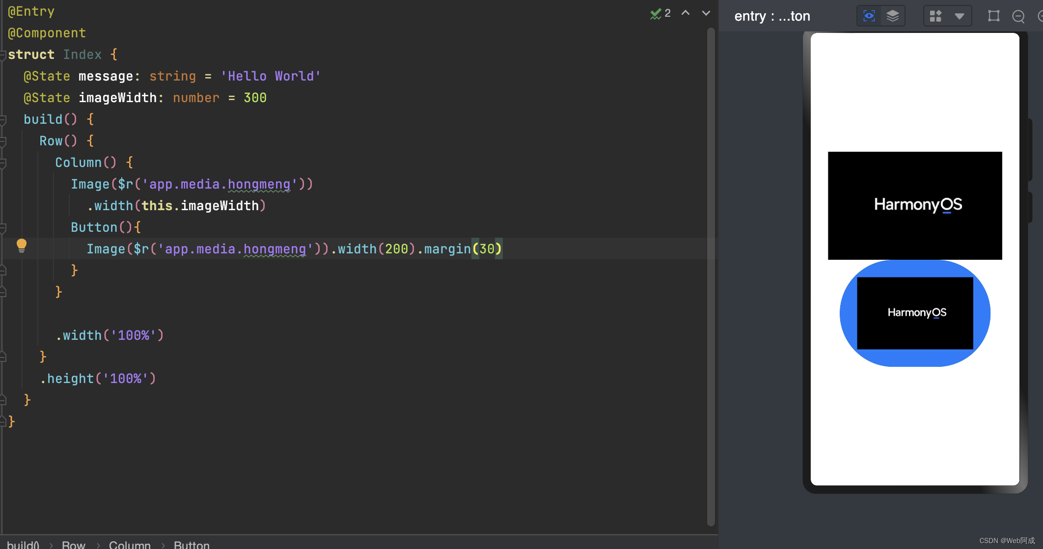
内部嵌套其他组件
可以放入icon图标来构建自己想要的样式
按钮类型
按钮使用type(ButtonType.xxx)属性来设置,xxx的类型分为三种
1.Capsule 胶囊型按钮
2.Circle 圆形按钮
3.Normal 普通按钮

事件方法
按钮最重要的肯定就是点击事件 使用.onClick()回调函数来实现
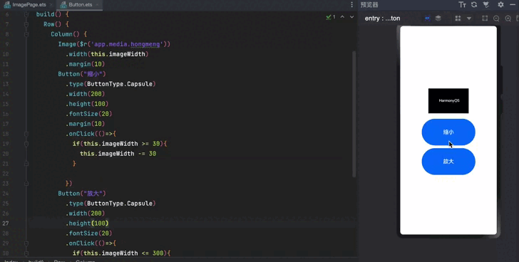
点击按钮实现更改图片大小实现
我们通过点击事件来动态的设置响应式imageWidth的值,来实现图片大小的改变,然后做了一个兼容,让他不能为负数,不能超出屏幕宽度
@Entry
@Component
struct Index {
  @State message: string = 'Hello World'
  @State imageWidth: number = 300
  build() {
    Row() {
      Column() {
        Image($r('app.media.hongmeng'))
          .width(this.imageWidth)
          .margin(10)
        Button("缩小")
          .type(ButtonType.Capsule)
          .width(200)
          .height(100)
          .fontSize(20)
          .margin(10)
          .onClick(()=>{
            if(this.imageWidth >= 30){
              this.imageWidth -= 30
            }

          })
        Button("放大")
          .type(ButtonType.Capsule)
          .width(200)
          .height(100)
          .fontSize(20)
          .onClick(()=>{
            if(this.imageWidth <= 300){
              this.imageWidth += 30
            }
          })
      }

      .width('100%')
    }
    .height('100%')
  }
}