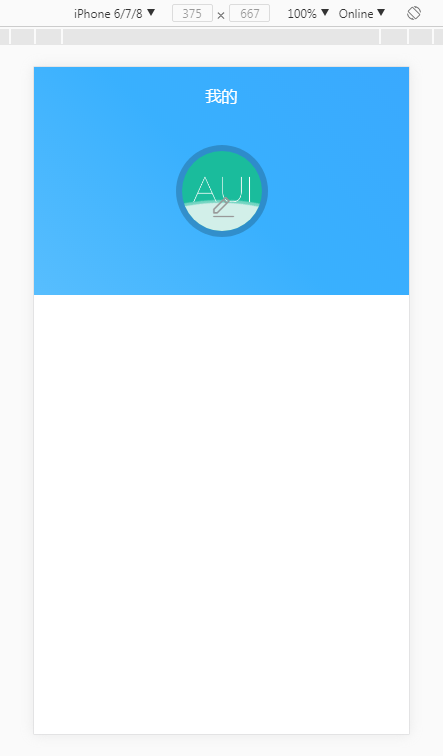
以上图片中含有2个动态效果:
1、蓝色背景有动画
2、头像中下部分的波浪也是动画
完整 html 页面代码如下:
注:头像中的笔是 iconfont,在此并未传入 iconfont 的相关文件
<!DOCTYPE html>
<html lang="en">
<head>
    <meta charset="UTF-8">
    <meta name="viewport" content="maximum-scale=1.0,minimum-scale=1.0,user-scalable=0,width=device-width,initial-scale=1.0"/>
    <meta name="format-detection" content="telephone=no,email=no,date=no,address=no">
    <title>头像</title>
    <link rel="stylesheet" type="text/css" href="iconfont.css"/>
    <style>
	html {font-size:62.5%;} 	/*此比例是按 iphone 6 的屏幕尺寸计算出的*/
	body,h1,h2,h3,h4,h5,h6,hr,p,blockquote,dl,dt,dd,ul,ol,li,pre,form,fieldset,legend,button,input,textarea,th,td {
		margin:0; padding:0;
	}
	@keyframes bgSize {
		0% {
		    transform: translate(30%, 30%);
		}
		25% {
		    transform: translate(30%, -30%);
		}
		50% {
		    transform: translate(-30%, -30%);
		}
		75% {
		    transform: translate(-30%, 30%);
		}
		100% {
		    transform: translate(30%, 30%);
		}
	}
    	.header{
    		width: 100%;
    		height: 19.0rem;
		font-size: 1.7rem;
    		position: relative;
    		overflow: hidden;
    	}
	.header::before {
	        content: "";
	        position: absolute;
	        top: -100%;
	        left: -100%;
	        bottom: -100%;
	        right: -100%;
	        background: linear-gradient(45deg,  #96dafd 0%, #39b0fe 50%, #3a9bfe 100%);
	        background-size: 100% 100%;
	        animation: bgSize 8s infinite linear alternate;
	}
    	.header .tit{
    		position: absolute;
    		top: 0;
    		left: 0;
    		width: 100%;
    		line-height: 4.8rem;
    		text-align: center;
    		color: #fff;
    		font-size: 1.6rem;
	}
    	.header .imgIn{
    		width: 80px;
    		height: 80px;
    		border-radius: 50%;
    		top: 7.0rem;
    		left: 50%;
    		margin-left: -40px;
    		position: relative;
    		z-index: 99;
    	}
    	.header .imgIn .wave {
		position: relative;
		width: 80px;
		height: 80px;
		border-radius: 50%;
	      	overflow: hidden;
    		z-index: 100;
	}
	.header .imgIn .wave::before,
	.header .imgIn .wave::after {
		content: "";
		position: absolute;
		width: 400px;
		height: 400px;
		top: 340px;
		left: 50%;
	}
	.header .imgIn .wave::before {
		background-color: rgba(250, 250, 250, 0.4);
		border-radius: 49%;
		-webkit-transform: translate(-45%, -70%) rotate(0);
		    transform: translate(-45%, -70%) rotate(0);
		-webkit-animation: rotate 6s linear infinite;
		    animation: rotate 6s linear infinite;
		z-index: 20;
	}
	.header .imgIn .wave::after {
		border-radius: 47%;
		background-color: rgba(250, 250, 250, 0.7);
		-webkit-transform: translate(-55%, -70%) rotate(0);
		    transform: translate(-55%, -70%) rotate(0);
		-webkit-animation: rotate 10s linear -5s infinite;
		    animation: rotate 10s linear -5s infinite;
		z-index: 10;
	}
	@-webkit-keyframes rotate {
	    50% {
		-webkit-transform: translate(-50%, -73%) rotate(180deg);
		    transform: translate(-50%, -73%) rotate(180deg);
	    }
	    100% {
		-webkit-transform: translate(-50%, -70%) rotate(360deg);
		    transform: translate(-50%, -70%) rotate(360deg);
	    }
	}
	@keyframes rotate {
	    50% {
		-webkit-transform: translate(-50%, -73%) rotate(180deg);
		    transform: translate(-50%, -73%) rotate(180deg);
	    }
	    100% {
		-webkit-transform: translate(-50%, -70%) rotate(360deg);
		    transform: translate(-50%, -70%) rotate(360deg);
	    }
	}
    	.header .imgIn img{
    		position: absolute;
    		top: 0;
    		width: 100%;
    		height: 100%;
    		display: block;
    		z-index: 99;
    		border-radius: 50%;
    	}
    	.header .imgIn:before{
    		content: '';
    		position: absolute;
    		top: -6px;
    		left: -6px;
    		width: 92px;
    		height: 92px;
    		border-radius: 50%;
    		background: rgba(0,0,0,0.2);
    		z-index: 90;
    	}
    	.icon-bianji{
		position: absolute;
		top: 43px;
		left: 30px;
		z-index: 100;
		font-size: 2.4rem;
		color: #999;
    	}
    </style>
</head>
<body>
	<div class="header">
		<div class="tit">我的</div>
		<div class="imgIn">
			<div class="wave"></div>
			<i class="iconfont icon-bianji"></i>
			<img src="demo1.png" />
		</div>
	</div>
</body>
</html>