
目录
内容持续更新中…
警告信息和可视化时中文和负号的正常显示
import matplotlib as mpl
import matplotlib.pyplot as plt
import warnings
warnings.filterwarnings("ignore")   # 忽略警告信息输出

# mpl.style.use('ggplot')

# 为了画图中文可以正常显示
plt.rcParams['font.sans-serif'] = ['Microsoft YaHei'] #指定默认字体
plt.rcParams['axes.unicode_minus'] = False  #解决保存图像时负号'-'显示为方块的问题
一、离散型变量的可视化
1 饼图
1.1 matplotlib模块
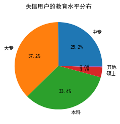
# 饼图的绘制
# 导入第三方模块
import matplotlib.pyplot as plt

# 构造数据
edu = [0.2515,0.3724,0.3336,0.0368,0.0057]
labels = ['中专','大专','本科','硕士','其他']

# 绘制饼图
plt.pie(x = edu, # 绘图数据
        labels=labels, # 添加教育水平标签
        autopct='%.1f%%' # 设置百分比的格式,这里保留一位小数
       )
# 添加图标题
plt.title('失信用户的教育水平分布')
# 显示图形
plt.show()
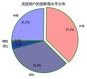
# 添加修饰的饼图
explode = [0,0.1,0,0,0]  # 生成数据,用于突出显示大专学历人群
colors=['#9999ff','#ff9999','#7777aa','#2442aa','#dd5555']  # 自定义颜色

# 将横、纵坐标轴标准化处理,确保饼图是一个正圆,否则为椭圆
plt.axes(aspect='equal')
# 绘制饼图
plt.pie(x = edu, # 绘图数据
        explode=explode, # 突出显示大专人群
        labels=labels, # 添加教育水平标签
        colors=colors, # 设置饼图的自定义填充色
        autopct='%.1f%%', # 设置百分比的格式,这里保留一位小数
        pctdistance=0.8,  # 设置百分比标签与圆心的距离
        labeldistance = 1.1, # 设置教育水平标签与圆心的距离
        startangle = 180, # 设置饼图的初始角度
        radius = 1.2, # 设置饼图的半径
        counterclock = False, # 是否逆时针,这里设置为顺时针方向
        wedgeprops = {'linewidth': 1.5, 'edgecolor':'green'},# 设置饼图内外边界的属性值
        textprops = {'fontsize':10, 'color':'black'}, # 设置文本标签的属性值
        )

# 添加图标题
plt.title('失信用户的受教育水平分布')
# 显示图形
plt.show()
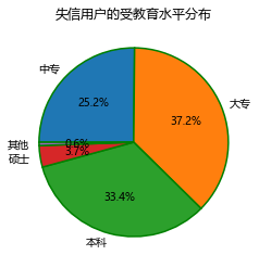
1.2 panda模块
# 导入第三方模块
import pandas as pd
# 构建序列
data1 = pd.Series({'中专':0.2515,'大专':0.3724,'本科':0.3336,'硕士':0.0368,'其他':0.0057})
# 将序列的名称设置为空字符,否则绘制的饼图左边会出现None这样的字眼
data1.name = ''
# 控制饼图为正圆
plt.axes(aspect = 'equal')
# plot方法对序列进行绘图
data1.plot(kind = 'pie', # 选择图形类型
           autopct='%.1f%%', # 饼图中添加数值标签
           radius = 1, # 设置饼图的半径
           startangle = 180, # 设置饼图的初始角度
           counterclock = False, # 将饼图的顺序设置为顺时针方向
           title = '失信用户的受教育水平分布', # 为饼图添加标题
           wedgeprops = {'linewidth': 1.5, 'edgecolor':'green'}, # 设置饼图内外边界的属性值
           textprops = {'fontsize':10, 'color':'black'} # 设置文本标签的属性值
          )
# 显示图形
plt.show()
2 条形图
2.1 matplotlib模块
2.1.1 垂直或水平条形图
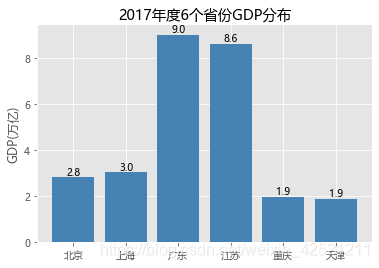
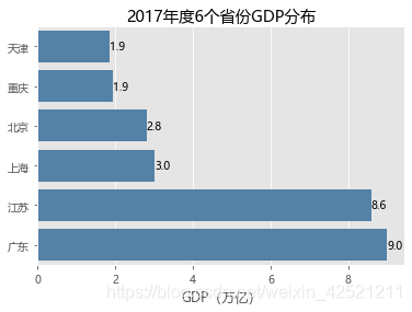
# 条形图的绘制--垂直条形图
# 读入数据
GDP = pd.read_excel(r'Province GDP 2017.xlsx')
# 设置绘图风格(不妨使用R语言中的ggplot2风格)
plt.style.use('ggplot')
# 绘制条形图
plt.bar(x = range(GDP.shape[0]), # 指定条形图x轴的刻度值
        height = GDP.GDP, # 指定条形图y轴的数值
        tick_label = GDP.Province, # 指定条形图x轴的刻度标签
        color = 'steelblue', # 指定条形图的填充色
       )
# 添加y轴的标签
plt.ylabel('GDP(万亿)')
# 添加条形图的标题
plt.title('2017年度6个省份GDP分布')
# 为每个条形图添加数值标签
for x,y in enumerate(GDP.GDP):
    plt.text(x,y+0.1,'%s' %round(y,1),ha='center')
# 显示图形
plt.show()
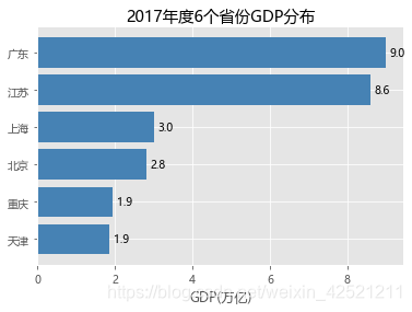
# 条形图的绘制--水平条形图
# 对读入的数据作升序排序
GDP.sort_values(by = 'GDP', inplace = True)
# 绘制条形图
plt.barh(y = range(GDP.shape[0]), # 指定条形图y轴的刻度值
        width = GDP.GDP, # 指定条形图x轴的数值
        tick_label = GDP.Province, # 指定条形图y轴的刻度标签
        color = 'steelblue', # 指定条形图的填充色
       )
# 添加x轴的标签
plt.xlabel('GDP(万亿)')
# 添加条形图的标题
plt.title('2017年度6个省份GDP分布')
# 为每个条形图添加数值标签
for y,x in enumerate(GDP.GDP):
    plt.text(x+0.1,y,'%s' %round(x,1),va='center')
# 显示图形
plt.show()
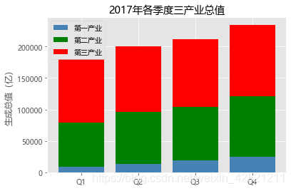
2.1.2 堆叠条形图
# 条形图的绘制--堆叠条形图
# 读入数据
Industry_GDP = pd.read_excel(r'Industry_GDP.xlsx')
# 取出四个不同的季度标签,用作堆叠条形图x轴的刻度标签
Quarters = Industry_GDP.Quarter.unique()
# 取出第一产业的四季度值
Industry1 = Industry_GDP.GPD[Industry_GDP.Industry_Type == '第一产业']
# 重新设置行索引
Industry1.index = range(len(Quarters))
# 取出第二产业的四季度值
Industry2 = Industry_GDP.GPD[Industry_GDP.Industry_Type == '第二产业']
# 重新设置行索引
Industry2.index = range(len(Quarters))
# 取出第三产业的四季度值
Industry3 = Industry_GDP.GPD[Industry_GDP.Industry_Type == '第三产业']

# 绘制堆叠条形图
# 各季度下第一产业的条形图
plt.bar(x = range(len(Quarters)), height=Industry1, color = 'steelblue', label = '第一产业', tick_label = Quarters)
# 各季度下第二产业的条形图
plt.bar(x = range(len(Quarters)), height=Industry2, bottom = Industry1, color = 'green', label = '第二产业')
# 各季度下第三产业的条形图
plt.bar(x = range(len(Quarters)), height=Industry3, bottom = Industry1  + Industry2, color = 'red', label = '第三产业')
# 添加y轴标签
plt.ylabel('生成总值(亿)')
# 添加图形标题
plt.title('2017年各季度三产业总值')
# 显示各产业的图例
plt.legend(loc='upper left')
# 显示图形
plt.show()
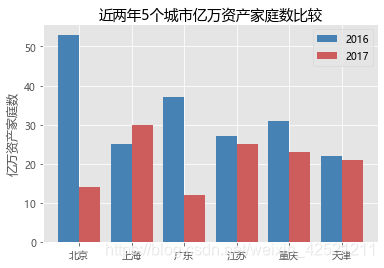
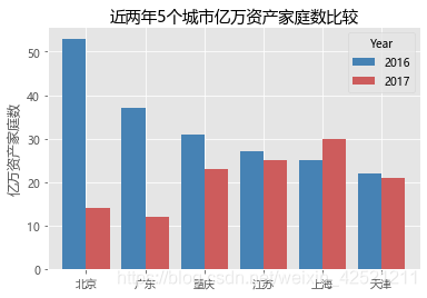
2.1.3 水平交错条形图
# 条形图的绘制--水平交错条形图
# 导入第三方模块
import numpy as np
# 读入数据
HuRun = pd.read_excel(r'HuRun.xlsx')
# 取出城市名称
Cities = HuRun.City.unique()
# 取出2016年各城市亿万资产家庭数
Counts2016 = HuRun.Counts[HuRun.Year == 2016]
# 取出2017年各城市亿万资产家庭数
Counts2017 = HuRun.Counts[HuRun.Year == 2017]

# 绘制水平交错条形图
bar_width = 0.4
plt.bar(x = np.arange(len(Cities)), height = Counts2016, label = '2016', color = 'steelblue', width = bar_width)
plt.bar(x = np.arange(len(Cities))+bar_width, height = Counts2017, label = '2017', color = 'indianred', width = bar_width)
# 添加刻度标签(向右偏移0.225)
plt.xticks(np.arange(len(Cities))+0.2, Cities)
# 添加y轴标签
plt.ylabel('亿万资产家庭数')
# 添加图形标题
plt.title('近两年5个城市亿万资产家庭数比较')
# 添加图例
plt.legend()
# 显示图形
plt.show()
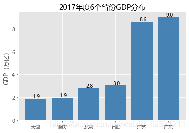
2.2 pandas模块
2.2.1 垂直条形图
# Pandas模块之垂直或水平条形图
# 绘图(此时的数据集在前文已经按各省GDP做过升序处理)
GDP.GDP.plot(kind = 'bar', width = 0.8, rot = 0, color = 'steelblue', title = '2017年度6个省份GDP分布')
# 添加y轴标签
plt.ylabel('GDP(万亿)')
# 添加x轴刻度标签
plt.xticks(range(len(GDP.Province)), #指定刻度标签的位置
           GDP.Province # 指出具体的刻度标签值
          )
# 为每个条形图添加数值标签
for x,y in enumerate(GDP.GDP):
    plt.text(x-0.1,y+0.2,'%s' %round(y,1),va='center')
# 显示图形
plt.show()
2.2.2 水平交错条形图
# Pandas模块之水平交错条形图
HuRun_reshape = HuRun.pivot_table(index = 'City', columns='Year', values='Counts').reset_index()
# 对数据集降序排序
HuRun_reshape.sort_values(by = 2016, ascending = False, inplace = True)
HuRun_reshape.plot(x = 'City', y = [2016,2017], kind = 'bar', color = ['steelblue', 'indianred'],
                   rot = 0, # 用于旋转x轴刻度标签的角度,0表示水平显示刻度标签
                   width = 0.8, title = '近两年5个城市亿万资产家庭数比较')
# 添加y轴标签
plt.ylabel('亿万资产家庭数')
plt.xlabel('')
plt.show()
2.3 seaborn模块
2.3.1 水平条形图
# seaborn模块之垂直或水平条形图
# 导入第三方模块
import seaborn as sns
sns.barplot(y = 'Province', # 指定条形图x轴的数据
            x = 'GDP', # 指定条形图y轴的数据
            data = GDP, # 指定需要绘图的数据集
            color = 'steelblue', # 指定条形图的填充色
            orient = 'horizontal' # 将条形图水平显示
           )
# 重新设置x轴和y轴的标签
plt.xlabel('GDP(万亿)')
plt.ylabel('')
# 添加图形的标题
plt.title('2017年度6个省份GDP分布')
# 为每个条形图添加数值标签
for y,x in enumerate(GDP.GDP):
    plt.text(x,y,'%s' %round(x,1),va='center')
# 显示图形
plt.show()
2.3.2 水平交错条形图
# 读入数据
Titanic = pd.read_csv(r'titanic_train.csv')
# 绘制水平交错条形图
sns.barplot(x = 'Pclass', # 指定x轴数据
            y = 'Age', # 指定y轴数据
            hue = 'Sex', # 指定分组数据
            data = Titanic, # 指定绘图数据集
            palette = 'RdBu', # 指定男女性别的不同颜色
            errcolor = 'blue', # 指定误差棒的颜色
            errwidth=2, # 指定误差棒的线宽
            saturation = 1, # 指定颜色的透明度,这里设置为无透明度
            capsize = 0.05 # 指定误差棒两端线条的宽度
           )
# 添加图形标题
plt.title('各船舱等级中男女乘客的年龄差异')
# 显示图形
plt.show()
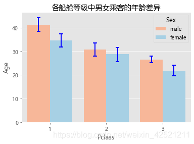
注意:需要注意的是,数据集Titanic并非汇总好的数据,是不可以直接应用到matplotlib模块中的bar函数与pandas模块中的plot方法。如需使用,必须先对数据集进行分组聚合。
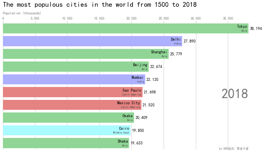
3 竞赛条形图
# 导入所需模块
import pandas as pd
import matplotlib.pyplot as plt
import matplotlib.ticker as ticker
import matplotlib.animation as animation
from IPython.display import HTML

# 读取数据
df = pd.read_csv('country_data.csv',usecols=['name', 'group', 'year', 'value'])
df.head(3)

# 配置不同洲的颜色
colors = dict(zip(
    ['India', 'Europe', 'Asia', 'Latin America',
     'Middle East', 'North America', 'Africa'],
    ['#adb0ff', '#ffb3ff', '#90d595', '#e48381',
     '#aafbff', '#f7bb5f', '#eafb50']
))
# 国家和对应的洲,化为字典
group_lk = df.set_index('name')['group'].to_dict()

def draw_barchart(year):
    dff = df[df['year'].eq(year)].sort_values(by='value', ascending=True).tail(10)
    ax.clear()
    ax.barh(dff['name'], dff['value'], color=[colors[group_lk[x]] for x in dff['name']])
    dx = dff['value'].max() / 200
    for i, (value, name) in enumerate(zip(dff['value'], dff['name'])):
        ax.text(value-dx, i,     name,           size=14, weight=600, ha='right', va='bottom')
        ax.text(value-dx, i-.25, group_lk[name], size=10, color='#444444', ha='right', va='baseline')
        ax.text(value+dx, i,     f'{value:,.0f}',  size=14, ha='left',  va='center')
    # ... polished styles
    ax.text(1, 0.4, year, transform=ax.transAxes, color='#777777', size=46, ha='right', weight=800)
    ax.text(0, 1.06, 'Population (thousands)', transform=ax.transAxes, size=12, color='#777777')
    ax.xaxis.set_major_formatter(ticker.StrMethodFormatter('{x:,.0f}'))
    ax.xaxis.set_ticks_position('top')
    ax.tick_params(axis='x', colors='#777777', labelsize=12)
    ax.set_yticks([])
    ax.margins(0, 0.01)
    ax.grid(which='major', axis='x', linestyle='-')
    ax.set_axisbelow(True)
    ax.text(0, 1.12, 'The most populous cities in the world from 1500 to 2018',
            transform=ax.transAxes, size=24, weight=600, ha='left')
    ax.text(1, 0, 'by @pratapvardhan; credit @jburnmurdoch', transform=ax.transAxes, ha='right',
            color='#777777', bbox=dict(facecolor='white', alpha=0.8, edgecolor='white'))
    plt.box(False)

#plt.xkcd()
fig, ax = plt.subplots(figsize=(15, 8))
animator = animation.FuncAnimation(fig, draw_barchart, frames=range(1900, 2019))
HTML(animator.to_jshtml())

二、数值型变量的可视化
1 直方图与核密度曲线
1.1 matplotlib模块
1.1.1 直方图
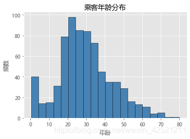
# matplotlib模块绘制直方图
# 检查年龄是否有缺失
any(Titanic.Age.isnull())
# 不妨删除含有缺失年龄的观察
Titanic.dropna(subset=['Age'], inplace=True)
# 绘制直方图
plt.hist(x = Titanic.Age, # 指定绘图数据
         bins = 20, # 指定直方图中条块的个数
         color = 'steelblue', # 指定直方图的填充色
         edgecolor = 'black' # 指定直方图的边框色
         )
# 添加x轴和y轴标签
plt.xlabel('年龄')
plt.ylabel('频数')
# 添加标题
plt.title('乘客年龄分布')
# 显示图形
plt.show()
1.2 pandas模块
1.2.1 直方图与核密度曲线
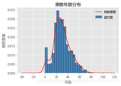
# Pandas模块绘制直方图和核密度图
# 绘制直方图
Titanic.Age.plot(kind = 'hist', bins = 20, color = 'steelblue', edgecolor = 'black', normed = True, label = '直方图')
# 绘制核密度图
Titanic.Age.plot(kind = 'kde', color = 'red', label = '核密度图')
# 添加x轴和y轴标签
plt.xlabel('年龄')
plt.ylabel('核密度值')
# 添加标题
plt.title('乘客年龄分布')
# 显示图例
plt.legend()
# 显示图形
plt.show()
1.3 seaborn模块
1.3.1 可分组的直方图与核密度曲线
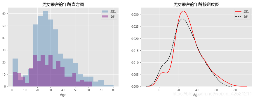
# seaborn模块绘制分组的直方图和核密度图
# 取出男性年龄
Age_Male = Titanic.Age[Titanic.Sex == 'male']
# 取出女性年龄
Age_Female = Titanic.Age[Titanic.Sex == 'female']
plt.figure(figsize=(15,5))
plt.subplot(121)

# 绘制男女乘客年龄的直方图
sns.distplot(Age_Male, bins = 20, kde = False, hist_kws = {'color':'steelblue'}, label = '男性')
# 绘制女性年龄的直方图
sns.distplot(Age_Female, bins = 20, kde = False, hist_kws = {'color':'purple'}, label = '女性')
plt.title('男女乘客的年龄直方图')
# 显示图例
plt.legend()
# 显示图形
# plt.show()

plt.subplot(122)
# 绘制男女乘客年龄的核密度图
sns.distplot(Age_Male, hist = False, kde_kws = {'color':'red', 'linestyle':'-'},
             norm_hist = True, label = '男性')
# 绘制女性年龄的核密度图
sns.distplot(Age_Female, hist = False, kde_kws = {'color':'black', 'linestyle':'--'},
             norm_hist = True, label = '女性')
plt.title('男女乘客的年龄核密度图')
# 显示图例
plt.legend()
# 显示图形
plt.show()
2 箱线图
2.1 matplotlib模块
2.1.1 单个箱线图
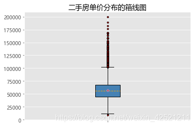
# 读取数据
Sec_Buildings = pd.read_excel(r'sec_buildings.xlsx')
# 绘制箱线图
plt.boxplot(x = Sec_Buildings.price_unit, # 指定绘图数据
            patch_artist=True, # 要求用自定义颜色填充盒形图,默认白色填充
            showmeans=True, # 以点的形式显示均值
            boxprops = {'color':'black','facecolor':'steelblue'}, # 设置箱体属性,如边框色和填充色
            # 设置异常点属性,如点的形状、填充色和点的大小
            flierprops = {'marker':'o','markerfacecolor':'red', 'markersize':3},
            # 设置均值点的属性,如点的形状、填充色和点的大小
            meanprops = {'marker':'D','markerfacecolor':'indianred', 'markersize':4},
            # 设置中位数线的属性,如线的类型和颜色
            medianprops = {'linestyle':'--','color':'orange'},
            labels = [''] # 删除x轴的刻度标签,否则图形显示刻度标签为1
           )
# 添加图形标题
plt.title('二手房单价分布的箱线图')
# 显示图形
plt.show()
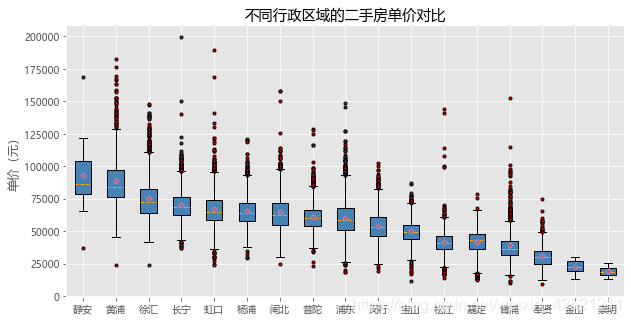
2.1.2 分组箱线图
# 二手房在各行政区域的平均单价
group_region = Sec_Buildings.groupby('region')
avg_price = group_region.aggregate({'price_unit':np.mean}).sort_values('price_unit', ascending = False)

# 通过循环,将不同行政区域的二手房存储到列表中
region_price = []
for region in avg_price.index:
    region_price.append(Sec_Buildings.price_unit[Sec_Buildings.region == region])
# 绘制分组箱线图
plt.figure(figsize=(10,5))
plt.boxplot(x = region_price,
            patch_artist=True,
            labels = avg_price.index, # 添加x轴的刻度标签
            showmeans=True,
            boxprops = {'color':'black', 'facecolor':'steelblue'},
            flierprops = {'marker':'o','markerfacecolor':'red', 'markersize':3},
            meanprops = {'marker':'D','markerfacecolor':'indianred', 'markersize':4},
            medianprops = {'linestyle':'--','color':'orange'}
           )
# 添加y轴标签
plt.ylabel('单价(元)')
# 添加标题
plt.title('不同行政区域的二手房单价对比')
# 显示图形
plt.show()
注意
- 用matplotlib模块绘制如上所示的分组箱线图会相对烦琐一些,由于boxplot函数每次只能绘制一个箱线图,为了能够实现多个箱线图的绘制,对数据稍微做了一些变动;
- pandas模块中的plot方法可以绘制分组箱线图,但是该方法是基于数据框执行的,并且数据框的每一列对应一个箱线图。对于二手房数据集来说,应用plot方法绘制分组箱线图不太合适,因为每一个行政区的二手房数量不一致,将导致无法重构一个新的数据框用于绘图。
2.2 seaborn模块
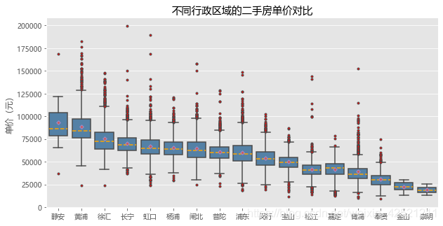
2.2.1 分组箱线图
# 绘制分组箱线图
plt.figure(figsize=(10,5))
sns.boxplot(x = 'region', y = 'price_unit', data = Sec_Buildings,
            order = avg_price.index, showmeans=True,color = 'steelblue',
            flierprops = {'marker':'o','markerfacecolor':'red', 'markersize':3},
            meanprops = {'marker':'D','markerfacecolor':'indianred', 'markersize':4},
            medianprops = {'linestyle':'--','color':'orange'}
           )
# 更改x轴和y轴标签
plt.xlabel('')
plt.ylabel('单价(元)')
# 添加标题
plt.title('不同行政区域的二手房单价对比')
# 显示图形
plt.show()
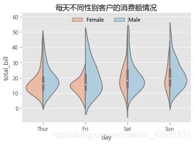
3 小提琴图
将数值型数据的核密度图与箱线图融合在一起,进而得到一个形似小提琴的图形。
3.1 seaborn模块
3.1.1 分组小提琴图
# 读取数据
tips = pd.read_csv(r'tips.csv')
# 绘制分组小提琴图
sns.violinplot(y = "total_bill", # 指定y轴的数据
               x = "day", # 指定x轴的数据
               hue = "sex", # 指定分组变量
               data = tips, # 指定绘图的数据集
               order = ['Thur','Fri','Sat','Sun'], # 指定x轴刻度标签的顺序
               scale = 'count', # 以男女客户数调节小提琴图左右的宽度
               split = True, # 将小提琴图从中间割裂开,形成不同的密度曲线;
               palette = 'RdBu' # 指定不同性别对应的颜色(因为hue参数为设置为性别变量)
              )
# 添加图形标题
plt.title('每天不同性别客户的消费额情况')
# 设置图例
plt.legend(loc = 'upper center', ncol = 2)
# 显示图形
plt.show()
4 折线图
4.1 matplotlib模块
4.1.1 单条折线图
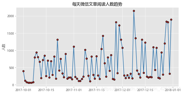
# 数据读取
wechat = pd.read_excel(r'wechat.xlsx')
# 绘制单条折线图
plt.figure(figsize=(10,5))
plt.plot(wechat.Date, # x轴数据
         wechat.Counts, # y轴数据
         linestyle = '-', # 折线类型
         linewidth = 2, # 折线宽度
         color = 'steelblue', # 折线颜色
         marker = 'o', # 折线图中添加圆点
         markersize = 6, # 点的大小
         markeredgecolor='black', # 点的边框色
         markerfacecolor='brown') # 点的填充色
# 添加y轴标签
plt.ylabel('人数')
# 添加图形标题
plt.title('每天微信文章阅读人数趋势')
# 显示图形
plt.show()
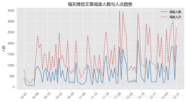
4.1.2 两条折线图
# 绘制两条折线图
# 导入模块,用于日期刻度的修改
import matplotlib as mpl
# 绘制阅读人数折线图
plt.figure(figsize=(10,5))
plt.plot(wechat.Date, # x轴数据
         wechat.Counts, # y轴数据
         linestyle = '-', # 折线类型,实心线
         color = 'steelblue', # 折线颜色
         label = '阅读人数'
         )
# 绘制阅读人次折线图
plt.plot(wechat.Date, # x轴数据
         wechat.Times, # y轴数据
         linestyle = '--', # 折线类型,虚线
         color = 'indianred', # 折线颜色
         label = '阅读人次'
         )

# 获取图的坐标信息
ax = plt.gca()
# 设置日期的显示格式
date_format = mpl.dates.DateFormatter("%m-%d")
ax.xaxis.set_major_formatter(date_format)
# 设置x轴显示多少个日期刻度
# xlocator = mpl.ticker.LinearLocator(10)
# 设置x轴每个刻度的间隔天数
xlocator = mpl.ticker.MultipleLocator(7)
ax.xaxis.set_major_locator(xlocator)
# 为了避免x轴刻度标签的紧凑,将刻度标签旋转45度
plt.xticks(rotation=45)

# 添加y轴标签
plt.ylabel('人数')
# 添加图形标题
plt.title('每天微信文章阅读人数与人次趋势')
# 添加图例
plt.legend()
# 显示图形
plt.show()
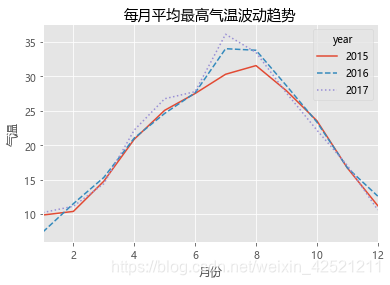
4.2 pandas模块
4.2.1 多条折线图
数据框的pivot_table方法,形成一张满足条件的透视表。
# 读取天气数据
weather = pd.read_excel(r'weather.xlsx')
# 统计每月的平均最高气温
data = weather.pivot_table(index = 'month', columns='year', values='high')
# 绘制折线图
data.plot(kind = 'line',
          style = ['-','--',':'] # 设置折线图的线条类型
         )
# 修改x轴和y轴标签
plt.xlabel('月份')
plt.ylabel('气温')
# 添加图形标题
plt.title('每月平均最高气温波动趋势')
# 显示图形
plt.show()
三、关系型数据的可视化
1 散点图
散点图用于发现两个数值变量之间的关系。
1.1 matplotlib模块
# 读入数据
iris = pd.read_csv(r'iris.csv')
# 绘制散点图
plt.scatter(x = iris.Petal_Width, # 指定散点图的x轴数据
            y = iris.Petal_Length, # 指定散点图的y轴数据
            color = 'steelblue' # 指定散点图中点的颜色
           )
# 添加x轴和y轴标签
plt.xlabel('花瓣宽度')
plt.ylabel('花瓣长度')
# 添加标题
plt.title('鸢尾花的花瓣宽度与长度关系')
# 显示图形
plt.show()
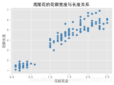
1.2 pandas模块
# Pandas模块绘制散点图
# 绘制散点图
iris.plot(x = 'Petal_Width', y = 'Petal_Length', kind = 'scatter', title = '鸢尾花的花瓣宽度与长度关系')
# 修改x轴和y轴标签
plt.xlabel('花瓣宽度')
plt.ylabel('花瓣长度')
# 显示图形
plt.show()
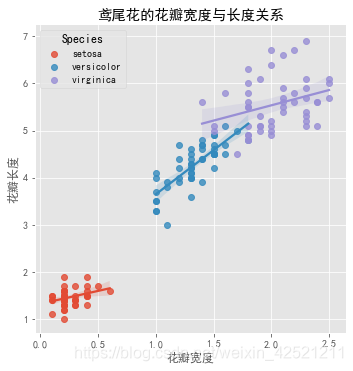
1.3 seaborn模块
lmplot函数不仅可以绘制分组散点图,还可以对每个组内的散点添加回归线(默认拟合线性回归线)。分组效果的体现是通过hue参数设置的,如果需要拟合其他回归线,可以指定:
- lowess参数(局部多项式回归)
- logistic参数(逻辑回归)
- order参数(多项式回归)
- robust参数(鲁棒回归)
# seaborn模块绘制分组散点图
sns.lmplot(x = 'Petal_Width', # 指定x轴变量
           y = 'Petal_Length', # 指定y轴变量
           hue = 'Species', # 指定分组变量
           data = iris, # 指定绘图数据集
           legend_out = False, # 将图例呈现在图框内
           truncate=True # 根据实际的数据范围,对拟合线作截断操作
          )
# 修改x轴和y轴标签
plt.xlabel('花瓣宽度')
plt.ylabel('花瓣长度')
# 添加标题
plt.title('鸢尾花的花瓣宽度与长度关系')
# 显示图形
plt.show()
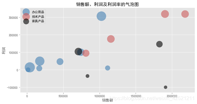
2 气泡图
气泡图可以展现三个数值变量之间的关系。
2.1 matplotlib模块
注意:pandas模块和seaborn模块中没有绘制气泡图的方法或函数。另外,可以使用Python的bokeh模块,来绘制气泡图。
# 读取数据
Prod_Category = pd.read_excel(r'SuperMarket.xlsx')
# 将利润率标准化到[0,1]之间(因为利润率中有负数),然后加上微小的数值0.001
range_diff = Prod_Category.Profit_Ratio.max()-Prod_Category.Profit_Ratio.min()
Prod_Category['std_ratio'] = (Prod_Category.Profit_Ratio-Prod_Category.Profit_Ratio.min())/range_diff + 0.001

plt.figure(figsize=(10,5))
# 绘制办公用品的气泡图
plt.scatter(x = Prod_Category.Sales[Prod_Category.Category == '办公用品'],
           y = Prod_Category.Profit[Prod_Category.Category == '办公用品'],
           s = Prod_Category.std_ratio[Prod_Category.Category == '办公用品']*1000,
           color = 'steelblue', label = '办公用品', alpha = 0.6
            )
# 绘制技术产品的气泡图
plt.scatter(x = Prod_Category.Sales[Prod_Category.Category == '技术产品'],
           y = Prod_Category.Profit[Prod_Category.Category == '技术产品'],
           s = Prod_Category.std_ratio[Prod_Category.Category == '技术产品']*1000,
           color = 'indianred' , label = '技术产品', alpha = 0.6
          )
# 绘制家具产品的气泡图
plt.scatter(x = Prod_Category.Sales[Prod_Category.Category == '家具产品'],
           y = Prod_Category.Profit[Prod_Category.Category == '家具产品'],
           s = Prod_Category.std_ratio[Prod_Category.Category == '家具产品']*1000,
           color = 'black' , label = '家具产品', alpha = 0.6
          )
# 添加x轴和y轴标签
plt.xlabel('销售额')
plt.ylabel('利润')
# 添加标题
plt.title('销售额、利润及利润率的气泡图')
# 添加图例
plt.legend()
# 显示图形
plt.show()
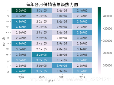
3 热力图
热力图则体现了两个离散变量之间的组合关系。
有时也称之为交叉填充表。该图形最典型的用法就是实现列联表的可视化,即通过图形的方式展现两个离散变量之间的组合关系。
3.1 seaborn模块
# 读取数据
Sales = pd.read_excel(r'Sales.xlsx')
# 根据交易日期,衍生出年份和月份字段
Sales['year'] = Sales.Date.dt.year
Sales['month'] = Sales.Date.dt.month
# 统计每年各月份的销售总额
Summary = Sales.pivot_table(index = 'month', columns = 'year', values = 'Sales', aggfunc = np.sum)

# 绘制热力图
sns.heatmap(data = Summary, # 指定绘图数据
            cmap = 'PuBuGn', # 指定填充色
            linewidths = .1, # 设置每个单元格边框的宽度
            annot = True, # 显示数值
            fmt = '.1e' # 以科学计算法显示数据
            )
#添加标题
plt.title('每年各月份销售总额热力图')
# 显示图形
plt.show()
4 仪表板
将绘制的多个图形组合到一个大图框内,形成类似仪表板的效果。
4.1 matplotlib模块
多种图形的组合,可以使用matplotlib模块中的subplot2grid函数。
# 读取数据
Prod_Trade = pd.read_excel(r'Prod_Trade.xlsx')
# 衍生出交易年份和月份字段
Prod_Trade['year'] = Prod_Trade.Date.dt.year
Prod_Trade['month'] = Prod_Trade.Date.dt.month

# 设置大图框的长和高
plt.figure(figsize = (12,6))
# 设置第一个子图的布局
ax1 = plt.subplot2grid(shape = (2,3), loc = (0,0))
# 统计2012年各订单等级的数量
Class_Counts = Prod_Trade.Order_Class[Prod_Trade.year == 2012].value_counts()
Class_Percent = Class_Counts/Class_Counts.sum()
# 将饼图设置为圆形(否则有点像椭圆)
ax1.set_aspect(aspect = 'equal')
# 绘制订单等级饼图
ax1.pie(x = Class_Percent.values, labels = Class_Percent.index, autopct = '%.1f%%')
# 添加标题
ax1.set_title('各等级订单比例')

# 设置第二个子图的布局
ax2 = plt.subplot2grid(shape = (2,3), loc = (0,1))
# 统计2012年每月销售额
Month_Sales = Prod_Trade[Prod_Trade.year == 2012].groupby(by = 'month').aggregate({'Sales':np.sum})
# 绘制销售额趋势图
Month_Sales.plot(title = '2012年各月销售趋势', ax = ax2, legend = False)
# 删除x轴标签
ax2.set_xlabel('')

# 设置第三个子图的布局
ax3 = plt.subplot2grid(shape = (2,3), loc = (0,2), rowspan = 2)
# 绘制各运输方式的成本箱线图
sns.boxplot(x = 'Transport', y = 'Trans_Cost', data = Prod_Trade, ax = ax3)
# 添加标题
ax3.set_title('各运输方式成本分布')
# 删除x轴标签
ax3.set_xlabel('')
# 修改y轴标签
ax3.set_ylabel('运输成本')

# 设置第四个子图的布局
ax4 = plt.subplot2grid(shape = (2,3), loc = (1,0), colspan = 2)
# 2012年客单价分布直方图
sns.distplot(Prod_Trade.Sales[Prod_Trade.year == 2012], bins = 40, norm_hist = True, ax = ax4, hist_kws = {'color':'steelblue'}, kde_kws=({'linestyle':'--', 'color':'red'}))
# 添加标题
ax4.set_title('2012年客单价分布图')
# 修改x轴标签
ax4.set_xlabel('销售额')

# 调整子图之间的水平间距和高度间距
plt.subplots_adjust(hspace=0.6, wspace=0.3)
# 图形显示
plt.show()
注意:
- 在绘制每一幅子图之前,都需要运用subplot2grid函数控制子图的位置,并传递给一个变量对象(如代码中的ax1、ax2等);
- 如果通过matplotlib模块绘制子图,则必须使用ax1.plot_function的代码语法(如上代码中,绘制饼图的过程);
- 如果通过pandas模块或seaborn模块绘制子图,则需要为绘图“方法”或函数指定ax参数(如上代码中,绘制折线图、直方图和箱线图的过程);
- 如果为子图添加标题、坐标轴标签、刻度值标签等,不能直接使用plt.title、plt.xlabel、plt.xticks等函数,而是换成ax1.set_*的形式(可参考如上代码中对子图标题、坐标轴标签的设置);
- 通过subplots_adjust函数重新修改子图之间的水平间距和垂直间距。1
四、plotly_express库可视化
一个强大的可视化库plotly_express(参考博文2,3 )可以在一个函数调用中创建丰富的交互式绘图,包括分面绘图(faceting)、地图、动画和趋势线。 它带有数据集、颜色面板和主题。
Plotly Express 完全免费。安装:
pip install plotly_express
大多数绘图只需要一个函数调用,接受一个整洁的DataFrame。
1 散点图
以下是内置的 Gapminder 数据集的示例,显示2007年按国家/地区的人均预期寿命和人均GDP 之间的趋势。示例数据如下:
# 加载模块
import plotly_express as px
gm = px.data.gapminder() # 数据框格式
# print('数据的前3行示例:\n',gm.head(3))

# 筛选出2007年的数据
gm2007 = gm.query('year==2007')
px.scatter(gm2007,x='gdpPercap',y='lifeExp')
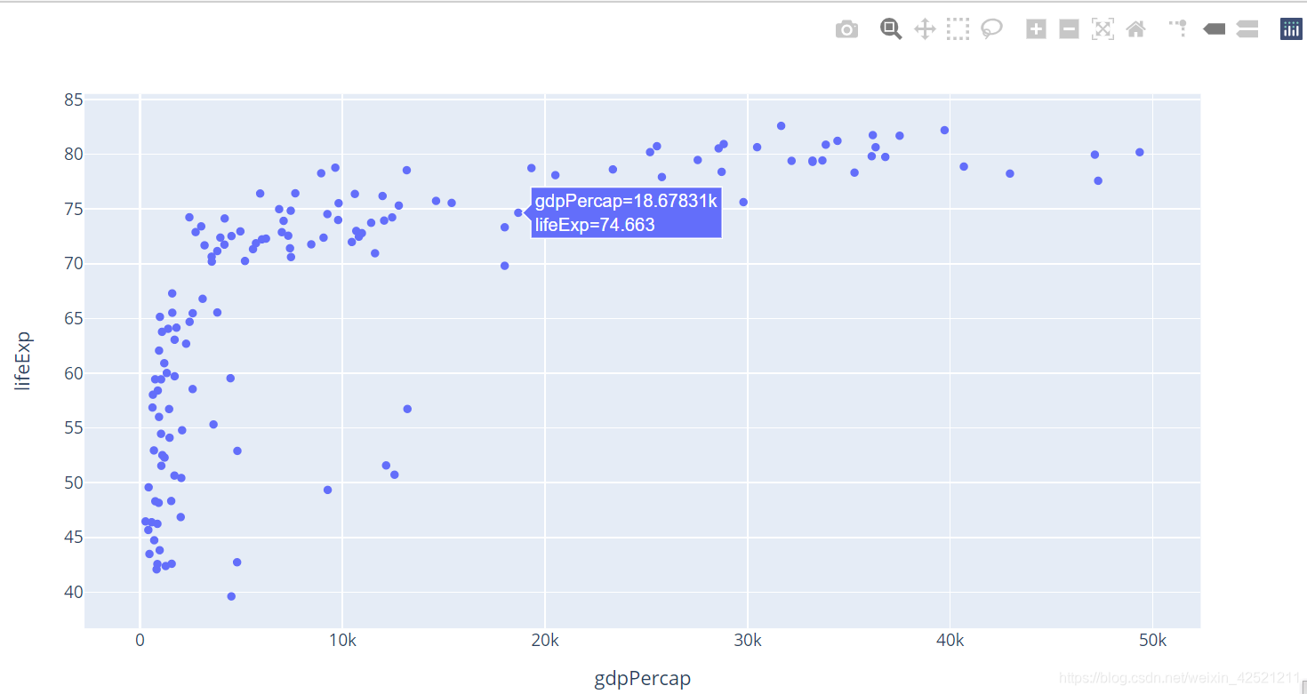
可以使用 color 参数为不同类别的点着色。
# 着色
px.scatter(gm2007,x='gdpPercap',y='lifeExp',color='continent')
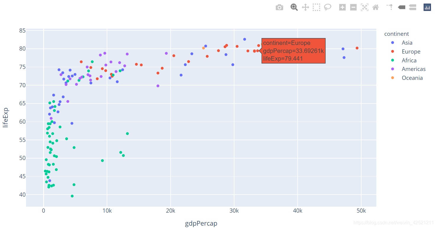
2 气泡图
通过国家的人口数量显示点的大小,参数size来设置。
# 加上点大小设置
px.scatter(gm2007,x='gdpPercap',y='lifeExp',color='continent',size='pop',size_max=50)
添加一个 参数hover_name ,可以轻松识别任何一点。
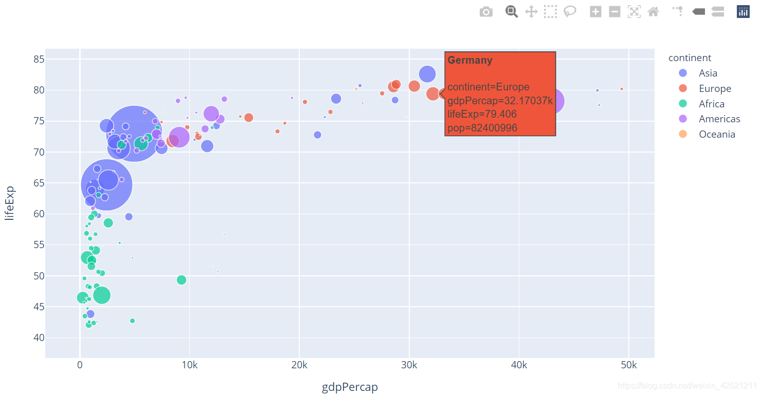
# 加上hover_name参数
px.scatter(gm2007,x='gdpPercap',y='lifeExp',color='continent',size='pop',size_max=50,hover_name='country')
3 分组-标色-气泡图
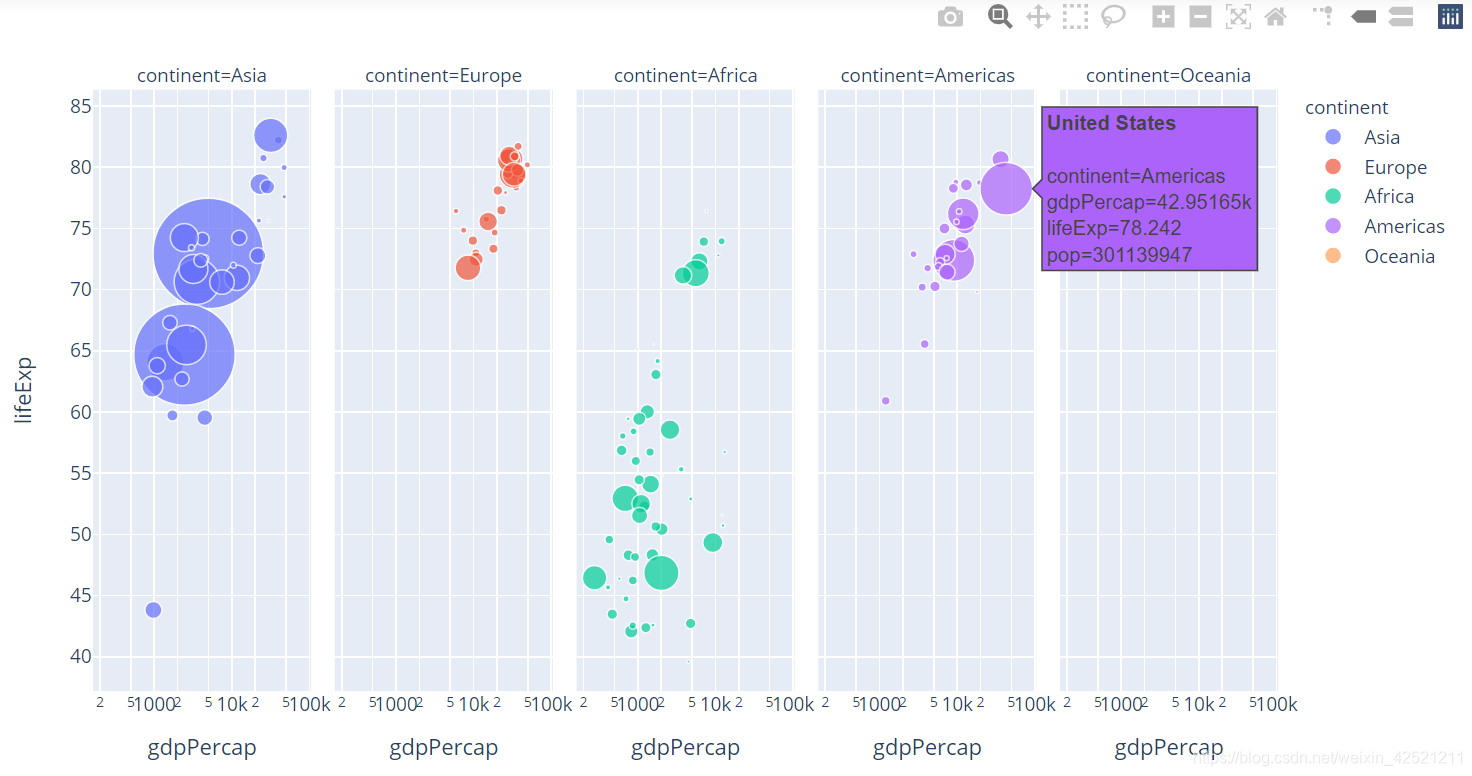
自己起的名字,通过参数facet_col =“continent” 可以将各大洲区分开。让x轴取对数(log_x)以便我们在图表中看的更清晰。
# 再加上facet_col参数
px.scatter(gm2007,x='gdpPercap',y='lifeExp',color='continent',size='pop',size_max=50,
           hover_name='country',facet_col='continent',log_x=True)
4 气泡动图
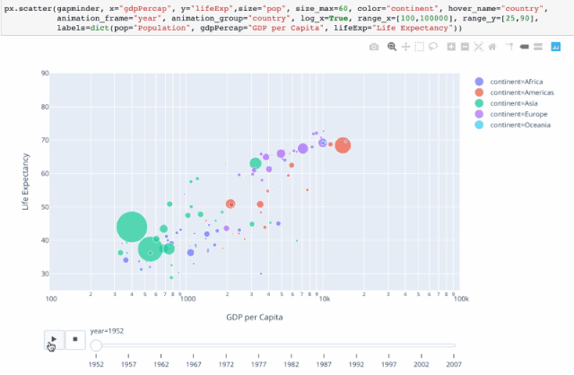
可以通过设置 animation_frame=“year” 来设置动画。
# 再加上animation_frame参数,来设置动画 ,为了图表更美观一点,对做坐标轴进行一些调整
px.scatter(gm,x='gdpPercap',y='lifeExp',color='continent',size='pop',size_max=50,
           hover_name='country',animation_frame='year',log_x=True,range_x=[100,100000],
           range_y=[25,90],labels=dict(pop='population',gdpPercap='GDP per Capita',lifeExp='Life Expectancy'))
题外话
最近突然萌发一种意识,想将日常常见的一些python可视化的手段,整理出来一个资料库,方便日后学习或者实现相关图表时,不用到处翻找其他的资源。由此诞生了此篇博文。
既然冠名资料库——可视化大全,也就让自己有一个刻意的意识:将常见的图表进行搜集整理,常抓不懈。现在才是刚刚开始,路漫漫其修远兮,吾将上下而求索,为此事也!
如果这个过程,恰好也帮助到了路过的你,感觉荣幸之至,可能这也是我整理的最大动力。
参考资料
从零开始学Python数据分析与挖掘/刘顺祥著.—北京:清华大学出版社,2018ISBN 978-7-302-50987-5 ↩︎