Python matplotlib可视化随笔
plt.figure
plt.figure来设置窗口尺寸。其中figsize用来设置图形的大小,a为图形的宽, b为图形的高,单位为英寸。
plt.figure(figsize=(a, b))
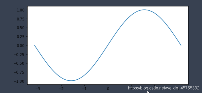
x=np.linspace(-np.pi,np.pi,100)
plt.figure(figsize=(8,4))
y1=np.sin(x)
plt.plot(x,y1)
plt.subplot
多个窗口画多个图
x=np.linspace(-np.pi,np.pi,100)
plt.figure(figsize=(8,4))
y1=np.sin(x)
y2=np.cos(x)
plt.subplot(221)
plt.plot(x,y1)
plt.subplot(222)
plt.plot([-1,1],[-1,1])
plt.subplot(212)
plt.plot(x,y2)
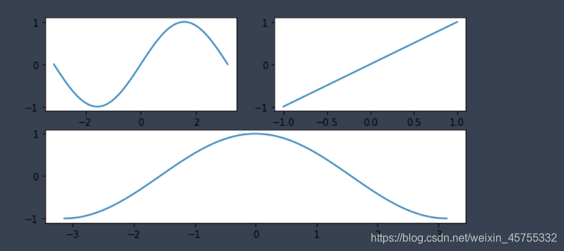
一个窗口画多个图
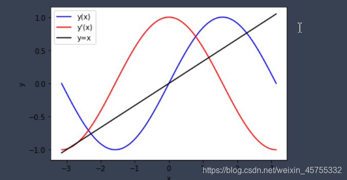
fig, ax=plt.subplots()
ax.plot(x, y1, color="blue", label="y(x)") # 定义x, y, 颜色,图例上显示的东西
ax.plot(x, y2, color="red", label="y'(x)")
ax.plot(x,x/3,'k',label="y=x")
ax.set_xlabel("x") # x标签
ax.set_ylabel("y") # y
ax.legend(); # 显示图例
axhline()
功能:绘制平行于x轴的水平参考线
y:水平参考线的出发点
c:参考线的线条颜色
ls:参考线的线条风格
lw:参考线的线条宽度
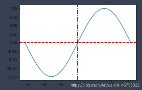
plt.axhline(y=0.0, c="r", ls="--", lw=2)
plt.plot(x, y1)
plt.axhline(y=0.0, c="r", ls="--", lw=2)#平行于X轴
plt.axvline(x=0.0, c="k", ls="-.", lw=2)#平行于y轴的线
plt.show()
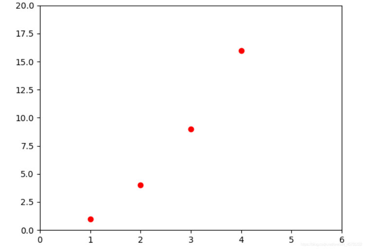
plt.axis()
plt.plot([1, 2, 3, 4], [1, 4, 9, 16], 'ro')
plt.axis([0, 6, 0, 20])#xmin xmax ymin ymax
plt.show()
方便的方法来获取或设置一些轴属性
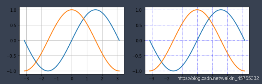
grid()网格
fig, axes = plt.subplots(1, 2, figsize=(10,3))
# default grid appearance
axes[0].plot(x,y1, x, y2, lw=2)
axes[0].grid(True)
# custom grid appearance
axes[1].plot(x,y1, x,y2, lw=2)
axes[1].grid(color='b', alpha=0.5, linestyle='-.', linewidth=1)#alpha:透明度,linewidth 线条宽度l
scatter
#x,y:表示的是shape大小为(n,)的数组,也就是我们即将绘制散点图的数据点,输入数据。
#s:表示的是大小,是一个标量或者是一个shape大小为(n,)的数组,可选,默认20。
#c:表示的是色彩或颜色序列,可选,默认蓝色’b
#marker:MarkerStyle,表示的是标记的样式,可选,默认’o’
#plpha:透明度 0-1之间
plt.pyplot.scatter(x,y,s=None,c=None,marker=None,alpha=None, )
x=np.random.rand(20)*10
y=np.random.rand(20)*10
a=np.random.randint(50,1000,50)
color=np.random.rand(20)
plt.scatter(x, y, s=a,alpha=0.5, c=color)

hist()
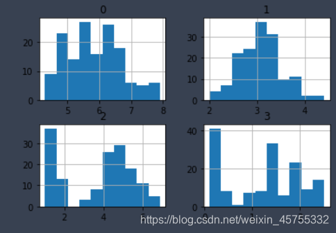
**pandas hist()**画柱状图,以鸢尾花为例,其有四个特征,三个类别,现只看其特征分布。
from sklearn.datasets import load_iris
iris=load_iris()
iris_feature=iris.data#四个特征
df=pd.DataFrame( iris_feature )
hist=df.hist()
可以看到,以一个特征明显有三个阶层,正好对应三个类别,其他一样。
plt.hist()
>>x=np.random.randint(0,15,30)
>>y=16
>>plt.hist(x,y)

(array([12,  6,  9,  8,  0, 11,  1, 12,  1,  4, 13, 14,  1,  2,  0, 13, 14,3,  9, 10,  6,  5, 10, 12, 13, 13,  7, 10,  8, 10]),
 (array([2., 3., 1., 1., 1., 1., 2., 0., 1., 2., 2., 4., 1., 3., 4., 2.]),
  array([ 0.   ,  0.875,  1.75 ,  2.625,  3.5  ,  4.375,  5.25 ,  6.125, 7.   ,  7.875,  8.75 ,  9.625, 10.5  , 11.375, 12.25 , 13.125, 14.   ]),

横轴是数据,纵轴是出现的次数(也就是频数)。
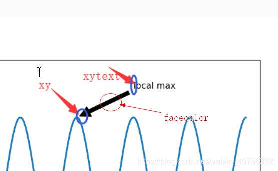
plt.annotate 注释工具
annotate(s, xy, args, kwargs)
xy=(横坐标,纵坐标)  箭头尖端
xytext=(横坐标,纵坐标) 文字的坐标,指的是最左边的坐标
arrowprops= {
  	 facecolor= '颜色',
	 shrink = '数字' <1  箭身长度
}
ax.annotate('local max', xy=(2,1), xytext=(3,1.5),
            arrowprops=dict(facecolor='black', shrink=0.05)
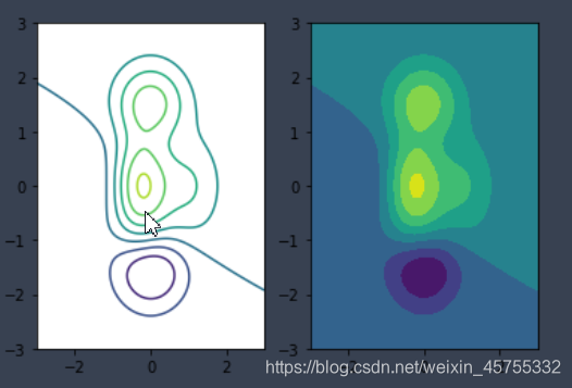
meshgrid画等高线
# 计算x,y坐标对应的高度值
def f(x, y):
      return (1-x/2+x**3+y**5) * np.exp(-x**2-y**2)
# 生成x,y的数
# 计算x,y坐标对应的高度值
def f(x, y):
      return (1-x/2+x**3+y**5) * np.exp(-x**2-y**2)
# 生成x,y的数
n = 256
x = np.linspace(-3, 3, n)
y = np.linspace(-3, 3, n)
# 把x,y数据生成mesh网格状的数据,因为等高线的显示是在网格的基础上添加上高度值
X, Y = np.meshgrid(x, y)
plt.subplot(121)
plt.contour(X,Y,f(X,Y))
# 填充等高线
plt.subplot(122)
plt.contourf(X, Y, f(X, Y))
# 显示图表
plt.show()
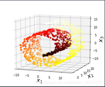
三维视图
三维散点图
from sklearn.datasets import make_swiss_roll #导入瑞士卷模型的数据
import matplotlib.pyplot as plt
from mpl_toolkits.mplot3d import Axes3D
X, t = make_swiss_roll(n_samples=1000, noise=0.2, random_state=42)#X.shape=(1000,3),t.shape=(1000,)

fig = plt.figure(figsize=(6, 5))#设置图形大小
ax = fig.add_subplot(111, projection='3d')#fig.add_subplot在二维中与plt.plot一样

ax.scatter(X[:, 0], X[:, 1], X[:, 2], c=t, cmap=plt.cm.hot)#颜色c=t是因为t与X数据相对应,画出来的散点图的颜色也是相应变化的
ax.view_init(10, -70)#设置视图方向 可以自己改改里面的数值试试看
ax.set_xlabel("$x_1$", fontsize=18)#加坐标轴的说明
ax.set_ylabel("$x_2$", fontsize=18)
ax.set_zlabel("$x_3$", fontsize=18)
axes = [-11.5, 14, -2, 23, -12, 15]
ax.set_xlim(axes[0:2])#设置坐标轴范文
ax.set_ylim(axes[2:4])
ax.set_zlim(axes[4:6])
plt.show()
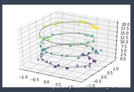
三维螺旋线
from mpl_toolkits import mplot3d
import matplotlib.pyplot as plt
import numpy as np
ax = plt.axes(projection='3d')#这里没有设置图像大小 也就不用想上例那样先plt=figure(***)

#三维线的数据
zline = np.linspace(0, 20, 1000)
xline = np.sin(zline)
yline = np.cos(zline)
ax.plot3D(xline, yline, zline, 'gray')

# 三维散点的数据
zdata = 20* np.random.random(100) #从0到20  100个随机数字
xdata = np.sin(zdata) + 0.1* np.random.randn(100) #就是在螺旋上近加减个很小的数字 使其在螺旋线附近
ydata = np.cos(zdata) + 0.1*  np.random.randn(100)
ax.scatter3D(xdata, ydata, zdata, c=zdata)#散点图的颜色随机
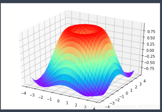
三维平面图
from matplotlib import pyplot as plt
import numpy as np
from mpl_toolkits.mplot3d import Axes3D

fig = plt.figure()
ax = Axes3D(fig)
X = np.arange(-4, 4, 0.25)
Y = np.arange(-4, 4, 0.25)
X, Y = np.meshgrid(X, Y)
R = np.sqrt(X**2 + Y**2)
Z = np.sin(R)

ax.plot_surface(X, Y, Z, rstride=1, cstride=1, cmap='rainbow')

plt.show()